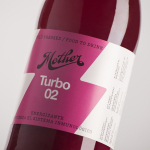
Mother Cold Pressed Juice by Mucho
Mother creates fresh cold pressed juices, milks, smoothies, cereal bars, snacks and detox systems from its location at the centre of Barcelona. Mother recently commissioned design studio Mucho to develop a name, visual identity and packaging treatment that would help express the love and care they put into crafting their range and the technological and industrial processes required to produce them....
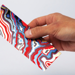
Arjowiggins Curious Matter x FIAC by The Bakery
FIAC is an annual contemporary arts fair where galleries from across the world gather and present work by the emerging artists they represent. The fair takes place at the Grand Palais in Paris and runs for four days during October. Paper merchant Arjowiggins, a longstanding partner, continued to support the event by providing material for FIAC’s catalogue and event guides. This year, these featured a distinctive bookmark...
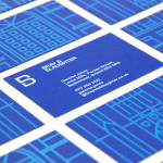
Bray & Slaughter by Mytton Williams
Bray & Slaughter is a UK based regional contractor with over 100 years of experience in the construction industry and an extensive understanding of the education, healthcare, commercial, heritage, conservation and residential sectors. Following industry and company changes, Bray & Slaughter commissioned design studio Mytton Williams to create a new visual identity that would better reflect their growth and move from ‘local builder’ to ‘regional...
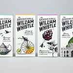
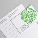
The Adventurous Blends of William Whistle by Horse
The Adventurous Blends 0f William Whistle is a small tea and coffee merchant crafting exotic flavoured teas, coffees and tisane from the highest quality ingredients sourced from across the world using an approach that is described as bringing together the very best discoveries of the past with the expertise of the present. This philosophy, as well as the merchant’s well-travelled and eccentric English nature, informed...
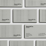
Ascui & Co. Architects by Grosz Co. Lab
Ascui & Co. Architects is an Melbourne-based studio with a rich history, depth of experience and a vision they describe as being a true perspective rather than one founded on intuition. Their projects are considered smart and environmentally sustainable, unexpected yet grounded by purpose, and range from residential additions to multimillion-dollar commercial developments. Anchored in the concept of Process & Possibility — a maxim that refers...
The Counter Press by The Counter Press
The Counter Press is a letterpress studio and workshop located in an old chocolate factory in the East End of London. They work exclusively with hand set wood and hot metal type on antique presses to create contemporary typographic design, artwork and limited edition prints. While taking on small outside projects, founders David Marshall and Elizabeth Ellis are keen to stress they are not...
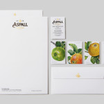
Aspall by NB Studio
Aspall is a British family run cyder maker with a significant history, now into its eight generation and third century. In response to increased competition from both the Cyder and Vinegar categories, Aspall recently worked with NB Studio to help reinvigorate and re-craft its brand identity. This included new logo and packaging treatments for retail and trade as well as website, point...
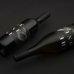
The Bone Line by Inhouse
The Bone Line is a New Zealand winery with a name that references the K—T Boundary, a thin band that runs close to The Bone Line’s location in the Waipara Valley, and that marks the end of the Mesozoic Era and the extinction of the dinosaurs. Auckland based graphic design studio Inhouse worked with the winery to establish a distinctive packaging and identity treatment. Like...
Coalition for Engaged Education by Blok
The Coalition for Engaged Education, formerly New Visions Foundation, is an LA based organisation, led by Dr Paul Cummins, that helps vulnerable children and young adults to realise their potential through an approach to education that respects and inspires them. CEE recently worked with design studio Blok to develop a new visual identity that would mark the organisation’s new national ambitions....
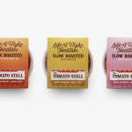
The Tomato Stall by Designers Anonymous
The Tomato Stall is a grower of speciality tomatoes whose distinct flavour is attributed to the increased sunshine they receive from being farmed on the southern English island of the Isle of Wight. From these, The Tomato Stall produces a range of ‘tomato inspired’ artisanal products that are stocked by farm shops and delis throughout the UK and sold from...
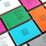
KVGD by Kerr Vernon
KVGD is a Glasgow based graphic design studio run by Kerr Vernon that works within the fields of brand identity design and print, has a ‘be nice, do good work’ philosophy, and a reputation for producing engaging, thoughtful and crafted projects. The studio’s client base is diverse, local and national, and includes businesses such as gallery, event and creative workspace The Whisky Bond,...
G . F Smith by Made Thought
G . F Smith is an independent British paper merchant with a heritage dating back to 1885 and a loyal staff, some of whom have provided over 20 years of loyal service. Made Thought, the design studio behind the visual identity for G . F Smith’s distinctive Colorplan range, were recently commissioned to develop a new brand identity for the company that would better...
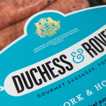
Duchess & Rover by Robot Food
The raw meat sector within the dog food industry continues to grow and innovate, reflecting owner’s increasing support and understanding that it can provide a fresh, natural and convenient way for their dogs to receive the nutrients they need. Recognising how unpleasant raw meat can be and looking to take advantage of the expanding market, design studio and now product development specialist Robot...
Fazer Café by Kokoro & Moi
Established in 1891 by Karl and Berta Fazer and located in Helsinki district of Kluuvikatu, Fazer began life as a French-Russian conditory that has grown to become one of Finland’s largest food companies, working within the bakery, confectionery, and work-place restaurant sectors. Summer 2013 saw the return of Fazer’s café chain to Helsinki with locations in the centre of the city and in the...
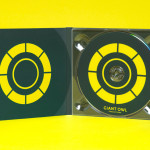
Giant Owl Productions by Alphabetical
Giant Owl is a London-based independent production company that creates television programmes, commercials and short films for clients such as Channel 4 and Rimmel London. Design agency Alphabetical recently developed a new brand identity solution for Giant Owl—which included an animated logo, flat colour palette, glow-in-the-dark paper and bold illustrative detail—that leverages a simple observation to balance an expected technicality with a playful...
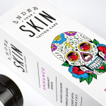
Under Your Skin by Robot Food
Under Your Skin is a specialist tattoo and skin care range made up of three treatments; ‘Recover’, ‘Protect’ and ‘Enhance’, developed in response to skin art’s move from sub-culture to the mainstream. Under Your Skin’s brand identity—which included a logotype, original illustrative work and packaging design, developed by Leeds-based Robot Food—was created to appeal to a broad audience, “from the newly marked”...
Puebla 109 by Savvy
Puebla 109 is a three floor 20th century townhouse, located in the Roma Norte colonia of Mexico City, “where art, design and gastronomy converge” in the form of an evolving space utilised as a place to work in the morning, as a restaurant to eat lunch in the afternoon and as a bar to have cocktails in the evening. Puebla 109’s new brand identity—which includes...
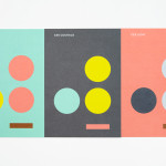
December’s Top 5 Projects 2013
This month’s highlights have included new packaging work from Believe In, Graphical House, Port Clarendon and Peter Gregson, brand identity projects by RoAndCo and For Brands, as well as a new visual identity and interior design solution by Savvy for Mexican seafood restaurant La Peñita De Jaltemba. However, five projects really stood out for me which have made it into BP&O’s...
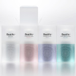
Beatific by Mousegraphics
Beatific is a new skincare range from Greek private medical service provider Hygeia Group “for women who are aware of the benefits of cosmeceuticals and can appreciate the results of thorough clinical research and high end care”. Created by Mousegraphics, the brand identity and packaging for Beatific takes the medical precision, exclusive care and expertise established by the Hygeia Group and a contemporary clinical experience...

Bundle by The Company You Keep
Bundle is a service established by Sarah Cole that provides mums-to-be with a curated bag containing everything they need for their stay in hospital. Melbourne based design studio The Company You Keep (TCYK) developed a visual identity for Bundle that, through colour, bold sans-serif typography, the high quality perceptions of embossed and debossed print work and plenty of space, reflects the quality of...
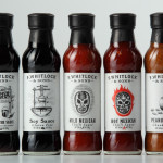
F. Whitlock & Sons by Marx
F. Whitlock & Sons is a New Zealand based producer of pickles and sauces with a heritage that dates back to 1877, a heritage that over the last century had disappeared from the packaging. Design studio Marx, in collaboration with running with scissors, sort to bring back and celebrate this with a mix of copywriting wit and illustrative authenticity based around Fred Whitlock’s love of...

Checklist by Anagrama
Checklist is a Mexican event planning business that specialises in ‘milestone occasions’ such as birthdays, anniversaries and graduations as well as corporate events. Checklist caters ‘exclusively for their client’s unique needs’ and can also provide options that are environmentally friendly. Design agency Anagrama recently devised an ‘institutional’ visual identity solution for Checklist that mixes the age and authority of a heraldic shield,...
Feral Sphere by Mind
Established by Goldsmiths graduate Holly James earlier this year, Feral Sphere is a UK-based fashion label that creates simple, colourful and comfortable clothing and accessories made from organic cotton using 100% renewable solar and wind energy. The label’s brand identity and packaging solution, created by Mind Design working in collaboration with illustrator Lenia Hauser, was “inspired by Japanese Shinto spirits...
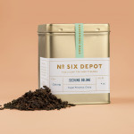
No. Six Depot by Perky Bros
“No. Six Depot is a family owned, small-batch coffee roaster and café nested in the beautiful Berkshires. Located in a historic train station on 6 Depot St, they serve teas, salts and coffee from small farms and roast on location. Their identity [designed by Perky Bros] juxtaposes a mix of unique rural and modern elements — drawing inspiration from their own backyard railroad...