
Bølgeblikk Arkitekter by Tank
In response to a change in leadership and the acquisition of new staff, Norwegian architectural firm Ottar commissioned Tromsø and Oslo-based design studio Tank to develop a new name and brand identity—which would go on to include a logo, stationery set and responsive website—that would better reflect the quality, professionalism and scale of the firm’s work within the health and education sector, whilst...
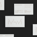
MHM Architects by 26 Lettres
MHM Architect is the studio of independent Canadian architect Maxine H. Marcovitch who, working with a team of professionals, trade and closely with clients, creates “beautiful, innovative, and unconventional architectural spaces.” The studio’s new brand identity, developed by 26 Lettres and which included a logotype, blind embossed business cards, portfolio with open stitch detail and website, delivers a familiar but appropriate...

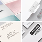
Haverstock by Spy
Haverstock is a UK based architectural practice that specialises in public-sector projects with a strong humanistic approach that enables “clients and the people who use the buildings to have a voice, and to shape the way their building ends up”. Following the retirement of Haverstock’s founding partners design studio Spy was commissioned to develop a new brand identity for the firm—which included a...
December’s Top 5 Projects 2013
This month’s highlights have included new packaging work from Believe In, Graphical House, Port Clarendon and Peter Gregson, brand identity projects by RoAndCo and For Brands, as well as a new visual identity and interior design solution by Savvy for Mexican seafood restaurant La Peñita De Jaltemba. However, five projects really stood out for me which have made it into BP&O’s...

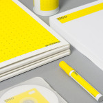
Mellbye by Heydays
Mellbye is a Norwegian architecture firm founded in 1954 with a “mindset anchored in modernism”. Design studio Heydays created a new brand identity for the firm based around a geometric M symbol built from the initials of their two main services, architecture and interiors. Executed as a combination of blind deboss and die cut detail across a earthy and urban...
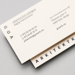
Goa Arkitektkontor by Heydays
Goa Arkitektkontor is an Oslo based architecture studio, established in 2012 by Johannes Ludvigsen Goa, that provides planning, regulation and architectural design services. The studio has a philosophy that sees restrictions such as economy, building regulations and social attitudes as opportunities, believes in simplicity and, a little unusually, is not afraid to be banal. These ideas are neatly resolved through...
Cemento by S-T
Cemento is the UK distributor of an Italian lightweight concrete product that can be used for wall panelling and furniture. Inspired by brutalist design — a movement that grew out of early 20th century modernist architecture and described by Wikipedia as being “linear, fortresslike and blockish” — London based studio S-T developed a visual identity for Cemento that included logo, logotype, brand...

Traveller Espresso Bar by TCYK
Traveller is the Melbourne based espresso bar of speciality coffee roaster and cafe operator Seven Seeds. Design agency The Company You Keep (TCYK) recently worked with Seven Seeds to develop a new visual identity solution for the Traveller that reflects an interior architecture of details such as ‘moulded plywood, vinyl and soft curves’ inspired by ‘the golden age of caravanning’, through period typography,...

MDD9 by Two Times Elliott
MDD9 is a Hong Kong and London based multidisciplinary architectural and interior design studio, founded in 2009, that is engaged in a variety of building and construction projects that include new developments and renovations, urban planning, lighting, landscape and acoustic design. The studio’s visual identity, developed by Two Times Elliott, reflects the “dynamic outlook” of the individual architects as well...
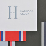
Harridge Group by Igloo
Harridge, formerly Ealing Travel Services, is a corporate travel group made up of Harridge Business Travel, Harridge Luxury and Harridge Events. London-based design studio Igloo were recently commissioned to design the group’s visual identity and brand architecture which would reference its “significant history and experience”. Their design solution, a combination of serif detail, sans-serif characters and a modern colour palette and pattern set, drawing on...
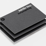
Adrián Key by Face
Adrián Key is a San Pedro based architecture firm and architect working with the rich and famous from “one of the most exclusive corners of northern Mexico”. Design agency Face Creative developed a new visual identity for the firm with a “clean, simple aesthetic with bold and modern touches, an icon that cleverly encases the name of the brand in its design, and...
Insiders by Garbett
Insiders is the membership program of Sydney Opera House launched to nurture customer loyalty, increase market share and raise the frequency of attendance through priority booking, discounts, dress rehearsal ‘sneak peeks’ and invitations to meet staff and artists. Multidisciplinary design agency Garbett were commissioned to ‘evolve’ the Insiders visual identity, positioning it as a retail product with greater focus on communicating the value proposition for members,...
Griab by Kollor
Griab is a Swedish engineering firm, founded in 1957 and located in Helsingborg, Sweden, that specialises in delivering a holistic design and build service that includes land planning, wastewater management, architecture and construction. Developed by multidisciplinary design agency Kollor, Griab’s visual identity, “inspired by the the straight lines and shapes commonly seen in architecture” and created to help reinforce the firm’s environmental...
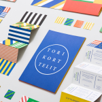
Torikorttelit by Kokoro & Moi
Torikorttelit is the old town district of Finland’s capital Helsinki. Its new visual identity, designed by Kokoro & Moi and based around bright colours, simple geometric patterns, a stacked typographic serif logo framed by a circle and paired with a modernist inspired secondary typeface neatly reflects the historic setting at the heart of a modern metropolis....
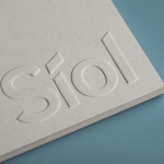
Síol Studio designed by Mucho
San Francisco-based architecture studio Síol recently commissioned multidisciplinary design agency Mucho to develop a new visual identity solution that would embody “their philosophy of conceptual, clean architecture for both interior and exterior design.” Based around a customised sans-serif logotype executed as a blind deboss, the identity conveys the familiar architectural themes of light and shadow formed within three-dimensional space and a practical, corporate efficiency....
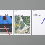
Tegn_3 by Neue
Tegn_3 is a Norwegian, multidisciplinary, architecture design studio that, through inclusive methods, process-oriented and competent project management, deliver holistic solutions that encompass the fields of architecture, planning and landscape, to large clients across Scandinavia. Their visual identity, developed by Neue, draws together the themes of technical knowledge, structure, connections, collaboration and creativity through neutral typography, a modular and expanding geometric...

K2LD Architects by Studio Hi Ho
K2LD is a small Melbourne-based architecture and interior design firm with a project history that includes individual private homes, community precincts, multi-unit developments and large-scale commercial projects. The firm’s identity, an abstract, structural and modular amalgamation of initials (check the ideation animation here), uncoated materials and a monochromatic colour palette – developed by brand and communication studio Hi Ho – unapologetically embraces the established and reductionist cues of the industry....
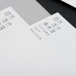
Sifang Art Museum by Foreign Policy
Sifang Art Museum is a gallery and creative space located in the Pukou region of Nanjing, China dedicated to art, architecture and international collaboration. Their visual identity, a bilingual logo-type set across a collateral of unusual trapezoidal cut detail and monochromatic colour palette—developed by Singapore-based creative and strategic design agency Foreign Policy—draws together the themes of architectural space, the dimensionality created by light and shadow,...

Krohn by Commando Group
Krohn is a young but experienced Oslo based furniture, interior and architecture design studio that develops holistic solutions that strengthen and add value to businesses through interior environments. Krohn’s visual identity, website and stationery—created by visual communications agency Commando Group—captures the multi-disciplinary nature of the studio and juxtaposes bold architectural structure and simple interior spaces with fine, high quality detailing, through an abstract,...
Ideo Architekci by For Brands
Polish design studio For Brands (formerly Artentiko) have published images of their latest visual identity project commissioned by Wrocław based architectural studio Ideo Architekci. Based around a modular and dynamic grid based framework, modernistic typeface and a bright industrial colour palette, Artentiko’s solution manages to capture the fundamental aspect of architectural planning and a consistent but expansive approach....

Mal de Mar by Face
Mal de Mar is a San Pedro, MX based business and on-line journal where art, design, architecture, photography and travel combine. The journal’s new identity, developed by ‘supermodernist’ design agency Face, captures and binds the timeless pursuit of knowledge and experience through travel and culture with that of the modern technological world with a contemporary fusion of light, symmetrical and consistent line...

Smets by Coast
SMETS is a luxury department store located in the heart of Brussels (with two more locations across Luxembourg) with over 3.500 square metres of fashion, design, art, food and beauty. Following last December’s BP&O review of the SMETS identity, independent design agency Coast has recently published some further images outlining how this new visual identity has been executed across a wider variety of collaterals and touch-points....
Škoda
Škoda is a Czech car manufacturer established in 1859 which started producing bikes, motorcycles and then automobiles at the start of the 20th century. In 1990 they were purchased by the Volkswagen Group and saw significant growth of 51% in 2010 compared to the previous year. As of March 2011 they will introduce a new identity to better represent their more ecological, innovative and aspirational...