
Galerija Kranjčar by Bunch
Galerija Kranjčar is an art gallery, located at the heart of Zagreb, opened in 2006 to showcase the work of Croatian contemporary artists and function as hub for a variety of cultural activities. The gallery is a long and unique space, one that balances the modern and historic. This can be seen in the meeting of smooth white walls, concrete floor...
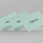
Trika by Bunch
Trika is an interior design company, working on both public and private spaces, with a showroom and studio in the Croatian capital of Zagreb. They represent furniture and equipment manufacturers such as Billiani, Enea and Federicia, amongst many others, whose brand names are described as being synonyms for quality, comfort and design. Graphic design studio Bunch worked with Trika to develop a new brand identity....
Superkül by Blok
Superkül is an Canadian architectural firm with a portfolio that is described as having an understated boldness, subtlety and spacial richness, and a process that intends to find the essence of each project and remain true to this throughout design and development. Superkül has won many awards and is considered one of Canada’s most progressive architecture firms. To celebrate their first...

Verso Architecture+Interiors by Studio South
Verso is a small Auckland-based architecture and interiors business working within the residential and commercial sectors. Drawing on the oppositional nature of name and using a mix of simple typographical form, high-quality materials and print finish Studio South developed a new visual identity for Verso that is described as being both sophisticated and playful, whilst effectively working in some universal architectural principles. This links a variety of printed...
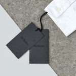
Helbers by Only
Helbers is a Parisian menswear label created by Paul Helbers, the former Head of Menswear at Maison Margiela and ex-Menswear Director at Louis Vuitton. The label has a carefully curated lookbook of garments and footwear with an unpolished elegance, and feature a subtle contrast of materials. Helbers has secured early acclaim for his AW16 collection, and is due to appear in stores around the world in the coming weeks. Paul worked with Leeds-based...

David Rowland by ico Design
David Rowland is an award-winning and straight-talking London-based photographer who has been capturing images for leading brands and agencies for over two decades. With a desire to remind existing and potential clients of his expertise and technical know-how David worked with graphic design studio and client ico Design to develop a new brand identity and supporting collateral. This included, alongside a new logotype, business...
Meg’s Tailoring by Studio South
Meg’s is a tailoring service, established by Megan Kenny, that began as a single store on Garfield Street in 1995. Meg’s now has two locations in Auckland, New Zealand, provides a broad range of services; from hems to full garment design, and works on large projects with high-end designers and labels such as Hugo Boss, Prada and Gucci, and on smaller jobs from High Street drop-ins....

The International by Studio South
The International is a new apartment complex, located not far from Auckland’s Albert Park, with 88 luxury residencies. The building, a repurposed former office, is currently being transformed into an iconic structure with a contemporary exoskeleton of elongated beams. To promote the building and help sell apartments off-plan, the graphic designers at Studio South worked with the developer behind The International...
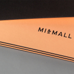
Mi&Mall by Atipo
Mi&Mall is an online shopping destination and resource that brings together and supports small to medium designer brands for people interested in fashion, trends and exclusive collections. Based around a simple logo-type, ampersand, a pale colour palette and a tactile print and material choice, Mi&Mall’s visual identity, created by Spanish multidisciplinary design studio Atipo, mixes high fashion and boutique craft...