Printed by Cerovski

Printed by Somerset by Leo Burnett
Somerset is described as being Canada’s top printer, known for its precision, attention to detail and ability to pull off complex jobs. Alongside reproduction services, Somerset, a family-run business, also provides extensive print finishing services. Inspired by this, the stacked paper of the press, and with the intention of engaging a new generation of designers, Toronto based studio Leo Burnett developed a new brand identity...
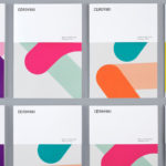
Cerovski by Bunch
Cerovski is a young Croatian print production studio that revels in the challenge of “nebulous finishing, microscopic editions, absurd materials and crazy deadlines”. Bunch worked with Cerovski to develop a new brand identity for the studio—which included a custom logotype and typeface, website, and a variety of printed collateral—that delivers a distinctive contrast of utility and creative flourish, technology and individualised service...
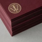
Willow Tree by Bunch
Willow Tree, one of London’s leading business consultancies, worked with graphic design studio Bunch to develop a new but traditional-looking visual identity with an attention to detail. Based around a WT monogram, created by typographer Spencer Charles, utilised as a mix of embosses, carved in seals and simulated watermark, and using purple cloth, black leather, cream paper and handmade coffee pottery, Bunch’s solution embraces a...
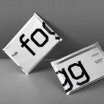
Fogg by Bunch & Kurppa Hosk
By purchasing overcapacity from international telecom networks, Fogg Mobile provides a fixed cost mobile data traffic service for people who want to avoid unexpected roaming bills when travelling abroad. Through the animate and evolving qualities of computer generated imagery and a combination of unbleached paper, stitching, flat coated colour and silver polypropylene, Fogg’s visual identity, created by Kurppa Hosk and developed by Bunch, delivers...
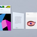
Nosive Strukture by Bunch
Nosive Strukture is a structural engineering firm who describe themselves as having a ‘unconventional attitude towards business, working environment and life itself.’ Inspired by their approach and a studio space of angled detail, independent design agency Bunch, “developed a stark, technical identity based around tensegrity structures and a black and white palette” executed across triplexed business cards, cardboard file folders, signage...