Prospectus Design
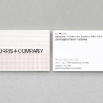
Morris+Company by Bob Design
Morris+Company dovetails the individual strengths of founder Joe Morris and the talents of a wider company of designers. This is expressed by a recent renaming, moving from Duggan Morris Architects to Morris+Company, and throughout the studio’s new graphic identity, designed by Bob Design. This is codified within a brand guidelines document of type, imagery, texture, pattern, words (by Emma Keyte) print finish and material...
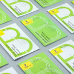
UNSW Built Environment by Toko
UNSW Built Environment (BE) intends to develop global leaders in architecture, planning and construction, and help shape resilient, connected, smart and inclusive future cities through its undergraduate, postgraduate and postgraduate research courses. As part of this, the faculty also runs an annual programme of events for students, academics, industry professionals and the general public. These serve as a platform to find out...
CCA Architecture by Manual
The Architecture Division of the California College of the Arts (CCA) is an internationally recognised leader in architecture and interior design education. Its programs, which focus on digital technologies and material systems, design research and urban agency, were developed to prepare students for creative practice where material innovation and formal experimentation meet social engagement and cultural collaboration. CCA Architecture strives to...

London School of Hygiene & Tropical Medicine by Spy
The London School of Hygiene & Tropical Medicine (LSHTM) was founded in 1899 and has established itself as a world leader in the fields of research and postgraduate education in public and global health. The university is made up of more than 4,000 students and 1,000 staff across 100 countries, and is one of the highest-rated research institutions in the United Kingdom....
UAL 2017–18 Campaign by Spy
The University of the Arts London is Europe’s largest specialist arts and design university. It is made up of six colleges, each with its own unique character and programme, yet unified in their effort to deliver a high quality creative eduction. This united position is expressed through a visual identity system developed by Pentagram partner Domenic Lippa. Based around Helvetica, UAL’s visual identity affords each...
Goldsmiths, University of London by Spy
Goldsmiths is a world-renowned public research university founded in 1891 and located in south-east London. It provides a diverse programme of study, but specialises in creativity, and covers the arts, design, humanities, and social sciences. Goldsmiths’ heritage, which was reflected in its previous identity in a familiar and conventional manner, makes way for a far more current visual expression created by...
UAL 2016–17 Campaign by Spy
The University of the Arts London is Europe’s largest specialist arts and design university. It is made up of six colleges, each with its own unique character and programme, yet unified in their effort to deliver a high quality creative eduction. This united position is expressed through a visual identity system developed by Pentagram partner Domenic Lippa. Based around a robust, black and white...
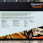
University Church by Spy
Located at the heart of Oxford, University Church of St Mary the Virgin, abbreviated to University Church, has been a site of worship and debate for over 700 years and is the “spiritual home” of the oldest university in Britain. The church recently received a grant from the Heritage Lottery Fund to raise awareness of the historical nature of the site...