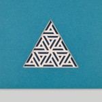
Silkscreen Printed

Eadem by Lotta Nieminen
The skincare industry is a varied visual landscape. At one end of the spectrum, brands like Glossier and Soft Services (reviewed July 2022) have found balance in softness and understated minimalism. At the other Dr.Jart+ (reviewed Jan. 2018) and Malin+Goetz bring pharmacy-chic with functional, type-led packaging. And then we have our classic, heritage brands – like Kiehl’s and Elizabeth Arden – which...
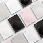
WallpaperSTORE* by A Practice For Everyday Life
WallpaperSTORE* is the online store of UK architecture, interior, fashion, art and contemporary design magazine Wallpaper*. It features and ships worldwide a broad but tightly curated catalogue of tabletop, lighting, desktop, stationery, grooming, technology and travel objects. Many of these objects, while individually distinctive, share a sense of contrast; in form and finish, materiality and colour, but also in their contemporary crafted quality....
Meg’s Tailoring by Studio South
Meg’s is a tailoring service, established by Megan Kenny, that began as a single store on Garfield Street in 1995. Meg’s now has two locations in Auckland, New Zealand, provides a broad range of services; from hems to full garment design, and works on large projects with high-end designers and labels such as Hugo Boss, Prada and Gucci, and on smaller jobs from High Street drop-ins....
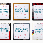
Second Hand Orchestra by Bedow
Second Hand Orchestra is a collection of tracks recorded for a documentary that was unfortunately and abruptly cancelled. Rather than let the work fall by the wayside, band leader Karl-Jonas Winqvist has released these as a limited edition album of 300 LPs. These feature a visual identity and packaging design of custom typography, individually numbered and block foiled sleeves, and screen printed t-shirts created by Stockholm...
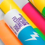
Latin American Design Festival by IS Creative Studio
The Latin American Design Festival is an organisation that promotes Latin American Design internationally and looks to highlight the social potential of design using lectures, workshops, exhibitions and complementary activities. This year’s festival took place in the Peruvian city of Lima with guest speaks that included Jessica Walsh, Brandlab and Anagrama. LAD’s visual identity, developed by IS Creative Studio and extending across posters, lanyards,...

Fort Standard designed by Studio Lin
Fort Standard is a New York based industrial design studio using long-lasting natural materials and traditional production methods in an innovative way to produce products, lighting and furniture with a simplicity, high functionality and an attention to detail. As the studio explain online, their ability to act as both designers and manufacturers not only informs their process, but yields smarter products...

University of the Arts Helsinki by Bond
“The Finnish Academy of Fine Arts, Sibelius Academy and Theatre Academy Helsinki merged in the beginning of 2013 into the University of the Arts Helsinki. Bond created the complete branding solution for the new university. The strategy for the identity was to create a distinctive set of logotypes based on a common design language, and to introduce an anchor symbol...