Toy Packaging
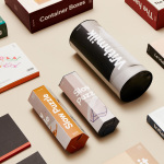
DOIY by Folch
DOIY is product design company creating playful objects that move between the useful and the more whimsical. These include items such as icepop socks, bicycle pizza slicer and unicorn scent. Much of this is firmly tongue-in-cheek but good quality, retailing in high-end and design-focused stores as well as larger chains. With the introduction of materials such as ceramics, woods, metal and porcelain across its new ranges,...
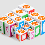
Kid O by Studio Lin
Kid O is a modern American toy company that creates products that engage and stimulate children through a rich variety of shapes, colours, and sizes. Designed by Studio Lin, Kid O’s new packaging treatment — which included over 50 boxes — takes the vivid colours of the industry, reduces these down to four, contains them within geometric boundaries and pairs...