Marc Jacobs by Triboro
Opinion by Eleanor Robertson Posted 14 April 2022
Fashion designer Marc Jacobs heads his own eponymous fashion brand, as well as diffusion lines The Marc Jacobs and Heaven by Marc Jacobs. He was also creative director at Louis Vuitton from 1997 to 2014, where he created the company’s first ready-to-wear clothing line. In his own words, Jacobs’ work is ‘a little preppy, a little grungy, a little couture’, and this can be seen across both couture and ready-to-wear.
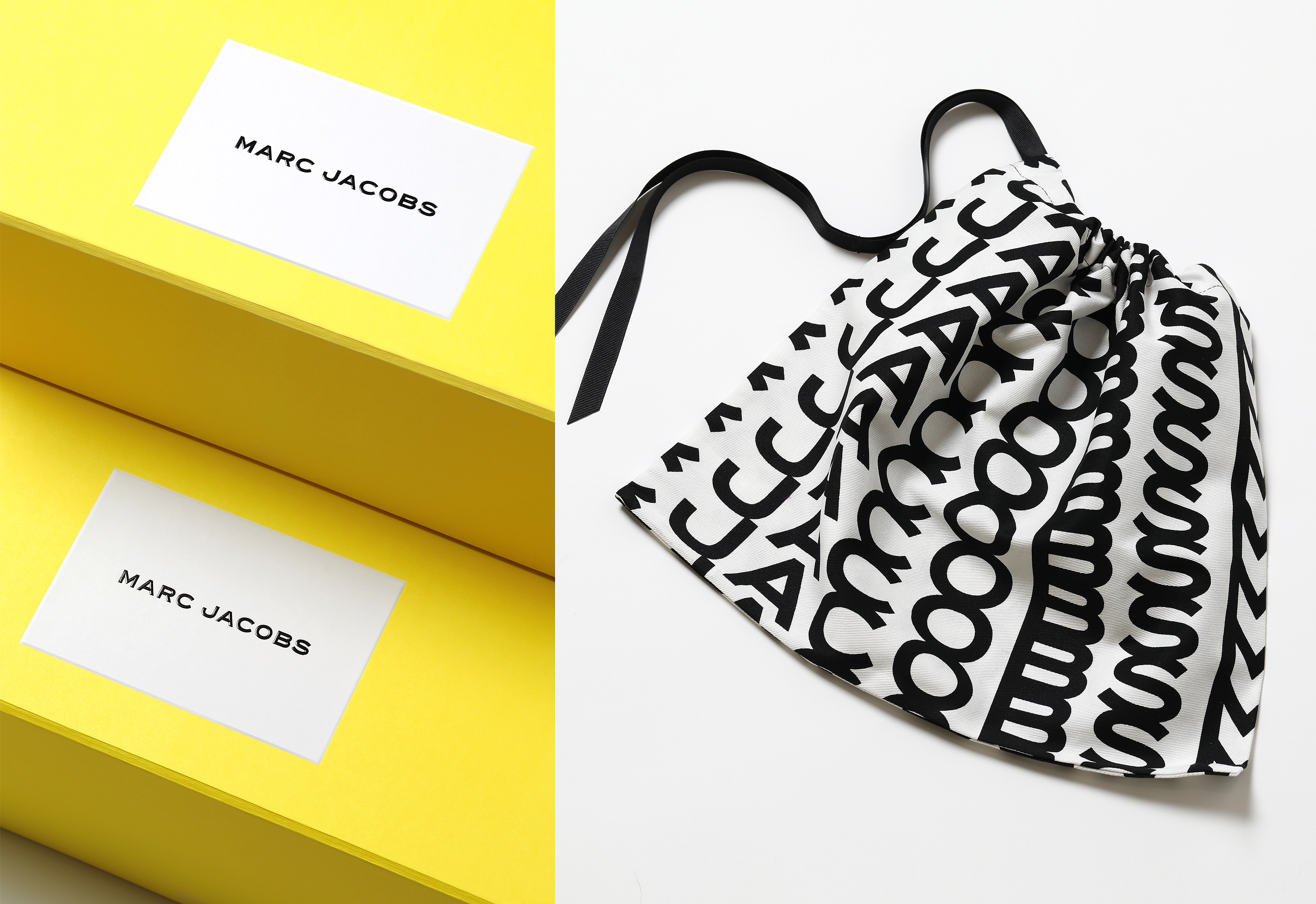
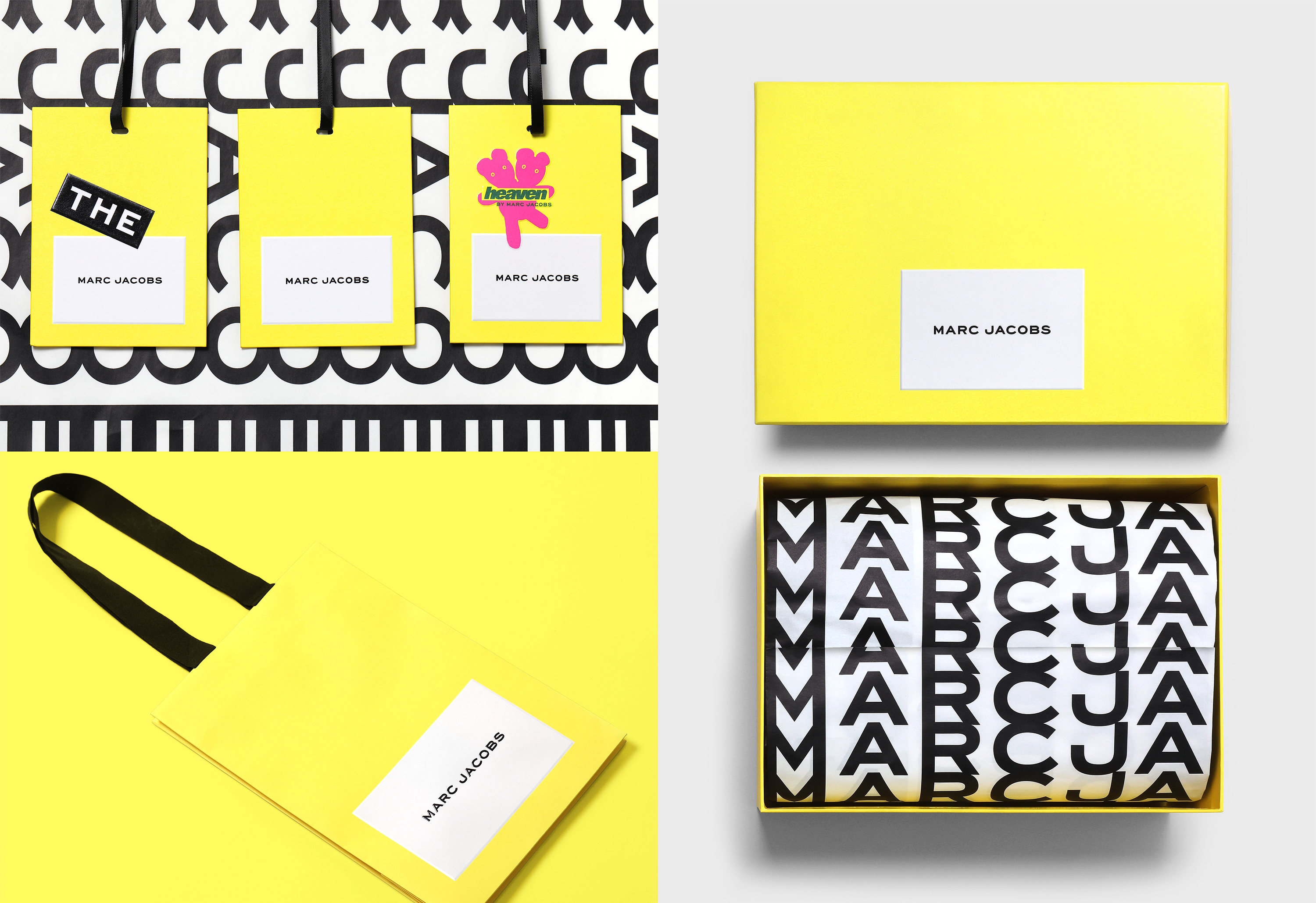
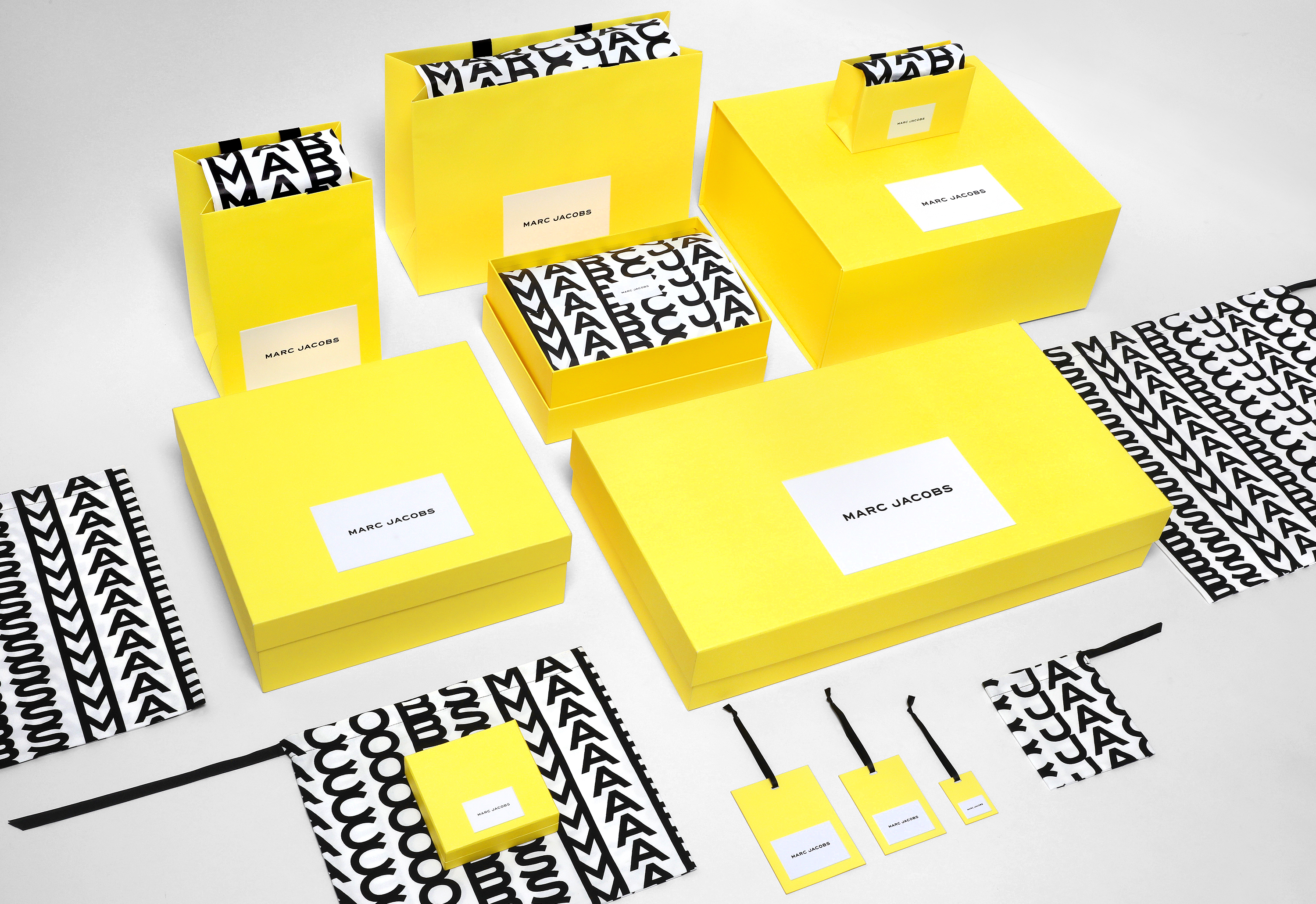
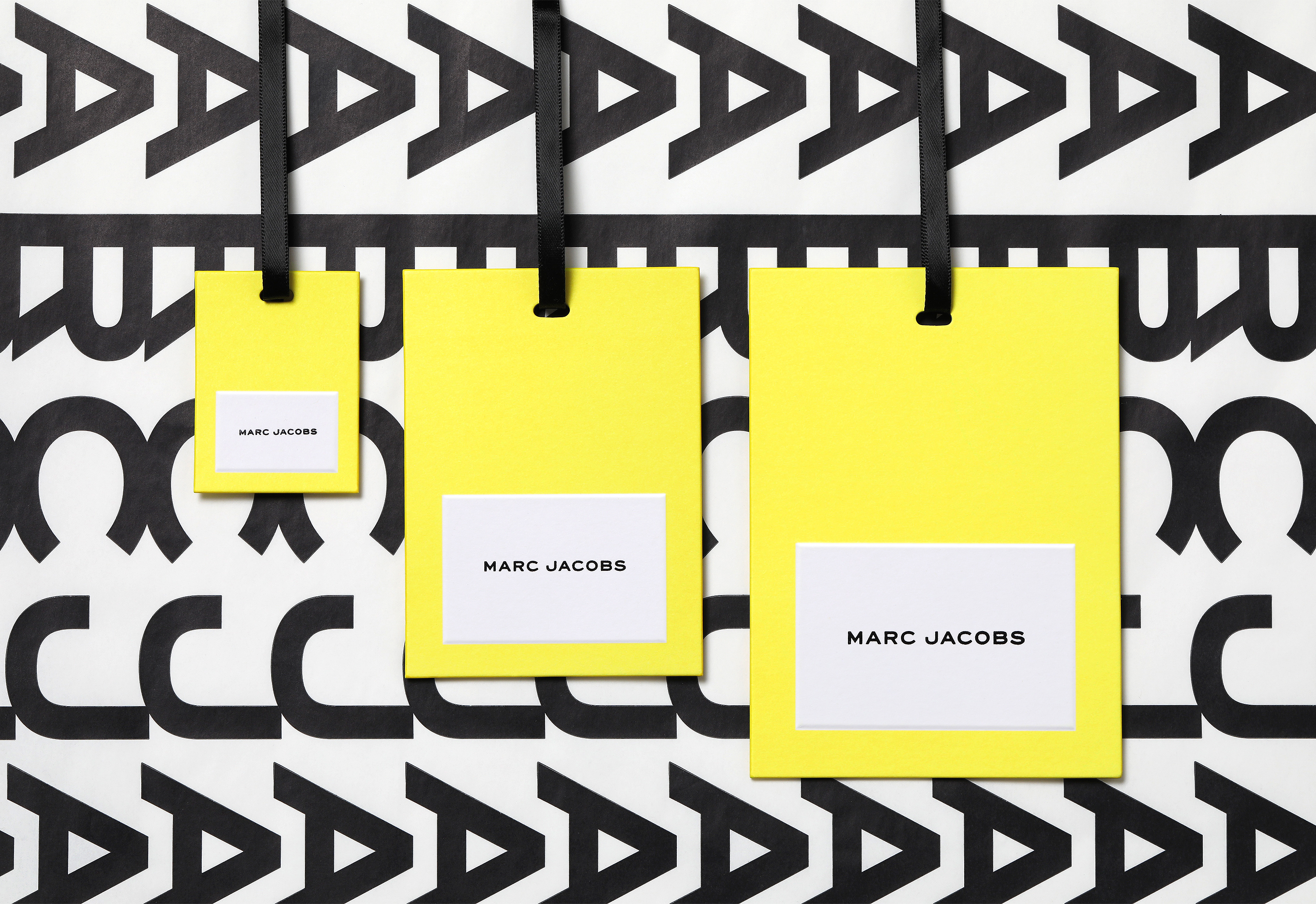
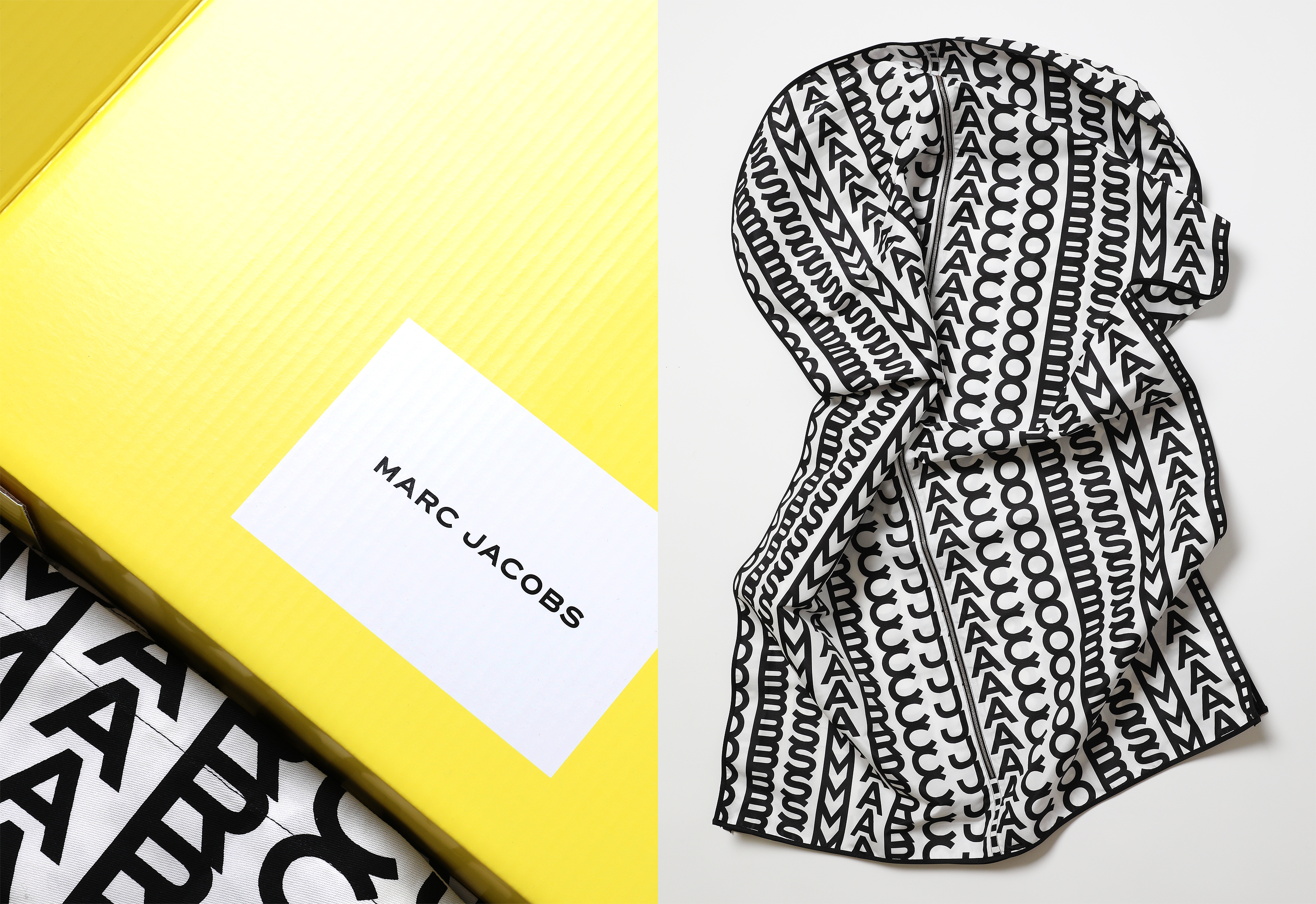
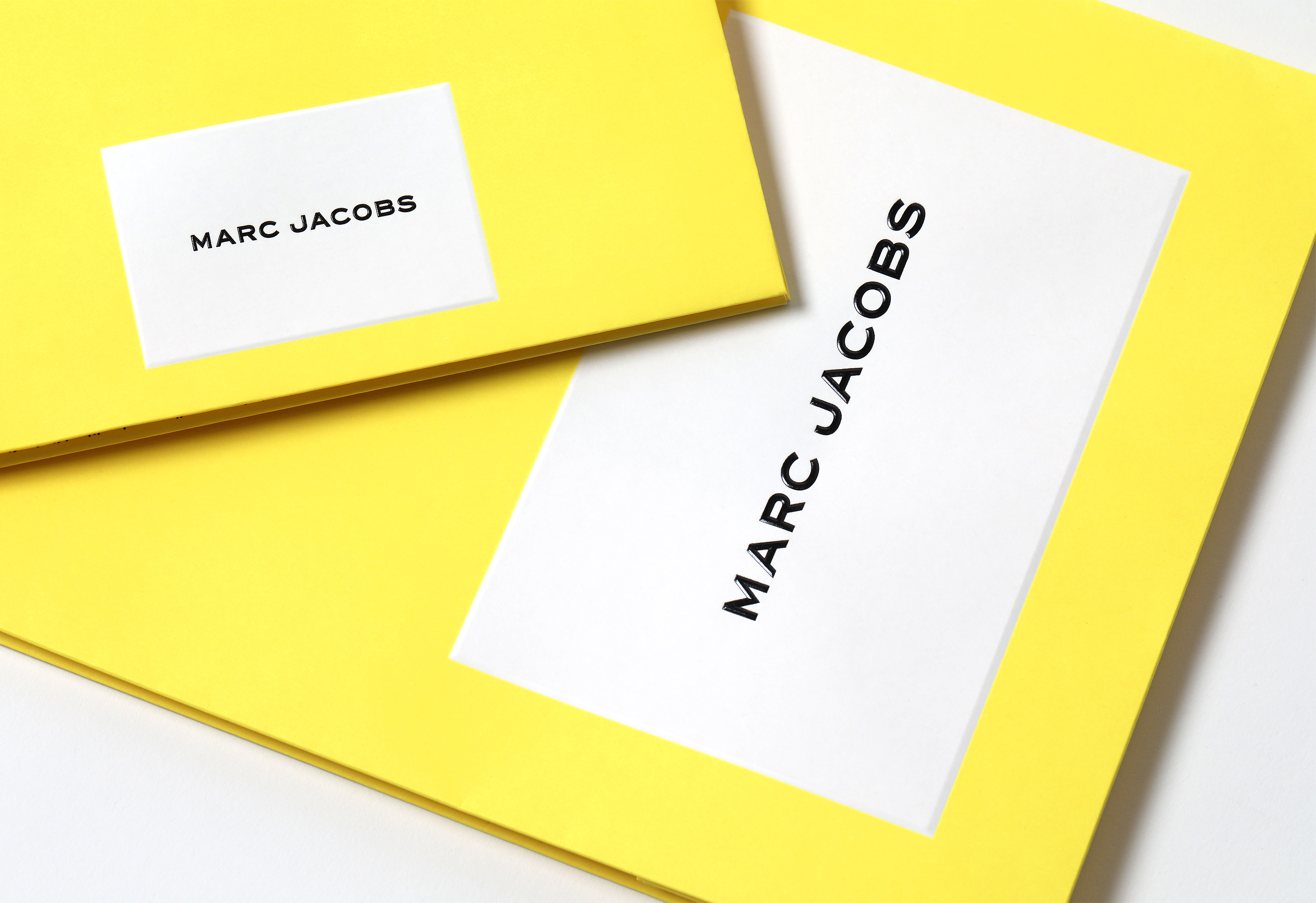
New York-based Triboro worked directly with Jacobs to develop a new brand identity for 2022. The project centres around the familiar Marc Jacobs logotype (essentially unchanged since its early 80s debut), amplified by the introduction of a dynamic typographic pattern, a bright yellow and a generous white framing device.
This post includes Extended Insights for BP&O Plus members.
Find out more and sign-up here.
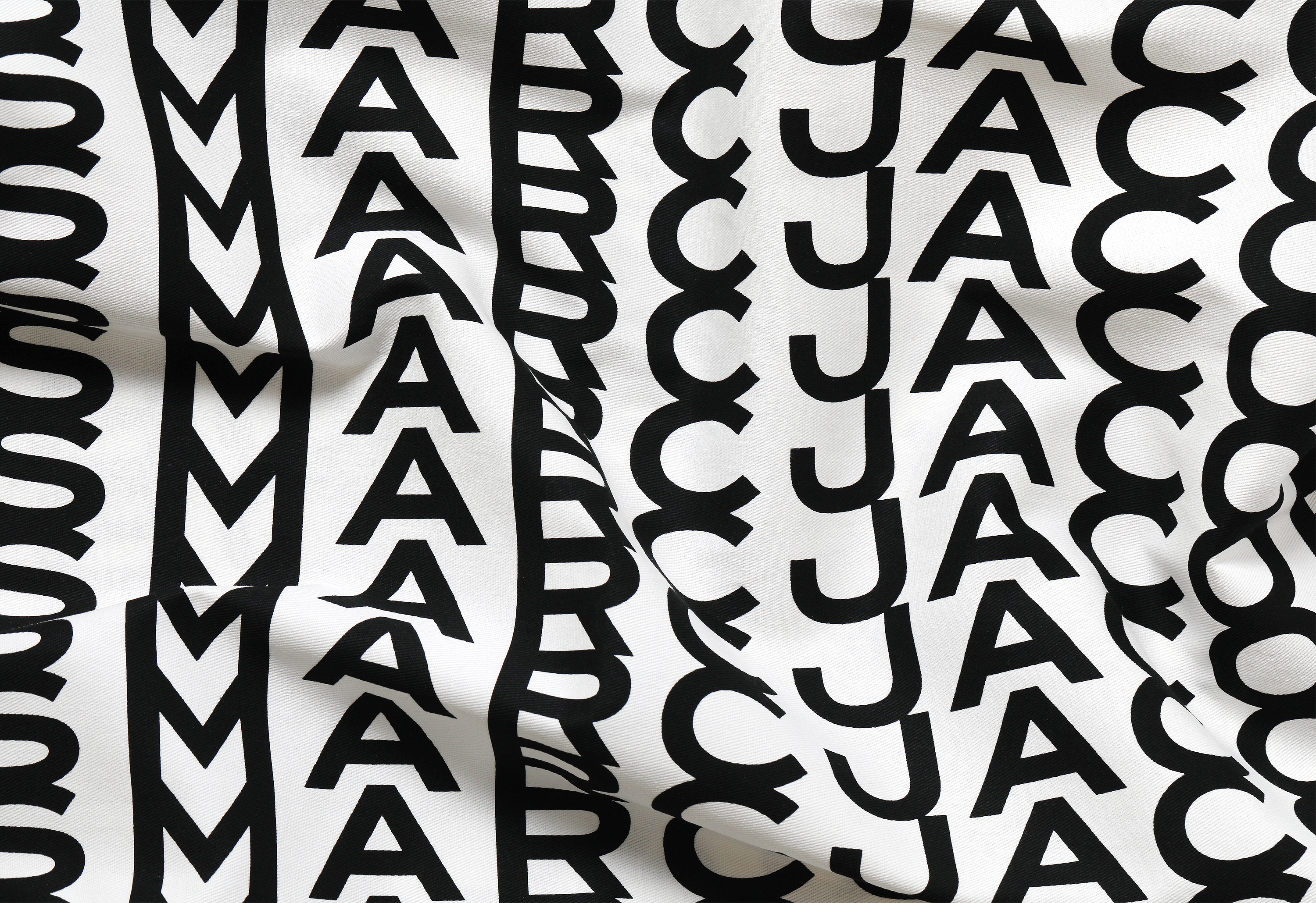
The extended grotesque typeface stays close to Engravers Gothic, tracked out in the authoritative uppercase letters that many high-end brands have gravitated towards in the last few years. From Fantastic Man magazine to Mr Porter, Engravers (along with related typefaces such as ITC Blair, Sackers Gothic, Sweet Sans and Burin Sans) has become ubiquitous in men’s fashion as the default signature of modern urbanity and discernment.
While Marc Jacobs’ logo precedes this recent trend (and perhaps even helped lay the foundation for it), the font choice was far from unprecedented in the world of luxury. As Commercial Type’s Paul Barnes explains, ‘Its provenance is in personalised stationery, produced by professional engravers. It shows you have money and class.’ The width of the individual characters also makes a social statement: ‘You are literally saying I can pay for the space around the letter.’
For Marc Jacobs, the font has provided consistency over the decades, confidently reinforcing the graphic codes of fashion (slim, neat, light, austere, romantic) while letting the clothes and campaigns lead the way. Triboro’s development augments it from restrained background device – a neutral narrator – to bold pattern, creating a distinctive secondary language for the brand and new ownable assets that help to distinguish it from the competition.
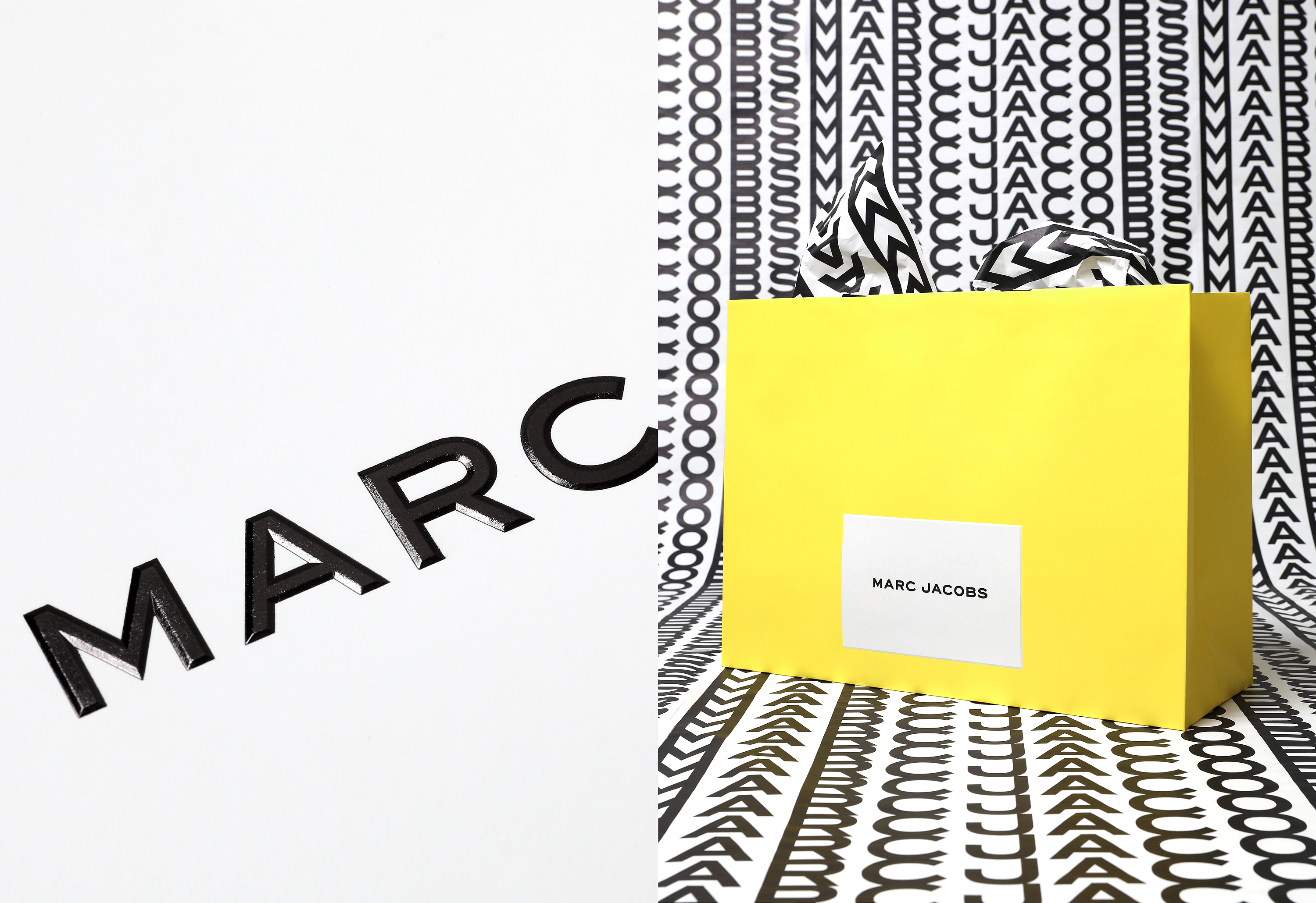
This is a pragmatic evolution, maintaining the general sensibility of what came before, while introducing new energy and opportunity for expression. Although the dynamic typographic treatment is visually arresting, it also asserts a distinct point of view on luxury, offering a counterpoint to Peter Saville’s Burberry rebrand. Back in 2018, Saville’s refined sans serif wordmark supported by the (now iconic) monogram pattern prompted countless think pieces on ‘blanding’ and ‘the death of the logo’.
‘I suspect that the idea behind these designs is as much about the logotype as an empty “container” that can hold the brand anywhere in any medium, as much as it is about the actual design itself,’ hypothesised Mitch Goldstein (professor of design, RIT) in a widely shared post for Hypebeast (90,746 ‘hypes’ and counting). ‘The specificity of these logotypes means that they can mean whatever the brand wants, whenever the brand wants it, wherever the brand needs to be.’
But for Marc Jacobs, logo is brand and brand is logo – the maximalist execution leaves no room for compromise. It’s an approach that is of the zeitgeist: from TikTok to Depop, Gen Z are embracing the ‘logomania’ of the early-2000s as a shortcut to accessing luxury culture in a post-pandemic world. Understated is out, extravagance is in; more is more. Now more than ever, the logo is also about identity – it’s a message, a statement of belief systems, part of a movement. After two years in t-shirts and pyjamas bottoms, showing up in a logo means something.
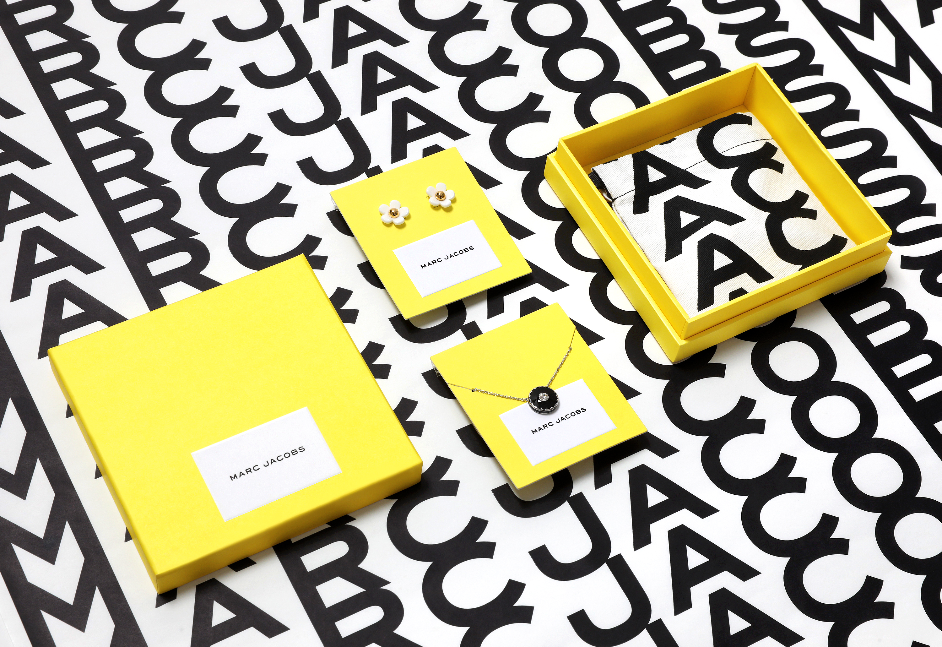
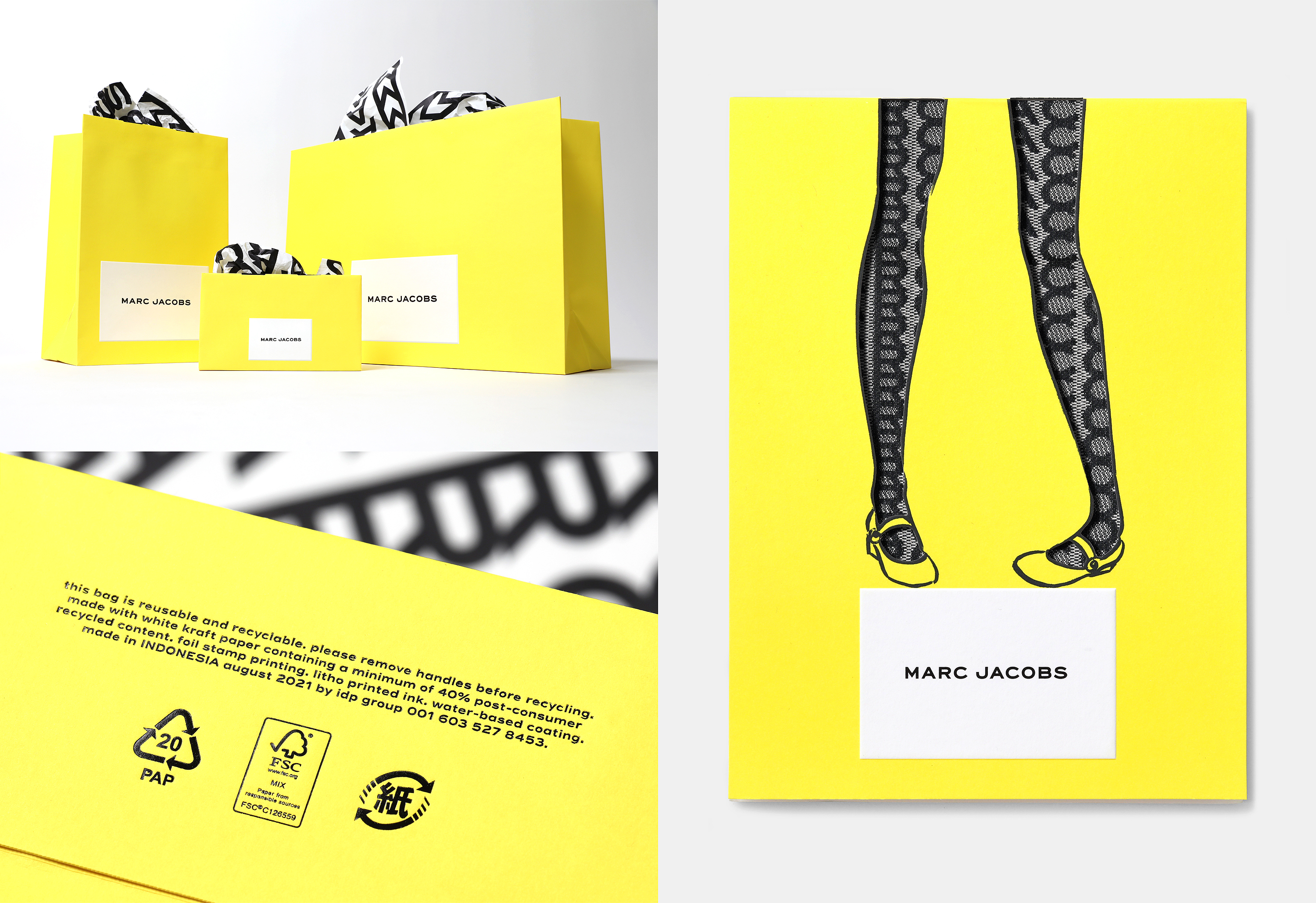
The monochromatic brand is made more current with a flood of optimistic, neon yellow across print materials, a further rejection of austerity in high-end branding. Like Engravers, yellow has existing equity in luxury (Veuve Clicquot, Acqua di Parma, Selfridges), but here it injects the brand with freshness rather than heritage cues. The yellow-white pairing also neatly suggests ‘Daisy’ (Marc Jacobs’ popular flagship range of perfumes) with all the flower’s spring crispness.
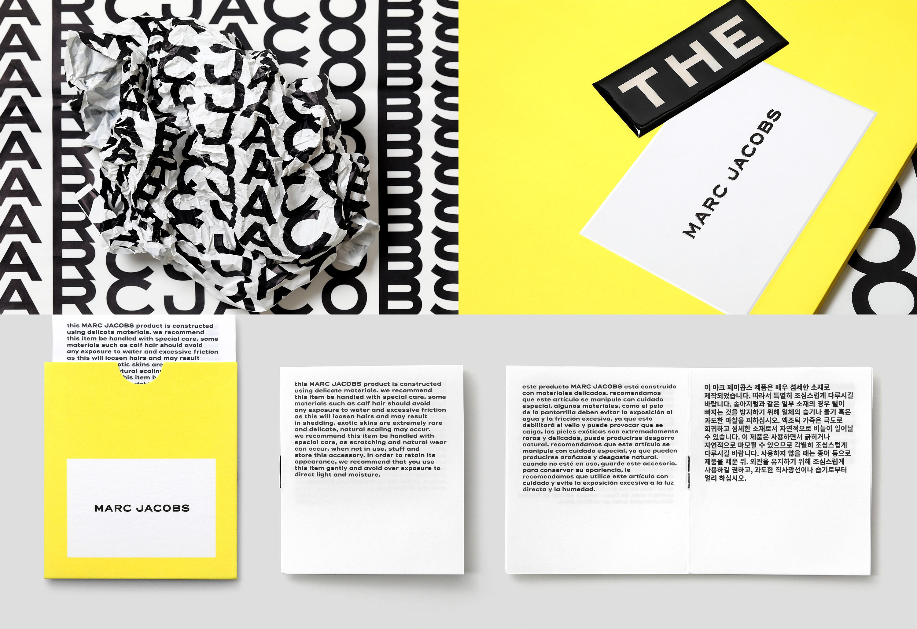
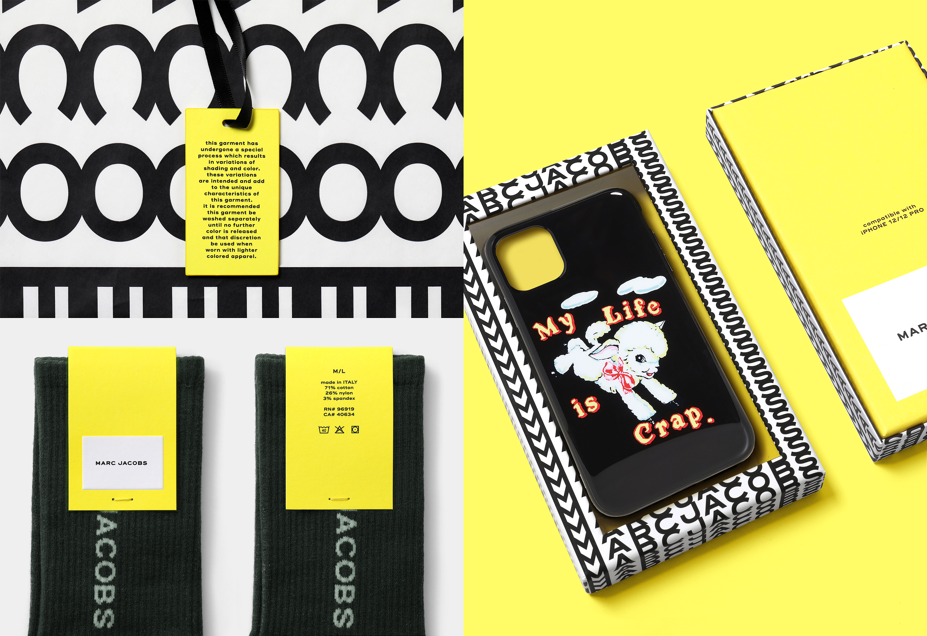
The brand is brought to life across postal packaging, shopping bags and tags. The application is restrained, purposeful and sequenced with glowing yellow boxes revealing patterned dust bags and papers. The quality is demonstrated in the detail, from substantial duplexed boards to tactile chiselled engravings. The structures are considered, with pleasing proportions and engineered creases.
The brand is also made wearable, in oversized knitwear and quirky colour combinations, with a launch campaign fronted by hip-hop artist Lil Uzi Vert. The £155 taupe/pink balaclava is particularly covetable, but it’s hard not to feel disappointed that it’s not modelled by Marc Jacobs himself, bringing the self-referential games full circle. When ‘The Tote Bag’ declares its own presence, why doesn’t the designer?
Nevertheless, Jacobs’ subversive sense of humour isn’t too deep below the polished surface, and it’s impossible not to smile with him. There is joy and warmth in this project, alongside a well-judged hint of provocation. Through evolution rather than reinvention, Triboro has developed the brand with increased relevance for new audiences living in today’s ‘new normal’, and that is fit to adapt to the dawning ‘vibe shift’.
