Crane by Collins
Opinion by Eleanor Robertson Posted 21 April 2022
In 1775 Crane paper was used to print the first money for the American colonies, and by 1801 the company was the primary paper producer for local and regional banks. Later that century, equipped with an arsenal of innovative techniques from Europe, Crane won a contract with the Bureau of Engraving and Printing and became the supplier for the US government’s Federal Reserve.
Around this time, the Crane family also expanded into luxury stationery, supplying bespoke cards and envelopes for iconic American brands like Tiffany’s – and for historical moments of all shapes and sizes. From the inaugurations of the Statue of Liberty and the Golden Gate Bridge to the Roosevelts’ Christmas cards and Jimmy Fallon’s weekly thank you notes, Crane stationery is ingrained in American life.
With this rich heritage to draw on, Collins was commissioned to write the next chapter in Crane’s story. ‘Something from their past became a seed for their future,’ the studio explains, describing how a dig through the archives inspired the new brand identity. It’s not an original strategy, but it is poetically expressed.
This post includes Extended Insights for BP&O Plus members.
Find out more and sign-up here.
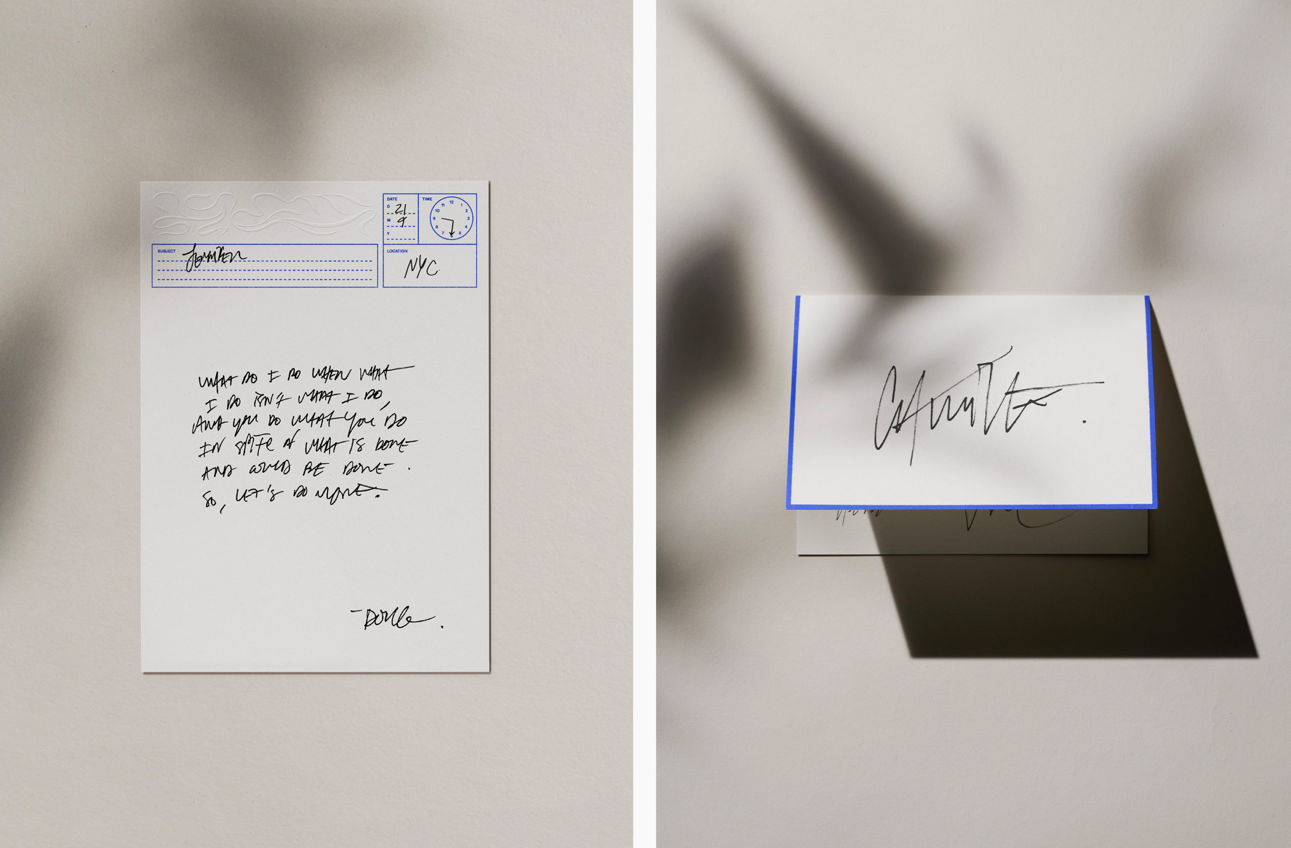
Collins draws a parallel between two eras obsessed with technology and its implications – the high tech world of today, and the industrial age at end of the nineteenth century, when Crane was establishing a reputation. The two periods, we are told, are united by ‘a push against the mechanization of humanity’ and a demand for a return to the tactile, personalised quality of the written word with respect for ‘thoughtful communication through beautiful means’.
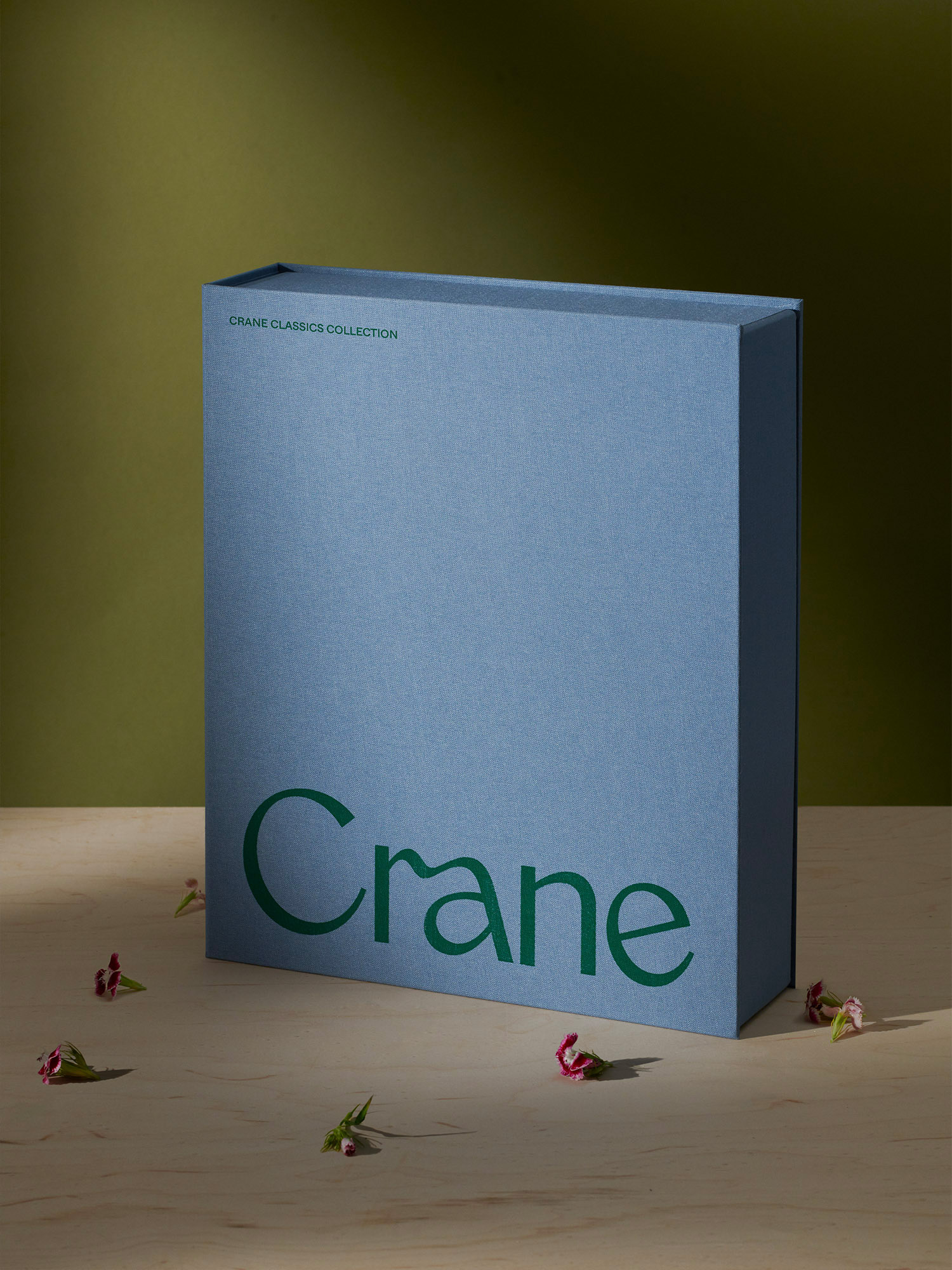
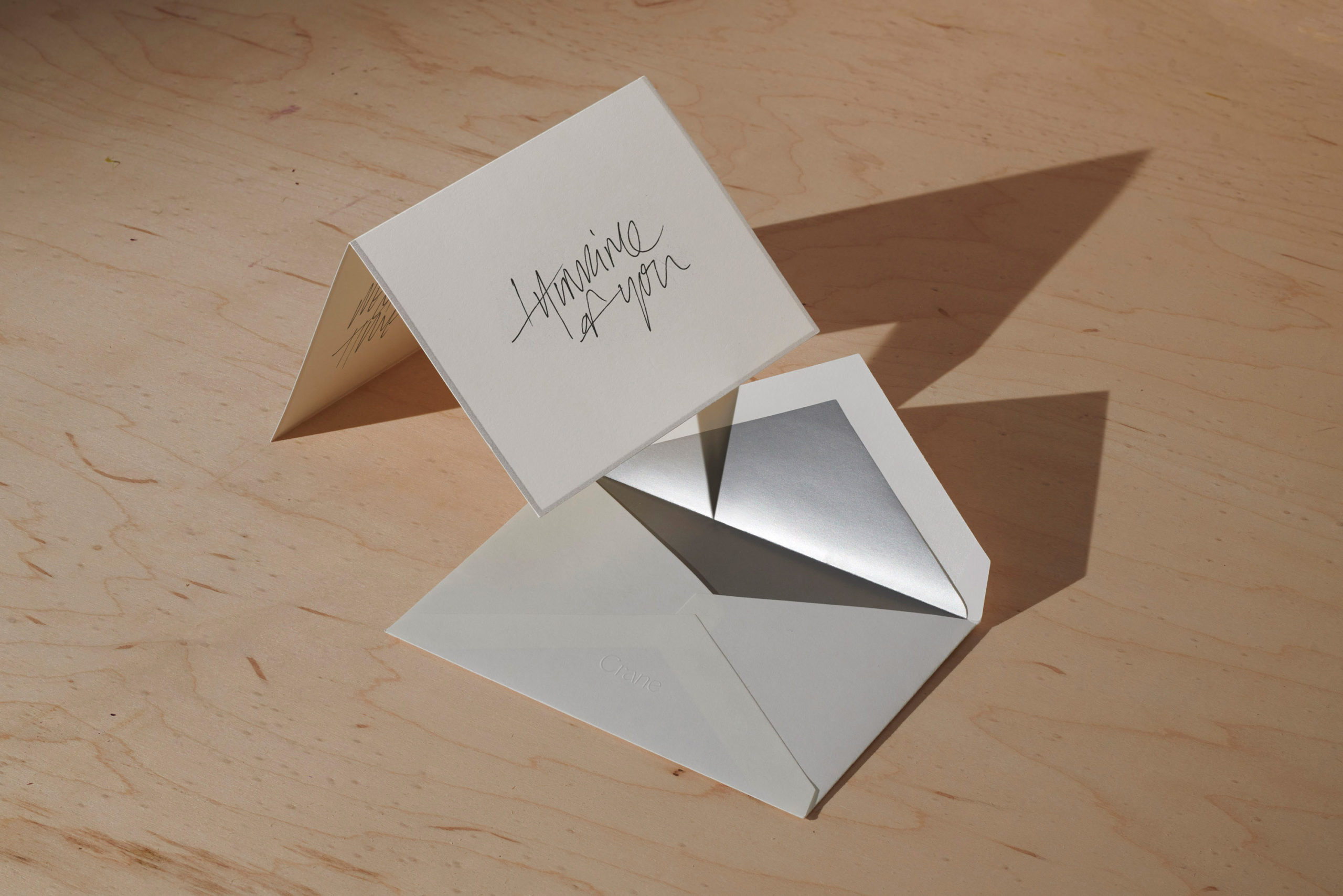
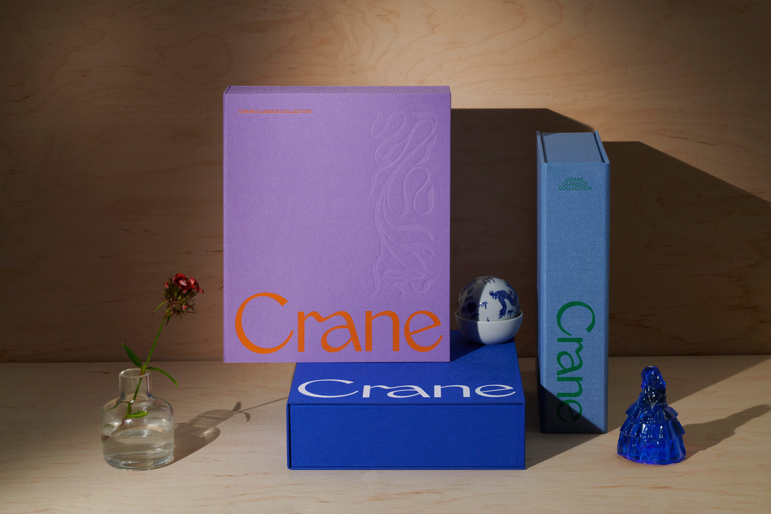
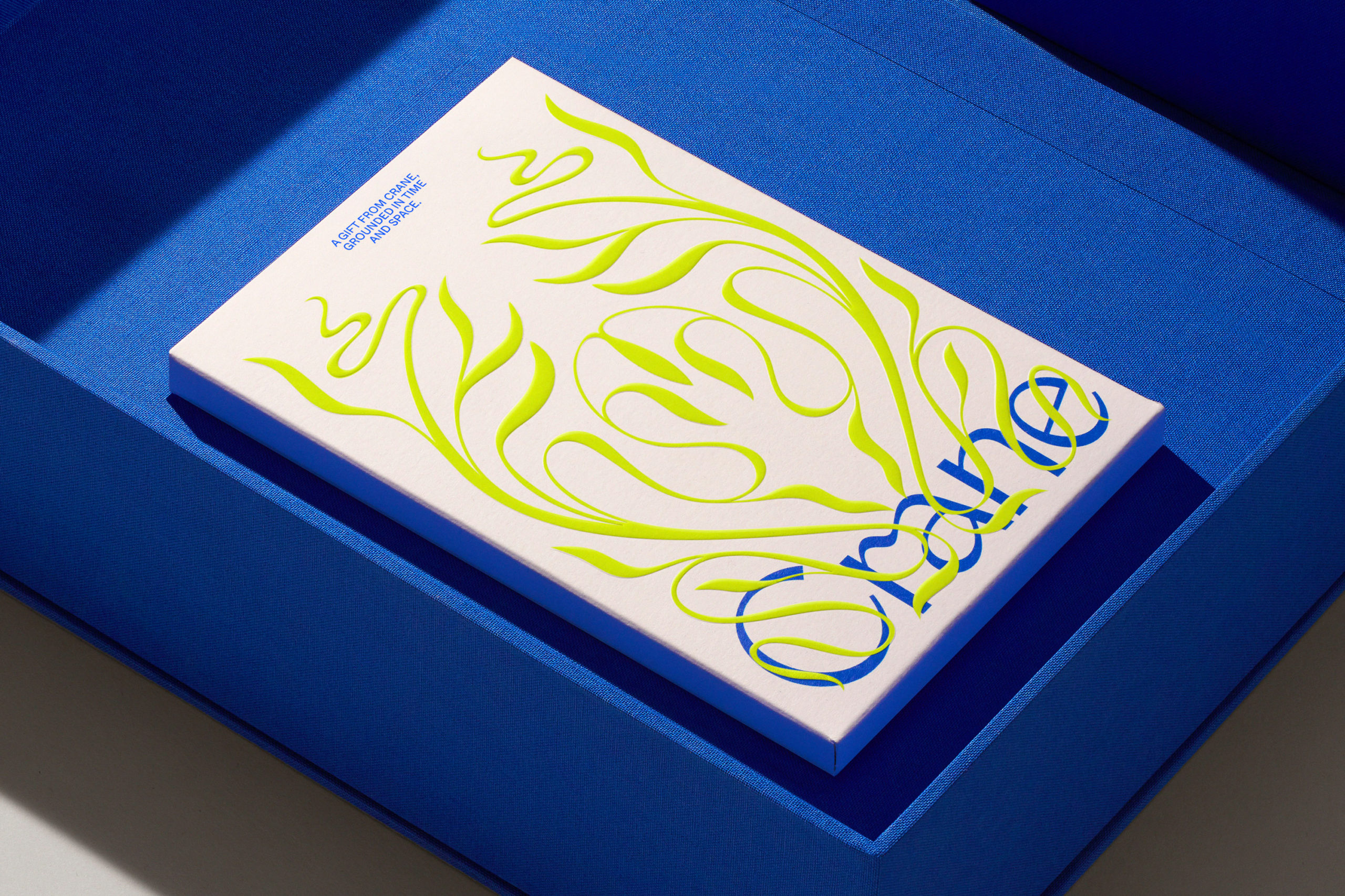
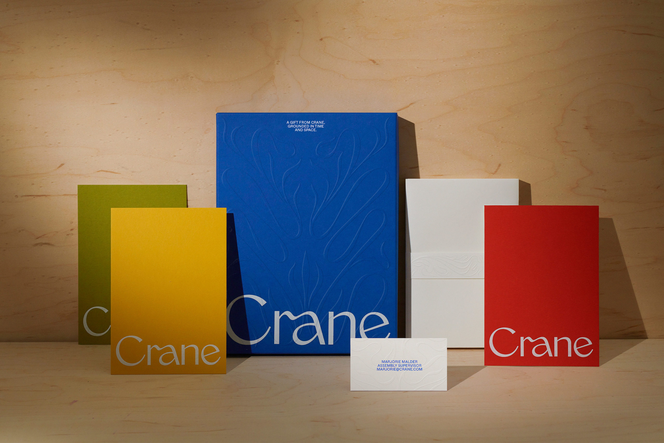
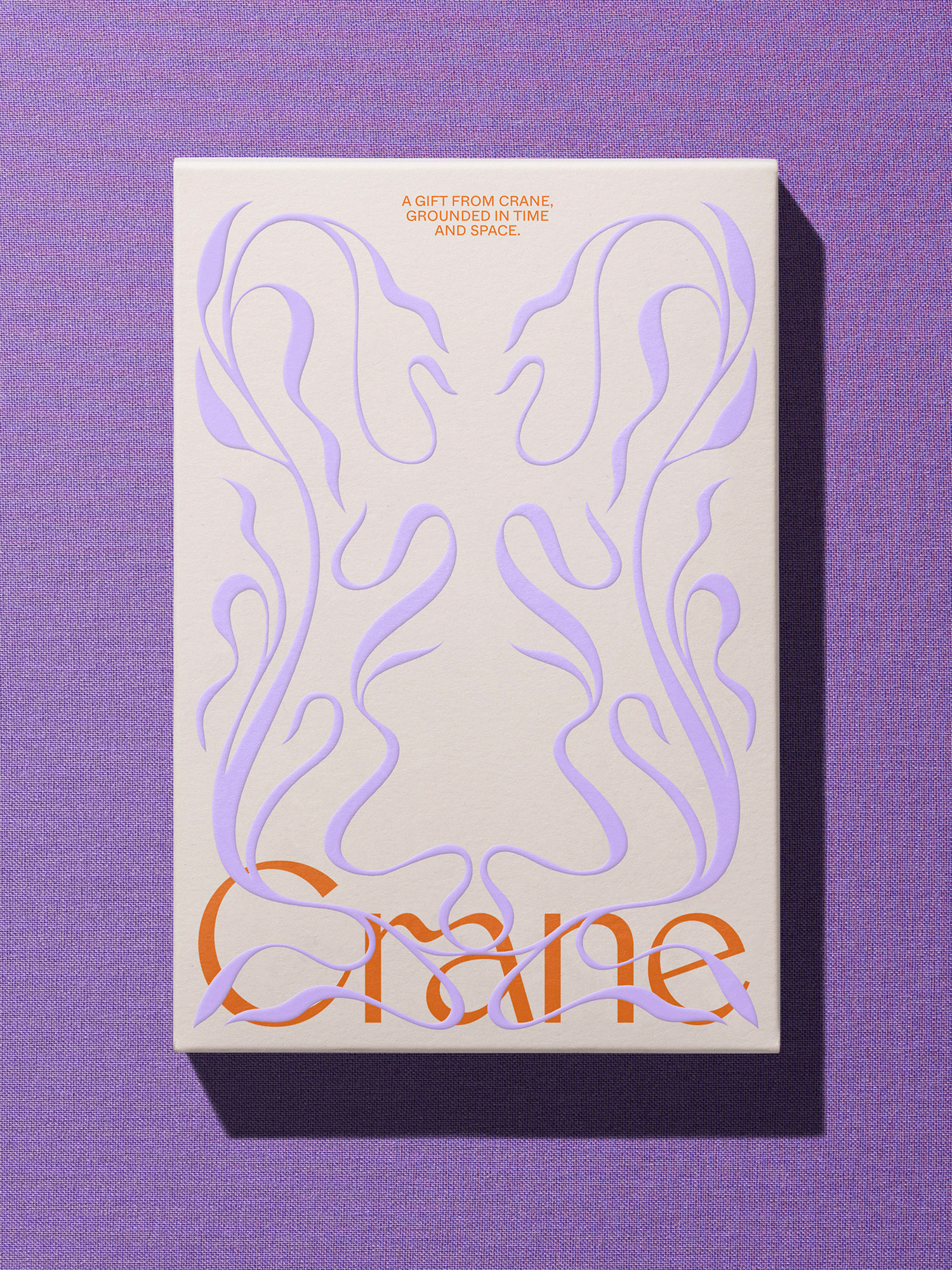
This connection led Collins to the captivating calligraphic pattern that flows over stationery and packaging, inspired by the Art Nouveau Movement that was – apparently – in full swing during Crane’s glory days. In a celebration of craft that explores embossing, debossing and engraving, this ‘whiplash’ device enhances the depth and weight of the immaculate 100% cotton paper, for ‘the written note, meant not just to be read, but to be savored and cherished’.
The customisation options that form part of the online platform are clever, creating a hybrid crossover that – while digital – has a material outcome, using on-demand print technology to make a greater personal impact. So although Crane stationery offers an antidote to the modern world, it is still tied to it, fulfilling Collins’ promise to honour both the past and the present.
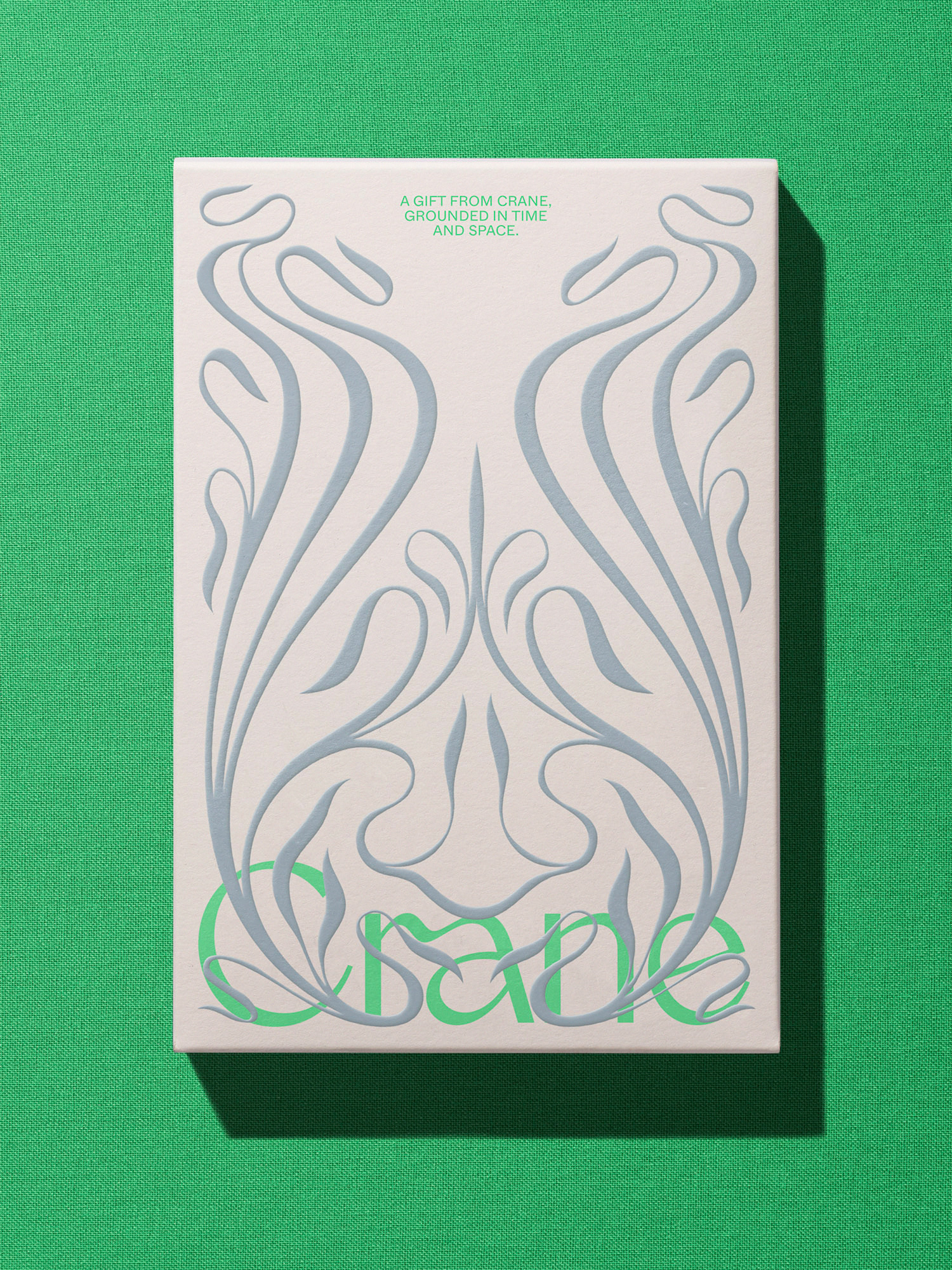
For the colour scheme, Collins used the company’s classic Crane blue as its starting point, dialling up the vibrant energy and pairing it with an unexpected primary palette alongside a complementary secondary palette of pastels and darker neutral tones. The combination is modern and fresh, though also decidedly digital.
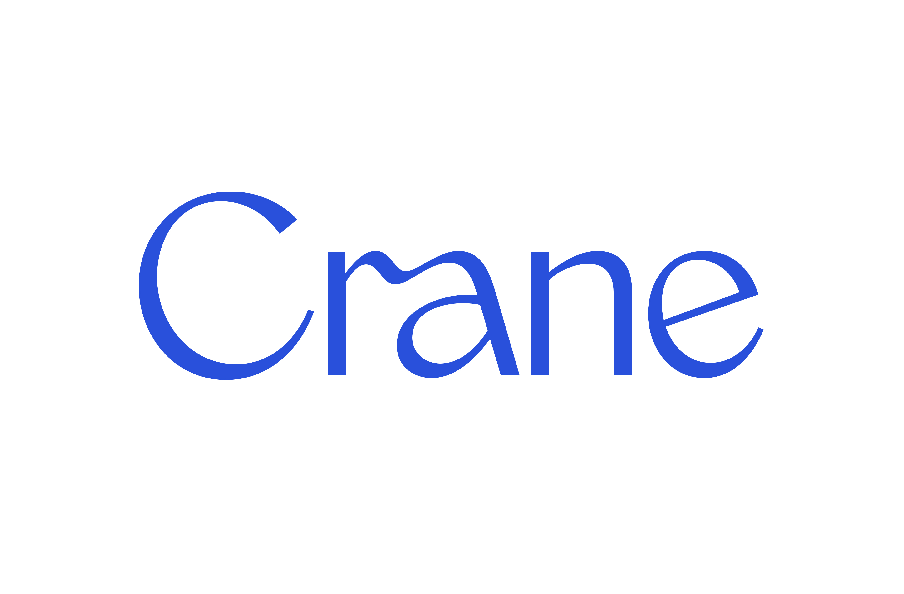
The new wordmark is elegant, suggesting the characteristics of engraved and humanist typefaces alongside the unique quirks of hand lettering. The ligature conveys the theme of connection through communication. WiseType’s Monarch may date, but it is characterful and sophisticated. It is balanced against Dinamo’s functional Whyte, which draws on early grotesques and provides a good counter for more ornate brand elements.
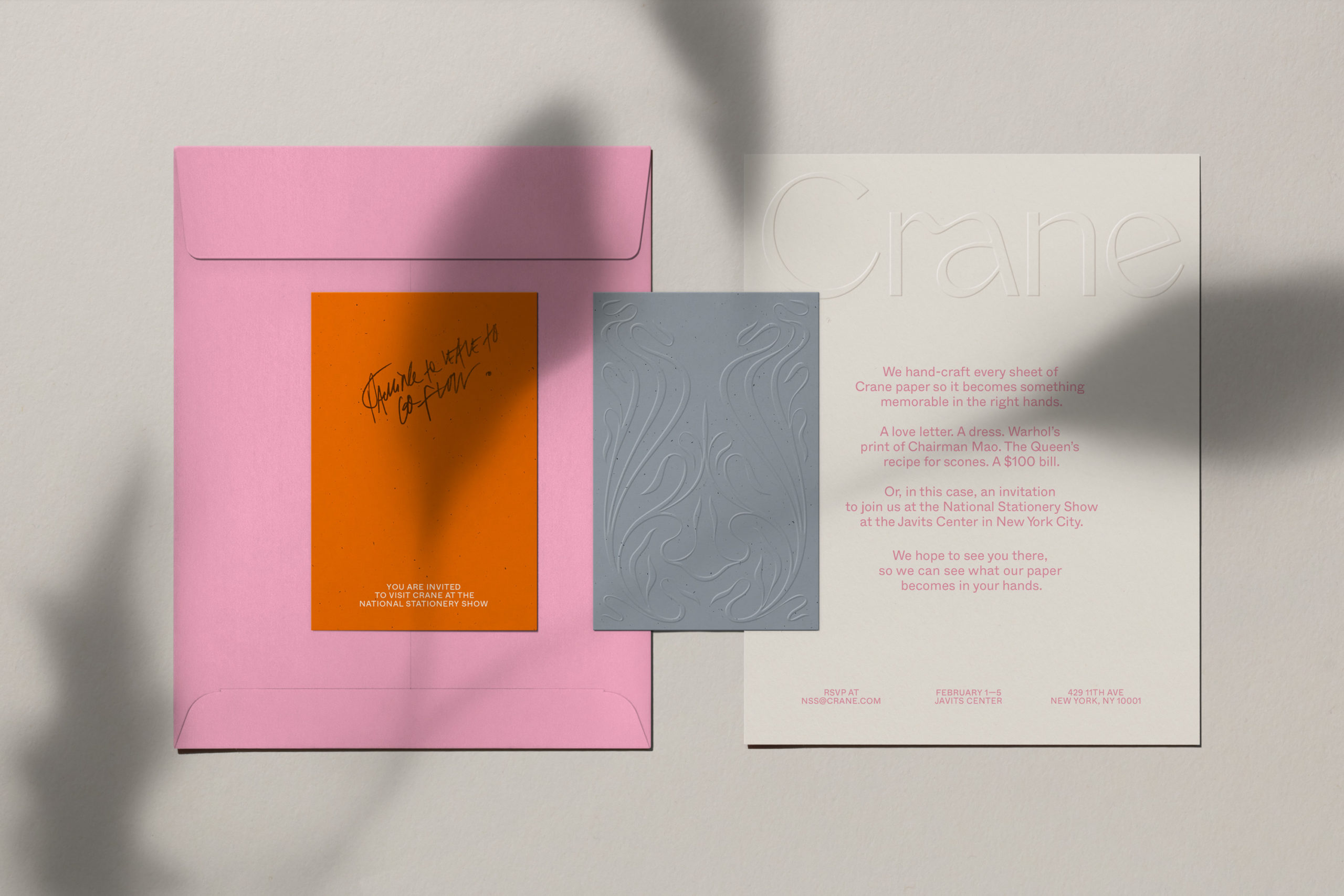
There is a tension here, between the timelessness of the ‘voice found only on paper’ that ‘will never fade’ and the delivery, which is rooted in this moment. This complexity is connected to the experience of putting pen on paper: ‘it can convey a quick reminder or imbue a lifelong memory’. A written message holds meaning, whether it’s an invitation, a family recipe, or a thank you note – it can be personal and memorable, but it is also of its time. In today’s fast-paced digital realm, it is a gesture.
But perhaps there is a degree of post-rationalisation at work in the eloquent case study, too. If you analyse the timelines, Art Nouveau didn’t reach mainstream popularity in the States until two decades after Crane was at its peak. Unlike the Arts and Crafts movement, which was staunchly anti-industrial, Art Nouveau championed the meeting of technology and human artistry to create a new kind of art, fashion, and architecture.
More importantly, paper-making has been a mechanised process since the introduction of the Fourdrinier machine in 1801. And Crane’s most important achievement in the nineteenth century was the highly advanced technological invention of methods to prevent counterfeit banknotes. So the idea that the handcrafted detail of Crane stationery was celebrated, during the Art Nouveau period, before the advent of digital communication, in reaction against mechanisation, is tenuous.

The aim of the rebrand was to ‘guide the world of Crane for today and tomorrow’. For tomorrow – who knows? But today, both the brand and stationery collection are striking and covetable. When it looks this good, how important is timelessness? In fact there’s a justified urgency: there has to be a reason not to simply send an email, and the contemporary beauty of Collins’ solution provides an incentive here and now, ‘grounded in this time and space’.
Collins’ work avoids romanticising the past, or looking too far ahead, but that’s OK. Through seduction, it encourages us to give words colour, shape, weight and texture – offering a formal or friendly accent, an inviting or insightful tone – to express generosity, care or thoughtfulness. Which is the most important role paper can play today. In this way, the project is a reflection of what it is to put something down on paper, and what makes it last – ‘a card, a note, a letter is a time capsule’ for the future.
