VW Corrado press & poster
Written by Paul Belford Posted 26 July 2022
Agency: BMP DDB. Year: 1990. Art Director: Mark Reddy. Copywriter: Richard Grisdale. Photographer: Lester Bookbinder. Typographer: David Wakefield.
What on earth has happened to car advertising?
Probably the same thing that happened to beer advertising. And pretty much every other category over recent years. A comment from a friend during a commercial break in the football the other day summed it up perfectly: ‘It’s like ad agencies just can’t be bothered any more…’.
I suppose it’s what inevitably happens when your creative workforce is underpaid, under-skilled, and under the thumb of risk-averse financial people.
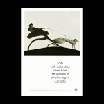
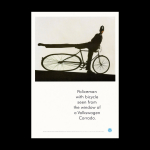
In 1990 things were not quite so bad. Hence the stunning work above. It’s a pre-launch campaign designed to generate interest in Volkswagen’s first sports car; The Corrado.
Can you imagine seeing a more visually interesting page in any newspaper these ads appeared in? Almost certainly not.
They also ran as 6-sheet posters which were no doubt equally impossible to ignore.
The idea (yes, car ads had ideas back then) is a simple one: To visually dramatise speed.
This was achieved by photographically depicting the classic sinuous cartoon-like animation device of objects in the landscape reacting flexibly to the passing of a fast moving object. (See Roadrunner etc.) With the consistent headline structure: ‘Lady with dalmatian seen from the window of a Volkswagen Corrado’.
Showing a speeding car was not allowed due to advertising regulations. But this imagery is of course way better. And it’s a pre-launch teaser campaign remember? So we can increase the sense of intrigue and anticipation by not actually showing the car at all.
But despite this logic and the fact that the proposed campaign was clearly fantastic, the agency account team were perplexed and nervous. In fact they wanted to kill it. Today, they would probably win. In 1990 they lost. And needless to say, the client Johnny Meszaros loved the ads.
Honestly, how can anyone not be blown away by these visuals? They were created by the master still-life photographer and genius Lester Bookbinder. He was famed not only for his artful eye, but also his scientific approach to problem solving. He even wore a white lab coat in the studio and the sets were always completely silent.
There was no computer manipulation available, in fact no computers at all. Everything was done in-camera using 10×8 inch colour transparency film. To create these photographs Lester constructed a huge length of optically perfect reflective material held in a frame which could be flexed precisely to alter the image of the subjects who stood on an elevated runway running parallel to the mirrored surface. The camera was positioned to the side, shooting the reflection. This approach was no doubt inspired by fairground mirrors and also the extraordinary photographs of distorted nudes by André Kertész.
The details in these pictures are also important. It’s not just a lady pedestrian, it’s a lady pedestrian with a dalmatian. And it’s not just a policeman, it’s a policeman with a beautiful, graphically interesting bicycle. Touches like these together with the marvellous contrasty lighting really help elevate the images further.
In addition to the two ads shown here, there was a third brilliantly surreal execution which never ran unfortunately. A giant ‘Big Foot’ red and white traffic cone.
But of course the layout is unusual too, given the typographic conventions applied by VW at the time. Much of the work developed in the UK in the 80s had lost the essential space, humour and graphic mastery present in Helmut Krone’s early US work. The art direction had become formulaic and a little sloppy. So with VW daring to produce a sports car I guess it seemed an appropriate moment to begin to develop a more precise, artful and contemporary look.
An asymmetrically placed, centred headline in white space using a slightly tracked out finer weight of Futura, provides a nicely balanced counter to the flurry of the image. No body copy required. It’s another great example of a layout stripping away all the unnecessary clutter so that it not only looks better, but also communicates better.
These ads may be over 30 years old but they haven’t dated. I find them truly beautiful and timeless. (Unlike the Corrado.)
Source: Paul Belford | @paul_belford_ltd