Panettoni Pavolucci by Requena Office
Opinion by Kinda Savarino Posted 18 August 2022
Panettone has origins as far back as ancient Rome, but its connection to Christmas was first established in the eighteenth century. This sweet bread – originally from Milan – has earned its place across the globe as a staple of the festive season. However, earlier this summer, Barcelona-based twins Chiara and Francesca Pavolucci opened a bakery to bring panettone to customers all year round.
How do you separate such an iconic Italian Christmas dessert from its roots? Packaging design for panettone is often loud, if not gaudy – relying on rich colours and elaborate script fonts. Even modern launches tend to follow maximalist principles, opting for bright clashing patterns and busy compositions that echo the brioche dough’s recipe, calling for an exuberant medley of candied fruits.
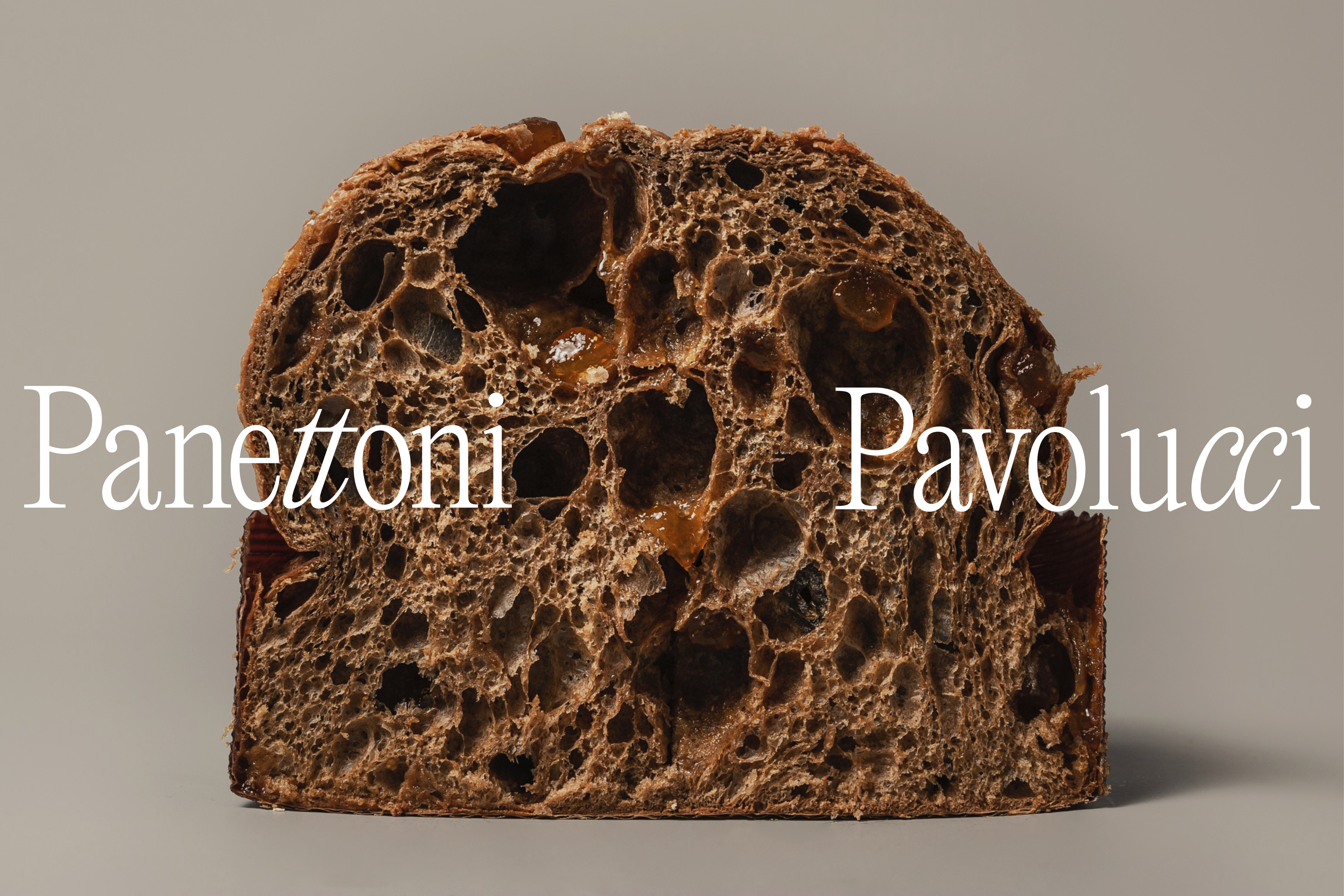
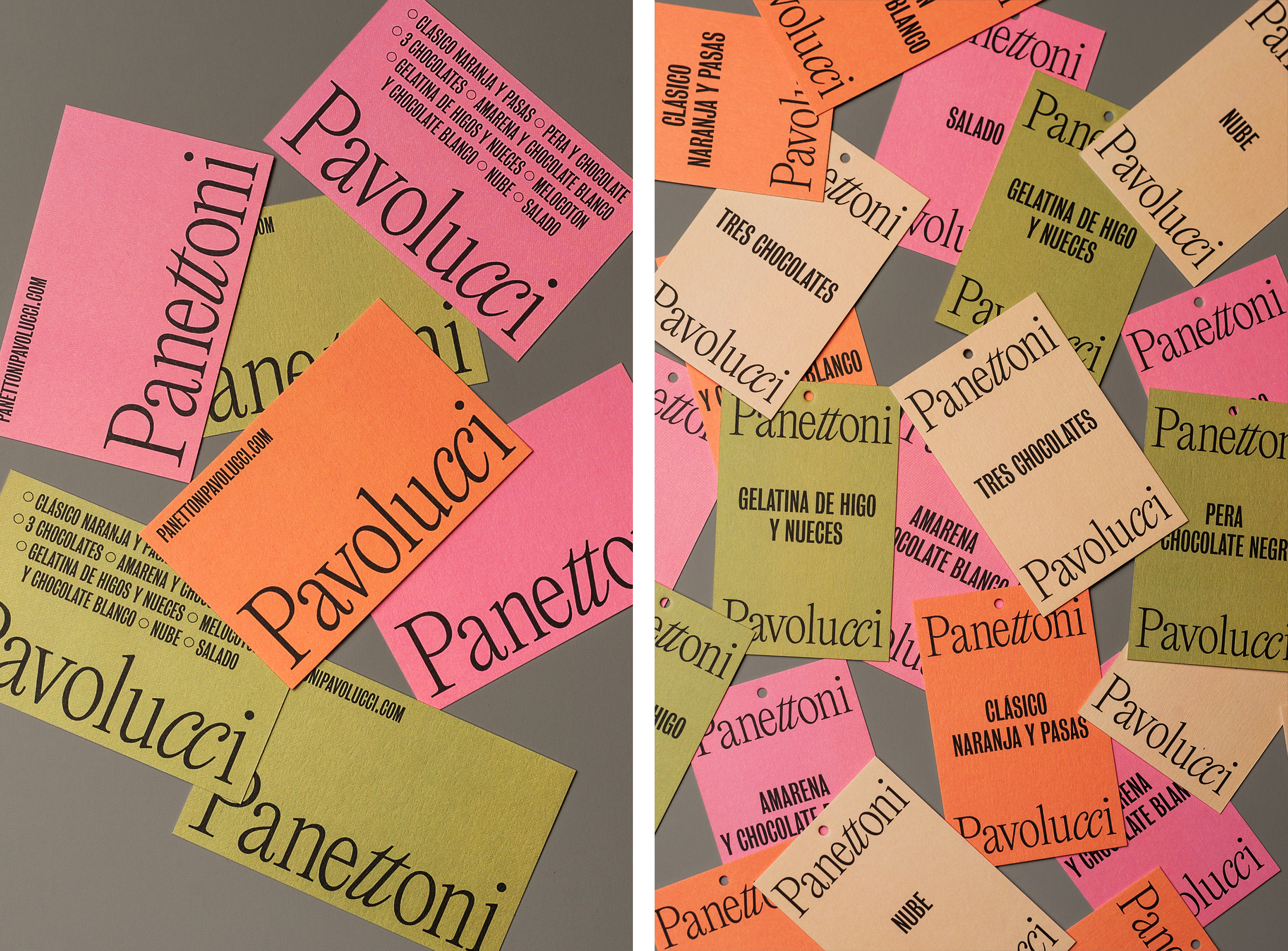
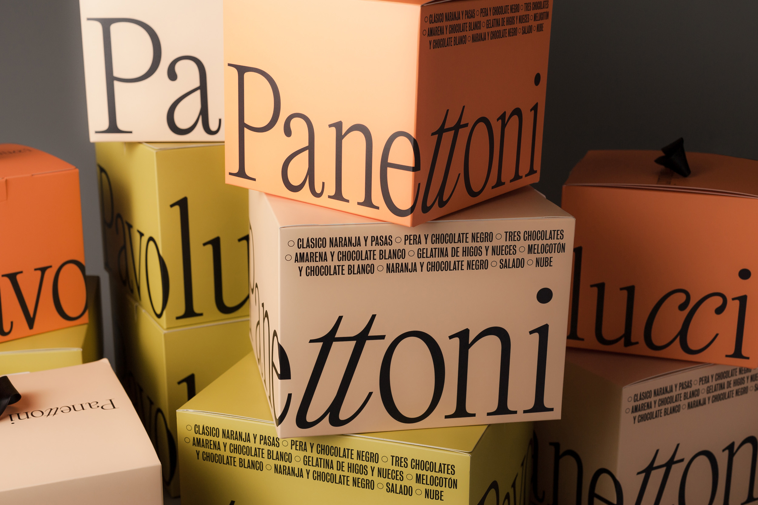
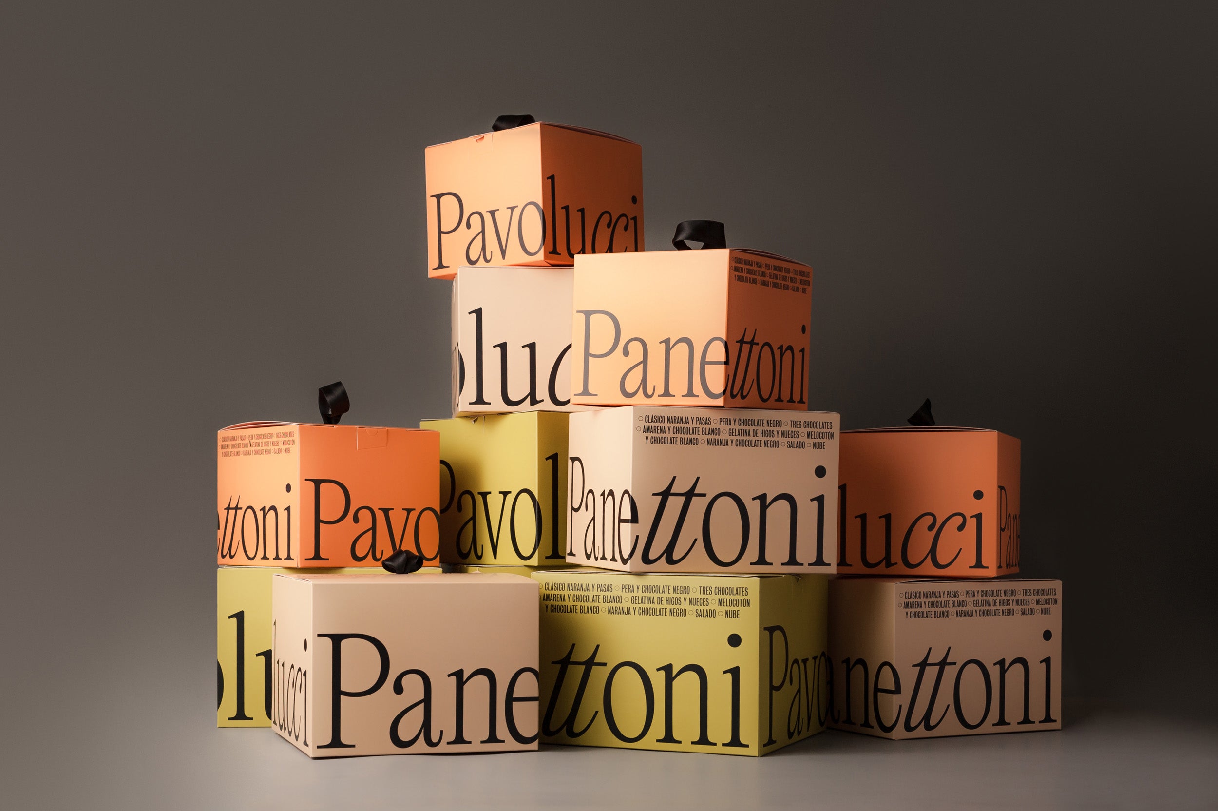
When it came to creating the visual identity for Panettoni Pavolucci, Spanish design agency Requena avoided any reference to Christmas. The project relies on two typefaces – a serif paired with a condensed sans serif – which harmoniously contrast and serve different functions. The serif, Editorial New by Pangram Pangram Foundry, acts as header, wrapping around the box to create a satisfyingly asymmetrical balance. This is then supported by the secondary typeface Bureau Grot Compressed.
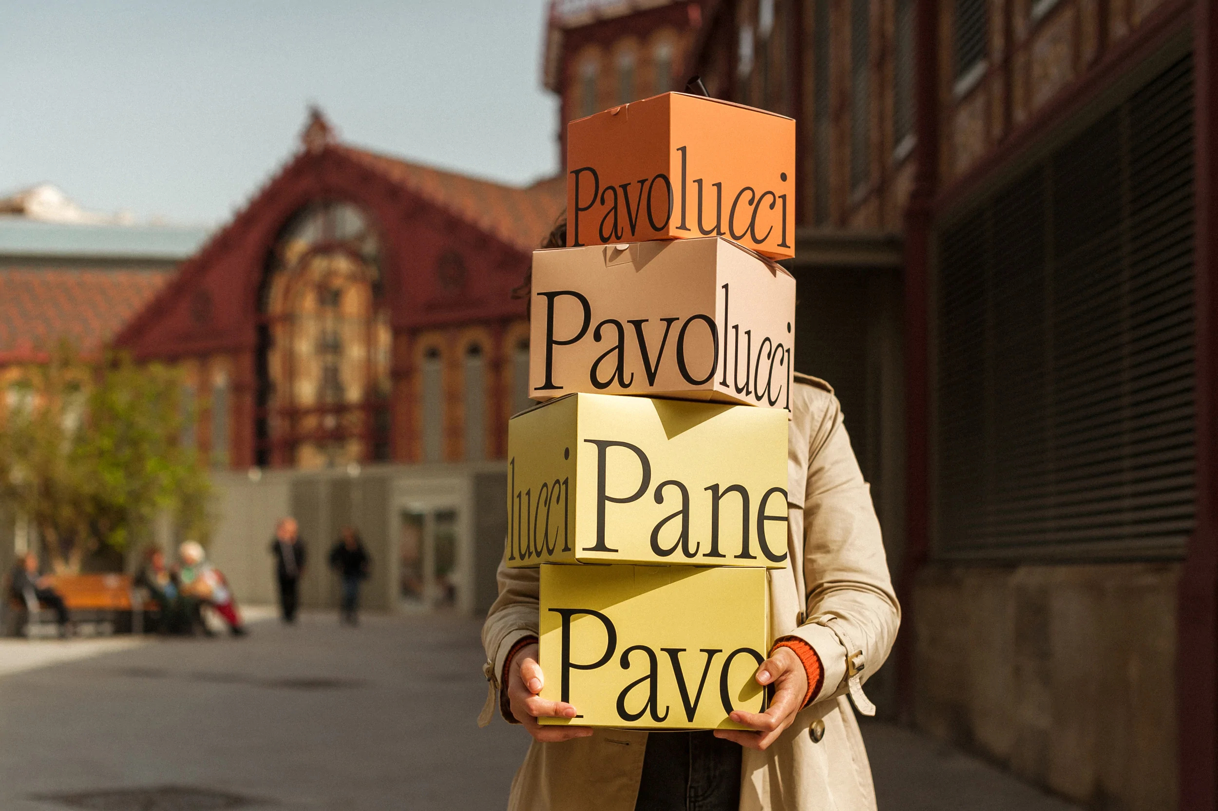
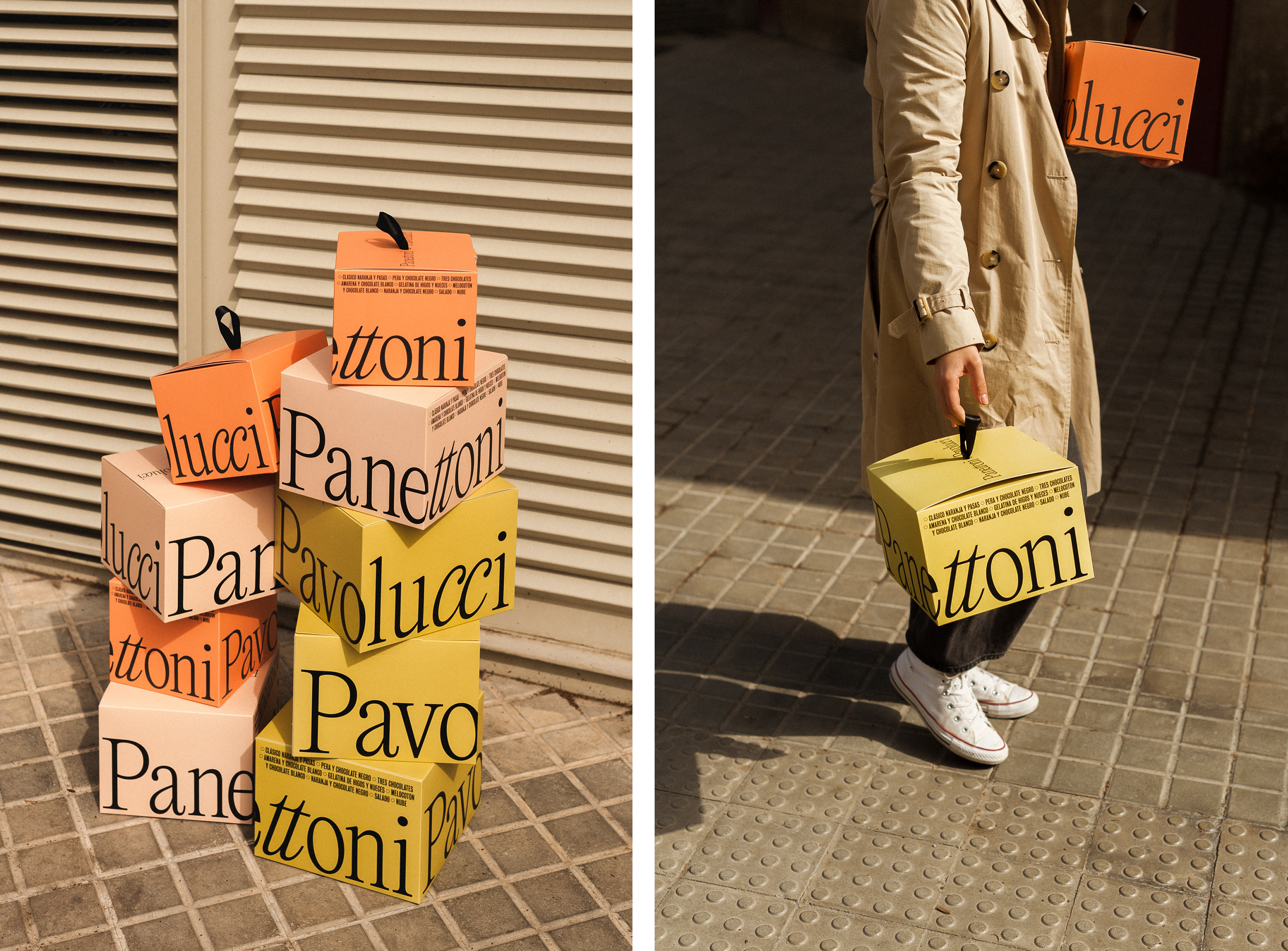
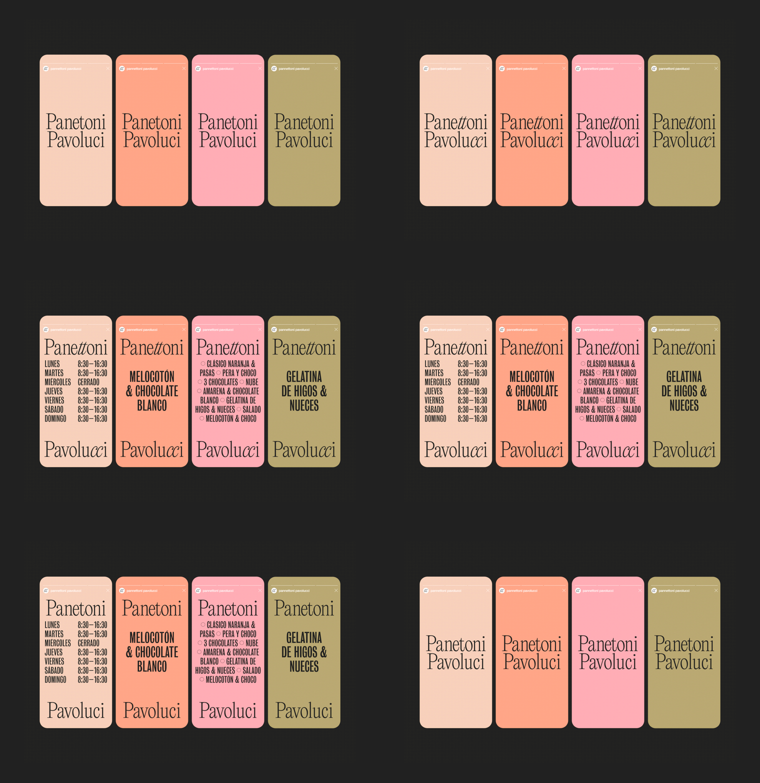
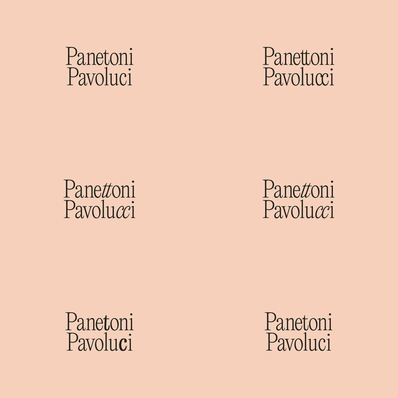
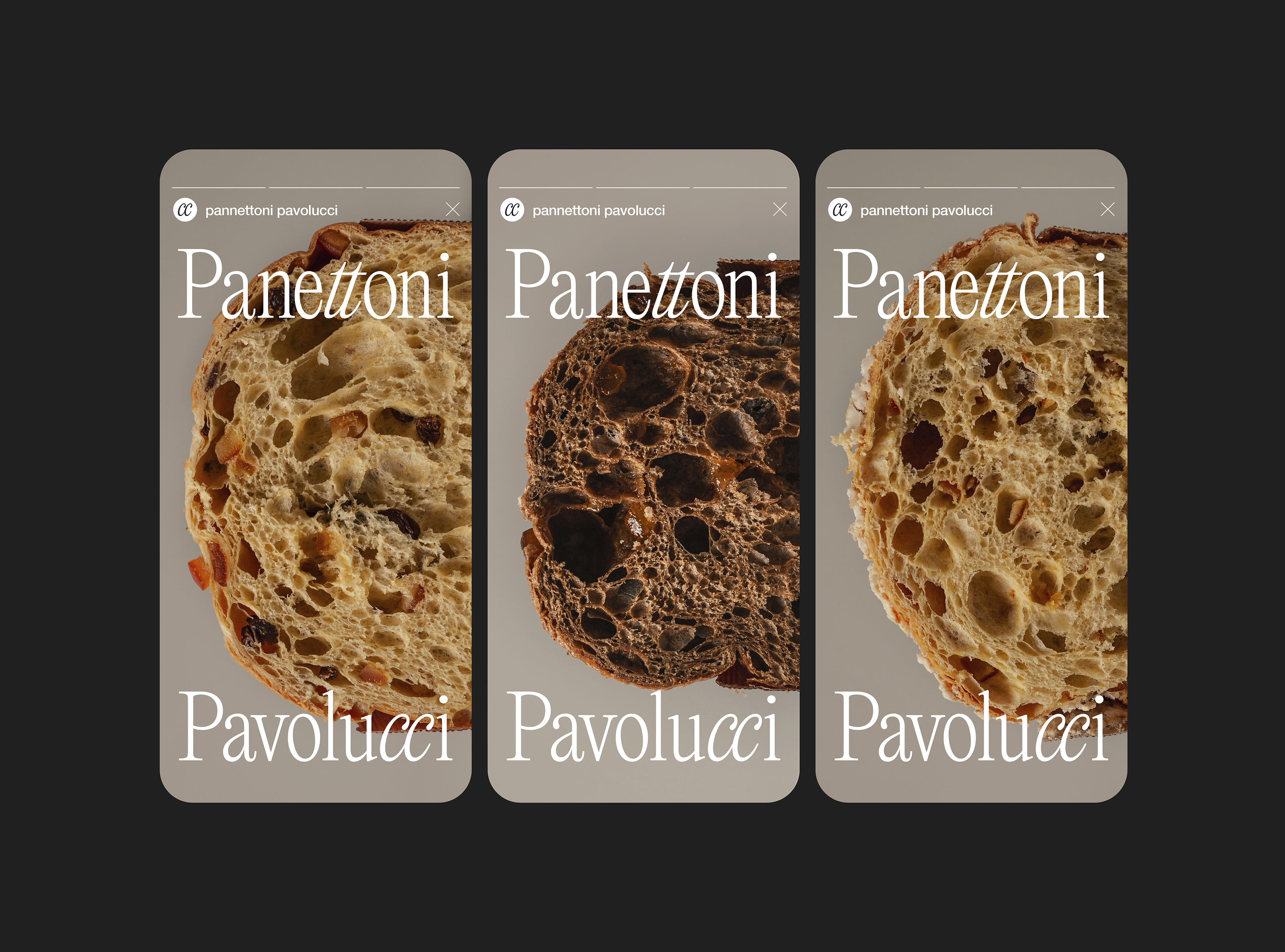
There are curious details in the type-setting here too – a nod to the owners’ own story, that has been cleverly worked in by Requena. Since the founders are twins, special attention has been brought to this through the italicisation of the ‘twin’ letters in ‘Panettoni’ and ‘Pavolucci’. On social media, this detail is called out further through playful animation. This decision brings the brand origin to the forefront in a subtle-yet-distinctive way.
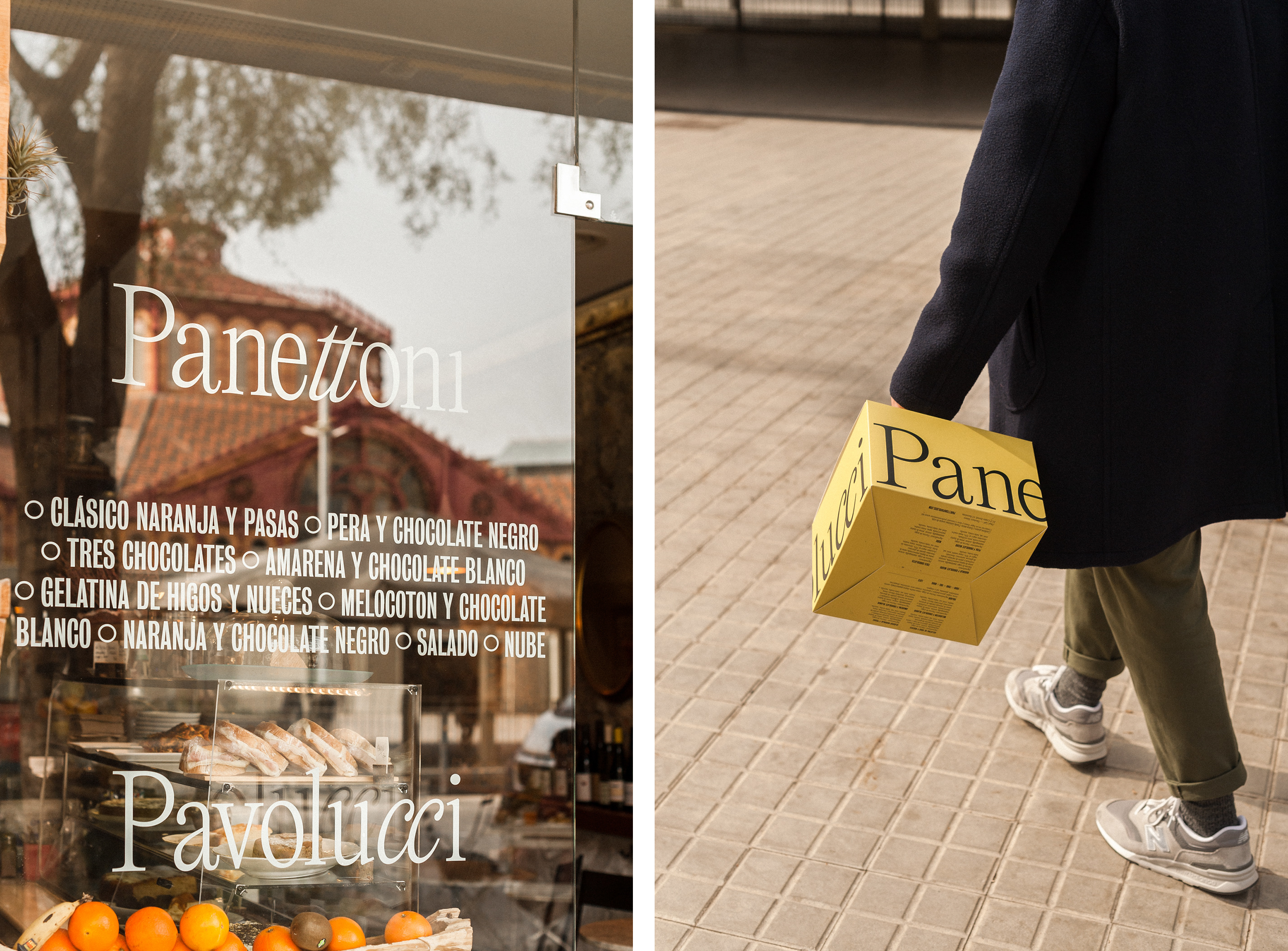
On functionality, Requena note: ‘we optimize flavors and ingredients in a single functional pack without the need to add extra labels.’ Each pack has the bakery’s panettone flavours listed at the top of one side, with the ability for checking off the customer’s chosen flavour. This allows for a varied colour palettes across packs that isn’t necessarily tied to flavour. Soft beiges, pistachio greens and peachy oranges work together to create a soft and tempting shelf of products that feels both indulgent and delicate at the same time.
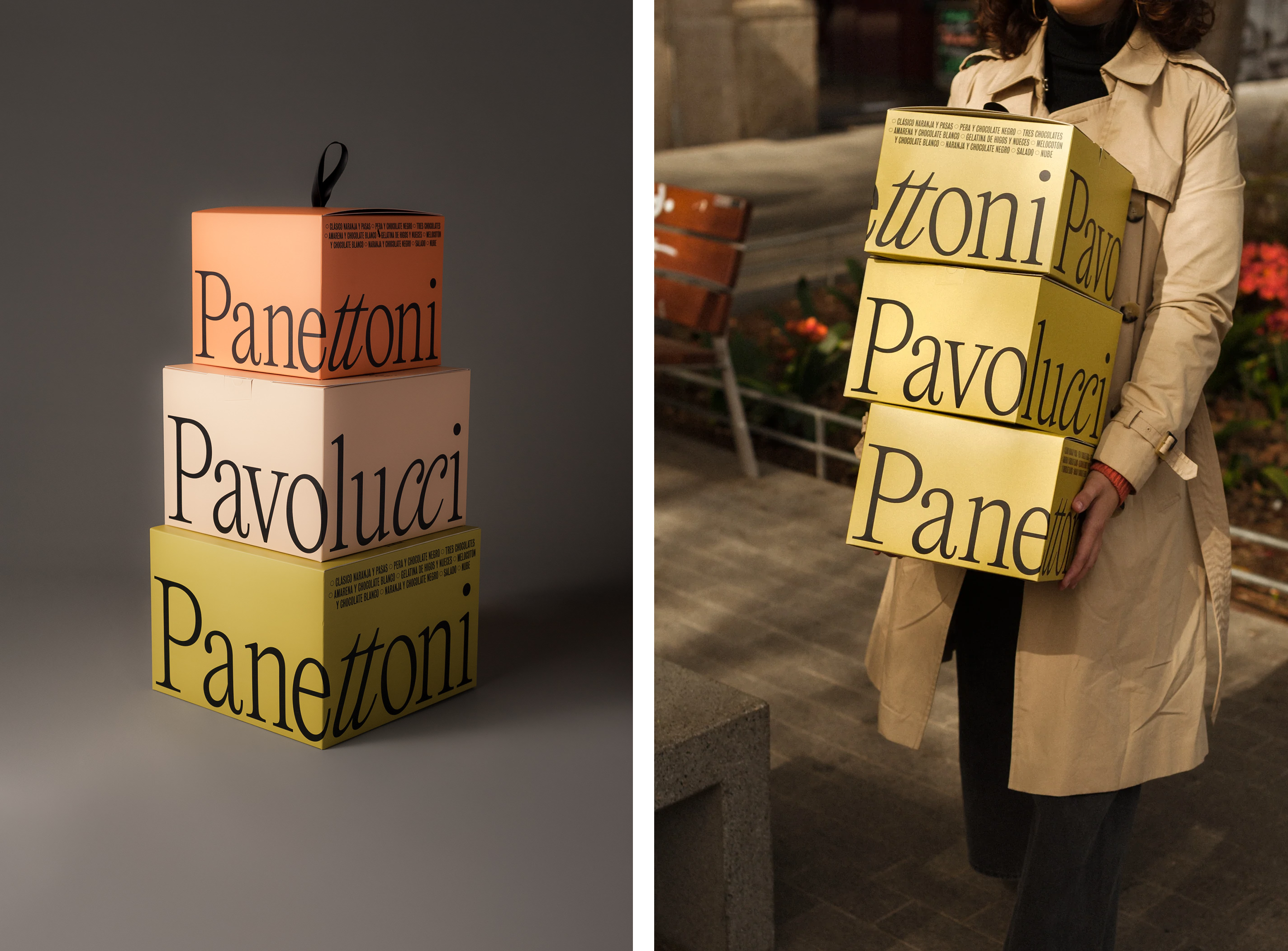
It is a welcome refreshing take on an old standard that feels truly modern in its approach. While the packaging shape and form doesn’t deviate far from its competitors (save for being more angular), the design presents a centuries-old dessert in a new light for a new audience. The work’s success lies in its simplicity and rejection of established seasonal tropes. By cutting through the noise of tradition, Requena have brought a classic into the 21st century – and with this packaging, it’s going to be a treat on Christmas Day, or any other day of the year.
