Agency: AMV. Year: 1983. Art Director: Ron Brown. Writer: David Abbott.
Some ancient Greek mythology, then some ancient advertising.
The ‘Sword of Damocles’ is a moral anecdote by Greek historian Timaeus. According to the story, Damocles was offered the chance to sit on the throne of King Dionysius, surrounded by wealth. The only catch was that there would be a sword suspended directly above his head, held by a single hair of a horse’s tail. The moral being that with great fortune and power, comes great danger.
The phrase is now used to describe any scenario infused with a sense of impending doom.
Ad agency creative departments spring to mind.
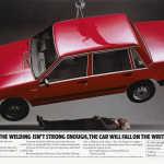
The above ad features not a sword, but a Volvo 740 hanging precariously over a copywriter.
It serves as an unintended metaphor for the dire predicament ad creatives find themselves in these days. If you’re good, and lucky, you may have 10 — 15 years before some soulless sociopath with a spreadsheet replaces you with a junior on a quarter of your salary.
I’m not knocking the raw enthusiasm of juniors of course. Every department needs a bit of that. But the rampant ageism in many agencies has a massively detrimental effect on the quality of the work. Because guess what? Art directors and copywriters get better as they become more experienced. Obviously.
This ad proves the point. The writer is David Abbott and he had already been working for 26 years when he came up with this terrific ad. He went on to work as a copywriter for nearly 40 years. And by creating ideas like this, he helped grow his agency to be the biggest in the UK.
Seen a car ad this good recently? Hmm… wonder why.
Apparently the original idea was to have the welder’s baby beneath the car. Client said no. Then a Volvo engineer. Still no. So David did it himself.
What a memorable way to show a big, client friendly, studio shot of the car.
And naturally, every syllable of the copy is perfect.
The ad is from 1983 when the majority of magazine ads bizarrely all had the same layout. Different fonts and logos of course, but look through any awards annual from that era and you’ll see what I mean: Large picture, centered headline in big type with columns of smaller body copy at the bottom.
Yes, this classic layout works well. Until you realise that all your competitors’ ads look just like yours. To be fair though, Volvo had a pretty distinctive headline font. Though it’s oddly curvy for such a boxy car. Fun fact: 1970s gay New York disco group ‘Village People’ used the same typeface for their logo.
Interestingly, there’s no logo on this ad… oh, actually there it is, on the car. Not exactly huge is it? Maybe it doesn’t need to be. Because the idea is so good and the product has such a distinctive shape. Yes, perhaps the product itself serves as a logo here. And what about the endline? Where is it? Pretty much every dot of ink on this ad is dramatising the proposition of ‘safety’. Do we really need to repeat that in an endline? No. It would add nothing but clutter. Instead we simply have the product name and price.
I applaud the superlative craft behind every element on the page. Right down to the tiny legal line, carefully justified with the columns of body copy and lined up with the coupon.
One of David Abbott’s quotes that I love is: ‘You should care about quality in everything you do. From the chairs in reception, to the way you answer a phone, to a piece of typography, to the ideas you have, to the meetings you hold, to the way you crop a photograph or write a line.’
A view diametrically opposed to the more common agency management philosophy of ruthlessly stamping out anything that could be done cheaper or quicker. These cynical attempts to boost short-term shareholder value generally result in rushed, ill-thought-out, poorly executed creative work.
Surely it’s only a matter of time before more and more clients get wise to this.
Which takes us neatly back to that dangling sword.
Source: Paul Belford | @paul_belford_ltd

