ARTIST | WORK | LISSON by Irma Boom
Opinion by Marthe Lisson Posted 27 September 2022
It’s rare that an art book comes with a personal story. As we ease ourselves into this new strand of the Voices column and as we begin to get to know each other, let me share one with you.
I first discovered ARTIST | WORK | LISSON on a shelf in the office at Whitechapel Gallery and thought it was so cool to see my surname in bold letters on the spine of a book for everyone to see.
(I thought you would ask! No, I have no relation to the gallery other than my ancestors potentially giving Lisson Street its name, where the gallery is situated.)
It was 2018 and I was working on the re-launch of the London Art Book Fair. Whether my sales skills paid off or the team at Lisson joined without much convincing, I don’t remember. Either way, that’s how I got to know Zoë Anspach. On the last day of the Fair weekend, she handed me ARTIST | WORK | LISSON: ‘It’s yours.’ I couldn’t believe my luck and in disbelief asked why? ‘Because you are Marthe Lisson.’
I will always remember this gesture and ever since ARTIST | WORK | LISSON sits proudly on my book shelf. This anecdote certainly influenced the decision to make it the first art book to present in this column. Though firstly, because it is a supreme example of what an art book design can be. We might even go as far as to say: art books connect. And with this in mind I hope that we – you, dear reader, and me – will build a solid connection over art books over the course of this column.
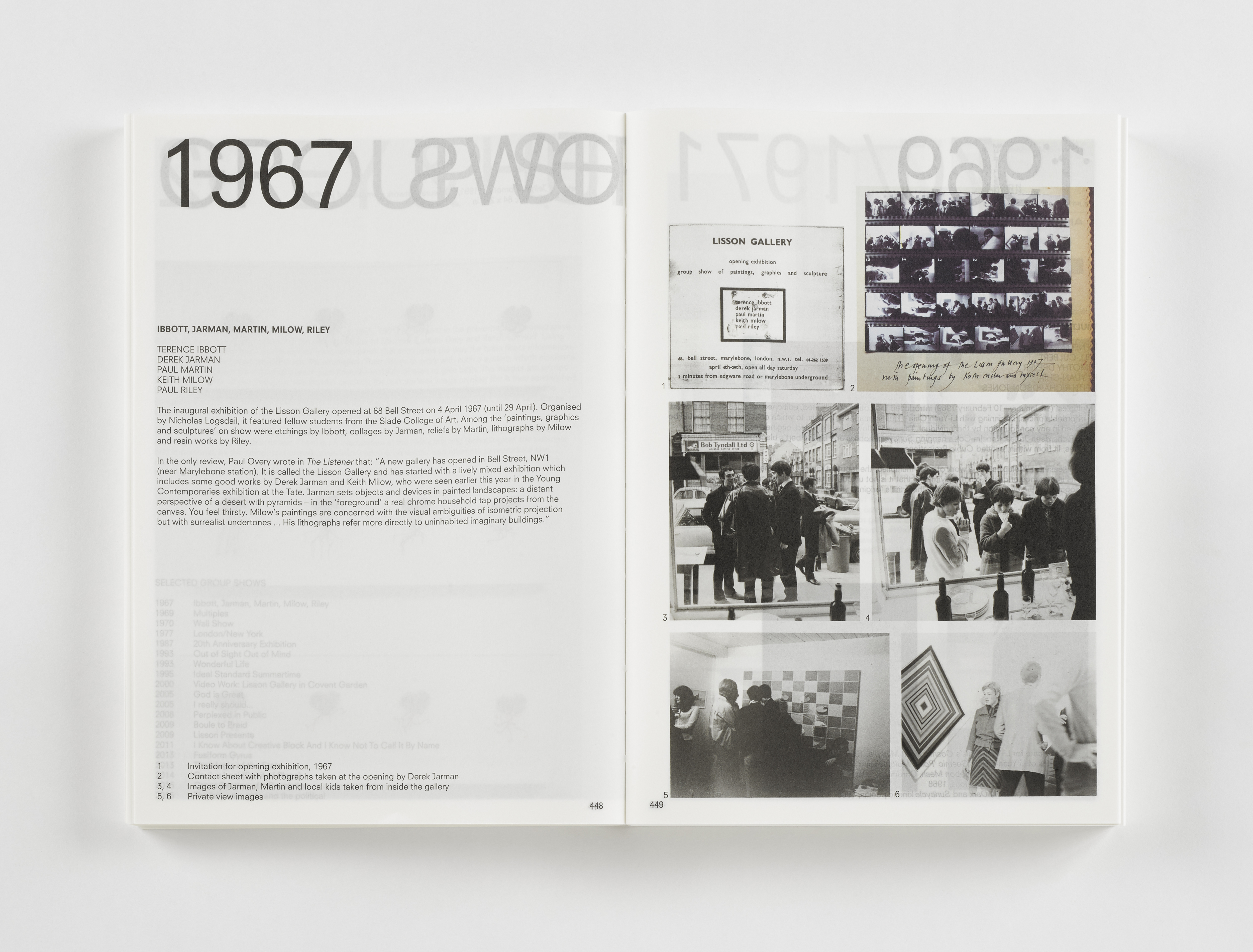
In 2017, Lisson Gallery celebrated its 50th anniversary with a catalogue raisonné (of sorts) that brings together 152 artists and their jointly accumulated more than 500 solo exhibitions in one of the gallery’s spaces in London, Milan and New York between 1967 and 2017.
It seems, there was only one person to trust with such an archival book endeavour: Irma Boom. The Dutch graphic designer is known for her experimental, large-scale book designs. Large-scale not necessarily in format, but amibition and page count. Take Think Book 1996-1896, one of Boom’s first commissions as an independent designer. Blessed with neither time nor budget constraints, it took her five years to complete; the result was 2,136 pages thick and 3.5 kg heavy.
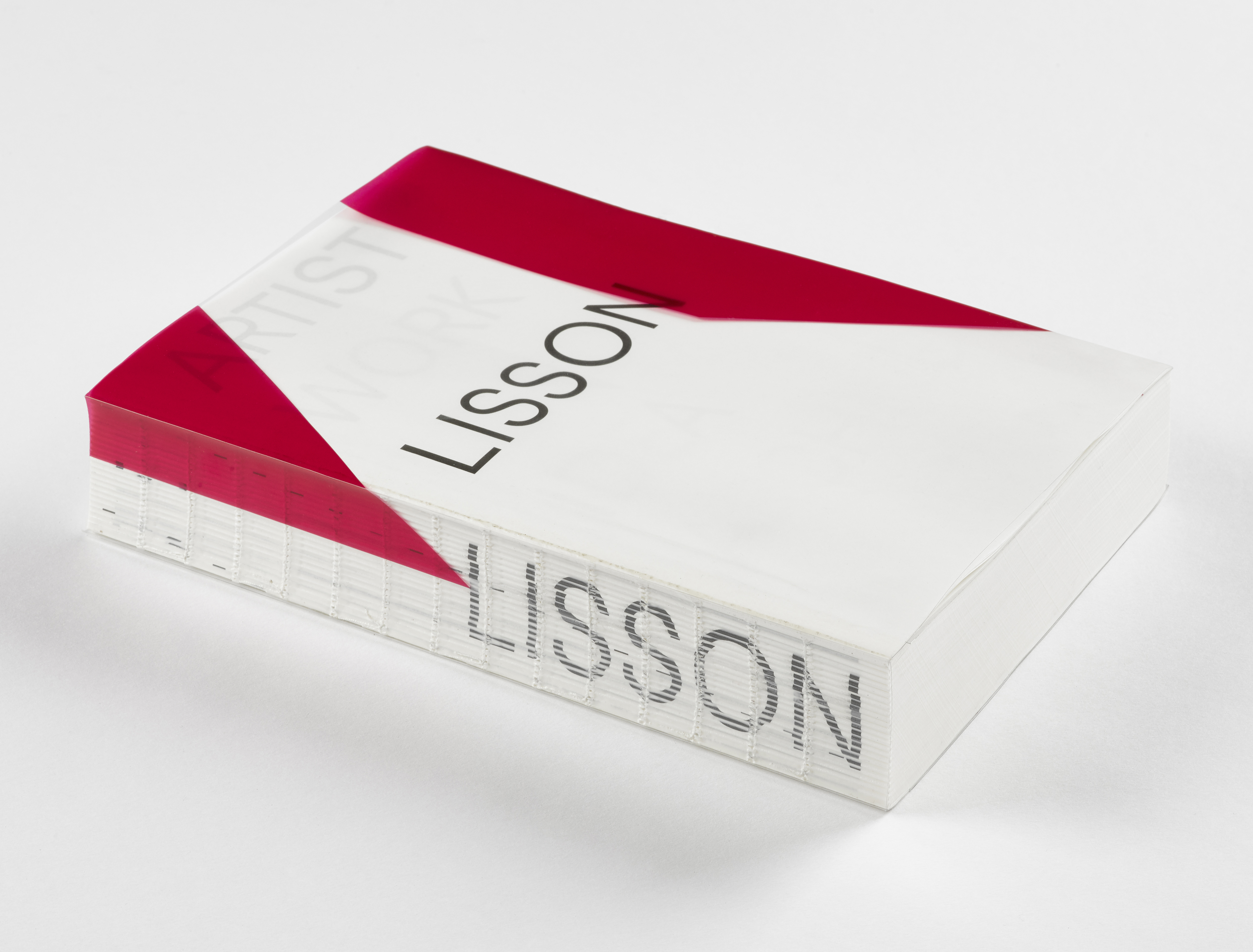
ARTIST | WORK | LISSON had a budget, time and page constraint. With the use of Boom’s own, almost transparent archival paper (IBO One, 60 g/m²) for the entire book, including the cover, it is a lot ‘lighter’ (1.2 kg). It is also a lot ‘thinner’, albeit ‘the 1,152 pages were simply the maximum number of pages that could physically fit in the machines at the bindery!’ Zoë Anspach remembers. Anspach is Design Manager at Lisson and assisted the print production in 2016/17. The result has ‘not unintentionally, the dimensions and weight of an old British telephone directory,’ remarked Helen Sumpter in ArtReview (2/2018).
The ‘Lisson directory’ is wrapped in a clear acetate dust jacket, designed by artist Daniel Buren, that, together with five consecutive leafs, create the cover. Each of the five pages carries one of the words: Artist – Work – Lisson (printed on acetate) – Idea – Archive – Index. With each page the words disappear further behind the paper. LISSON is imprinted on the openly visible spine.
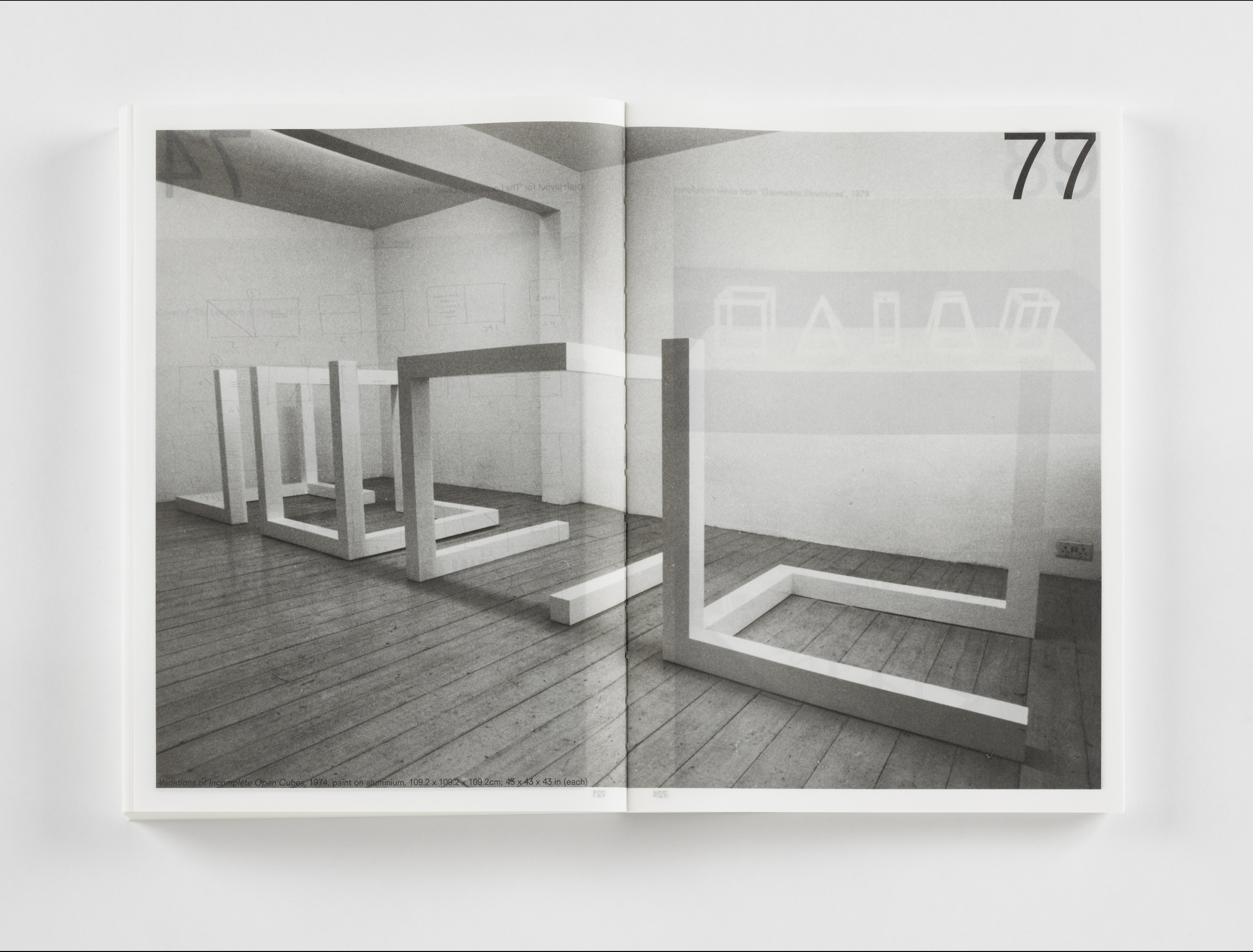
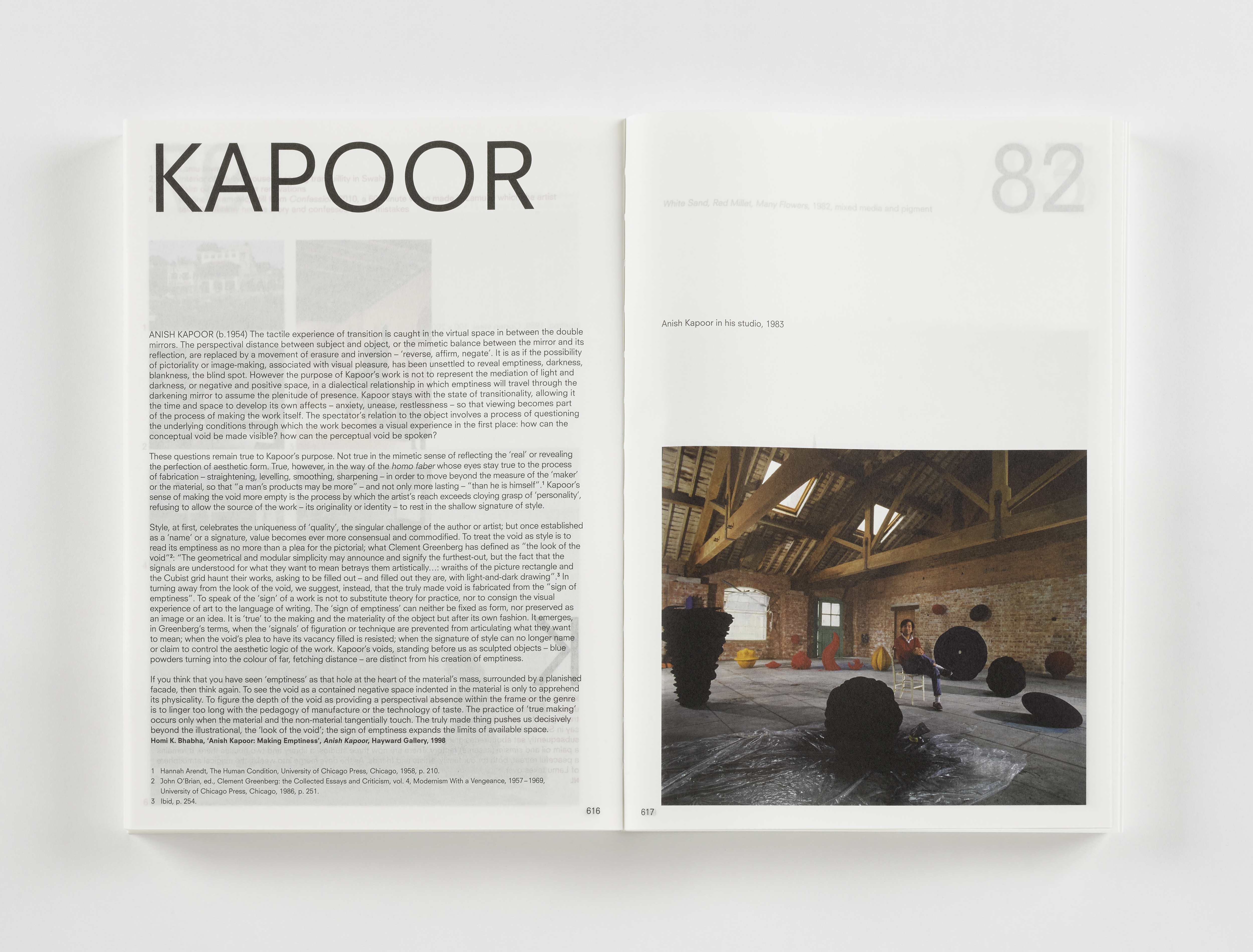
The book follows an alphabetical structure by artists’ name. Each artist’s solo exhibition is acknowledged on a double-page spread with a short narrative or previously published text. As a result, Jemima Stehli is presented on two pages, Anish Kapoor, with 16 solo exhibitions, on thirty-two. The number(s) in the top right corner of each page indicate the year of the exhibition, not a cryptical pagination scheme. In fact, there are no page numbers. To look for artists you must be knowledgable of the alphabet; to look for contributors (listed in an index at the back), you must be lucky to find them. Short essays on broader themes relevant to the gallery’s history are interspersed throughout the publication – in alphabetical order of course, from B for Beginnings to Y for Youth – as are more than 2,000 illustrations.
The translucent pages are something to get used to. The paper is so thin you always see the content of the previous and following pages too. ‘Like seeing past, present and future all on one page’, Sumpter observes.