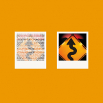
Agency: Doyle Dane Bernbach. Year 1980. Art director: Helmut Krone. Copywriter: Tom Yobbagy. Photographer: Larry Sillen.
This piece of art direction from 1980 is so timeless it’s even outlasted the product.
In fact the more I think about it, timelessness may be one of the best indicators of great art direction. Which is more than a bit ironic don’t you think, given the transient, disposable nature of most ads? But that’s for another post.
Today we’re back to that old chestnut, the logo. I’m buggered if I can find one here. Does it matter a jot? No. Apologies to my friends in the branding agencies. It’s just that communications for brands can sometimes be more vibrant, surprising, memorable, powerful and… yes, loved, when released from the straitjackets that you often create. As I am about to demonstrate.
Do you know who this ad is for? Of course you do. Polaroid. That distinctive white border shape is unmistakable. (Well it certainly was in the eighties.) So the point here is if your product is instantly recognisable, why can’t it actually be the branding? Nothing else required. DDB art director Helmut Krone thought so. And amazingly, so did his client, Ted Voss.
In fact Voss went further. When presented with the finished artwork, ready to run, he asked the agency to remove the legal copyright line of tiny type at the bottom of the ad. Leaving an uncluttered field of bright colour. Is the communication any less effective without a line of six point legalese? Of course not. Does the page look better without it? Of course it does. No-brainer then.
And what do we put in this impactful field of solid colour? Something persuasive — something that dramatises a product benefit. Something that sells. A product demonstration perhaps.
The product, Polaroid Time-Zero, was a type of instant film that developed before your eyes, in just a few seconds. So why not have the copy that explains this, also visually explaining the process — a picture developing through the type? A masterstroke.
You don’t even have to read the copy. Although I’ll bet most photographers did.
And what a picture. Simple, graphic and impossible to ignore. (It’s not a real road sign by the way, just layered paper in a studio.)
But let’s get back to selling. Speed of development wasn’t the only product benefit. This film also had better dyes, resulting in improved colour saturation. Hence the bright colour on the page. The same as the main colour in the photograph of course. You see, everything has been thought through by the art director and everything can be justified and explained.
What I can’t explain though, is why on earth we don’t see more advertising of this calibre. It’s bloody hard to do of course. But I wonder how many art directors would even consider pushing things this far. No logo, no headline, no packshot and copy that’s incredibly hard to read.
Impossible to get that through, surely. So why even try?
Edwin H. Land, inventor of Polaroid film had a mantra: Insist on the impossible. An attitude more art directors would be well advised to adopt.
Source: Paul Belford | @paul_belford_ltd

