LBDO by Universal Favourite
Opinion by Kinda Savarino Posted 6 December 2022

Self-care is nothing new, but our understanding and appreciation of it as a society has grown enormously in the last half century, and especially recently when it became a trending topic during the isolation periods of coronavirus in 2020 and 2021 (70 million hashtags on Instagram, and counting). In the dawn of this enlightened thinking, products in this space have evolved with brands like AKT, Cora and Thinx paving the way for what personal hygiene products can look like.
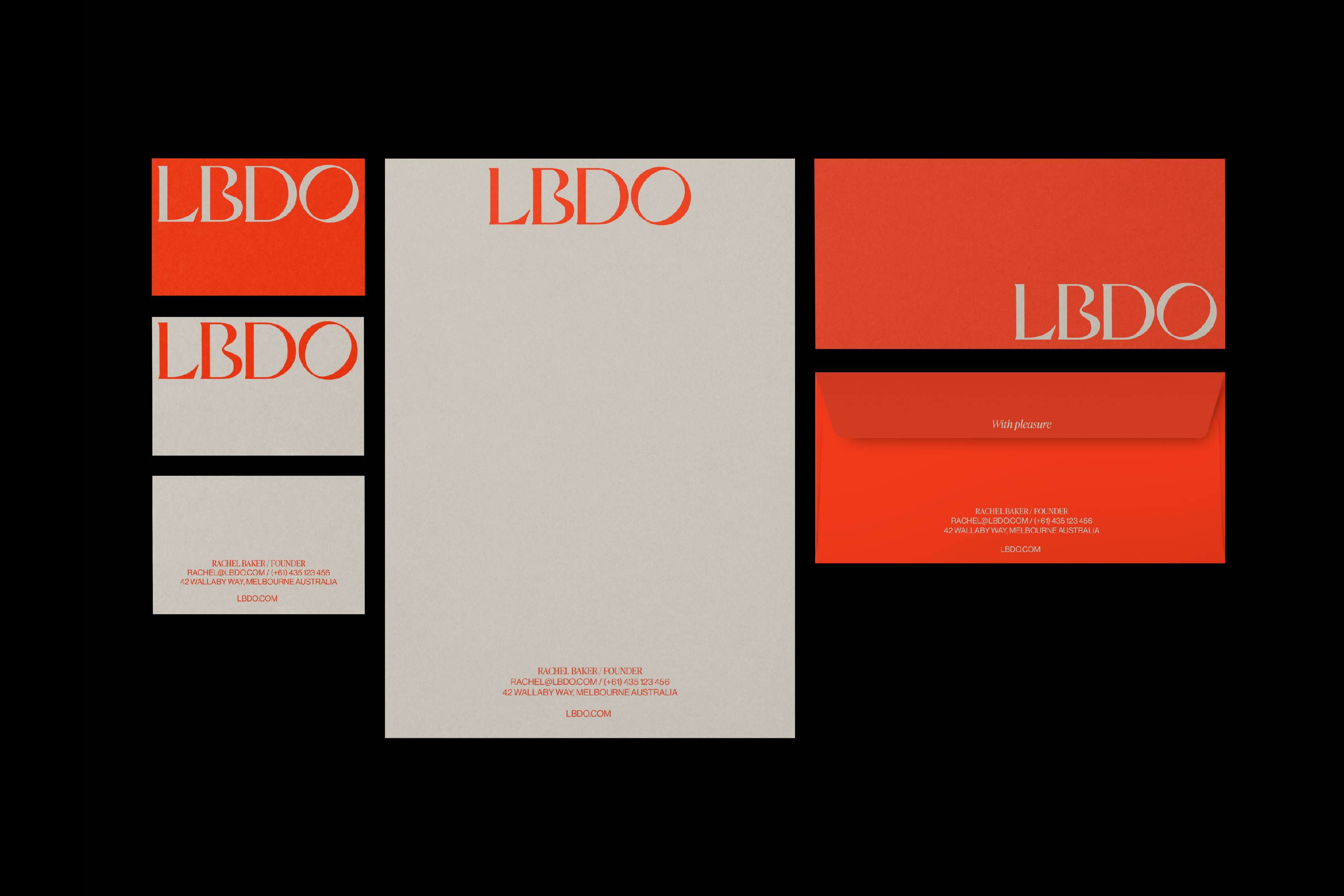
It has taken a while for the sexual intimacy and pleasure space to catch up, but LBDO is one such brand where visuals break away from the competition to embrace a new cultural landscape. Gone are the days of the gaudy purple vibrator (at least they are if you’re purchasing from LBDO). The colour palette – employed sensitively by Sydney-based design agency Universal Favourite – is soft and calming, with neutral hues predominant. Softer pastels, such as lilac and pink feature, but what cuts through the noise is the contrast of sands and greys with a vibrant red, bringing the perfect amount of sharpness to entice.
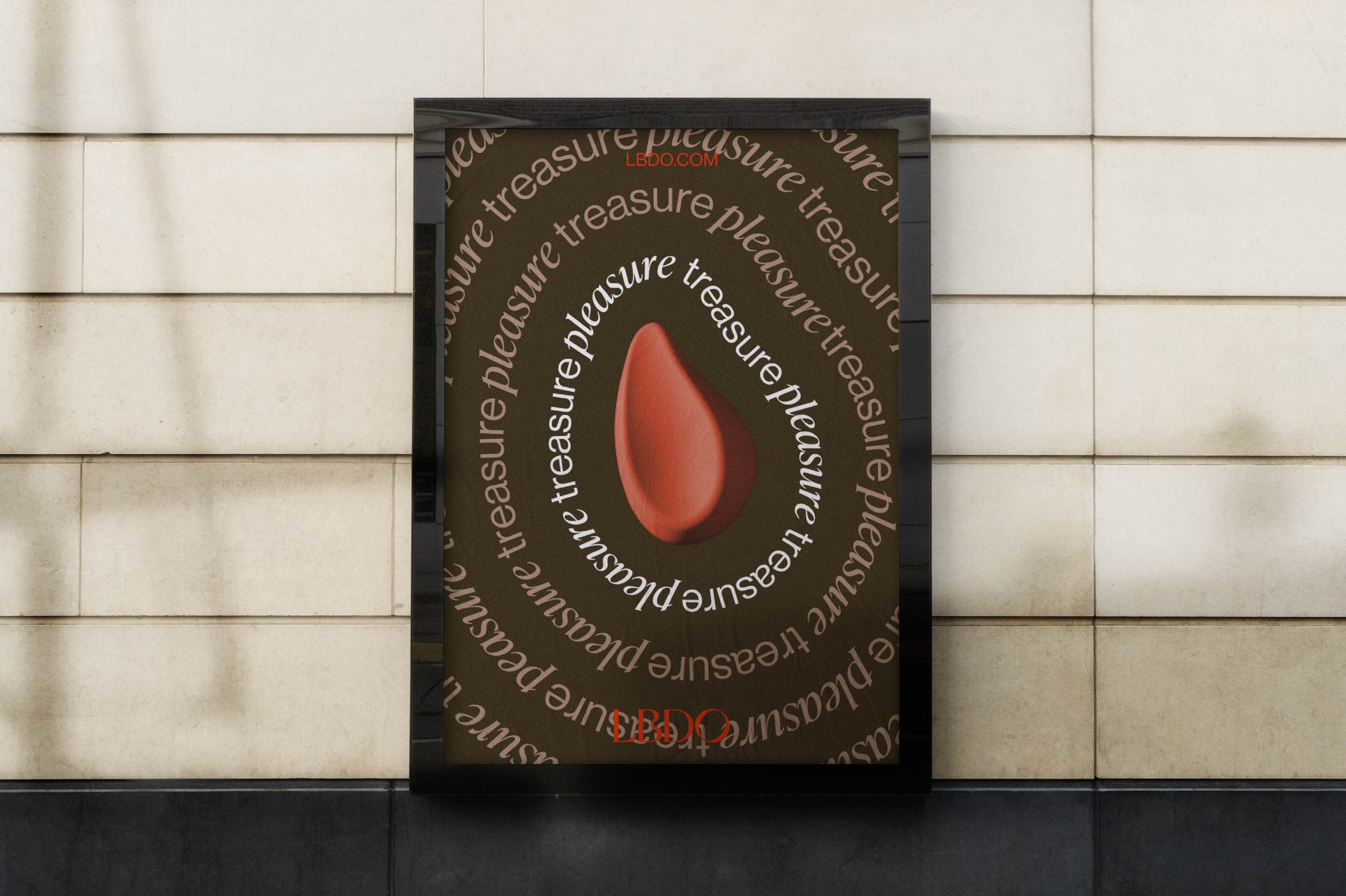
The concept behind LBDO’s new visual identity is ‘getting in sync’, which speaks to both the products and the brand’s mission of being more in touch with its audience. Looking at the end result, it is clear that this theme has been well-executed, but especially in the brand’s motion visuals which use fluid animation for a calming effect: one style involves the canvas rippling to softly displace the type, while another animates the letters to curve around the Essensual Vibe, a flagship product. This is visual ASMR, and it satisfies.


While the idea of ‘getting in sync’ is key, a central part of LBDO’s ethos is that their products are for everybody, as well as every body. This notion has informed the logo, which includes both curves and hard lines nd also extends to the brand fonts – elegant IvyPresto and utilitarian Neue Haas Grotesk are a serif and sans couple that pair beautifully but also represent sexual individuality, exuding quiet confidence.
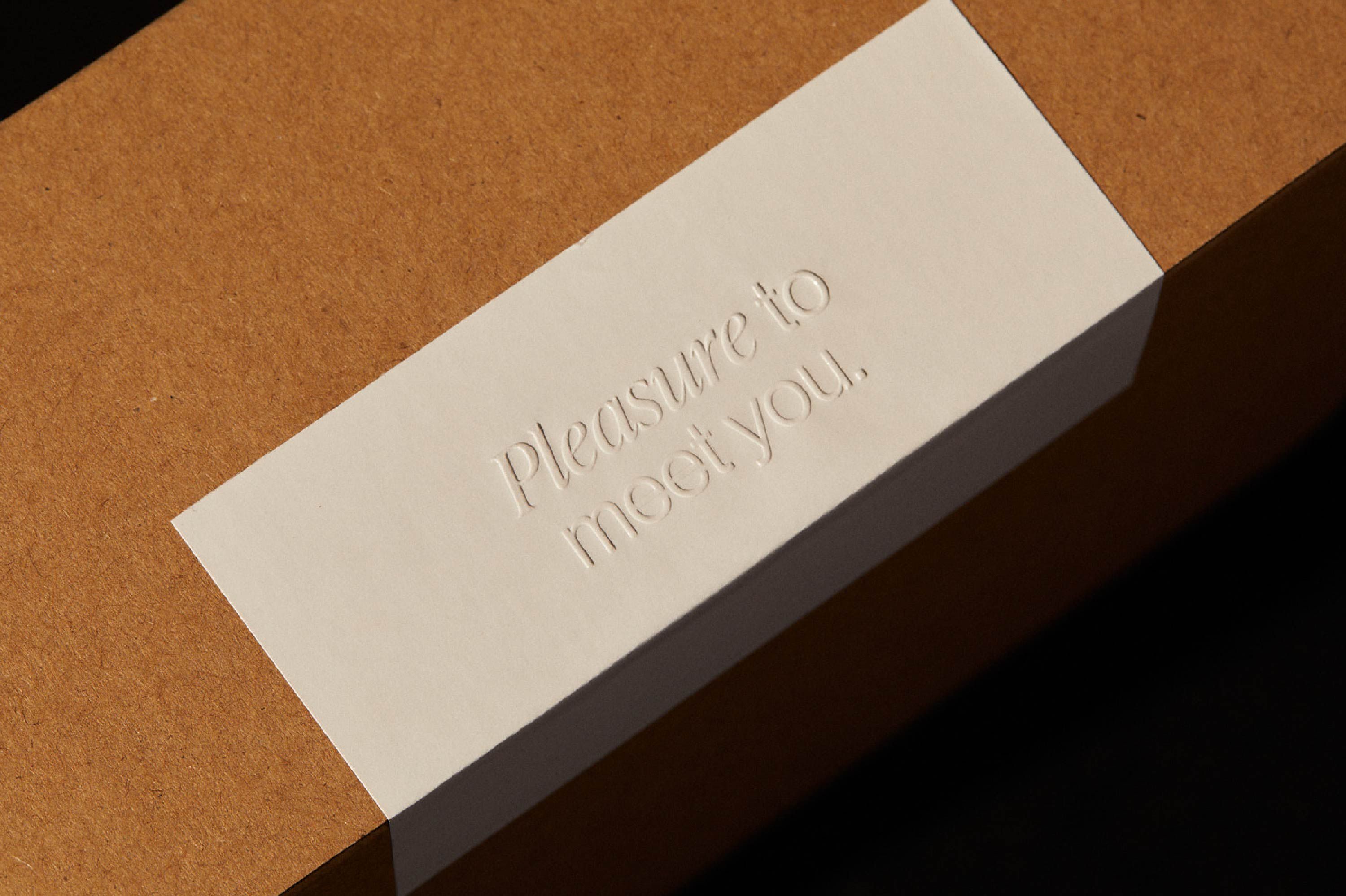

Every touchpoint is intended to bring the consumer closer to themselves, and the packaging is no exception. Following from the brand’s more minimal cues, the products are beautiful in their own right. The reasoning is clear: why should self-pleasure products be hidden out of sight? LBDO aims to instil confidence in its audience, creating beautiful products that can sit on a bedside table is one of the many ways it achieves this. Another strong execution is the brand’s Instagram grid, which serves as a place to engage with audience and build community. The grid houses both typographic compositions and photography – in combination the balance of the two creates a feed that is both educational and warm.
Ultimately LBDO’s visual identity is successful because it speaks to the relationship we have with ourselves – one ‘shaped by pleasure, joy, vulnerability, self-love and expression’. By championing these principles, it has done what other self-pleasure brands have failed to do – it has told its audience that this is a relationship worth embracing, exploring and one to feel empowered by.