Peerspace by Mother Design
Opinion by Eleanor Robertson Posted 12 January 2023
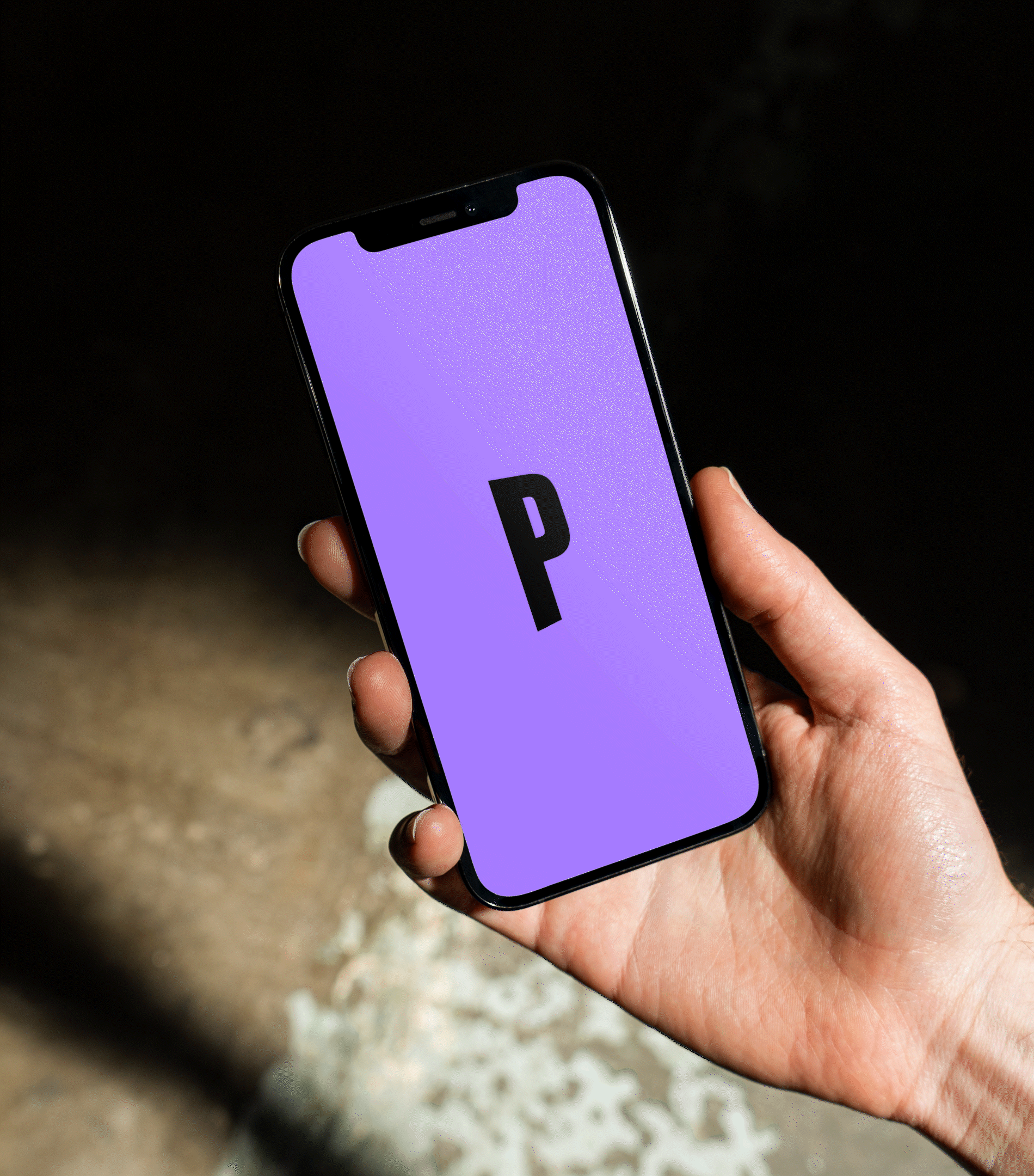
Straight up, I’ll admit that I struggle to resist a condensed sans typeface set in uppercase. I’ll also confess that I’ve spent the last hour (no lie), trying to identify this one… Helvetica? Hell no. Railroad Gothic? The wrong track. Söhne? Sö not. Must be Knockout? Another blow. For Druk’s sake is it Druk? Well, whatever it is, it’s neatly kerned in three configurations: the Wordmark (for headers and larger spaces), the Stack (for small, square-format spaces such as profile pics) and an Icon (for the most economic of spaces, like web browser or email icons).
Behind the font, Peerspace operates the largest and most successful marketplace for rentable venues and event spaces in unique locations worldwide, from photo studios to meeting rooms and bars. Think Airbnb for hourly rentals – except don’t, because ‘while being compared to Airbnb is not a bad thing, it does immediately take away the uniqueness of what Peerspace is,’ says Mother Design.

In a busy market of digital-led brands that is becoming increasingly crowded and indistinguishable, the agency’s main challenge was therefore to help Peerspace redefine and express who they are, what they do and what they stand for in a way that is ‘relevant, memorable and timeless’. In short to stand out, build recognition and inspire hosts and guests to choose the platform for personal and professional events.
The strategic insight behind the new brand is centred around the idea that ‘Peerspace opens doors – to opportunity and self-expression’, but also (literally speaking) to space, the network’s core offering. Embracing this with motion, that sexy sans serif is the beating heart of a dynamic type-based visual world. The Wordmark demarcates the walls of various imagined rooms, playing dizzying games with perspective that deserve a Kubrick cameo; the Stack takes the eye on a journey up and down, left to right, as if having a conversation within the boundaries of the square it occupies; the simple ‘P’ icon is slightly angled to mimic the opening of ‘a door to endless possibility’.
Complementing this system are four weights of Social, a typeface by Dinamo type foundry. Aside from legibility, Social’s rounded shapes and quirky forms lend the brand a friendly and inviting tone. While I get the logic, stylistically there’s a slightly uncomfortable relationship between the tight apertures of the condensed logo marks and the open, angled terminals of supporting typography. It’s also a shame not to see some of the concept-led expression of type-in-motion translate into static formats.


There are other inconsistencies and under-exploited opportunities. (The rationale underpinning the grid system seems to be ‘plonk the headline wherever it looks good’, for example). But ultimately Mother’s work is imbued with storytelling that is bright, rich and full of personality. Peerspace’s new signature punchy purple – a colour often overlooked in branding – boldly stands out from the techy aesthetic of the competition. It is applied with confidence alongside optimistic horizon hues, vibrating with potential.


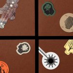
Finally, photography focuses on three key aspects of the Peerspace experience: the Space (the before, or blank canvas), the Process (production and preparation), and the Result (the event, the art – the #madeinpeerspace outcome) to represent what the platform makes possible. ‘Because people are capable of extraordinary things; they just need the time and place to do them.’ This is where the identity leaves space – that word again – for Peerspace’s users and their achievements to shine, showcasing a community of photographers, filmmakers, event planners and content creators.
Just as Peerspace isn’t complete without its peers, so Mother has built a brand structure that is only completed by the creativity, inventiveness and imagination of others. And that font? Must be custom.