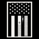
Agency: CBS advertising and sales promotion. Year: 1962. Art directors: Lou Dorfsman, Al Amato. Writer: Robert Strunksy.
Look! A decent press ad. (Oh, and a rocket.)
This offering for American TV network CBS ran as a glorious full-page ad in the New York Times on Friday, January 26, 1962.
The idea and layout, in common with most great work, are timeless. Okay, I admit it. A few things do date this ad. Its quality. Its sophisticated use of a graphic idea. Its cool, clever headline. Its use of elegantly written long copy. And the absence of a dumb, embarrassing endline.
My advice to any young ad creative today is ‘know your history’. Start with the New York creative revolution of the late 1950s and 1960s. You’ll learn a lot by searching out and studying the work of the great agencies of that period: Doyle Dane Bernbach; Papert Koenig Lois; Young & Rubicam; Wells Rich Green; Carl Ally; Scali McCabe Sloves… and also long forgotten yet great places like Erwin Wasey Ruthrauff & Ryan; Delehanty Kurnit & Geller; Leber Katz Paccione…
So what exactly can we glean from th9s vintage ad, produced in-house and designed to announce the TV coverage of America’s first attempt to orbit the Earth?
Well, we can see a giant crop of the U.S. flag: The Stars and Stripes. And what a clever juxtaposition, to have a photograph of a rocket shooting upwards towards the graphic stars. Even better, to have it powering to the stars through a dark stripe of the flag.
In 1962 all the newspaper ads were black and white. Which is just as well because the abstraction of the U.S. flag to put the stars on a black background, and with black rather than red stripes, works much better both conceptually and graphically. How many art directors today even consider whether their layouts may actually be more powerful in black and white when the default option is always colour?
Another contemporary conundrum for art directors is the proliferation of media spaces. This ad is a portrait page in a newspaper. It has to be. Because there’s copy to read and because it’s a topical ad, and it is portrait format of course because the rocket needs to fly upwards, not sideways. I wonder what the creatives involved would have done if presented with a ‘set in stone’ media schedule including a plethora of ridiculously proportioned landscape digital banners? Would this concept have been sacrificed at the altar of ‘matching luggage’, in favour of something less good, with less copy, that was sufficiently bland and malleable to squeeze into any media format? Probably. In my experience this happens all the time. It’s the tail wagging the dog. It’s crazy.
And what about those words? What do they say and how do we arrange the typography? Again, the headline links rockets and America by referencing a lyric from the U.S. anthem: The Star-Spangled Banner. Genius.
Of course, if they had used PDFs and email to present work back in the sixties, and if the clients had used smartphones to look at those emails, then the size of the headline would have been rejected when viewed on such a tiny screen. But remember, this is a full-page newspaper ad. The headline is plenty big enough. In fact any bigger and it would fight with the stripes.
To finish off the communication, a few hundred words of body copy are precisely set in justified columns to fill some of the white stripes. The paragraphs and small sub-heads breaking up the copy just enough to offer an inviting read without destroying the graphic impact. Again, the art direction draws attention to, and links back to the patriotic theme. Even the logo is perfectly positioned (and brilliantly designed by William Golden).
This ad really couldn’t be much better. Look and learn.
Source: Paul Belford | @paul_belford_ltd

