Whale Tales by Interbrand
Opinion by Kinda Savarino Posted 4 April 2023
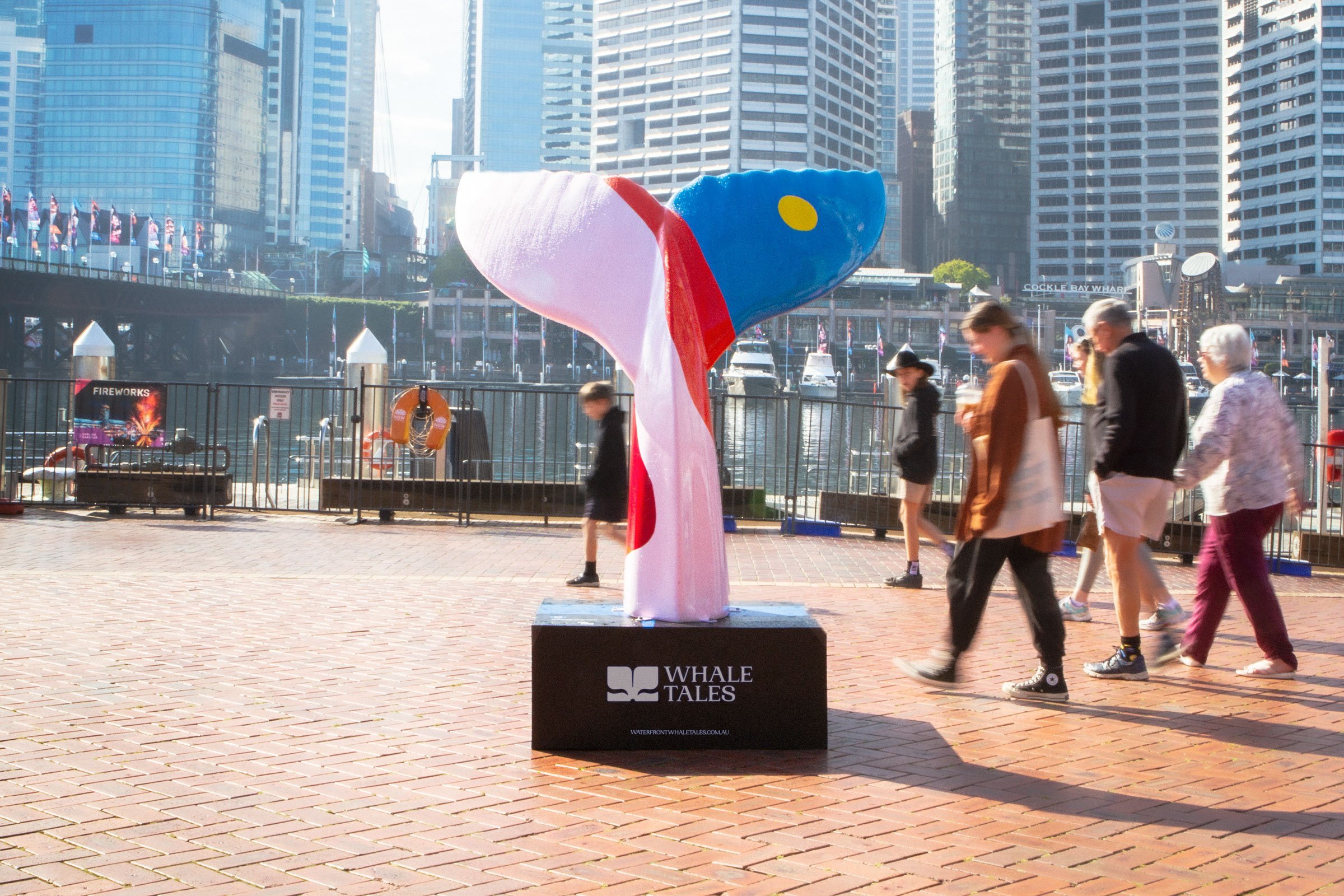
Every year an impressive 40,000 humpback whales travel along the Sydney coastline. This annual migration pattern is one of the many awe-inspiring natural spectacles that make the city so unique. It is fitting then, that the New Sydney Waterfront Company chose to revitalise Sydney’s Western Harbour Precinct with an installation of thirty whale tail sculptures, telling thirty individual stories, or Whale Tales.
The artworks – which are dispersed around the harbour area – were created by a diverse group of local artists, resulting in a collection and trail of distinct pieces. This gives the installation a discoverable aspect, encouraging locals and visitors to make their own way along the water, learning about stories and histories from the precinct. The engaging initiative is made all the enjoyable by a simple and bold visual identity design by Interbrand Sydney.

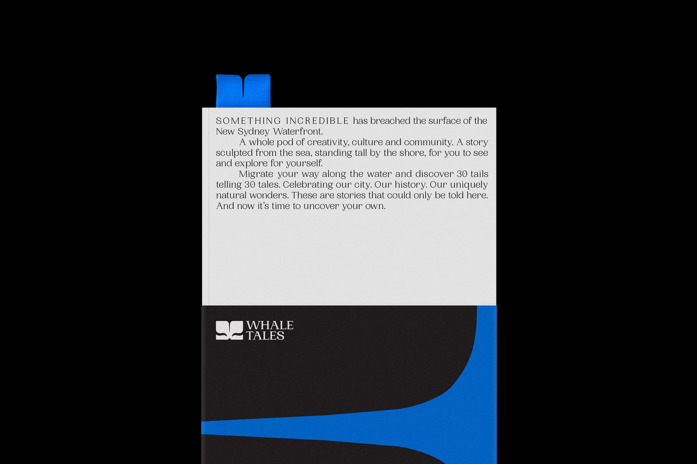
How does a project like this, featuring so many different artists, live outside of its own medium? Interbrand’s solution provides Whale Tales with a recognisable and approachable brand, without taking away from the art at the centre of it all. The overarching architecture is straightforward, taking cues from minimalism with a monotone colour palette, providing space for each sculpture to have its moment to shine and take centre stage. The logo application, serving as a frame for photography, also nods to this approach.
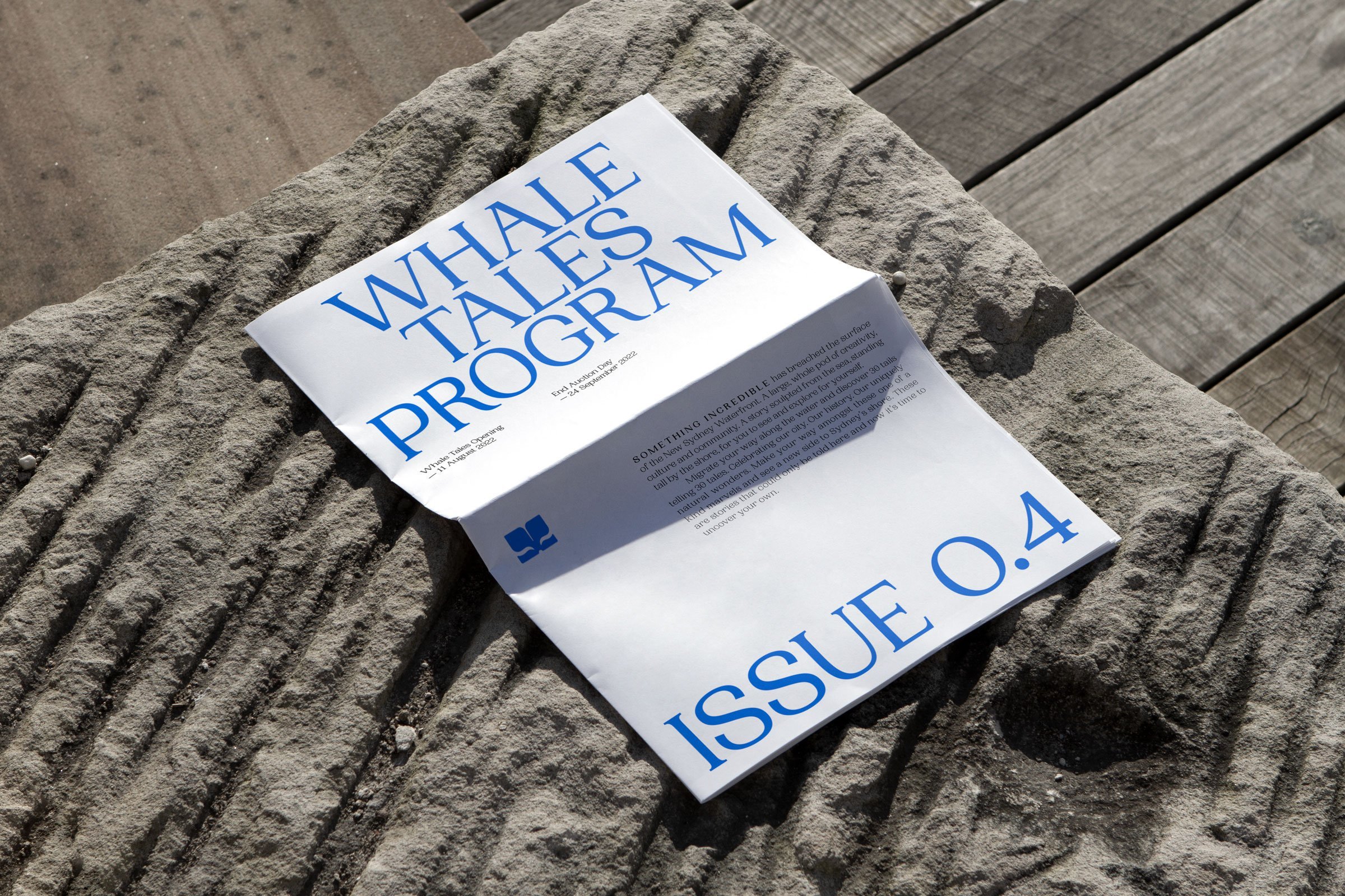
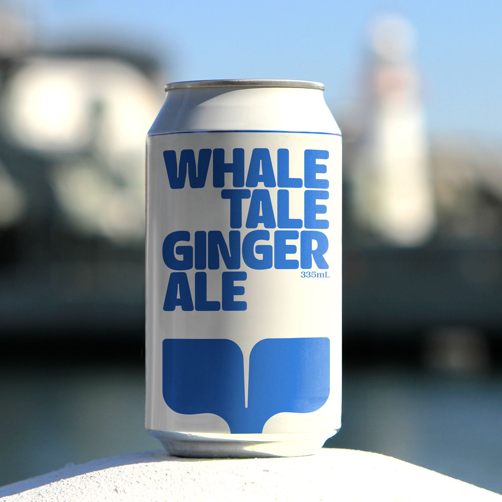
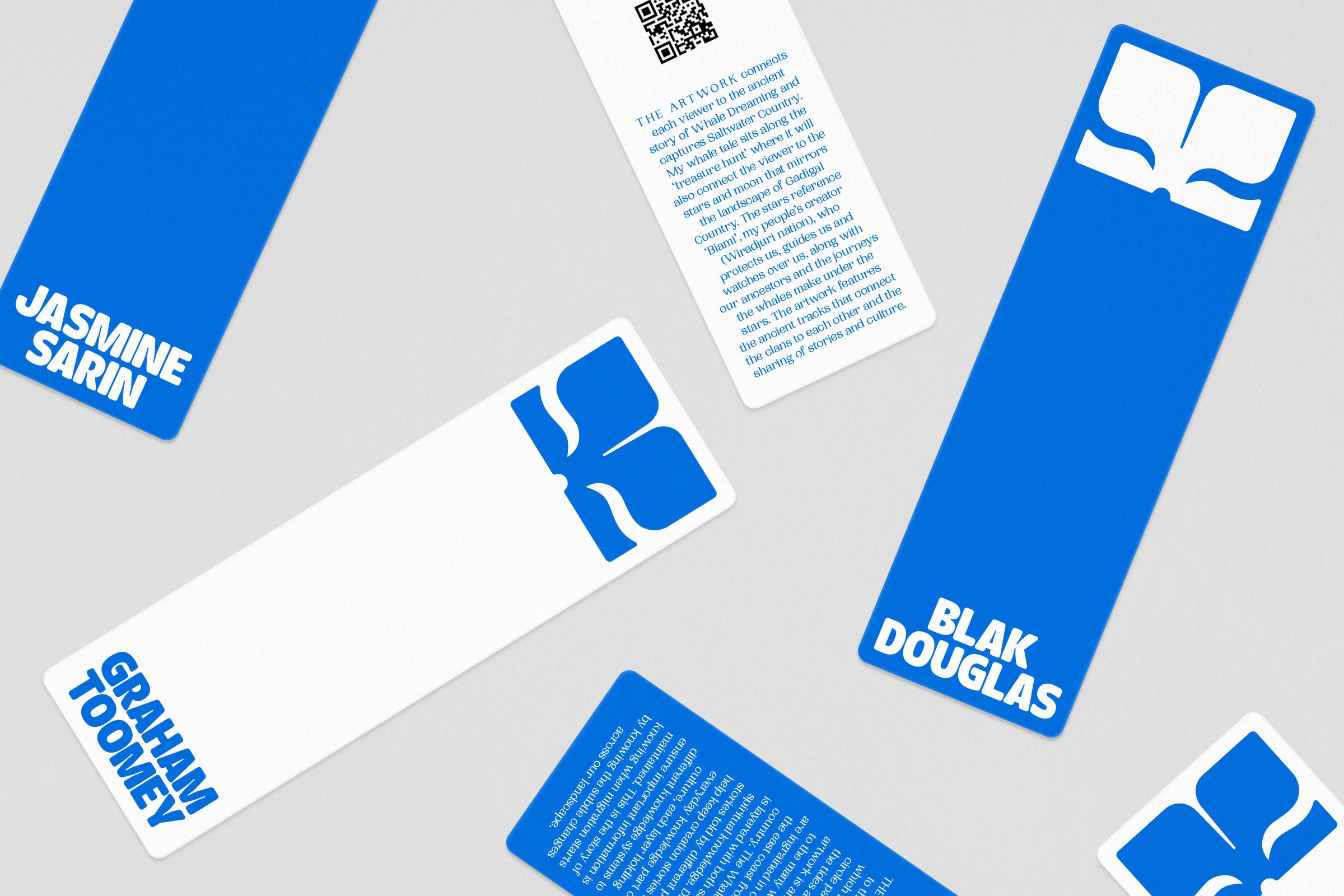
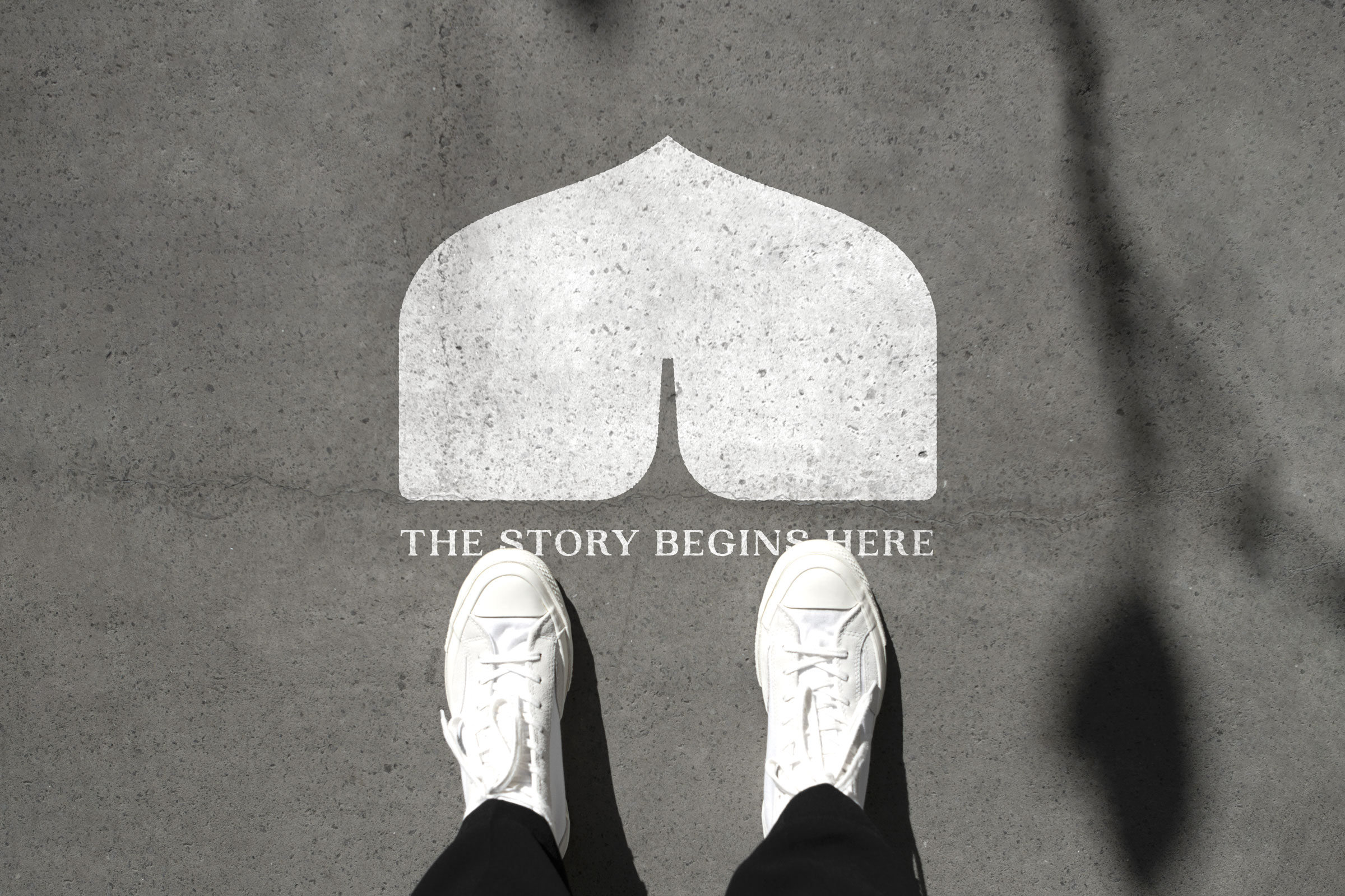
The logo itself is formed of a whale’s tail emerging from an open book, accompanied by curvy serif: PP Woodland. The symbol is perfectly symmetrical, with rounded corners to develop a friendly tone. Its versatility can be seen across print and online, where the device is cropped from different angles to expand the brand’s suite of graphic assets. The unusual shapes that are created allow for easy recognition even when colours and type are removed.
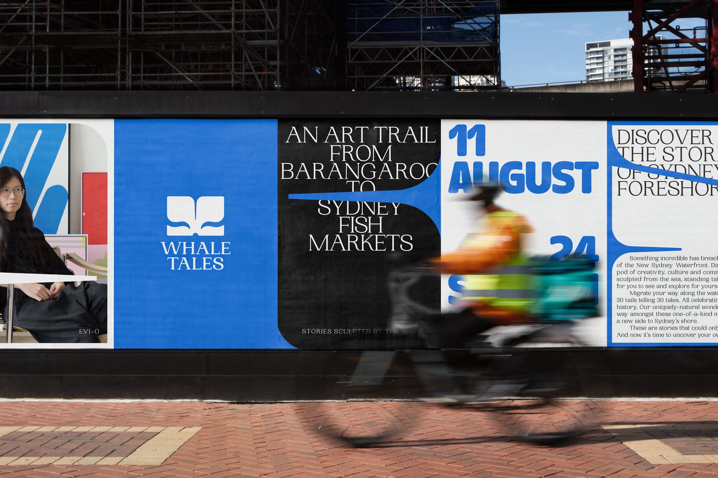
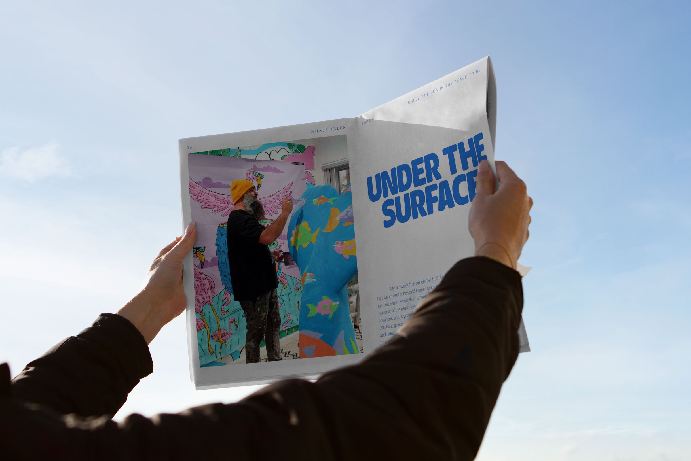
While the resulting identity feels open and clean, it doesn’t shy from two contrasting but important attributes – heritage and playfulness. While PP Woodland has a wholesome, reassuring 70s character, building a sense of belonging, the serif is accompanied by a soft rounded sans from Type Everything, appropriately named Doughy. Doughy can be seen in call-outs and playful activations for children, injecting fun and light humour. It has a close relationship with the logo, providing bloated forms and wavy corners that are reminiscent of fish fins and whale tails.

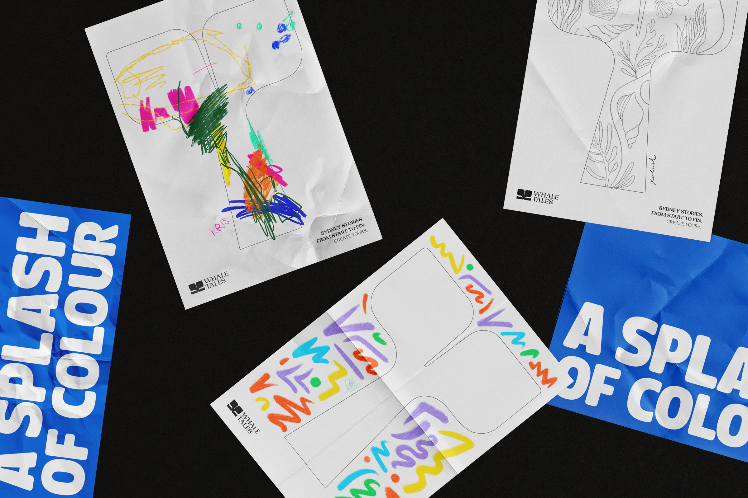
Ultimately Interbrand’s work for Whale Tales is refined yet lively, reflecting the ideas of both storytelling and whales. It supports the initiative with a coherent and friendly brand that invites audiences to experience the event – and yet, the simplicity of the scheme allows for the activation to shine through and tell its own tale.
