Fergus by Principal Studio
Opinion by Kinda Savarino Posted 15 August 2023
Organic food brands often land in the same visual territory as many vegan and eco-conscious counterparts – but when did the pursuit of consumer trust become so entwined with muted colour palettes, illustrated veg and rustic textures? There’s nothing inherently problematic with this combination of design elements, yet it has become a tired and overused formula for brands operating in the space.
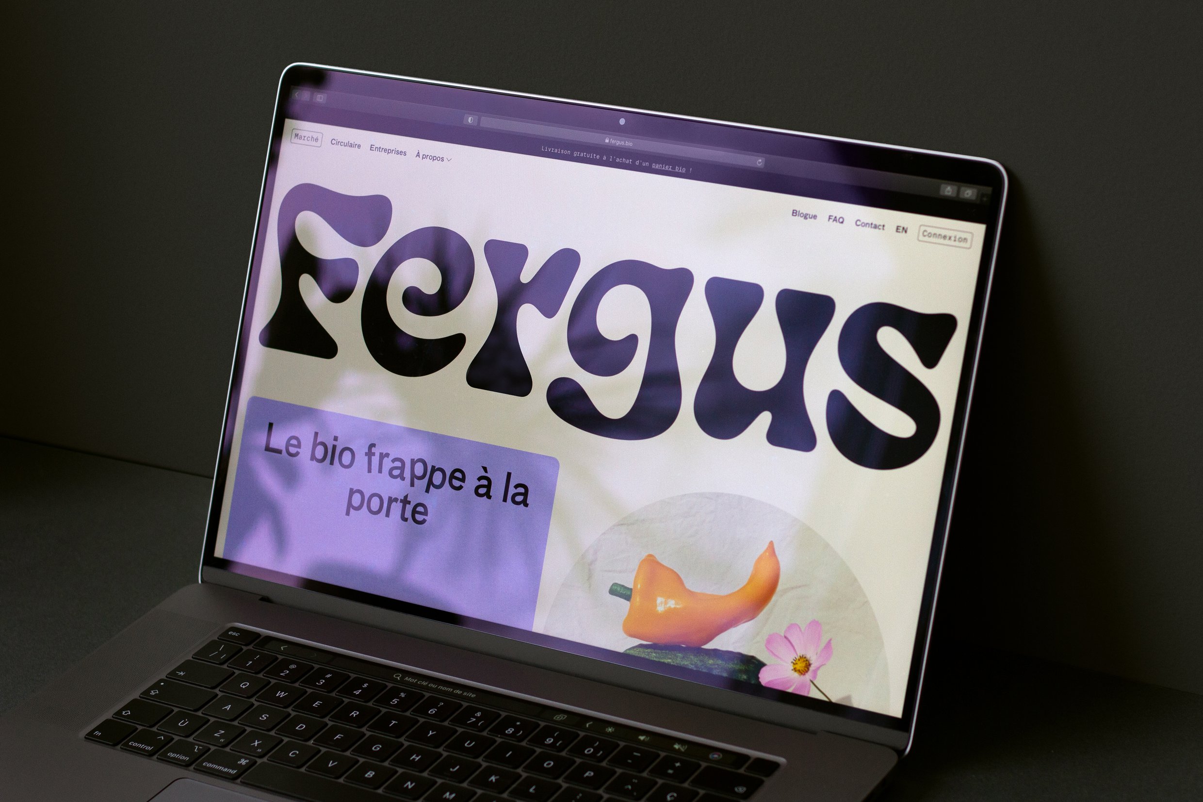
Enter Fergus, an online grocery and organic farm based in Laval, Québec, a region renowned for its fertile soils. Born from the merger of two family-owned agricultural cooperatives, Jardins de la Montagne and Jardin des Anges, Fergus has undergone an extensive brand transformation thanks to Principal Studio. The very name, endearingly inspired by one of the farm’s tractors, is a strong signifier that this brand is going to defiantly buck the trends.
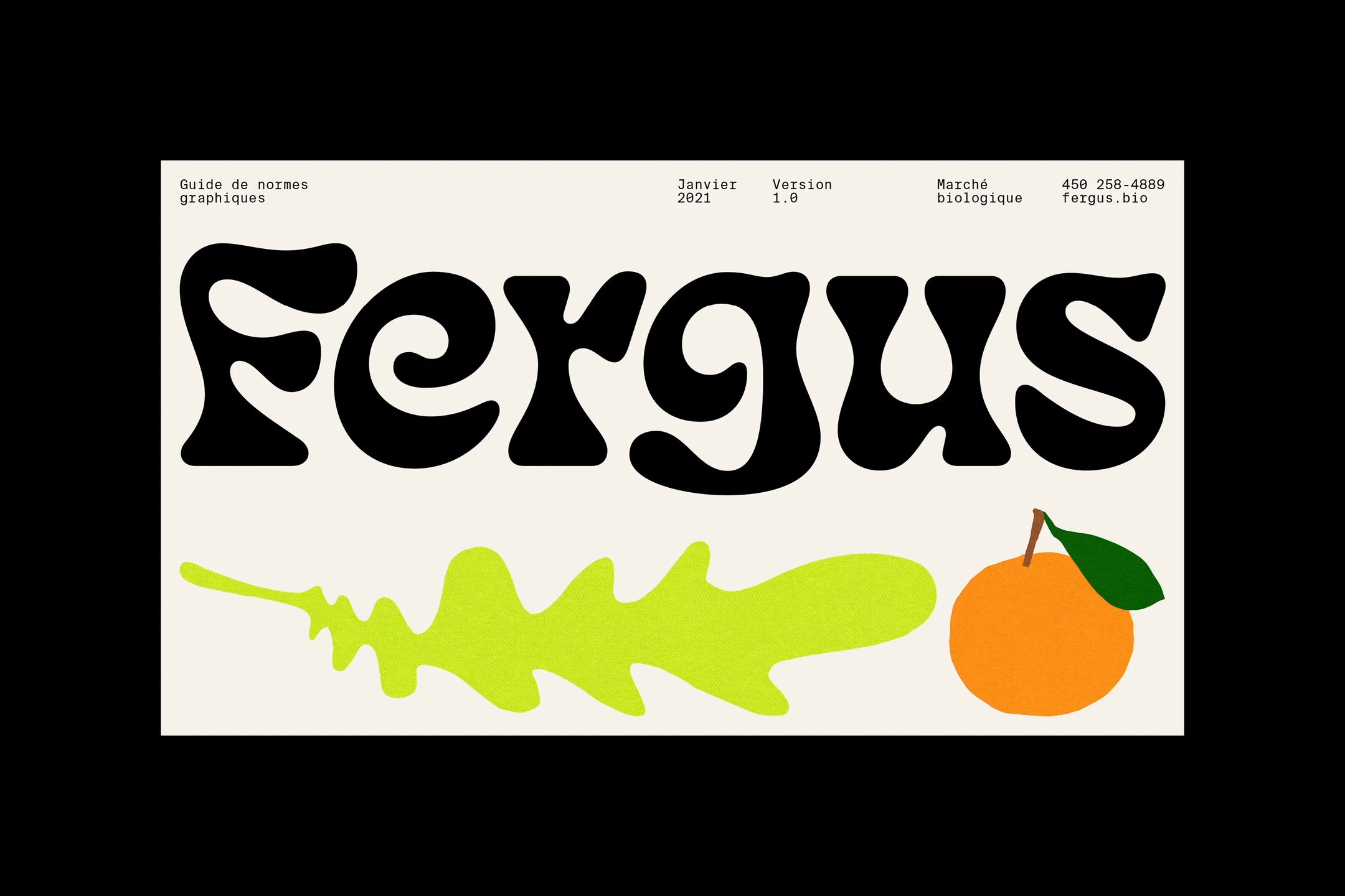
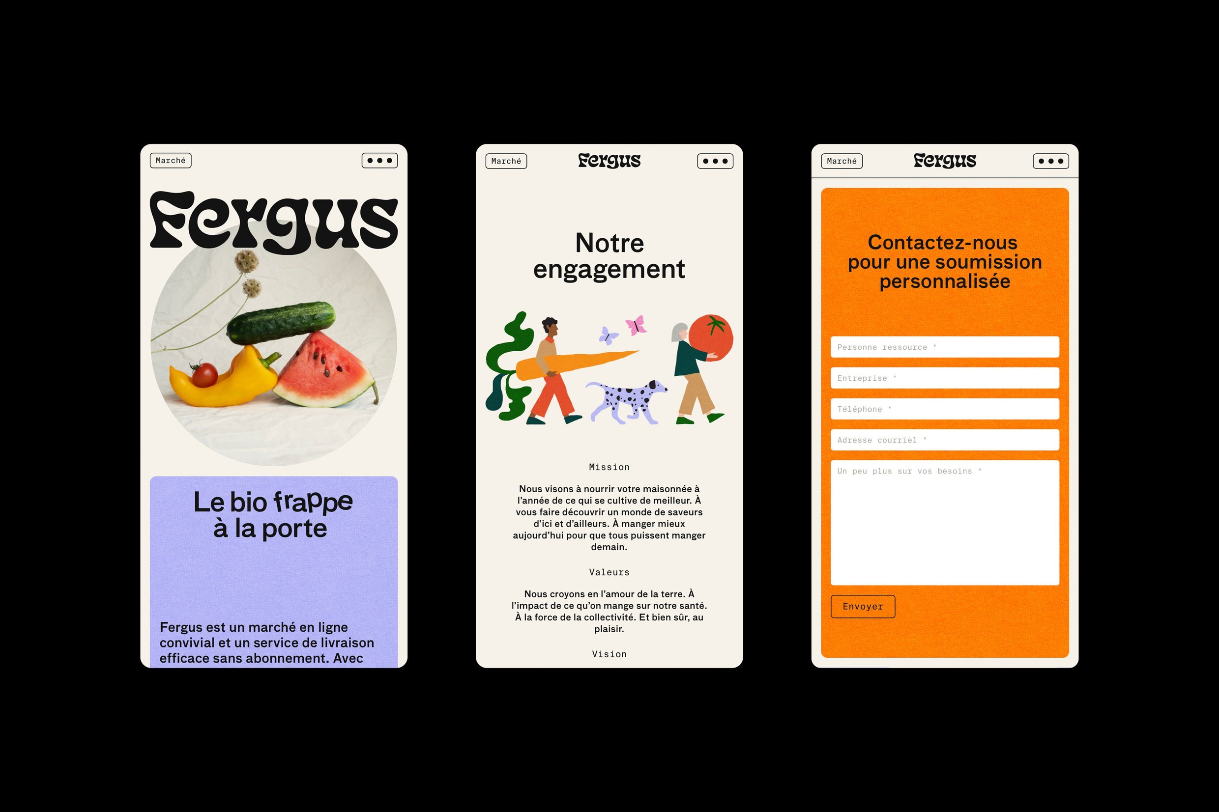
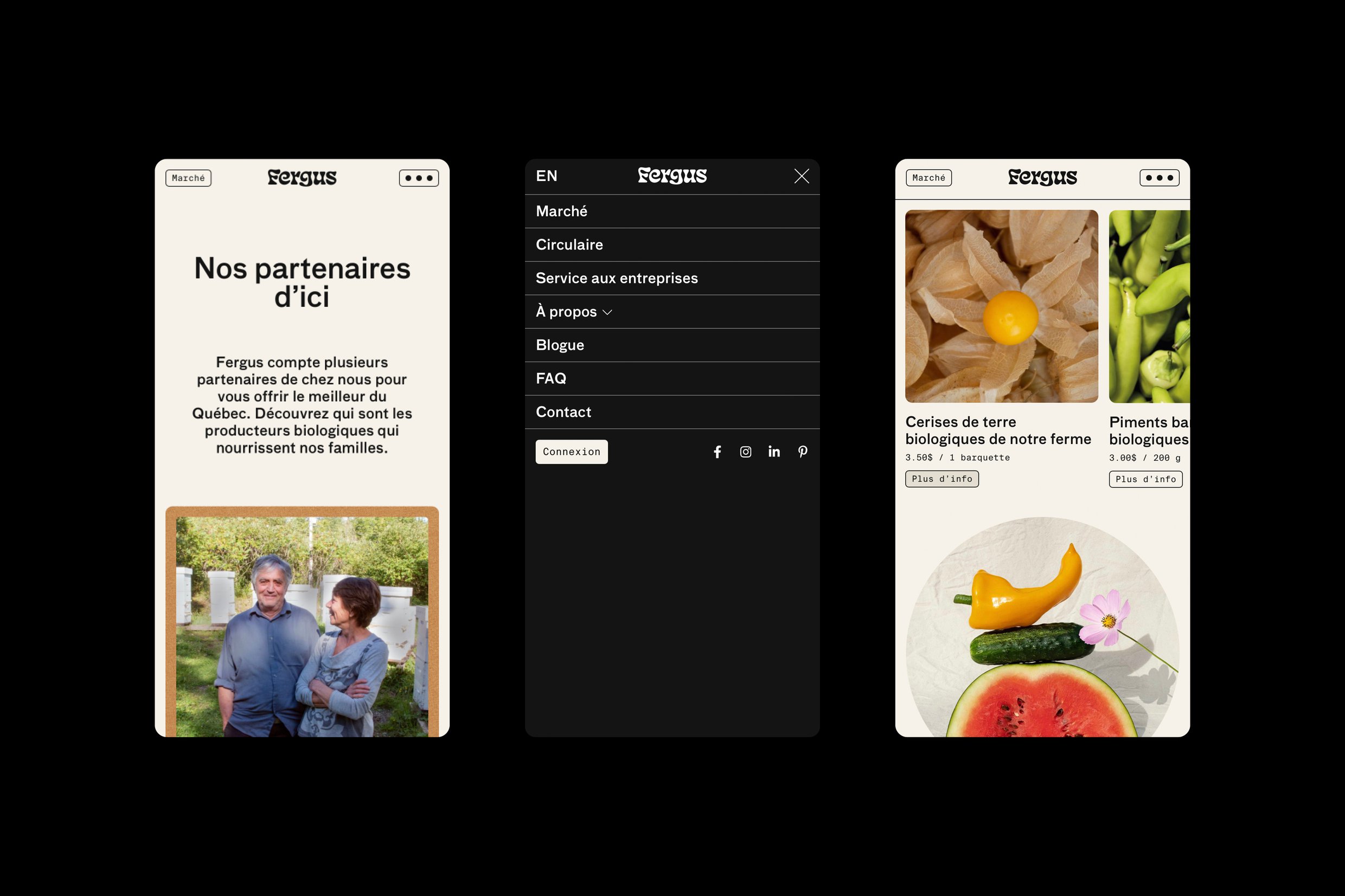
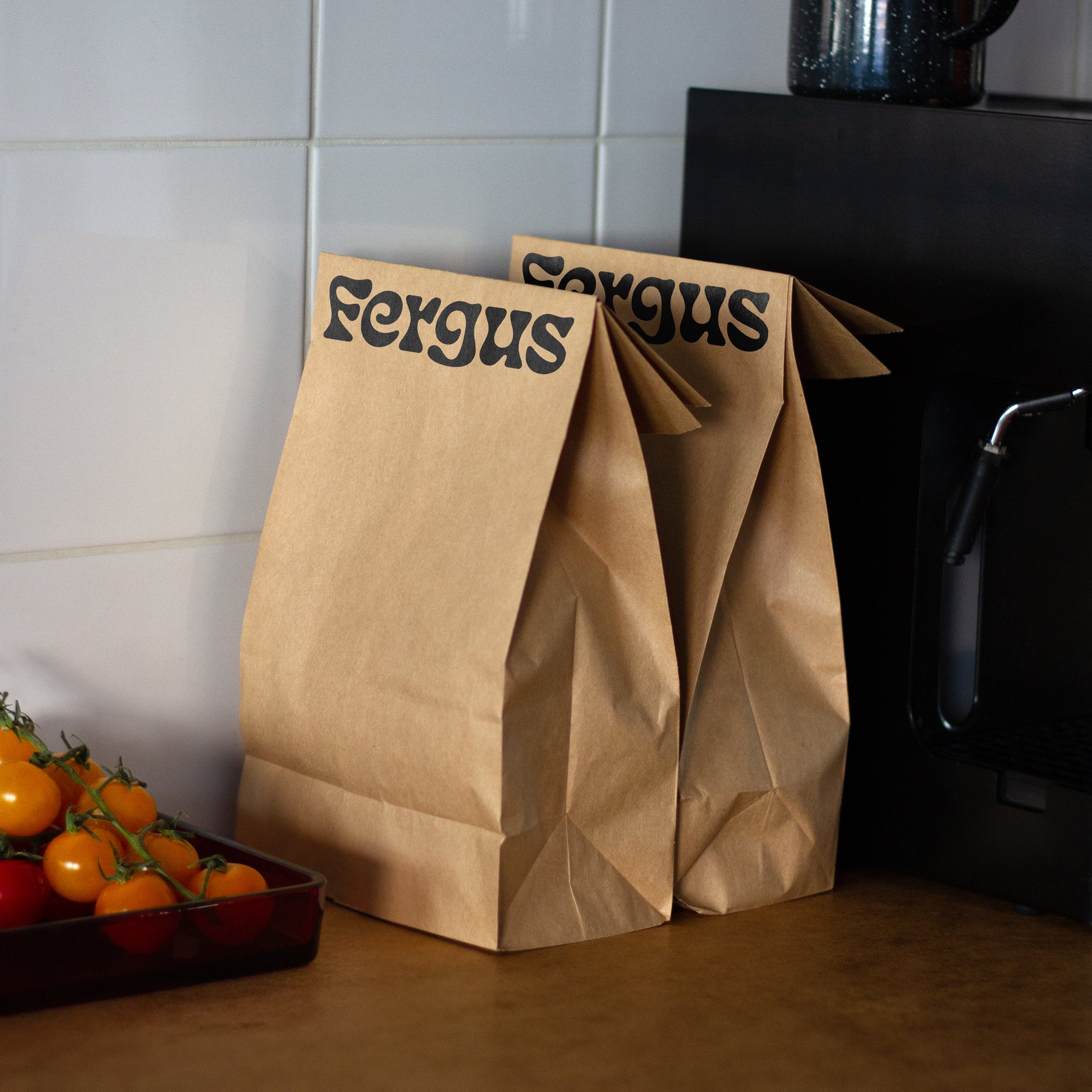
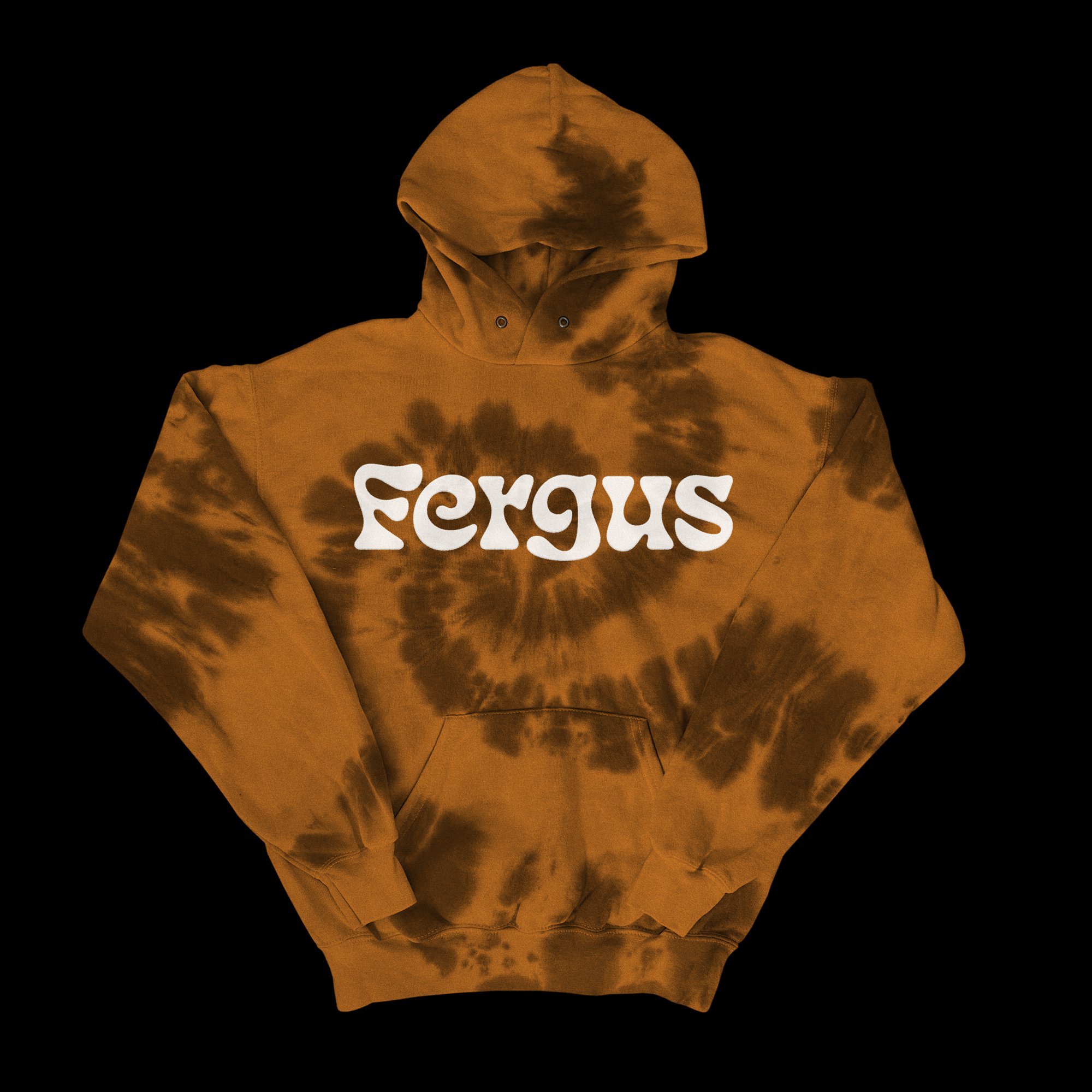
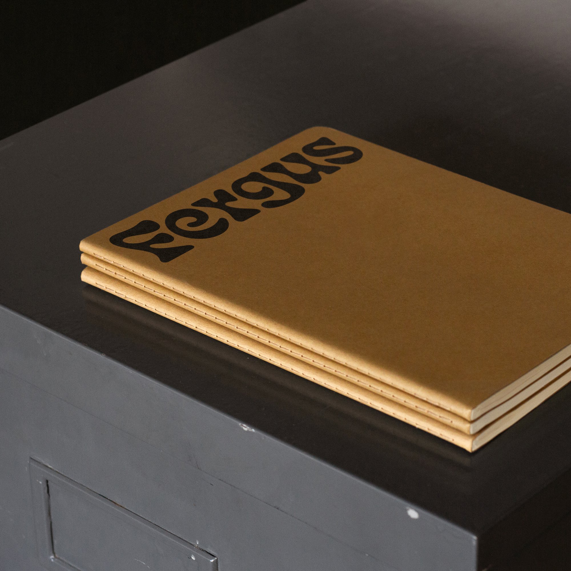
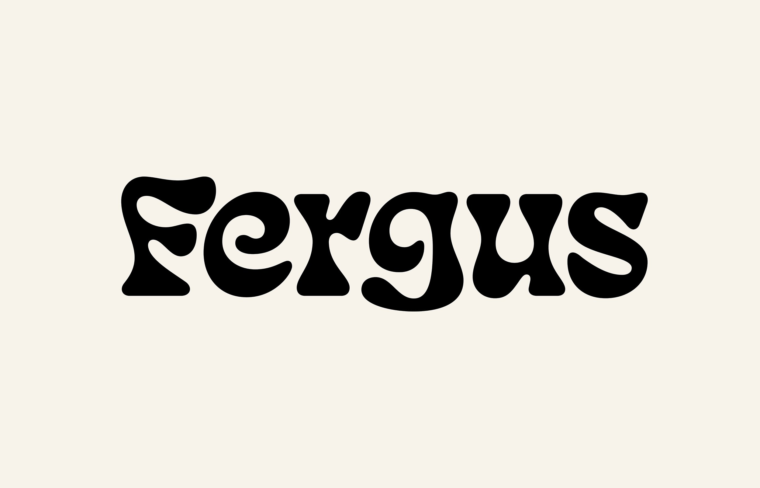
The wordmark itself appears soft, friendly, and even slightly psychedelic at the same time. Principal Studio used a slightly modified version of typeface Eckmannpsych, and while ‘psychedelic’ might seem an unlikely word to describe the branding of an organic online grocery service, it oddly fits. Eckmannpsych’s letterforms boast beautiful curves that mirror the imperfect growth of organic vegetables and, in the words of the Montreal-based studio, capture the ‘magic of agriculture’.
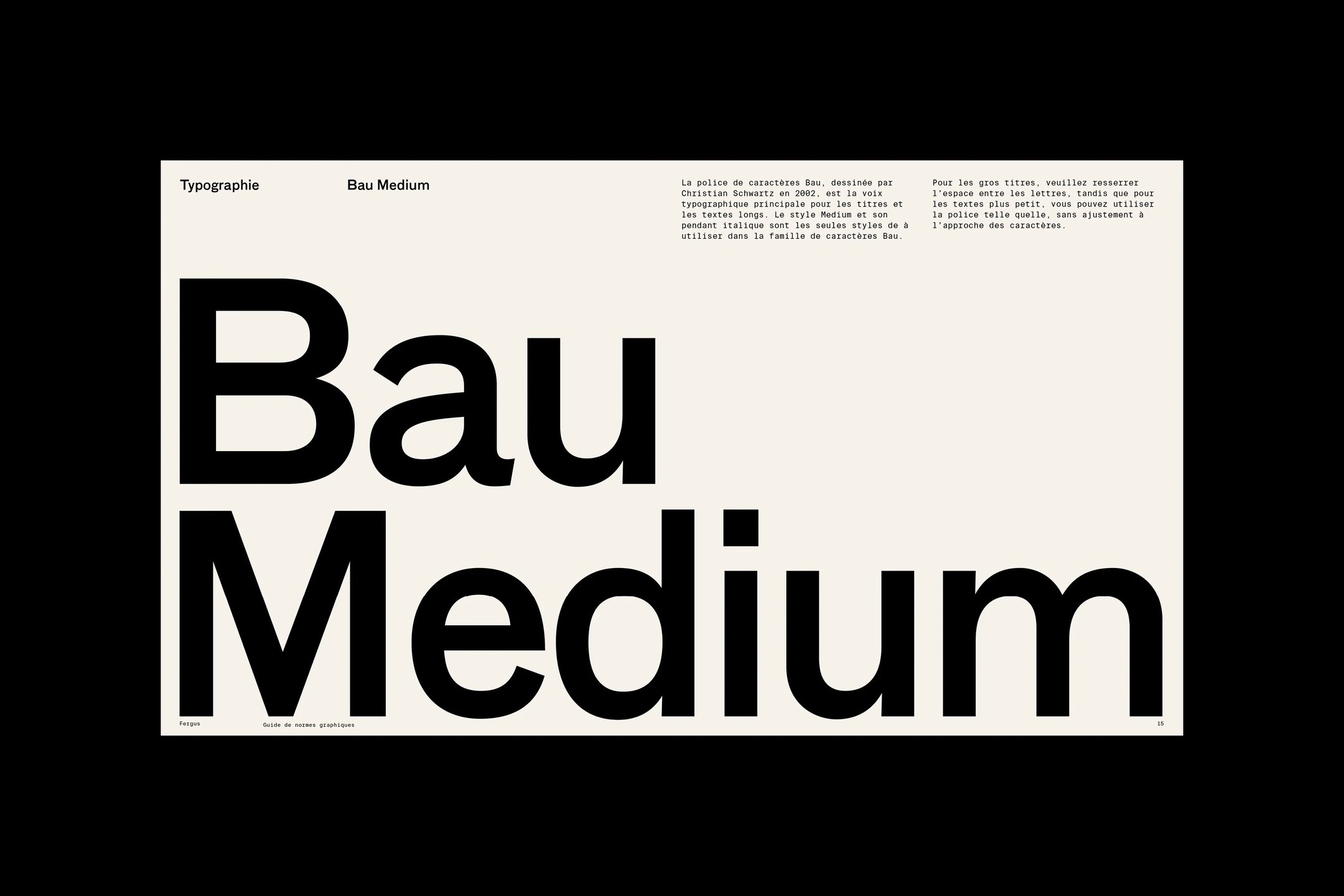
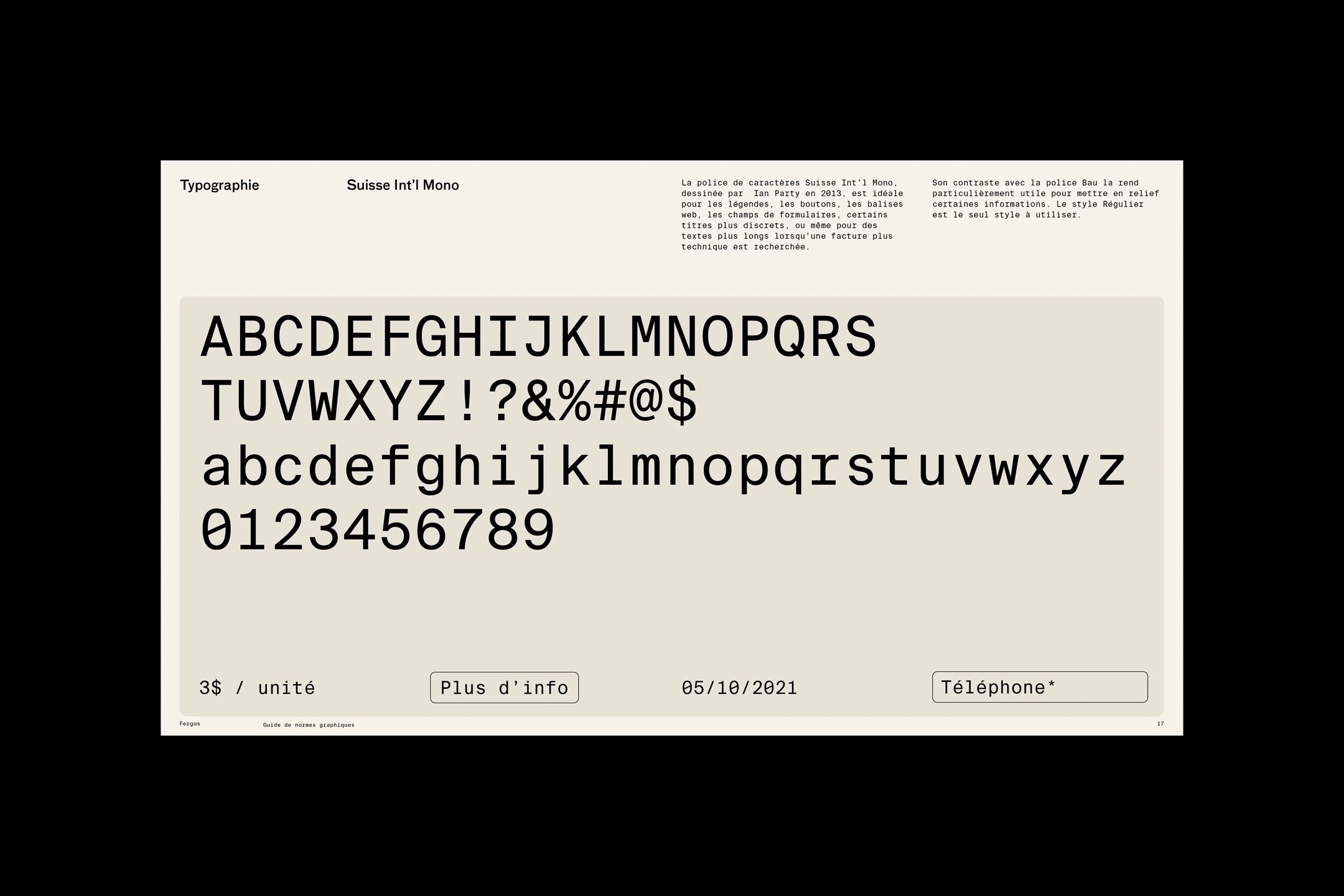
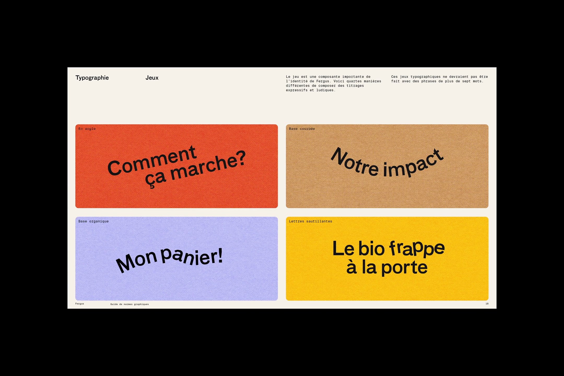
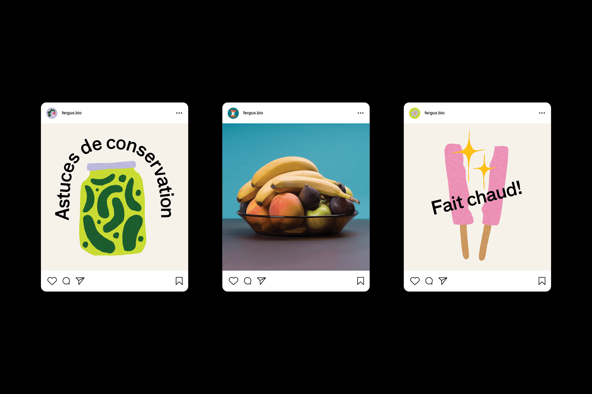
Two other typefaces – FF Bau and Suisse Int’l Mono – are used for both headers and body copy. Fergus’ playful nature becomes most noticeable in the way headers are typeset across social media and posters. Jaunty type disrupts clean layouts and letters perch on varying baselines. This typographical choice breaks away from the usual feel of farm-fresh and eco-conscious brands in this space.
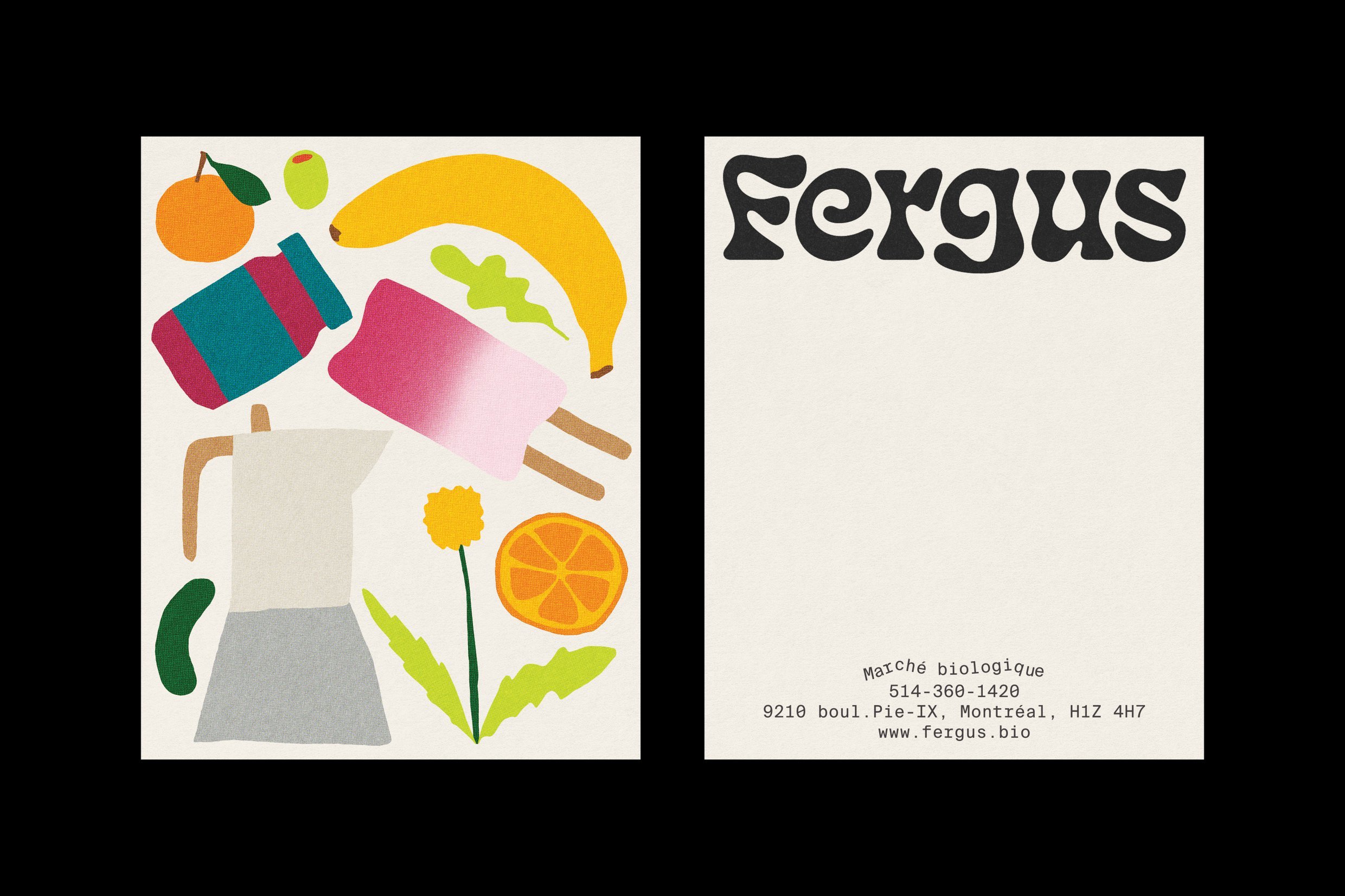
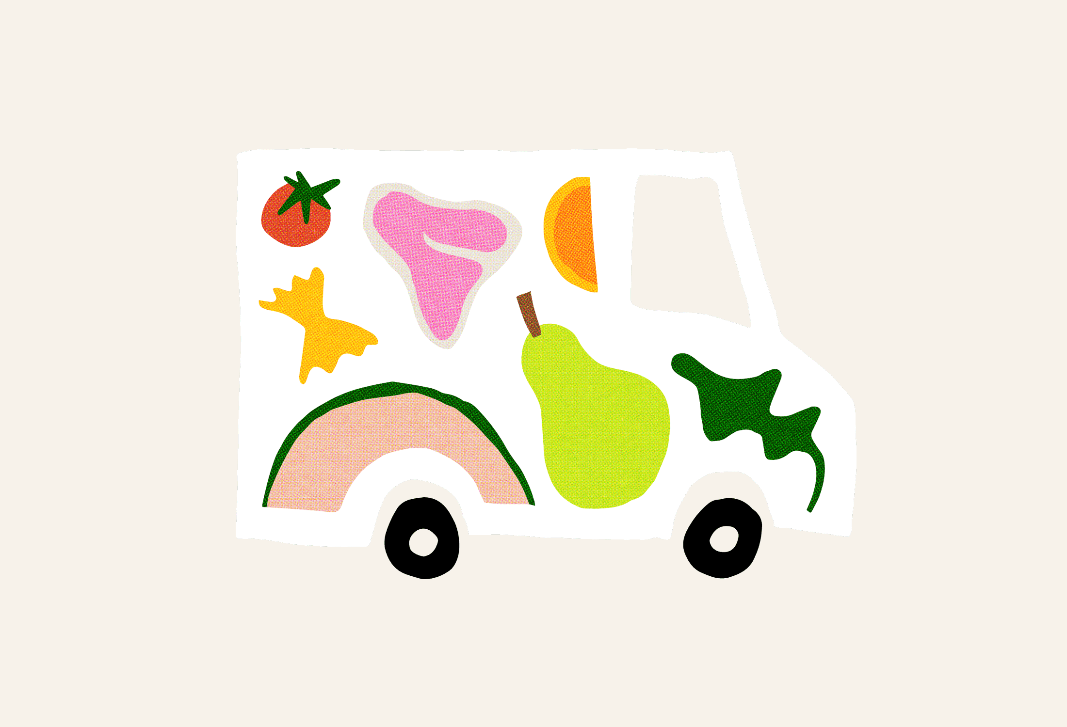
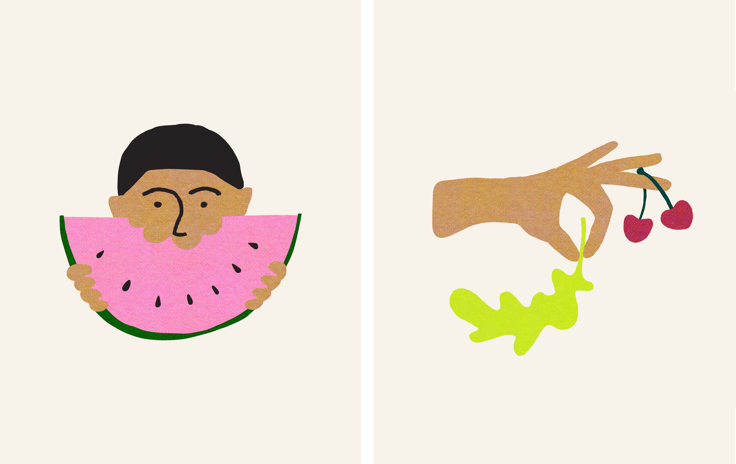
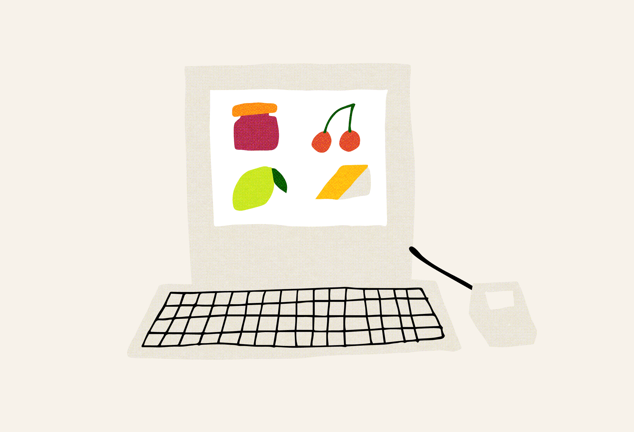
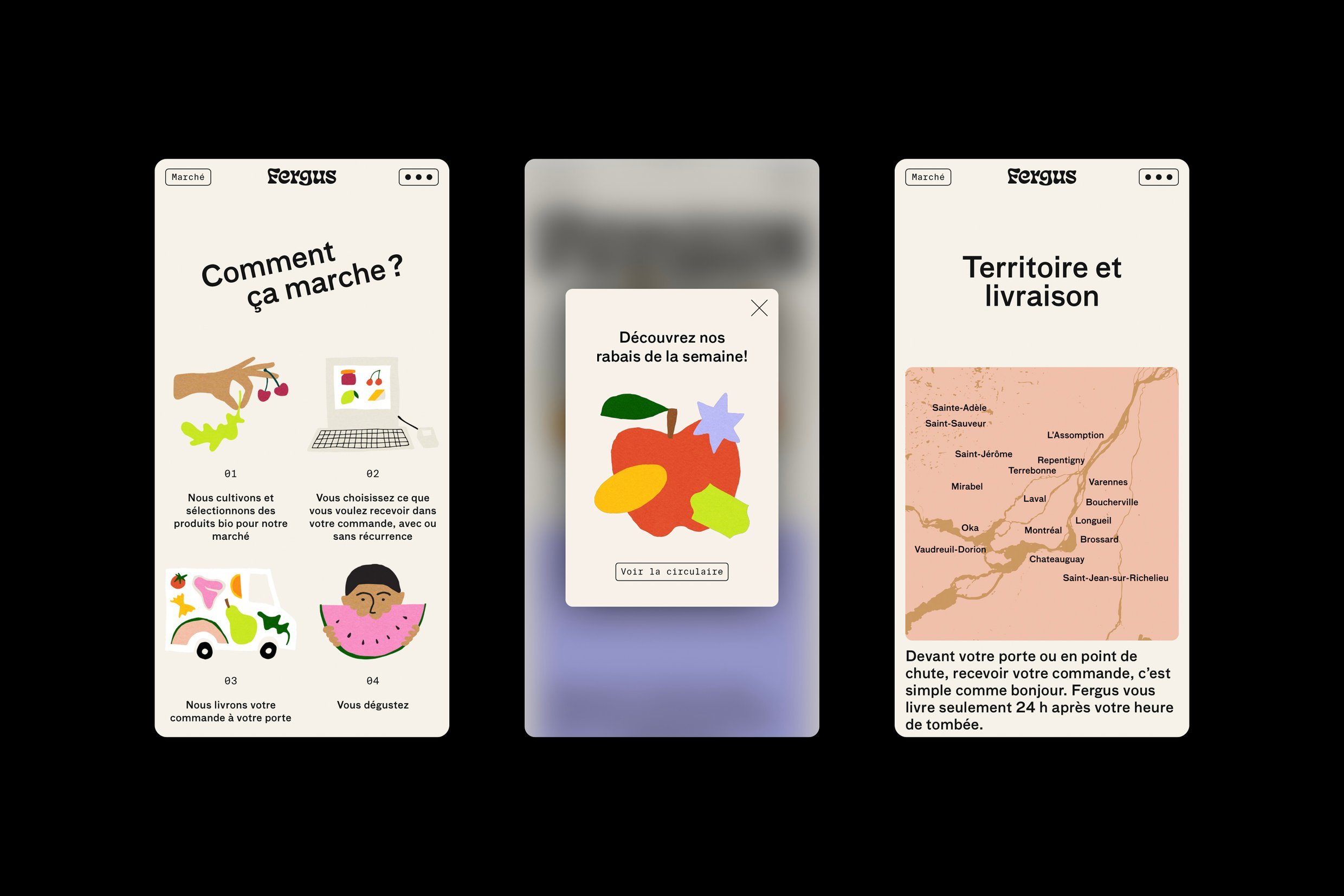
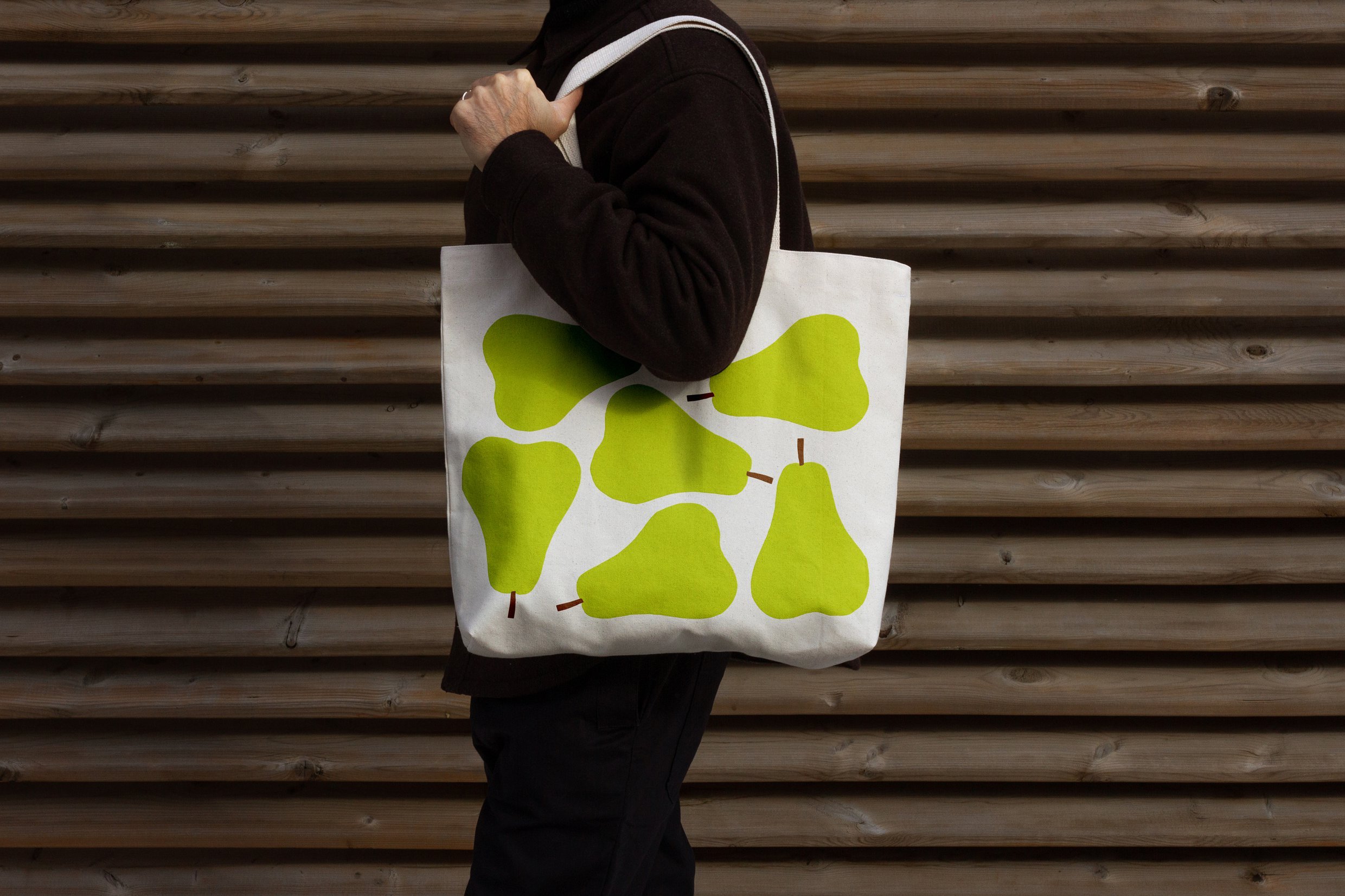
Amid the psychedelic logo and animated typography, Fergus also boasts proudly simple, boldly colourful illustrations. These are used in joyful compositions and patterns across Fergus’ digital platforms, website and tote bags. The illustrations depict fresh produce in a kaleidoscope of hues, drawing from the eighteen colours specified in the brand’s palette. This spectrum encompasses everything from deep forest green to vibrant raspberry red to warm gingerbread. The choice to lean heavily on graphic elements gives Fergus further ability to stand out among competitors, who usually rely on natural imagery and photography.
Principal Studio has injected some much-needed zest into the realm of organic food brands. Fergus, with its human name and curved type, feels more like a friend than a delivery service. This is exactly what is needed from a design perspective when crafting an identity for an organic grocery service rooted in the principles of community and locally cultivated produce that is hand-picked with love.
