Florentia Village by DNCO
Opinion by Thomas Barnett Posted 17 August 2023
On first hearing, ‘Florentia Village’ is a ridiculous name for a warehouse complex in South Tottenham, as if Hyacinth Bouquet had somehow risen from the grave and gained a seat on the borough council in order to render floridly Italianate a grimy chunk of East London. However, the name does in fact arise from an organic nomenclatural etymology: indicating ‘flourishing’ or ‘prosperous’, but also perhaps deriving from the flowery patterns of textiles manufactured on the site.
Florentia Clothing Village was originally established as a textile manufacturing centre in the 1970s. Located within Haringey Warehouse District in South Tottenham, it comprises 90,000 sq ft of warehousing and factory space, 42 loft apartments and 1.5 acres of ‘vacant space’. It has now been acquired by developer General Projects, with the stated intention of creating ‘one of London’s biggest creative maker hubs – a community resource where independent manufacturing and design businesses are set to thrive’.
So far, so good. Unlike the mindless and much reviled plan by developer MajorLink to ‘redevelop’ (aka ‘demolish, evict and turn into luxury flats’) the neighbouring Omega Works warehouse complex, the developers behind Florentia Village seem truly committed to the welfare of the creatives and small businesses that define the area. General Projects state that ‘our vision is to redefine and reinvigorate this characterful site through careful refurbishment and the addition of 100,000 sq ft of new, purpose-built, best-in-class maker facilities – doubling the size of the campus, and bringing together a community of over 150 like-minded creatives to Haringey’. They add that ‘we will set a programme of meaningful benefits in place for new and existing occupiers, as well as our neighbours – providing them with all the support and resources they need in every step of their business journey.’

DNCO has handled the branding of this extensive and ambitious revitalisation project, and has devised a brand that is full of energy and vigour, celebrating the site’s industrial heritage. DNCO state that they set out to create ‘a brand that makes your fingers itch to assemble its pieces’, and in many ways they have succeeded.
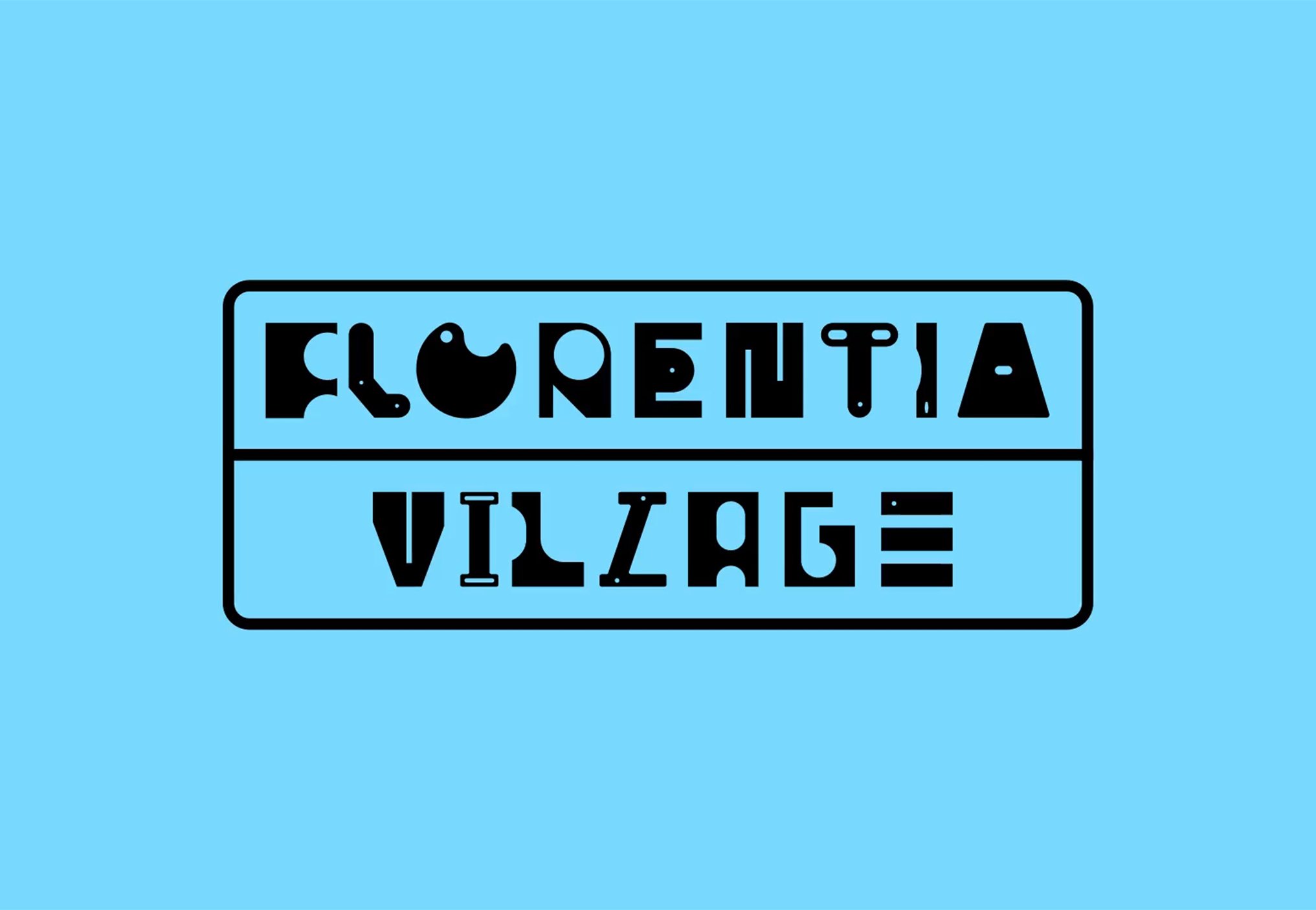
The foremost element of the brand is a fabulous ‘found-object’ inspired display typeface, with letterforms rendered as a graphic Mecano-kit of nuts, bolts, spanners, brackets and other ambiguous industrial ephemera, all simplified to pleasingly irregular geometric forms. While this is a strong homage to a broader manufacturing legacy, the letterforms aren’t particularly evocative of the specific textile manufacturing history of the site. Instead, they emphasise Florentia’s progressive expansion ‘into the wider creative spheres of food, consumer products, film, theatre, music, design and photography.’ Perhaps the point is that this library of appealing forms (and there are a truly impressive array of alternate character designs for each letter) points open-endedly to future creativity, rather than any particular moment in Florentia’s past.

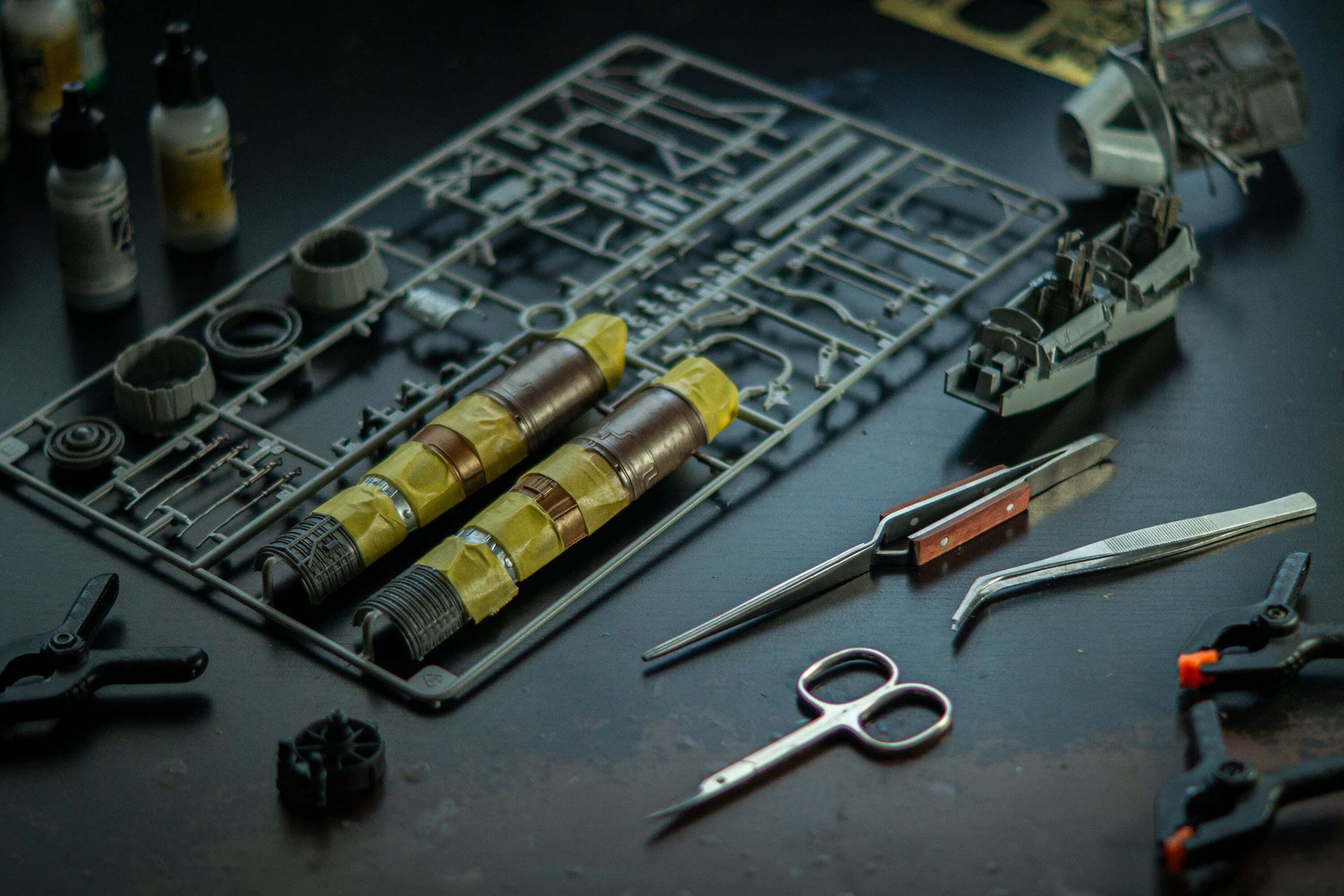
The found-typographic elements are held together by a clever framework inspired by punch-out kits (think Air-fix models). These kits have an inherent appeal to creatives: both reminiscent of early childhood creativity, and possessed of an innate, iconic graphic quality – a neatly spaced tessellation of miniature and multifarious forms, held in place by elegantly spindly plastic threads.
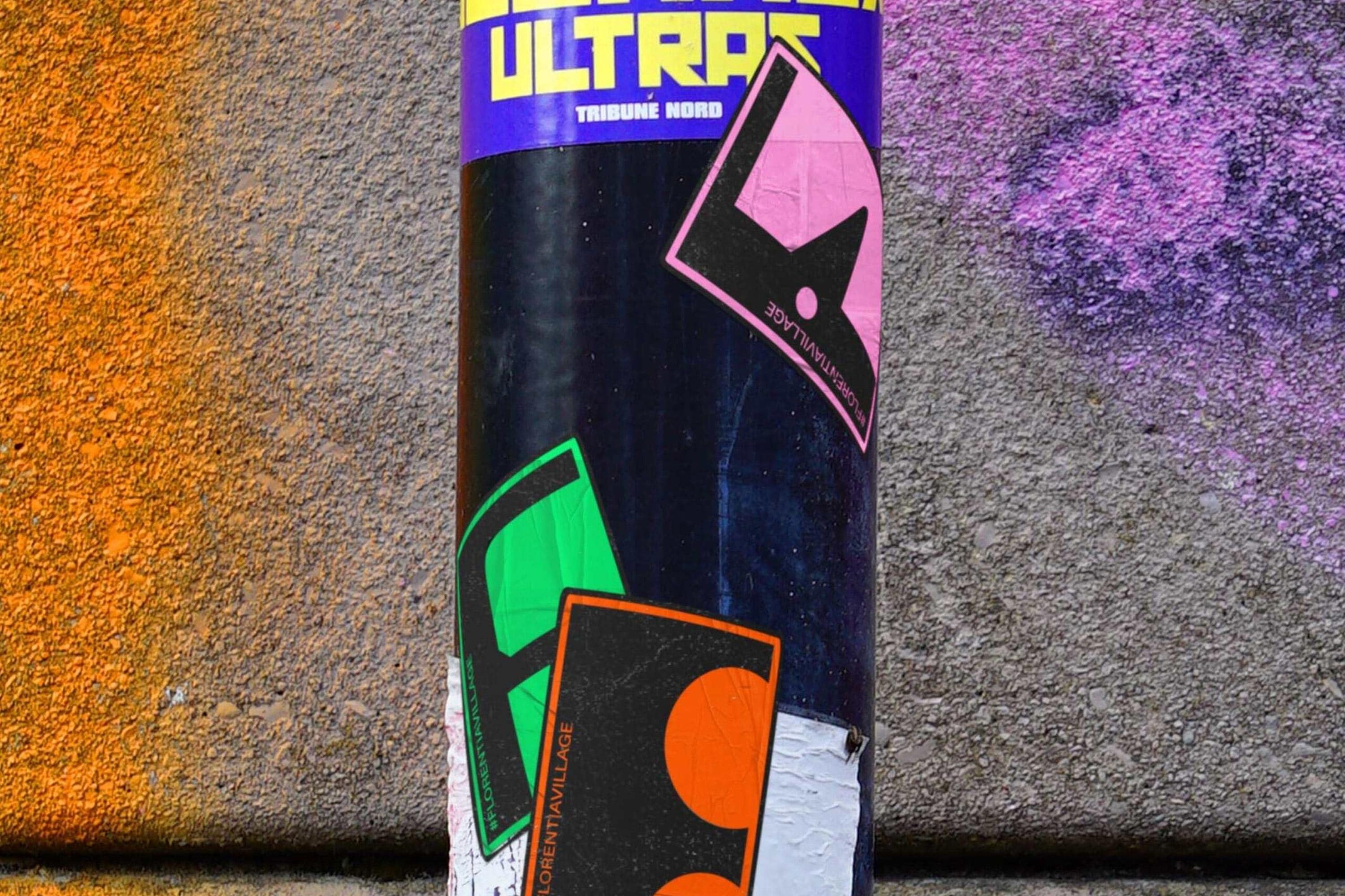
These graphic qualities are given freest range in the glorious murals that DNCO has created for Florentia’s walls. Elsewhere, the punch-out kit framework is simplified to a chunkier, round-cornered rectangular border around the logotype and other typographic elements. While losing some of the immediate visual connection, this makes the system truly versatile and one can easily imagine it flexing to accommodate a huge range of potential applications.
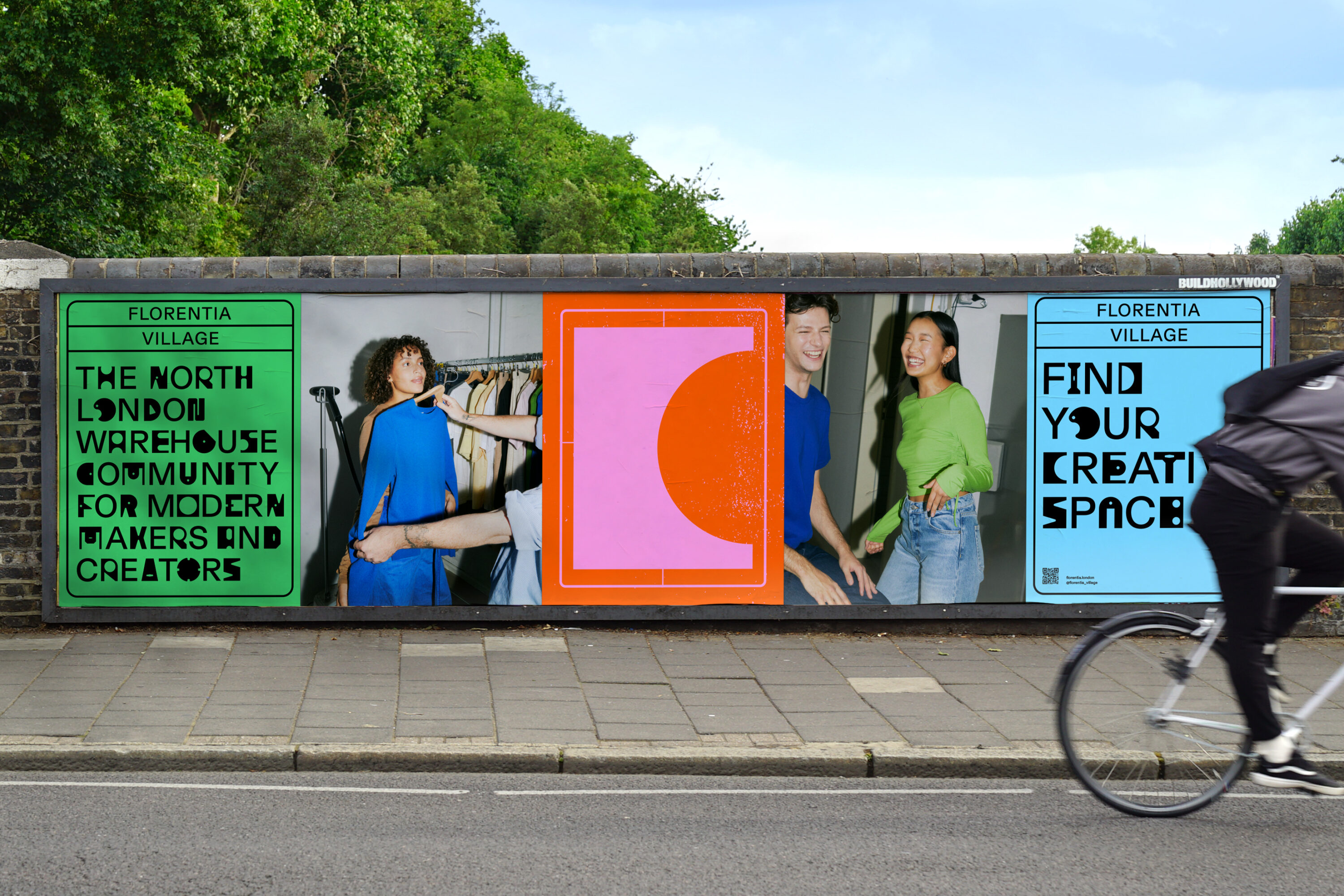
Out of the palette of neon bright colours, the tangerine orange is strongest. It captures the vitality of the design-led businesses of Florentia’s present, while connecting to the industrial heritage of the site. The accompanying neon green, turquoise and pink are more of a departure, taking the branding in a direction more redolent of a festival or nightclub. A clue to the rationale behind this lies in the final photo of DNCO’s case-study: a candid shot of deliberately shabby hipsters in sunglasses sipping craft ales from wobbly plastic pint glasses in front of one of Florentia Village’s hot pink walls – a scene so stereotypical of gentrified East London that it could have been generated by AI. It stands to reason that in the course of transforming Florentia Village into ‘a new benchmark for modern, design-led creator spaces’, General Projects probably also need a brand that will propel the site into this kind of generic, craft-ale lubricated millennial affluence.
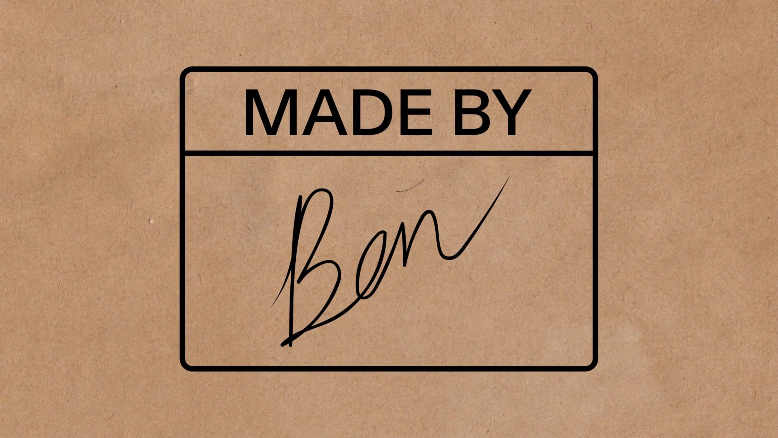
There is a moment of interesting contrast between these ‘poppy’ bright hues with a brown paper colour/texture that briefly appears in a showreel in DNCO’s case study. I would be curious to see the possibilities for combining this skeuomorphic colour and texture element (and perhaps there are others – corrugated steel, brickwork etc) with the more abstract graphic forms and bright colours.
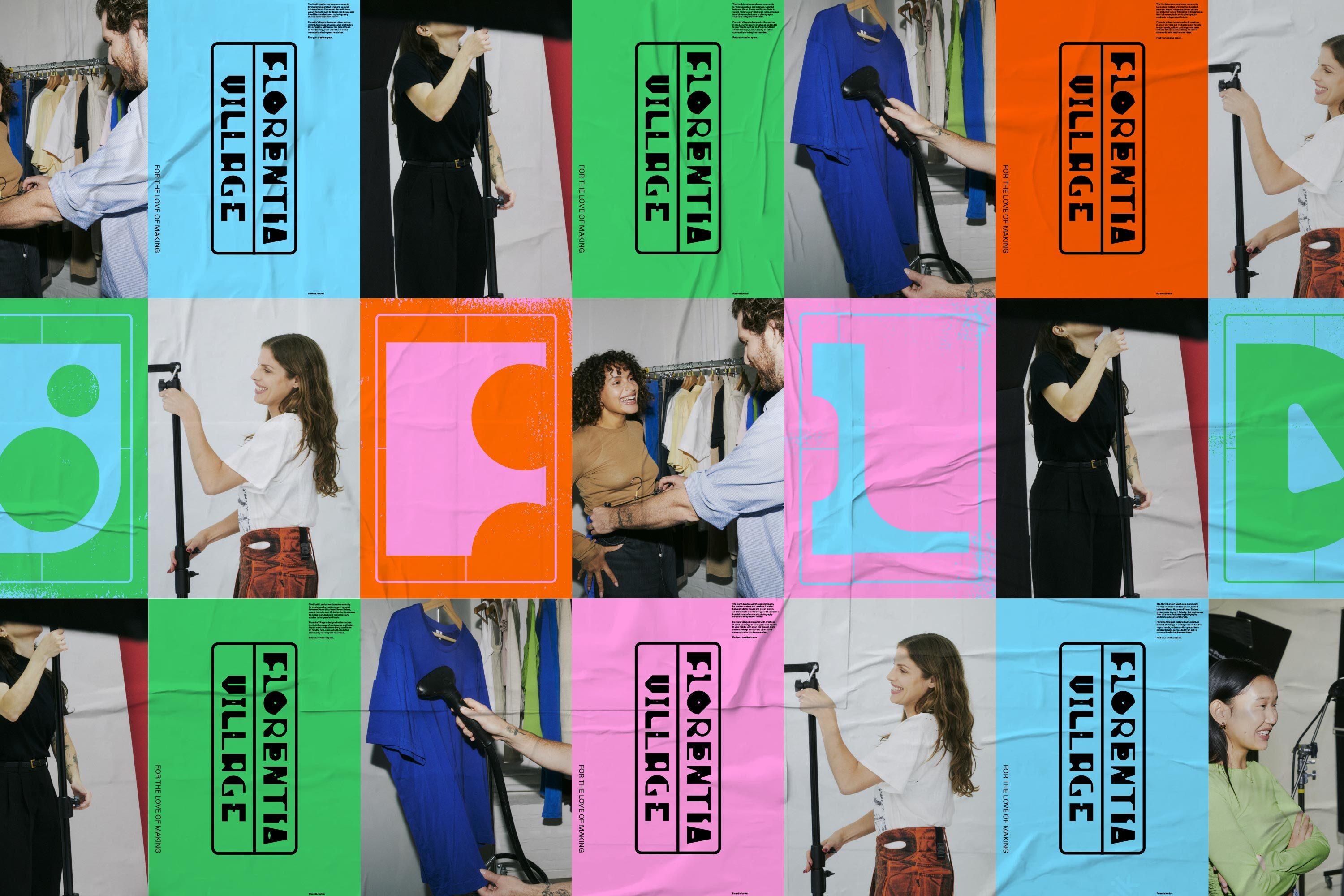
In another point of successful contrast between brand elements, the found typography and abstracted letterforms are complemented by high contrast direct-flash photography. The style suits, and from the few examples visible in the case study, the art direction also seems well thought out: capturing the sometimes unglamorous but interesting reality of these creative businesses (dresses being steam-cleaned, photoshoot backdrops being assembled), documenting the giddy excitement of fledgeling businesses. The photography provides a welcome dash of the reality of Florentia Village and its businesses, presented with pride but also with a loveable humility.
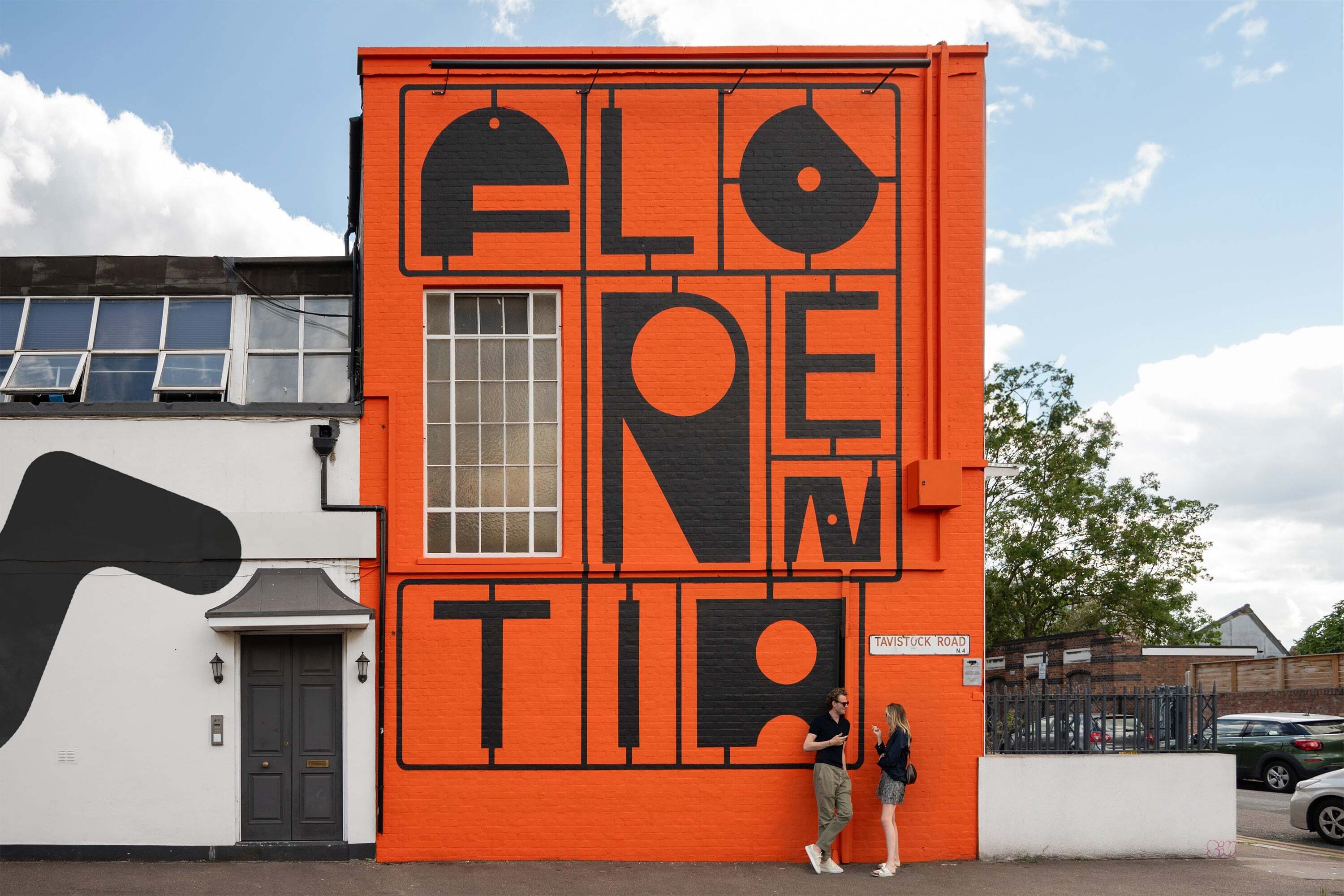
To come full circle and return to that curiously flowery name: one wonders whether a more specific sense of this charmingly eclectic architectural, etymological and industrial reality could have made it into the brand. Among the post-industrial fantasy of nuts, bolts and spanners, a little space could have been made for a needle and thread or two, as both a nod to the site’s true history, and as a way to marry that highfalutin name with the brash, industrial visuals. Like the ‘lo-fi community boards’ from which it borrows its ‘monotone textures’ and lurid neon palette, occasionally this brand seems to be merely papered over the top of Florentia Village. Perhaps this was the intention, to create a sort of synthetic unity between the disconnected architectural styles, multi-functional spaces and the constellation of business that comprise the site, but one struggles to shake the nagging feeling that this brand could be overlaid on pretty much any warehouse redevelopment in the country.
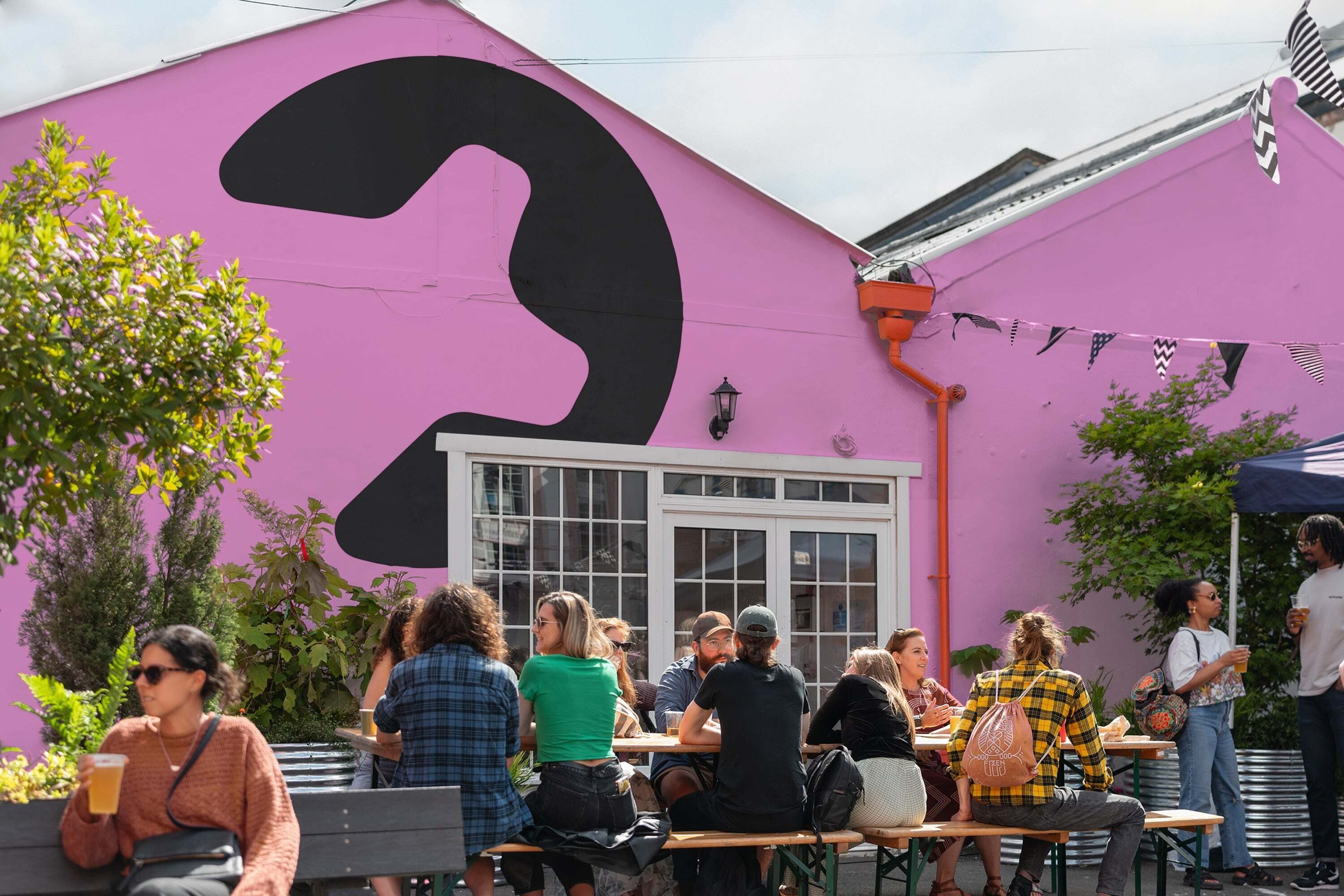
What the brand does capture in abundance, however, is a great feeling of energy and positivity. In this sense, the brand does capture that ‘flourishing’ etymology of Florentia. This sense of vigour is evident in the exhaustive library of alternate letterforms that the team at DNCO so obviously had a blast creating, in the photography, and in the delightfully squishy, kinetic grid system that grows and shrinks and morphs to fill any space and accommodate any content. The joy and energy of this brand bodes well for the makers of Florentia Village, and one hopes that it represents the developers’ intentions to preserve all that is good about Florentia Village as they redevelop it.
