Knahia by Requena Office
Opinion by Thomas Barnett Posted 16 February 2024

Estepona is a Spanish resort town on the Costa del Sol. It surveys the azure waves of the Mediterranean from the apex of a bight that traces a gentle South-Westerly arc from Marbella to Gibraltar. Strewn as it is on this notoriously idyllic coastline, Estepona largely conforms to the stereotypically cheerful charm of the Spanish resort town, pandering to the predictable pleasures preferred by the British abroad: golden sand, a scenic beachfront promenade, and blithely tautological Spanglish nomenclature (‘Playa Beach’).
The restaurant scene that is clustered along this promenade and around the harbour largely strives to meet, rather than to subvert, these expectations: wooden barrel tables and other such faux-rustic flim-flam are the uniform de rigueur for countless facades promising freshly caught local seafood, unctuous with the ubiquitous flavours of the Mediterranean.
However, amongst the harbourside homogeneity of Spanish restaurant culture simplified and hyperbolised for the incurious mind of the casual tourist stands a singular anomaly. Against the tame backdrop of white tablecloths, nautical motifs and beer-branded patio parasols, stands a conspicuously chic apparition, aflame in blood-red neon.
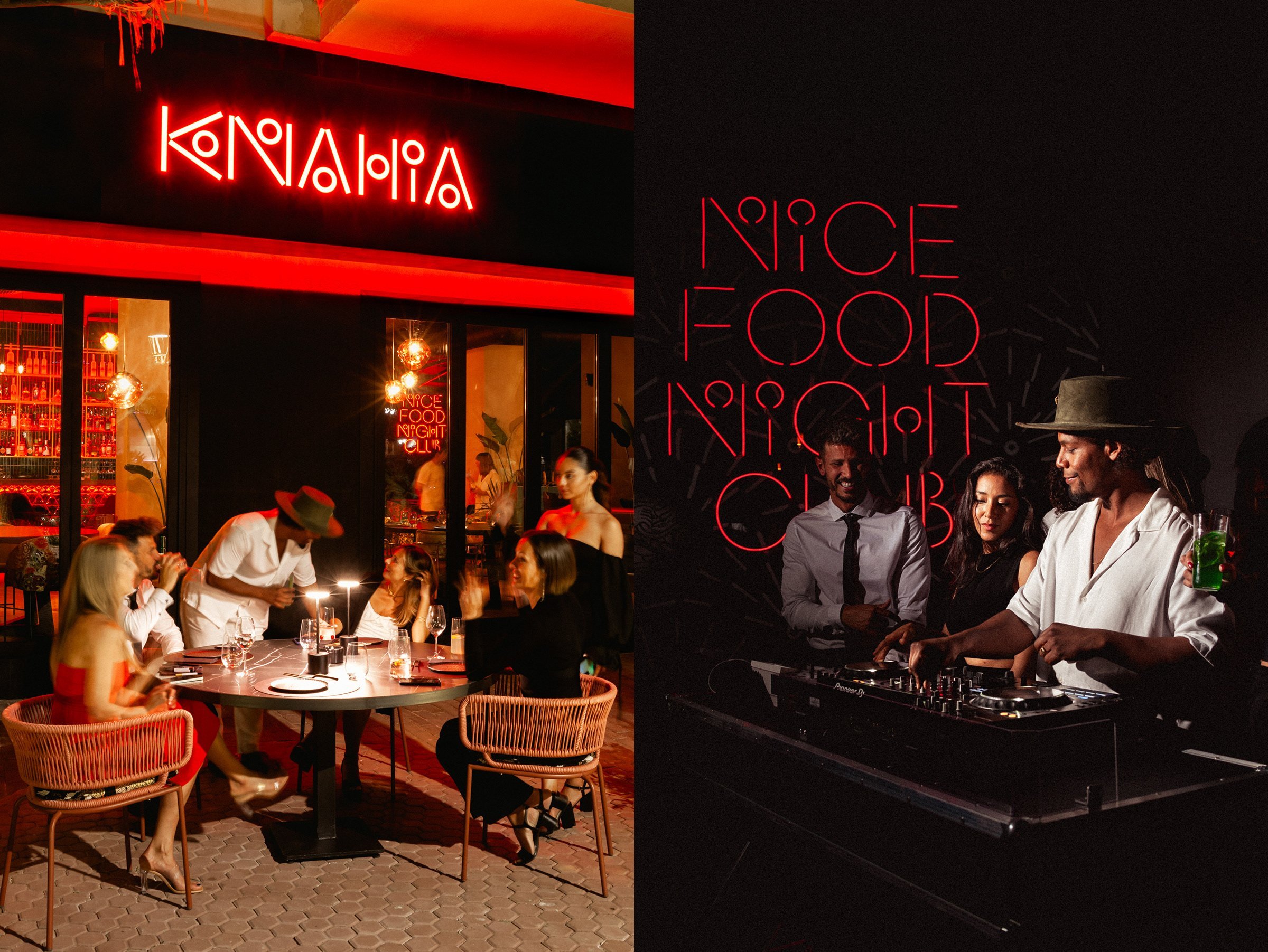

This scandalously sexy entity is Knahia, a hybrid sushi-restaurant-dance-club that promises a haven of good taste for the locals of Estepona (and perhaps its more sophisticated visitors). You would be perhaps forgiven if that incongruous hyphenate briefly conjured a queasy vision of sun-dazzled and sashimi-smeared ravers bellowing at each over pounding music in an atmosphere faintly perfumed with fishy breath. Thankfully, Knahia appears to be a significantly suaver affair, courtesy of a scintillating brand identity by Requena Office that is a seductive blend of serene Japanese minimalism and full-blooded Spanish vivacity. In the Barcelona-based design studio’s disarmingly straightforward copywriting, Knahia is simply a ‘nice food nightclub’. When you hear it put like that, you question why you’d dance anywhere else.
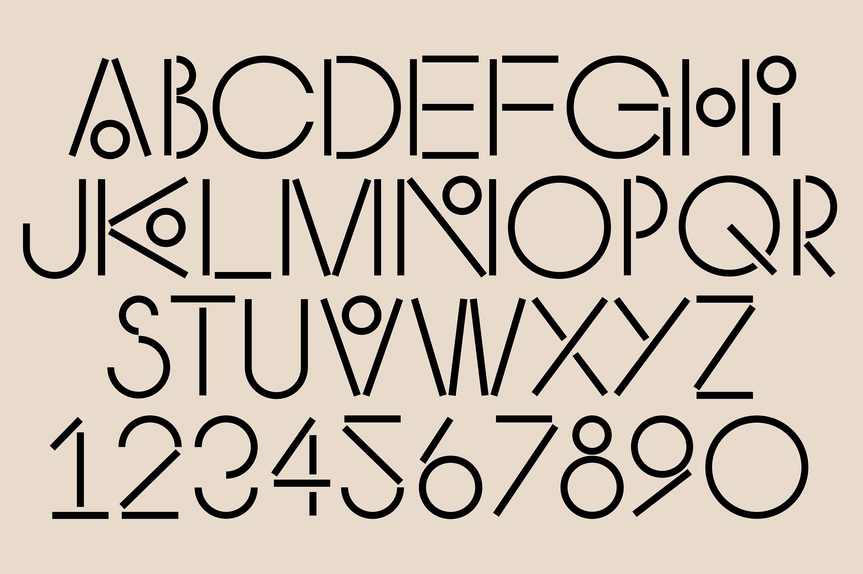
At the heart of this seductive visual identity is the conceptual fusion of Japanese and Spanish influences. The amalgamation of East and West is an idea somewhat stripped of its grand ambition by sheer force of repetition, yet Requena’s identity for Knahia manage to pull off a fresh take on this no-long-quite-as-radical-as-it-thinks concept by focusing exclusively on a brilliantly simple typographic vocabulary.
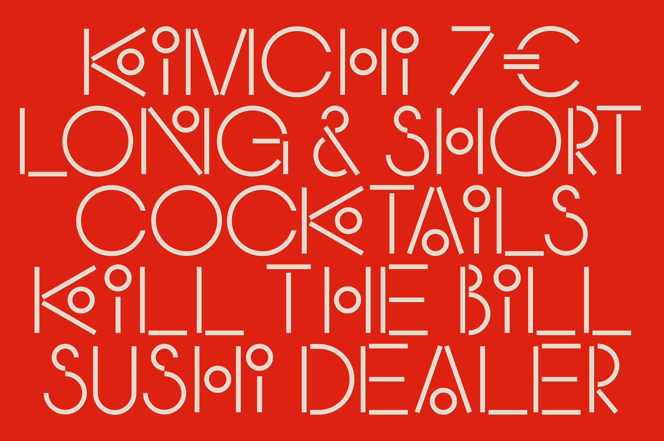
This brand is all about one thing: a custom typeface ‘KnahiaByRequena’ composed of sticks and circles, managing to multifariously evoke chopsticks closing on sushi rolls, olives dropped into martini glasses, the linear and curved strokes of the Japanese Hiragana syllabary writing system, and yet also nods to a distinctively Mediterranean Euro-Deco modernism. It is an enormous triumph to so comprehensively capture every important facet of a hybrid identity so efficiently, in literally nothing more than an arrangement of lines and circles. The lettering may look similar to countless other geometrically abstracted decorative typefaces, but I will bet that very few, if any, of those doppelgangers are as completely purposeful and intentional as KnahiaByRequena.

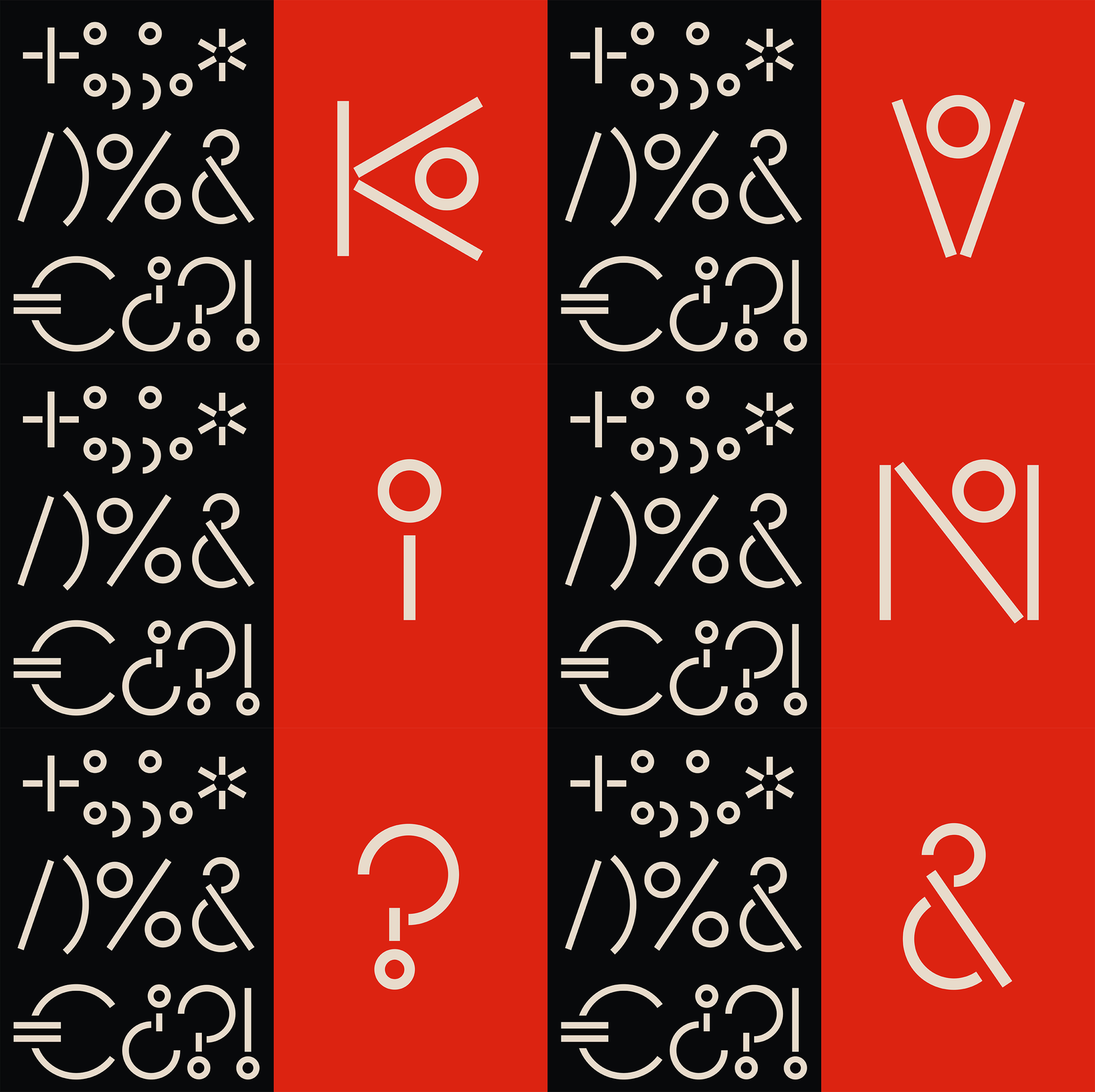
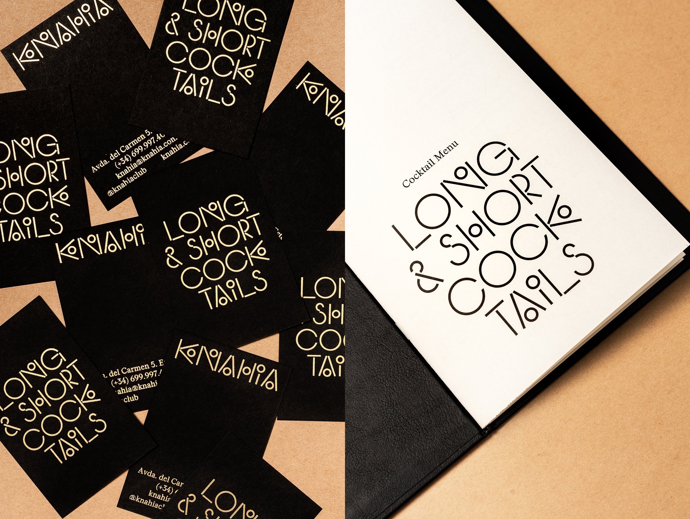
The custom typeface is used for short, punchy headings across print, website and social media. The logotype also uses it, with no additional embellishments other than a charismatically springy, squishy animation by Ester Dus—a treatment that particularly brings out the reference to chopsticks. This is a nice addition to the identity, and adds a charming dash of levity to the otherwise stark red-and-black minimalism, but really, the typeface is evocative enough on its own to conjure the association even when static.
Rounding out the typographic approach is secondary typeface ‘Stanley’, a robust serif by Ludovic Balland. Its compact proportions, angular, hybrid wedged-bracketed serifs and general air of bullish practicality prevents things sliding too far into that aforementioned slick Euro-Deco vibe.
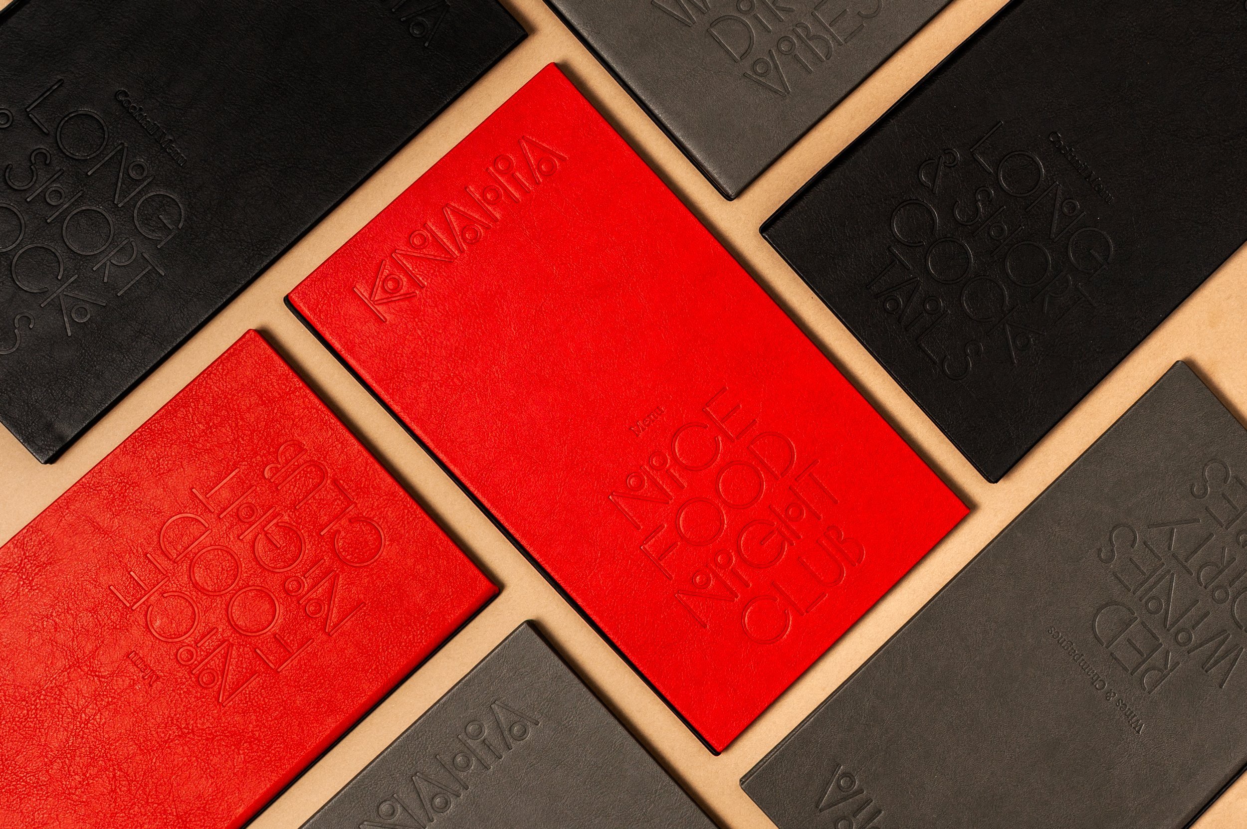
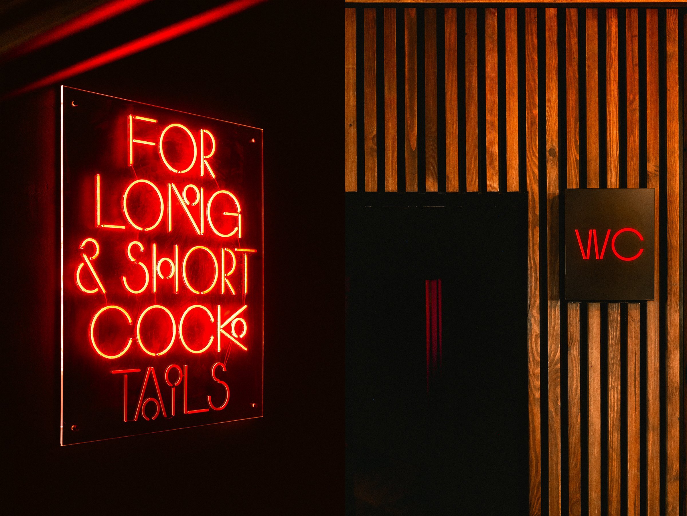
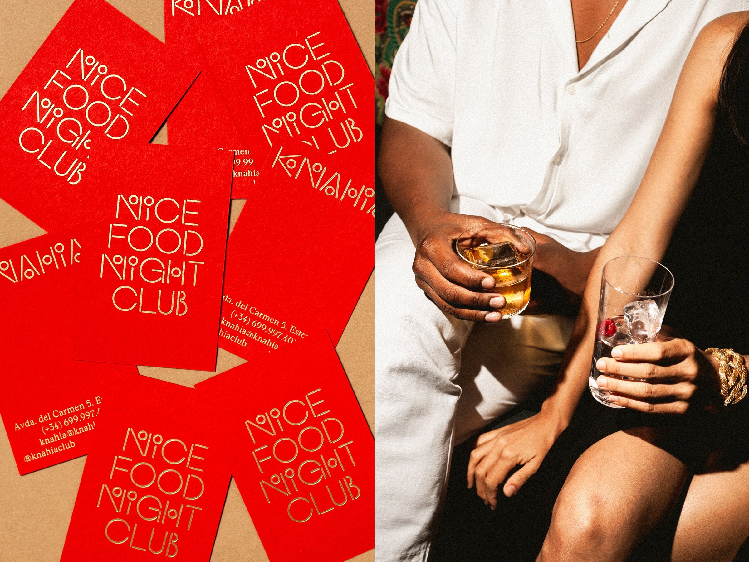
The pairing of black and blood-red may be the oldest trick in the book for proclaiming ‘Sex! Thrills! Danger!’, yet, astonishingly, somehow, it works here. Perhaps only a Malagan nightclub that impishly promises ‘good sushi, bad people’ could successfully aspire to this brazen statement in 2024, tapping the same deep, primordial current of drama, violence and eroticism as the matador’s satin traje de luces. The success of this outrageously simple ‘palette’ can also be attributed to the particular attention that has been paid to tactile finishes throughout the visual identity. Here, the brand is permitted certain controlled luxuries. Deep embossing and gold foiling adorns printed collateral such as business cards and sumptuous leather-bound menus. Meanwhile, in the interior design scheme gorgeously contrasting green majolica tiles and prominent neon signage bring depth to the simple palette, allowing that vivid, pulsating red to retain its shocking urgency wherever it is used.
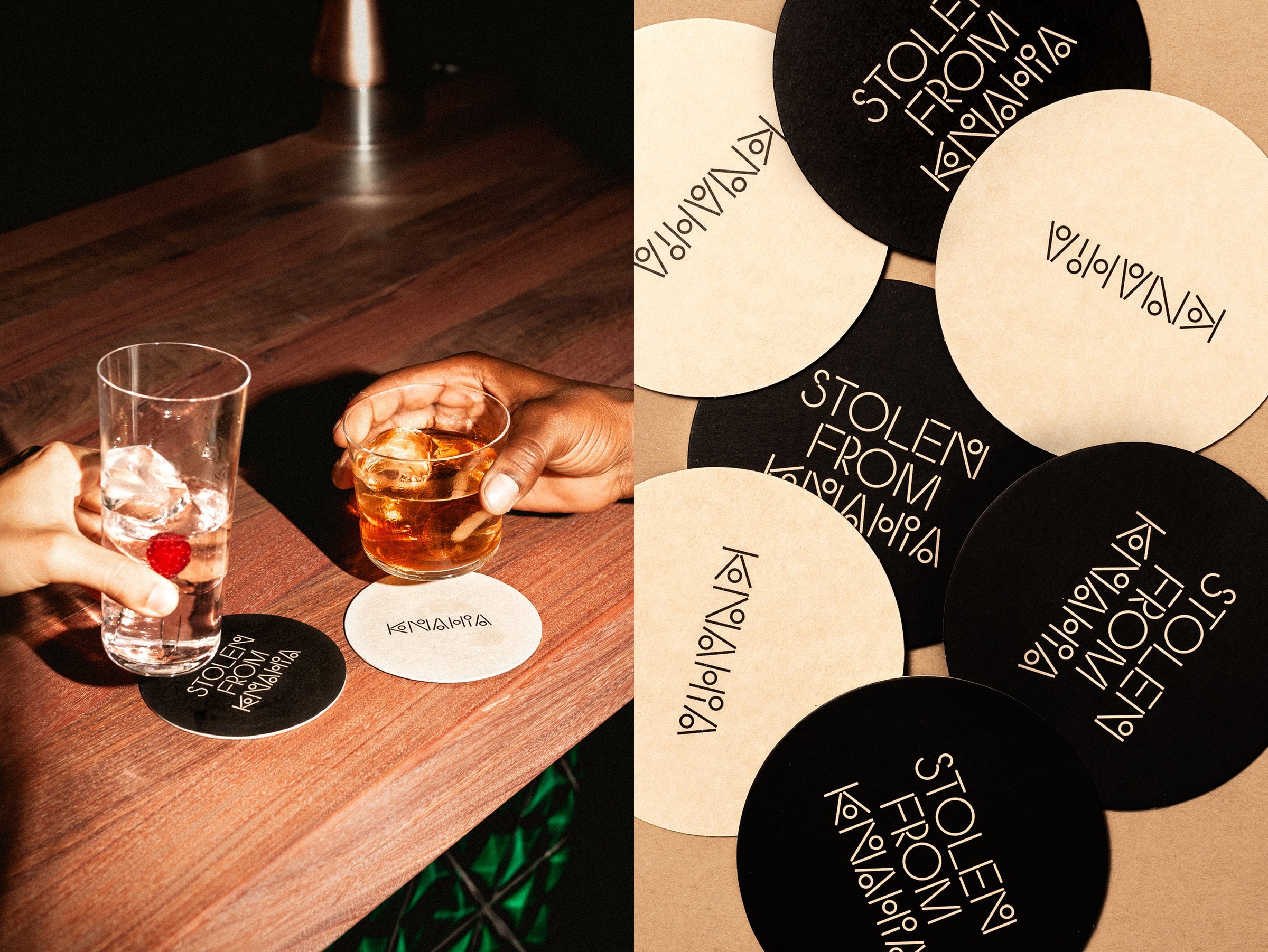
The final ingredient in this heady concoction of an identity is the superb photography by Martí Pujol. The interior looks immaculate. The food looks irresistible. The clientele look ravishing. The imagery flickers between the illicit glamour of vintage paparazzi, and the intimate spontaneity of flash-lit house-party snaps taken on a disposable camera.
It goes without saying that all of this makes Knahia feel like it’s from a different planet (let alone different town) from the unthreatening family-friendly whites, woods and seaside blues of its neighbouring establishments. In a town of tamer pleasures, Knahia is a respite for those tortured souls who need a little naughtiness with their nigiri.
