Murray’s Cheese by Base Design
Opinion by Angelica Frey Posted 21 May 2024
The ‘shoppy shop’ trend shows no sign of abating. For those not in the know, the term – popularised by New York Magazine’s Grub Street – indicates those small-to-medium businesses selling upmarket ‘provisions’ (charcuterie, legumes, sauces, tinned goods) with a veneer of heritage, authenticity, and (seemingly) innovative ingredients, as if they were the modern ‘general stores’ of olden days. On the shelves you might find fancy pantry brands like Graza, Fishwife and Diaspora – Instagram natives with digital D2C origin stories. The popularity of these aesthetically-pleasing bricks-and-mortar boutique grocers, where you can touch all the products you covet online, shows no sign of abating. So where do genuinely storied artisanal institutions sit in this landscape, and how can they compete online?
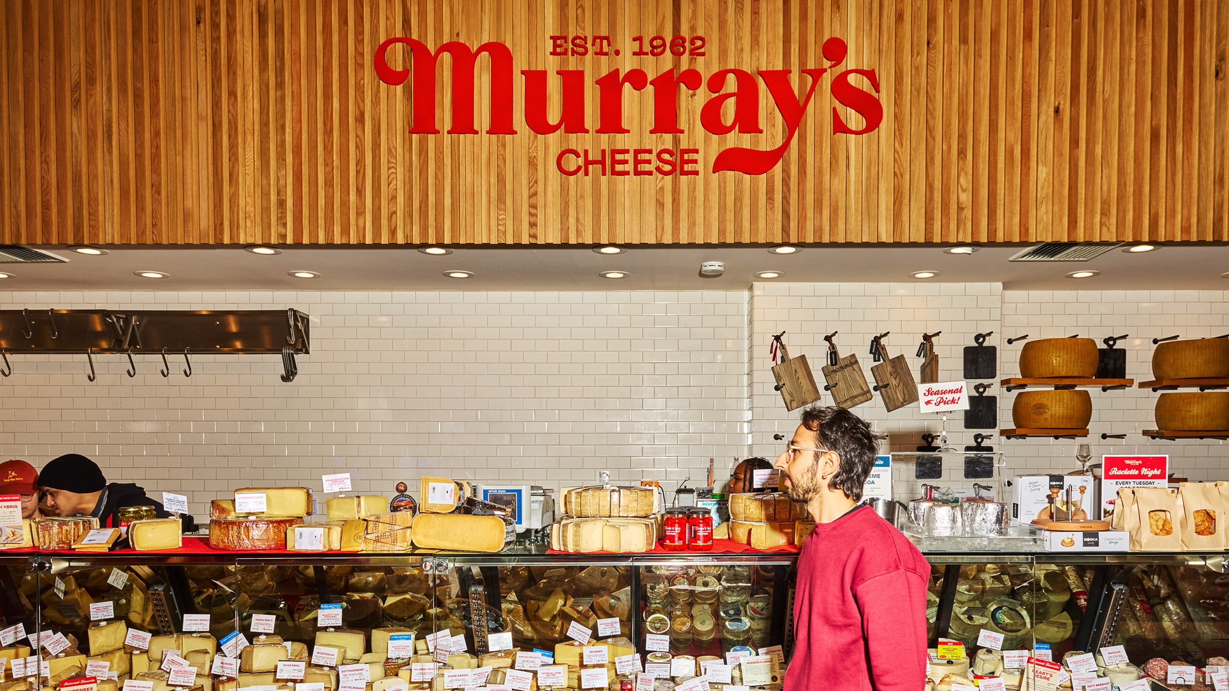
Murray’s Cheese is a New-York-based purveyor of specialty cheeses, delicatessen, and pantry staples, established in 1962. From small local origins it’s grown rapidly since 2008, expanding to over 1000 locations across the US. Its most impressive achievement, however, is that Murray’s did all this while maintaining an authentic ethos and aesthetic. In 2023, it sought to expand further – from physical to digital, in addition to opening new stores – hoping to entice a larger, younger audience. But how to embrace heritage, and own it, while evolving to suit a new context? To answer this question, Murray’s enlisted Base Design, whose tagline is ‘building brands with cultural impact’.
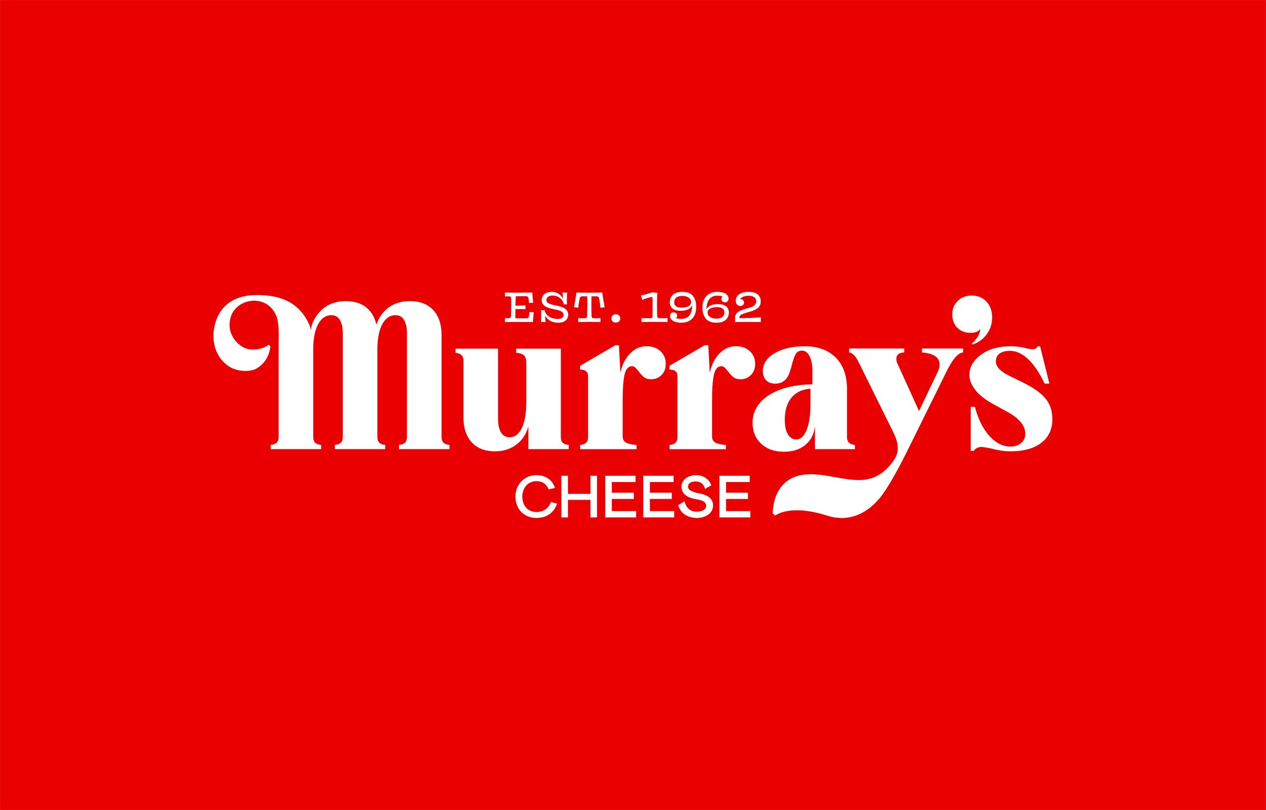
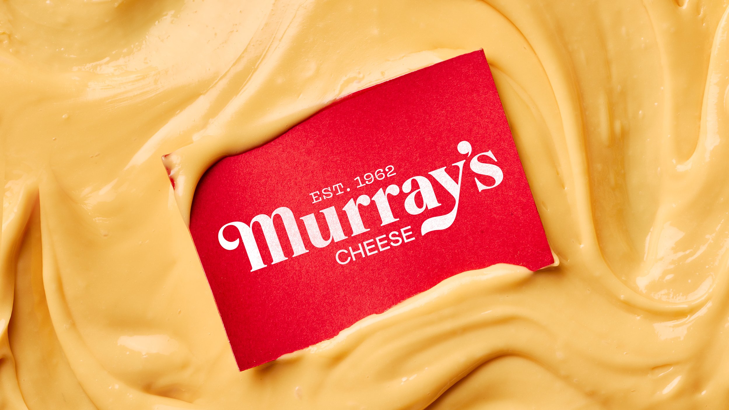
In an era when logos are simplified to the point of oblivion, or the nostalgia factor is dialed up to the max, Base’s work for Murray’s Cheese hinges on a timeless, yet contemporary aesthetic. To signal a new chapter, the swirly, slanted script that characterised the historic logo has been swapped for Colophon’s Brick Pro, a serif that maintains Murray’s visual legacy but is bolder than its original counterpart. It’s well-judged: familiar yet new, retro but modern. The addition of ‘est. 1962’, which replaces the original tagline ‘we know cheese’, adds a more immediate element of heritage, helping new customers see the cheesemonger as an authority in the field, with proven track record and expertise.
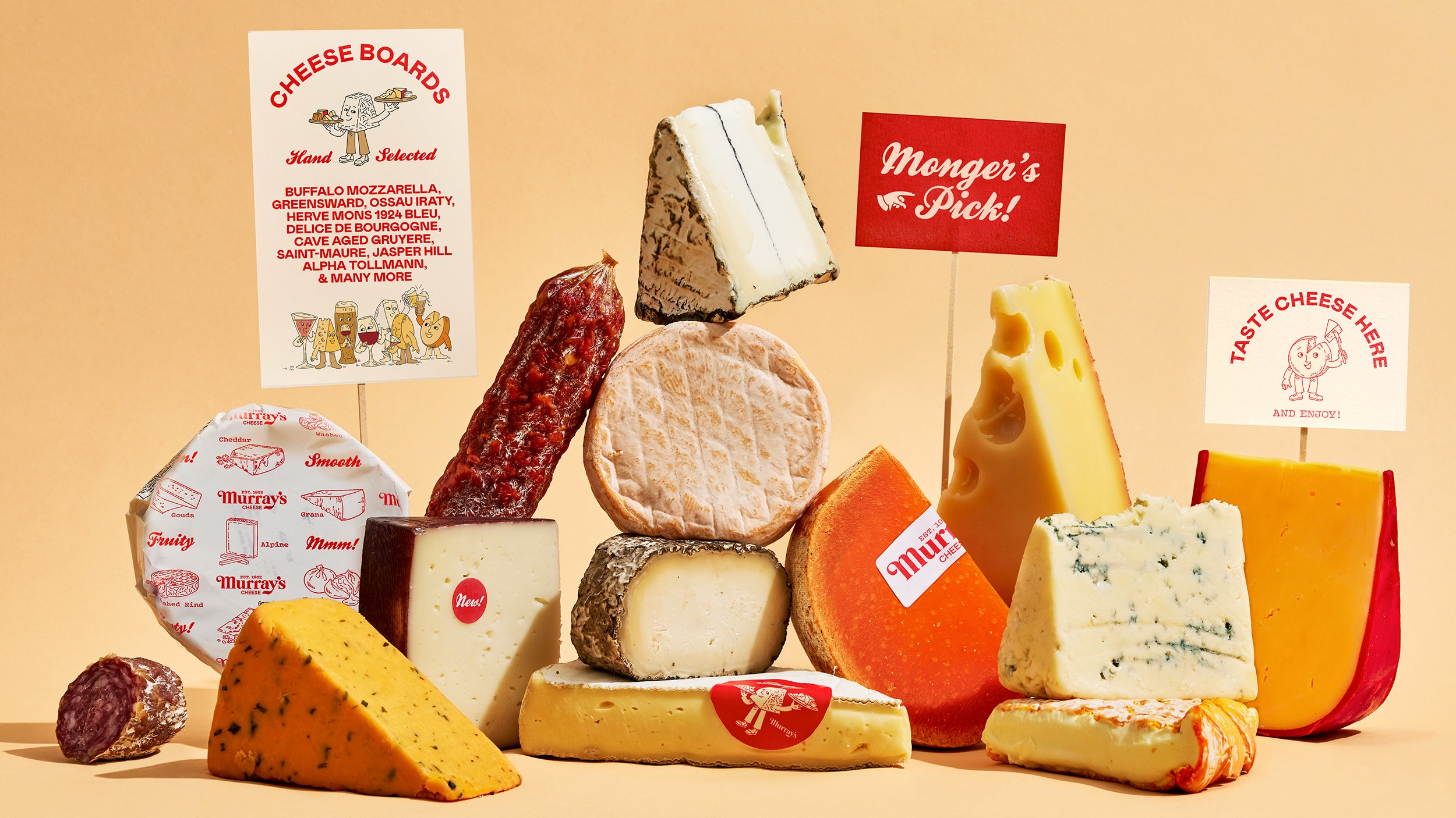
Meanwhile Murray’s Cheese signature red has been given a brighter (more digital) refresh, and is juxtaposed with a range of warm dairy whites and cream hues that occur in the wide variety of cheeses on offer. In this context, the red can be compared to the colour of wax rind on some types of cheese – and though it’s unclear if that’s intentional, it all looks tasty. On the theme of variety, Base has introduced at least four typefaces (Brick Pro, Mabry, Vulf Mono and Kestrel Script), providing versatility and texture. When paired with a singular approach to colour, this maximalist combination feels simultaneously fresh and vintage, drawing on authentic heritage to tap into highly-curated shoppy shop cues.
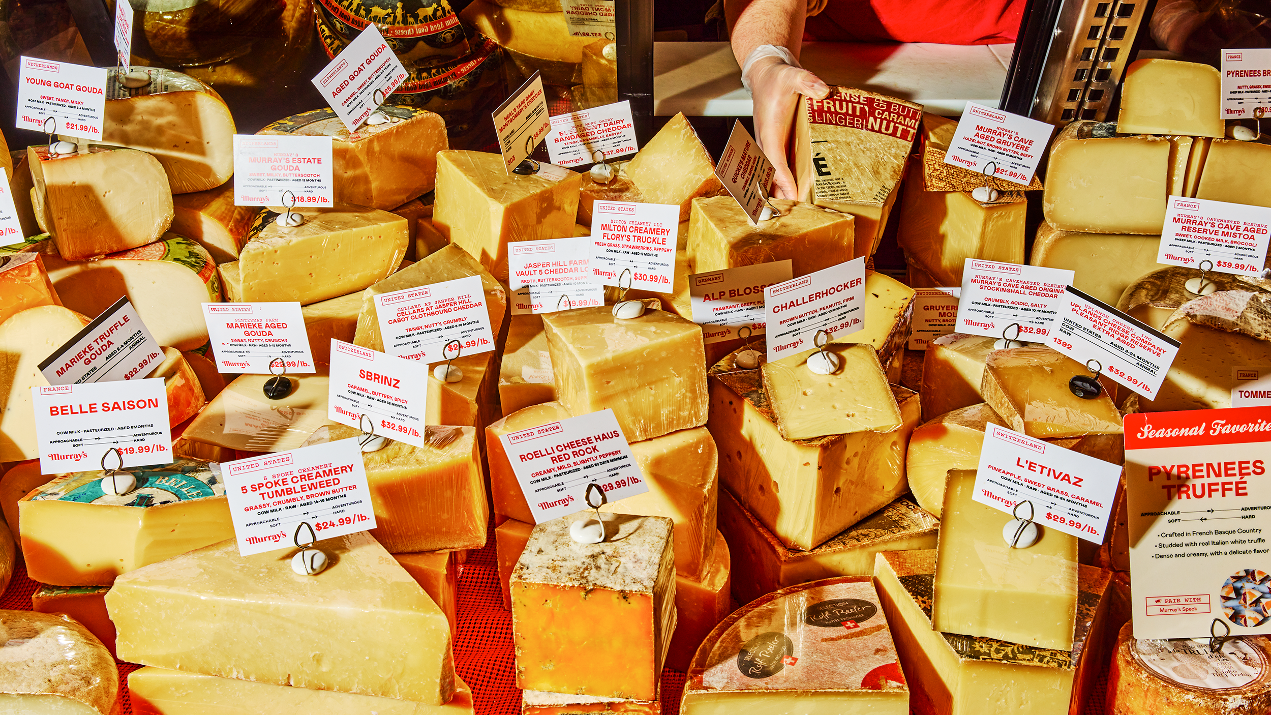
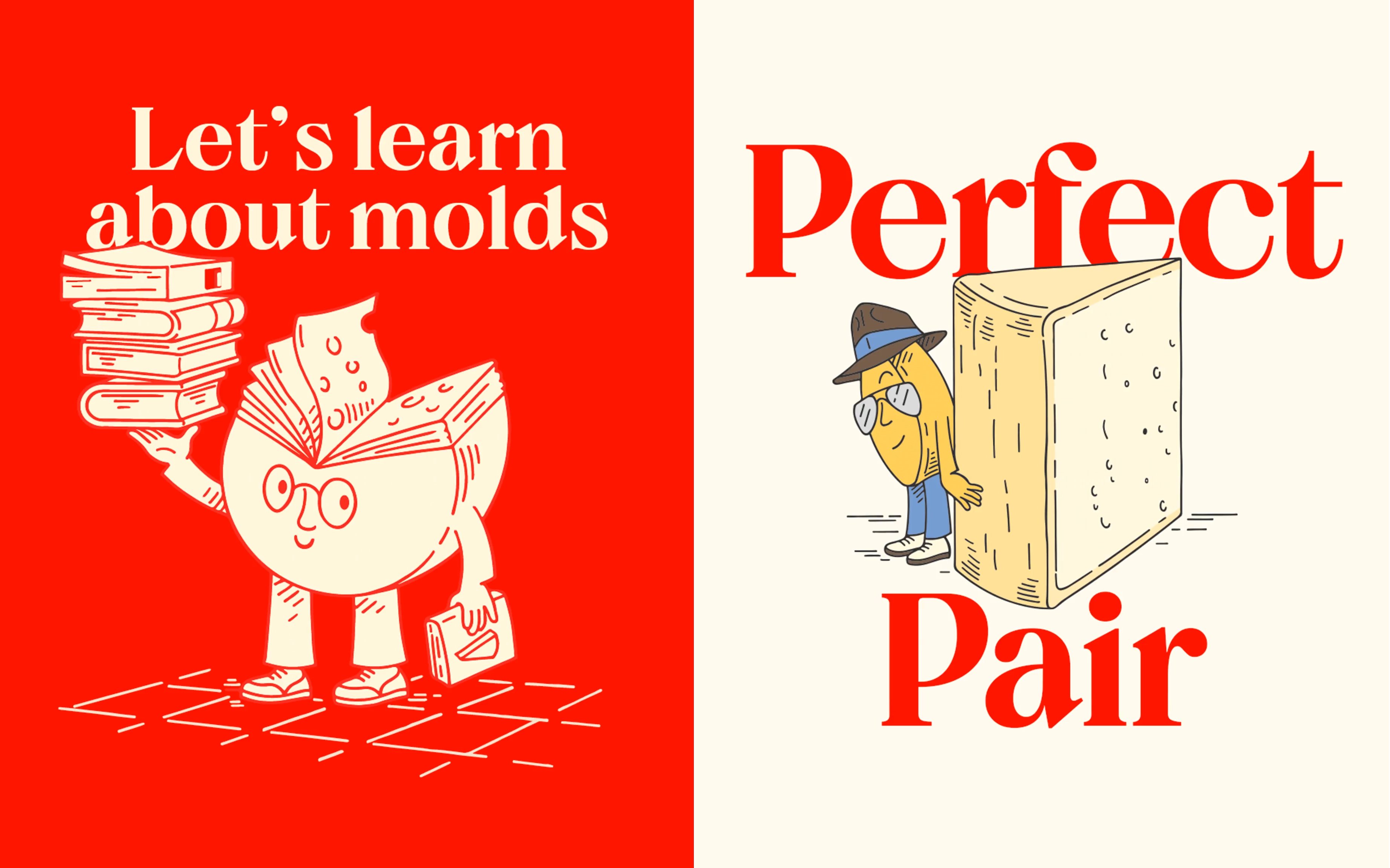
Illustration also leverages this aesthetic with linework drawings by Christine Van Wassenhove that wouldn’t feel out of place on packaging for S’Noods or Lapo’s Negroni – that is among the online indie brands that inspire lust from millennial and gen Z consumers. In this world, dominated by the small screen, illustration is a practical alternative to photography since the vector-based assets can be scaled in unlimited ways. But the approach also creates space for personality, distinctiveness and for a human component (the hand-drawn) to fully shine through. This emphasis positions the products as covetable little luxuries that invite the consumer in rather than keeping them at arm’s length.
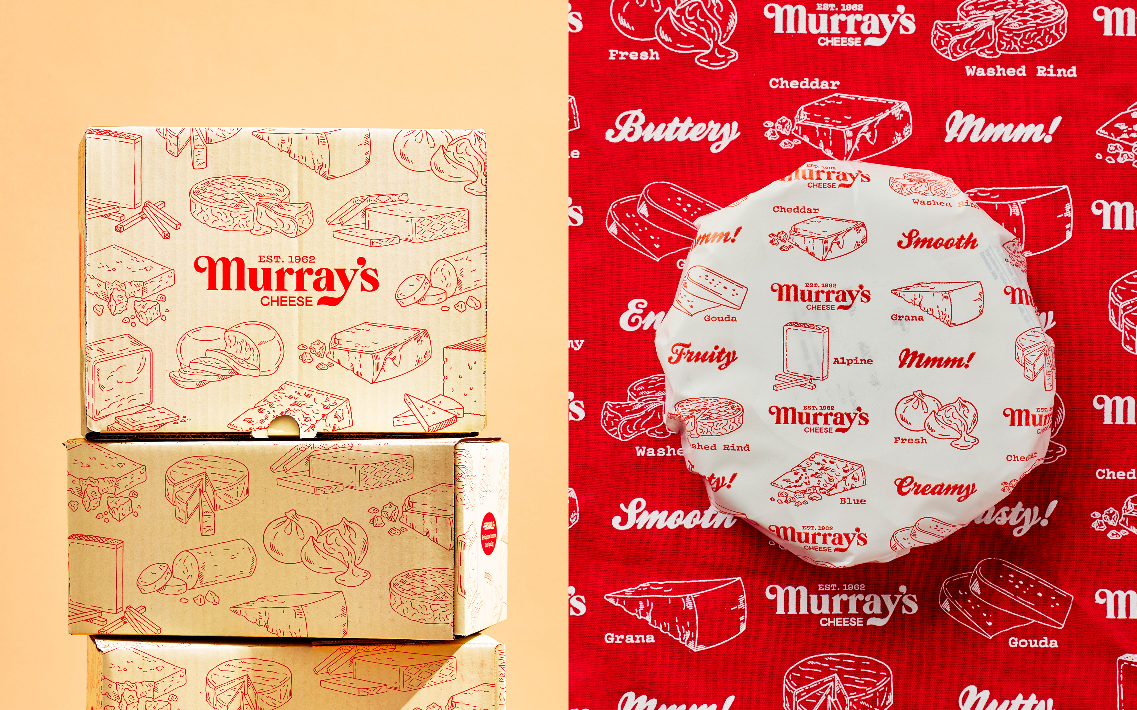
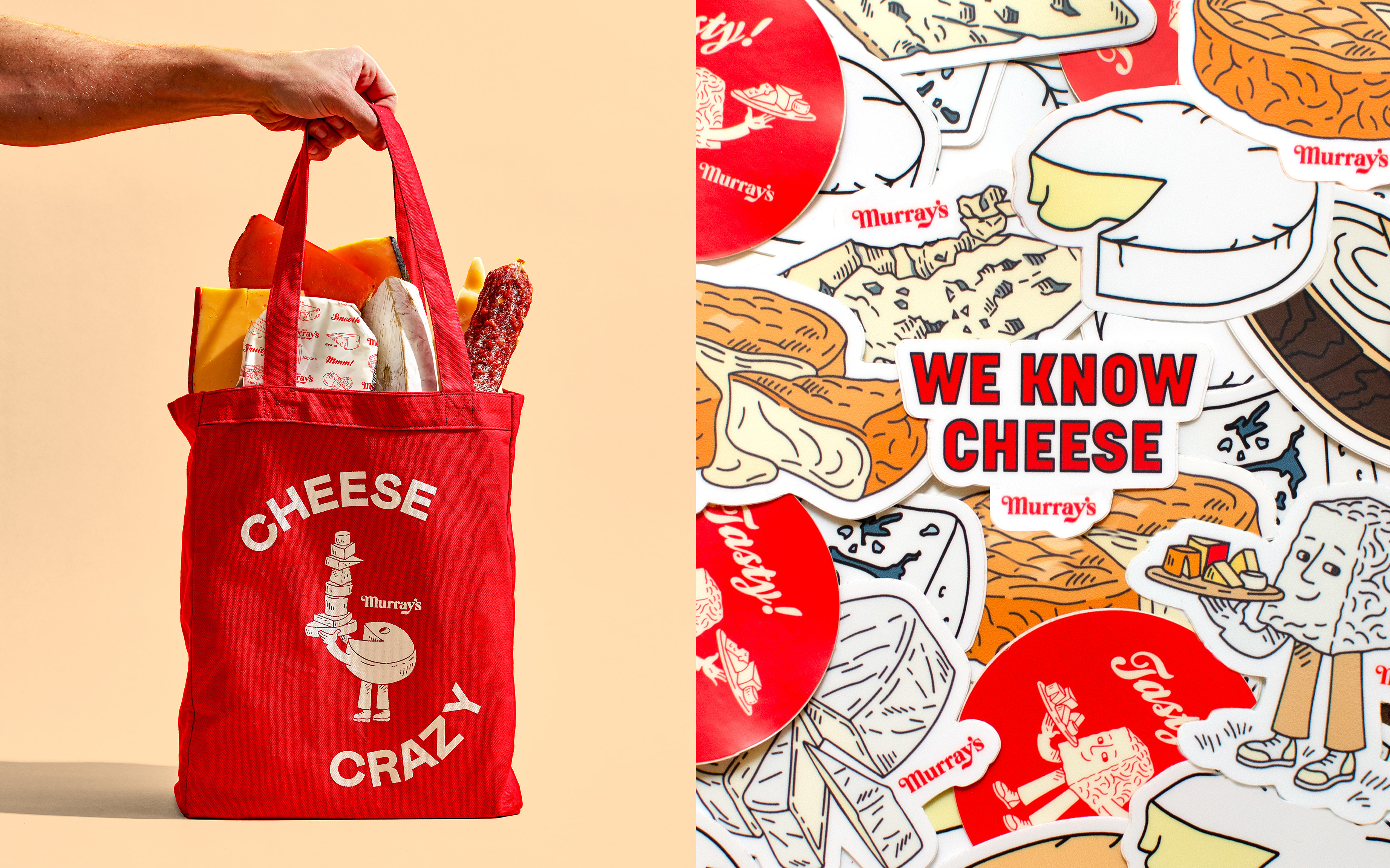
For Murray’s, an anthropomorphised wheel of cheese serves as a guide to the merchant’s world. The website and the packaging are then adorned with a supplementary series of stylised, yet detailed illustrations showcasing the many varieties of produce on offer, merging the functional and the whimsical. Those assets also come as stickers, which adds an element of collectibility. Again, while the treatment may be trend-led, there’s an authentic connection to Murray’s founding core, based on a commitment to high-level expertise that doesn’t feel exclusionary or intimidating.
Online, this principle comes into its own, drawing the refreshed brand assets together in a crafted e-commerce experience where educational content is given as much prominence as commercial pages. Despite the limitations of a digital interface (no in-store sampling!) users can actively discover a new type of cheese to try. Open any product page, such as the ‘Tempesta ‘Nduja’, and the exhaustive product description is followed by a row of pairing recommendations – in this case, caciocavallo, Gorgonzola, and River’s Edge Up in Smoke. Cheeses come with suggested beverage pairings: Murray’s Parmigiano Reggiano, for instance, goes well with New World Cabernet, known for its bold, oaky flavors. A similar approach demystifies highbrow foods and beverages, and actively invites people to discover and experiment.
With this immersive experience Base demonstrates how heritage can meet D2C, drawing on internet food culture to highlight authentic USPs, balancing the playful with the practical, the maximalist with the minimal, and nostalgia with the new. Through these carefully judged binaries, the local shop experience is translated into e-commerce with a human touch, capturing the essence of Murray’s rich history while ushering in a new era of digital engagement.
