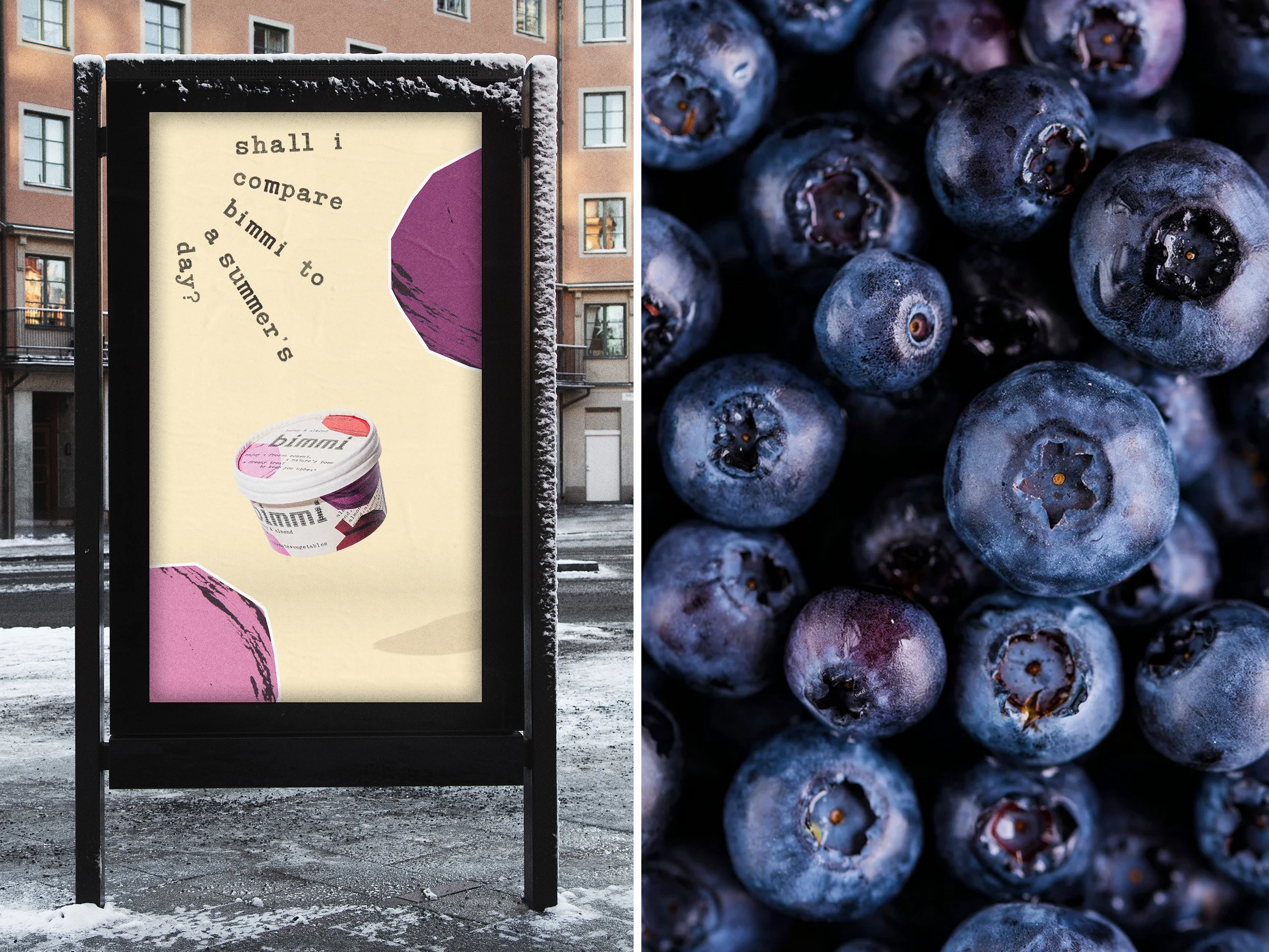
Bimmi by Bedow
Opinion by Angelica Frey Posted 11 June 2024
When it comes to pre-packaged, semi-liquid meals and snacks, it’s easy to cite the infamous examples that are now stand-ins for whole demographics – I’m talking about SlimFast, the epitome of 90s diet culture; biohacker fuel Soylent; and, more recently, the US-based celeb-backed Daily Harvest, which made headlines due to product recall over food poisoning incidents.
But there’s perhaps no product more universally embraced than the smoothie, which has transcended generations and demographic groups to represent the lifestyle choices of everybody from hippies and vegetarians (70s) to aerobics enthusiasts (80s) and mall rats (90s) – and more recently – wellness influencers.
Chameleon-like, the smoothie has therefore worn many colours, but in its most recent carnation – aligning with the anodyne minimalism of the ‘clean girl’ and ‘that girl’ – there’s a prevailing aesthetic: sherbet hues and/or stylised by skeuomorphic renditions of fruit and veg (see Blix, Froosh, Batch Organics, and of course Erewhon). Supposedly, this conveys wellness, and a calm, focused type of energy.
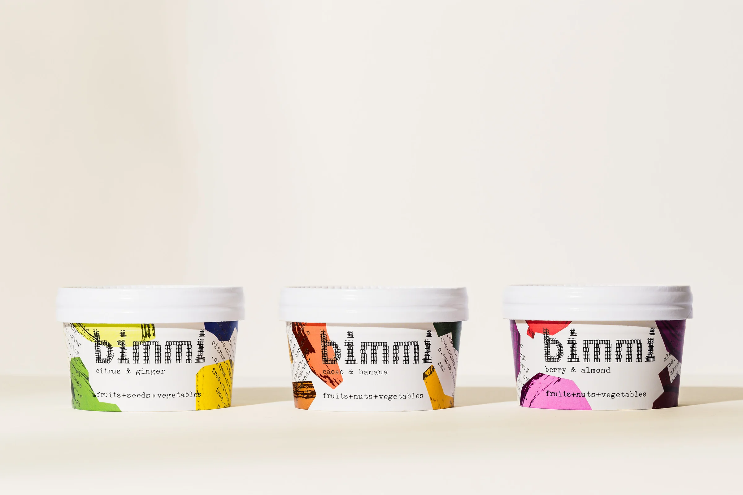
Now, however, Stockholm-based Bimmi is on the scene, with a whole new product category blurring the line between smoothies and frozen desserts, wellbeing and indulgence. Bimmi’s ‘vitamin-packed frozen smoothies’ promise to provide flavour alongside nutritional benefits: ‘an all-natural treat that’s equally delicious for dessert as it is as fuel for a workout’.
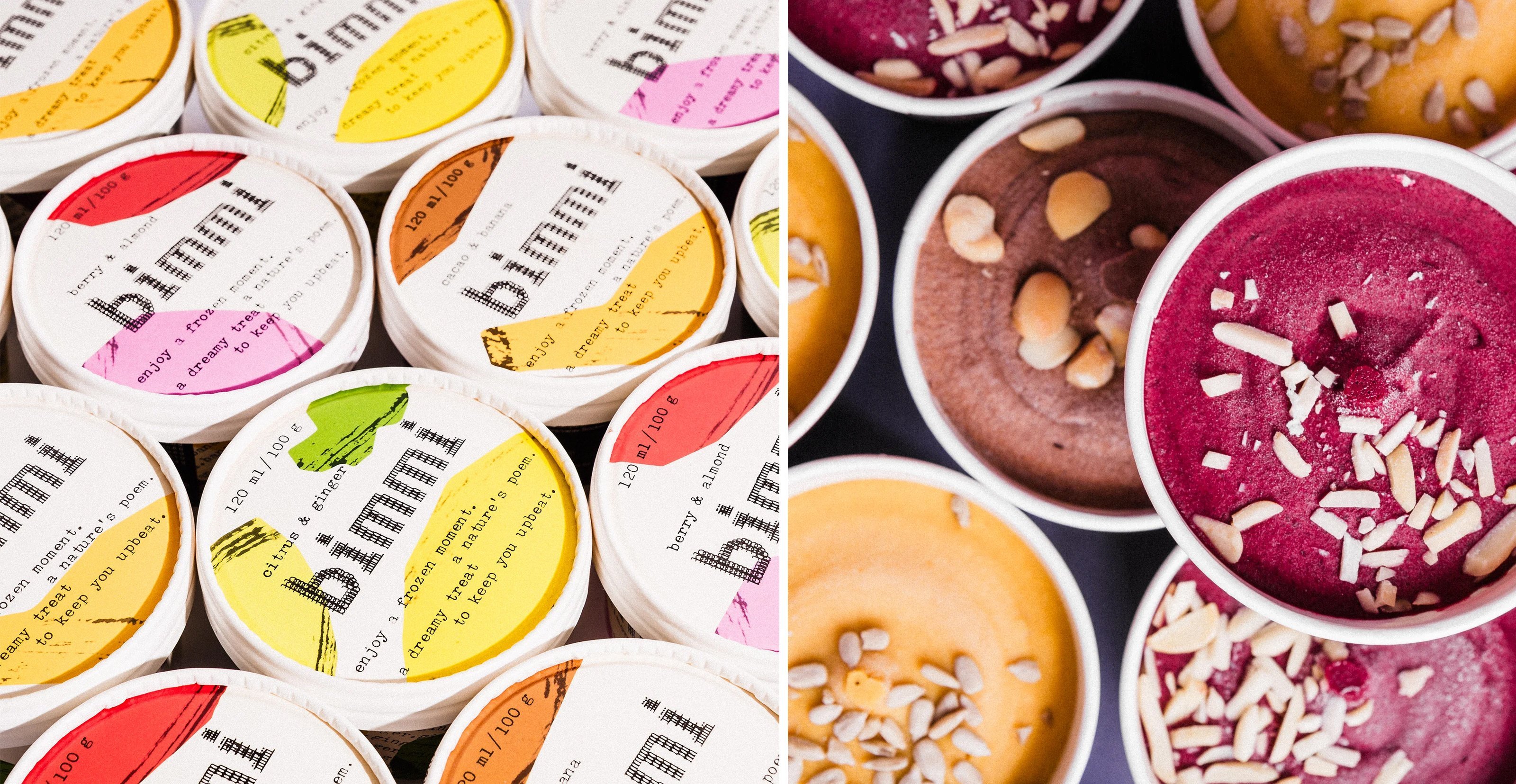
Developed in partnership with a ‘Swiss food lab staffed by former Michelin-starred chefs’, Bimmi’s recipes are made entirely from fruits, vegetables, nuts, seeds and wholegrain cereals. With the ingredients in place, the producer enlisted fellow Stockholm-based design studio, Bedow, to cook up an equally delicious brand (both visual and narrative).
While frozen snacks are extremely popular in the UK and US, they’re a fairly new concept in Swedish supermarkets, so a key part of the brief was to entice potential customers with a brand that felt bold but not intimidating.
Bedow homed in on the insight that Bimmi’s ‘methods are innovative, but the product is all natural’, summarising this in the tagline ‘Nature’s Poetry’. Presumably taking the lead from this, functional product benefits are expressed in short light-hearted rhymes: ‘full of slow-release energy from nuts and seeds’ is translated to ‘a dreamy treat to keep you upbeat’, for example, while the Citrus & Ginger flavour is ‘hyper delicious and super nutritious’.
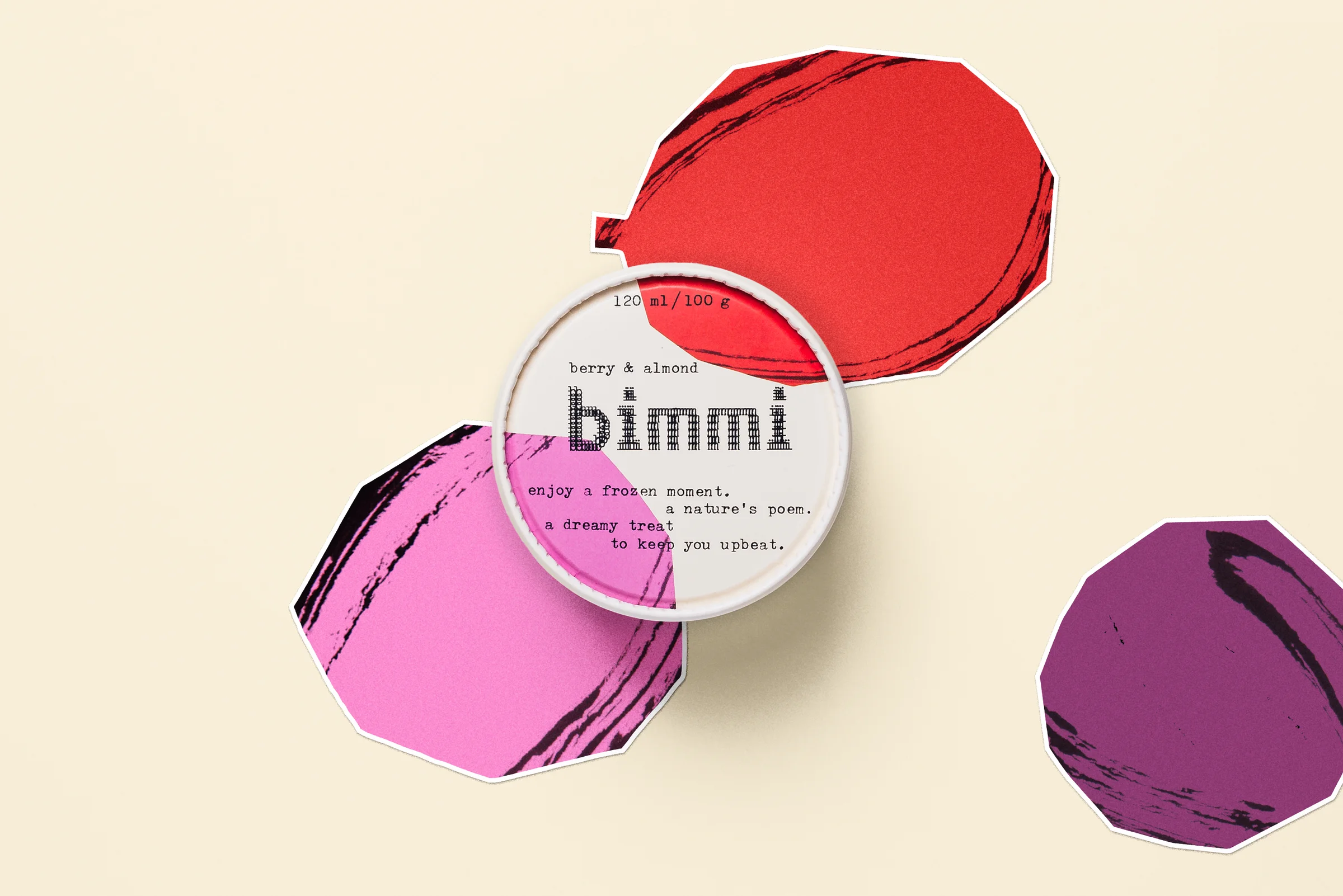
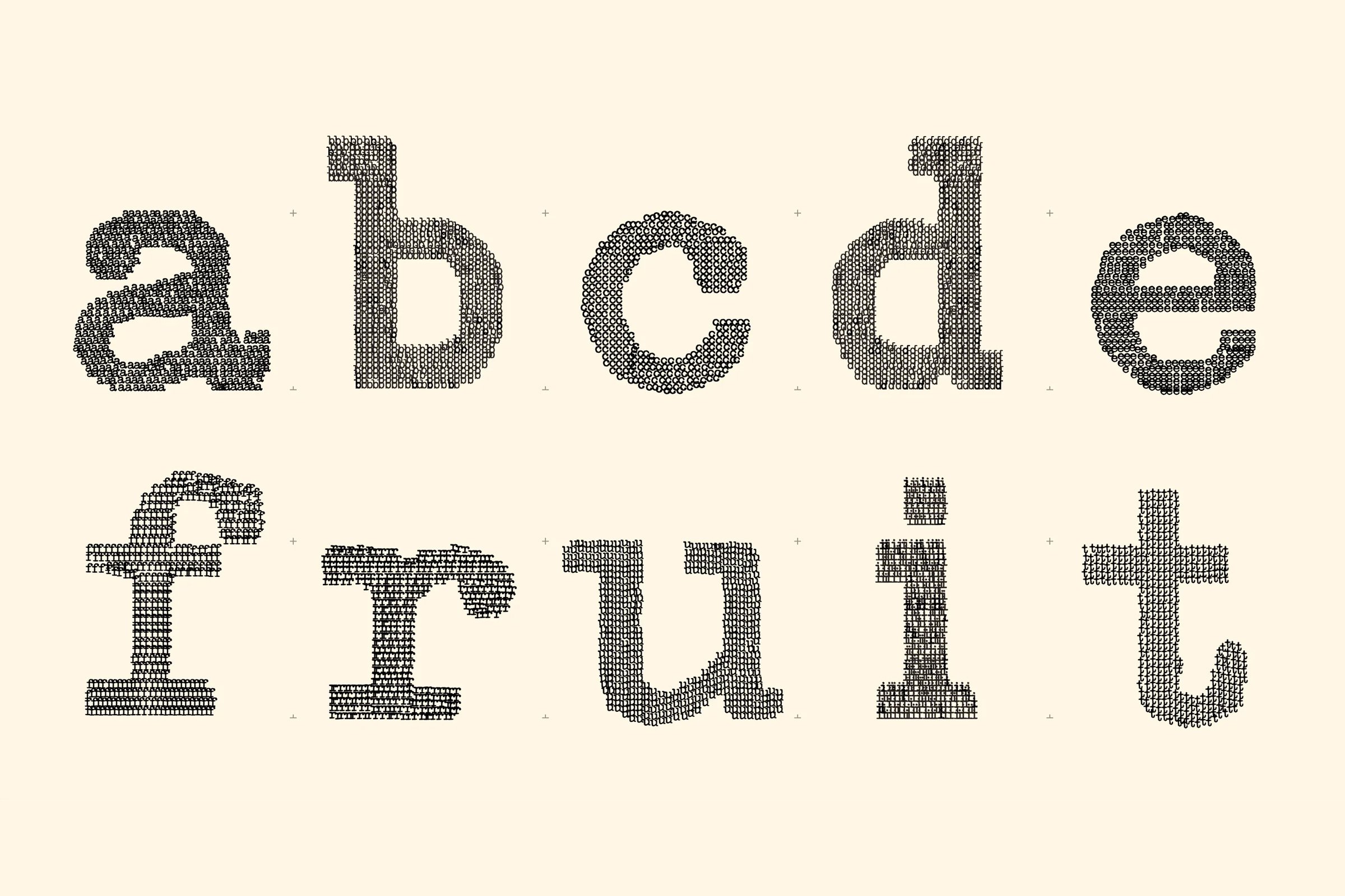
The same strategic premise was the starting point for the visual identity, drawing inspiration from the style of concrete poetry. In a move that designers globally will admire, the wordmark was crafted on an Olivetti Lettera 32 typewriter with each letter being made of hundreds of smaller letters, almost like a piece of ASCII art. This creates a scalable, variable word mark – the bigger the mark, the more letters are used. Supporting typography is also set on the Olivetti, composed in spirals, on steep angles, and in dense blocks.
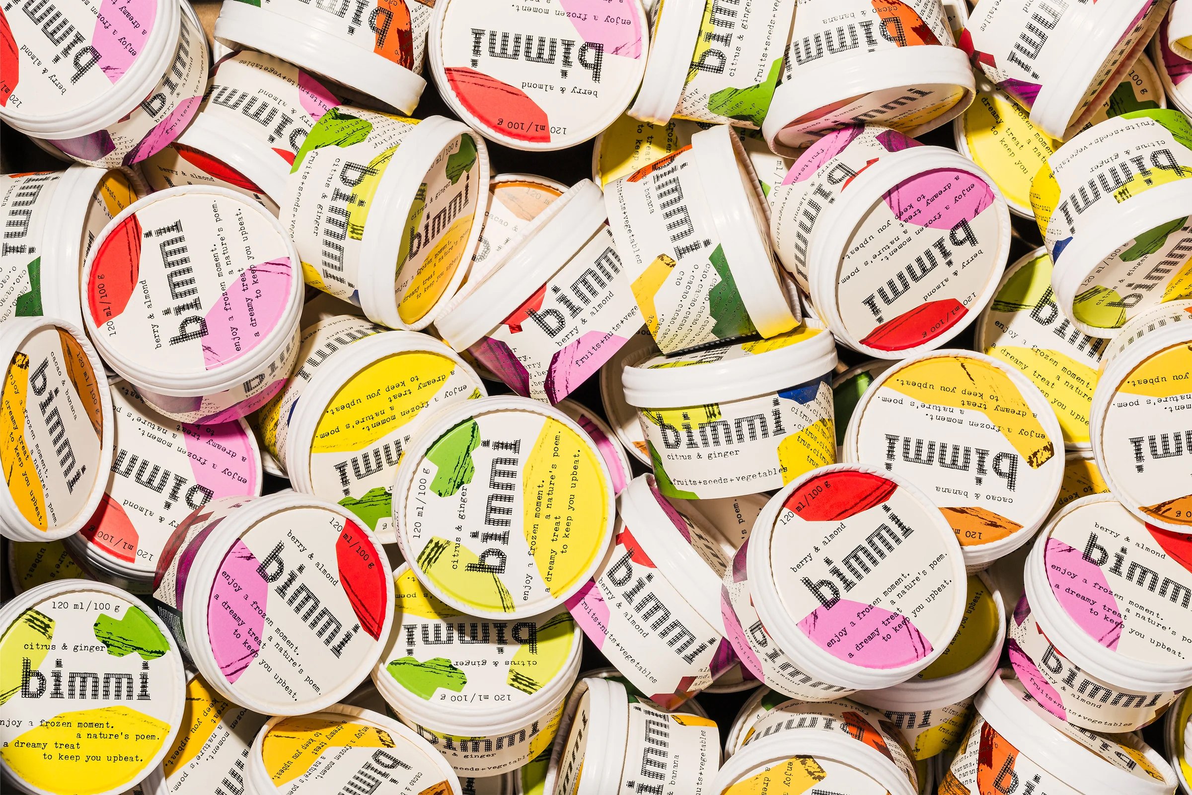
The analogue approach continues with a suite of visual elements portraying the various types of fruits, nuts and vegetables. These were created with paper and scissors with black inkwork shading to give the flat colours an illusion of depth. Despite the abstract nature of these shapes, colour helps to make the ingredients instantly recognisable: warm yellow for banana; red, pink, and purple for berries; and a pinkish medium brown for cacao. In variety, I’m reminded of the adage ‘eat the rainbow’, but tonally there’s a throwback to the saturated, almost acidic, 8-bit 256 palette of a Windows 95 operating system.
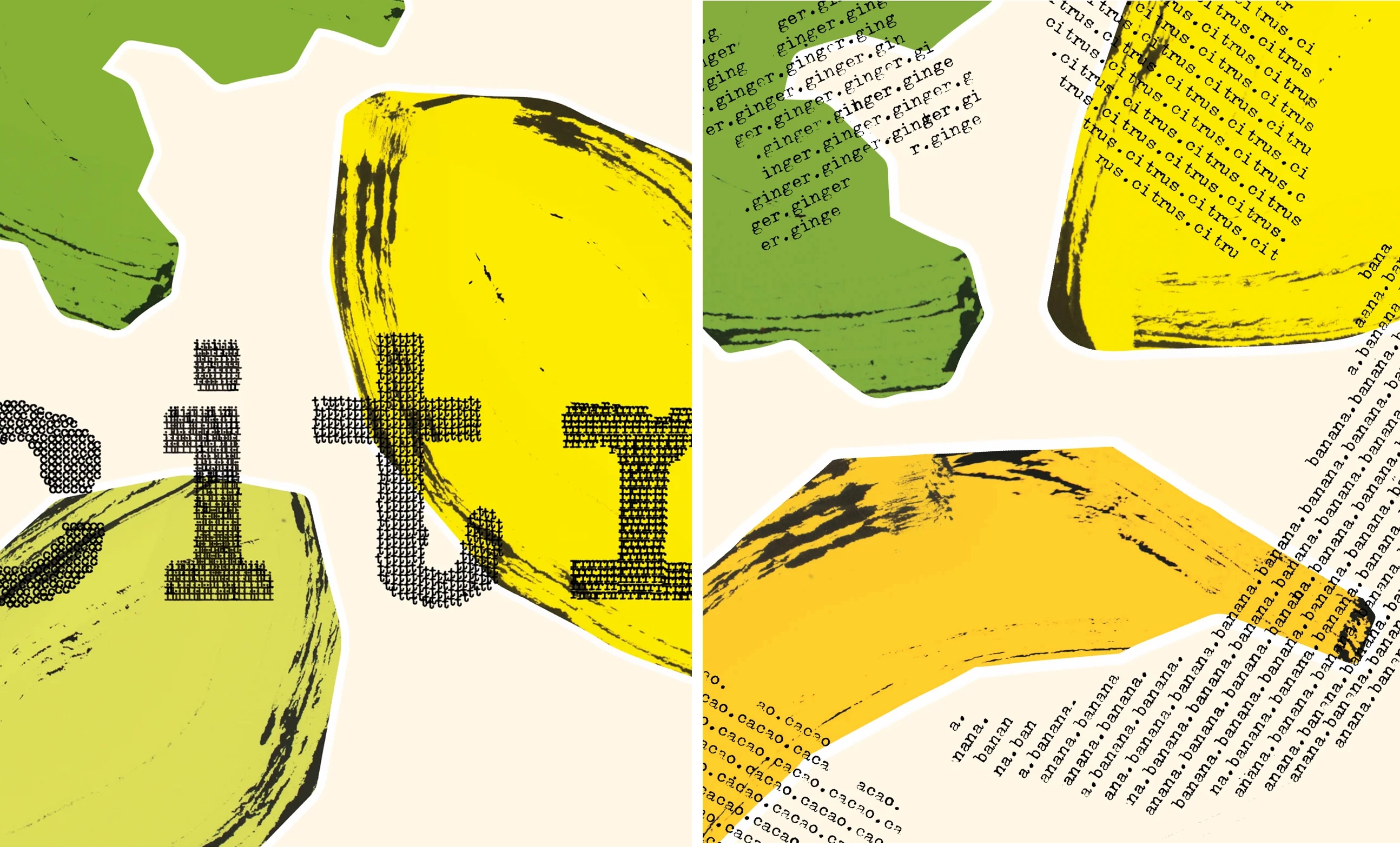
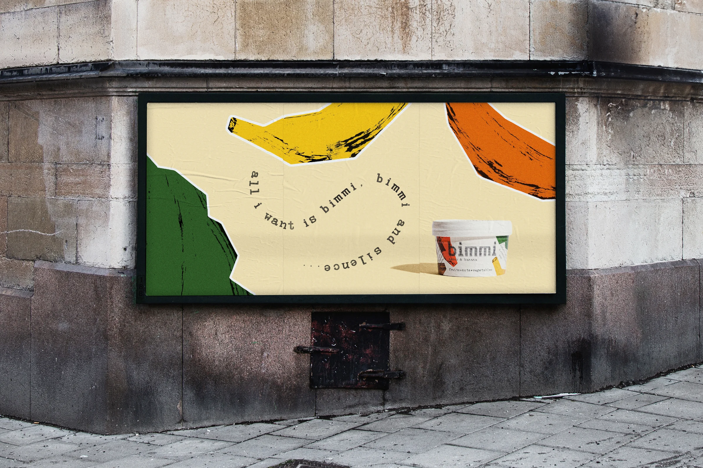
The typography is laid over the illustrations in a collage-style that might be described as ‘harmony within asymmetry’. Alongside concrete poetry, the compositions also draw on the visual vocabulary of 90s zines, concert flyers and even early-internet art. And yet, the result – through the use of restraint and white space – feels fresh rather than nostalgic, and luxurious rather than amateur.
As Bedow puts it, ‘to capture both sides of the brand it was essential to create a suite of assets that were analogue and felt natural, but were used in exciting and innovative ways’. By harnessing elements that tread the line between familiarity and counterculture, Bedow successfully emancipates the smoothie from its association with wellness subculture. The hand-drawn and hand-crafted approach creates an artisanal aesthetic that makes health food seem tasty, rather than a chore that needs twee packaging and pretty colours to distract you from it.
