RTS Cambridge Convention by Studio Kiln
Opinion by Thomas Barnett Posted 18 June 2024

The Royal Television Society’s annual two-day event at The University of Cambridge brings together leading television industry bigwigs to ponder the present and future of the small screen. This year, over 350 luminaries descended on Cambridge to contend with such weighty topics as ‘the future of media, the impact of AI, and the role of opinion in news’. Quite a lot to pack into two days… I wonder if they had time for a tea break? Oh, and they’ve thrown in a bit of stardust for good measure – Emma Thompson, no less! Aptly, for such a packed and eclectic agenda, the convention was titled ‘Too Much To Watch’.
As this year’s event was held in collaboration with the Channel 4, it was 4creative, the broadcaster’s in-house agency, who tasked culture-and-media sector specialists Kiln with creating a suitably jam-packed visual identity for the bustling event. The studio set out its challenge as having to create an identity that needed to; adapt to multiple touchpoints… book covers, windows and pillars’.

Inspired by the evocative title, and in response to the unique spatial challenges of event branding, Kiln created a joyful, dynamic identity that ‘that playfully explores the idea of a crowded screen’. This idea is primarily expressed in the graphic device of a super-mobile set of balloon-like letters spelling out the event title. Kiln describes how, as they inflate, compress, squish and jiggle into endless reconfigurations, each letter ‘competes for our attention, imitating the dizzying array of content viewers and broadcasters have to navigate’.
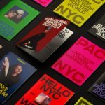
The endlessly variable balloon letters are an ingenious and visually delightful solution to the particular demands of designing for an event: that graphics have to look good in an enormous variety of different touchpoints, from bespoke window decals and pillar wrap-arounds to ultra-wide presentation screens, to tiny name badges.
A particularly delightful application is when the lettering squishes itself to the edges of the screen to create a border, comically evoking the cartoonish logic of the Pink Panther hiding behind a lamp and somehow, magically assuming its shape. While the approach undoubtedly sacrifices some legibility at the altar of graphic form, in a less direct sense the letterforms do contribute to the clear navigation of this vast and sprawling event. Plastered on every available inch of space in the venue, their graceful, laconic contour creates an intuitive sense of flow and movement.
![]()

The flexibility is further aided by a well-chosen colour palette. Comprising just eight vibrant hues, the palette has been carefully calibrated to allow multiple different combinations: some complementary, some contrasting. This versatility creates the bang-on-theme effect of bewildering variety that yet holds together harmoniously. The initial impression is of multicolour abandon; it is only upon closer inspection that you notice how coherent and restrained the palette actually is, falling comfortably into the territory of smart, up-to-date (but not particularly challenging) corporate colour palettes.
In execution, however, and primarily through the charismatically precise motion design, this identity is also theatrical, playfully capturing some of the emotional range from drama to comedy that a zoomed-out view of the mighty television industry would hope to capture. Within a corporate vernacular, Kiln’s work manages to evoke some of the magic of the small screen, even when this event brand needs to speak primarily to industry insiders – those who have already seen behind (indeed who live behind) the curtain.


This puckish graphic treatment is balanced with some cool, clean typography courtesy of Lay Grotesk. Interesting details include the curved, teardrop shaped counter of the lowercase ‘a’ and a slightly angular ascender for the lowercase ‘f’. Lay Grotesk has a really fun, fruity set of ligatures and alternate characters, but, wisely, Kiln have opted for the straight-laced version to avoid creeping into the solo spotlight occupied by the balloon lettering.


Kiln was also responsible for applying the visual identity to the design of a programme. The result is a luscious piece of print featuring an embossed and spot-UV printed balloon letter cover in bubblegum pink on dark green, perfectly rendering in physical form the inflated texture of the animations. It is testament to this thoughtful and thorough choice of print finishes that the essence of a dynamic graphic device is translated to print with such unlikely success. The interior pages deploy that bold colour palette across backgrounds, and a gradient-mapped treatment of photography that manages to make even James Corden look cool.


This visual identity has undoubtedly been given a significant leg-up by the fact that it rests upon an absolutely spectacular piece of copywriting in the chosen title for the event. ‘Too Much To Watch’ perfectly captures a complex ambiguity. The phrase ‘too much’ inherently encodes a kernel of panic, a fear of overwhelm, the flirtation with potentially threatening unknown quantities beyond what can be processed or managed. And yet in the context of this event, the phrase registers more ambivalently: partly referencing the existential crisis that the newly risen titans of the streaming age pose to the old guard of traditional broadcasters; partly revelling in the glut of incredible content generated in the new golden-age of small screen entertainment. Kiln skillfully captures these dualities, while framing them in a design vocabulary that is appropriately smart and positive for an industry conference.