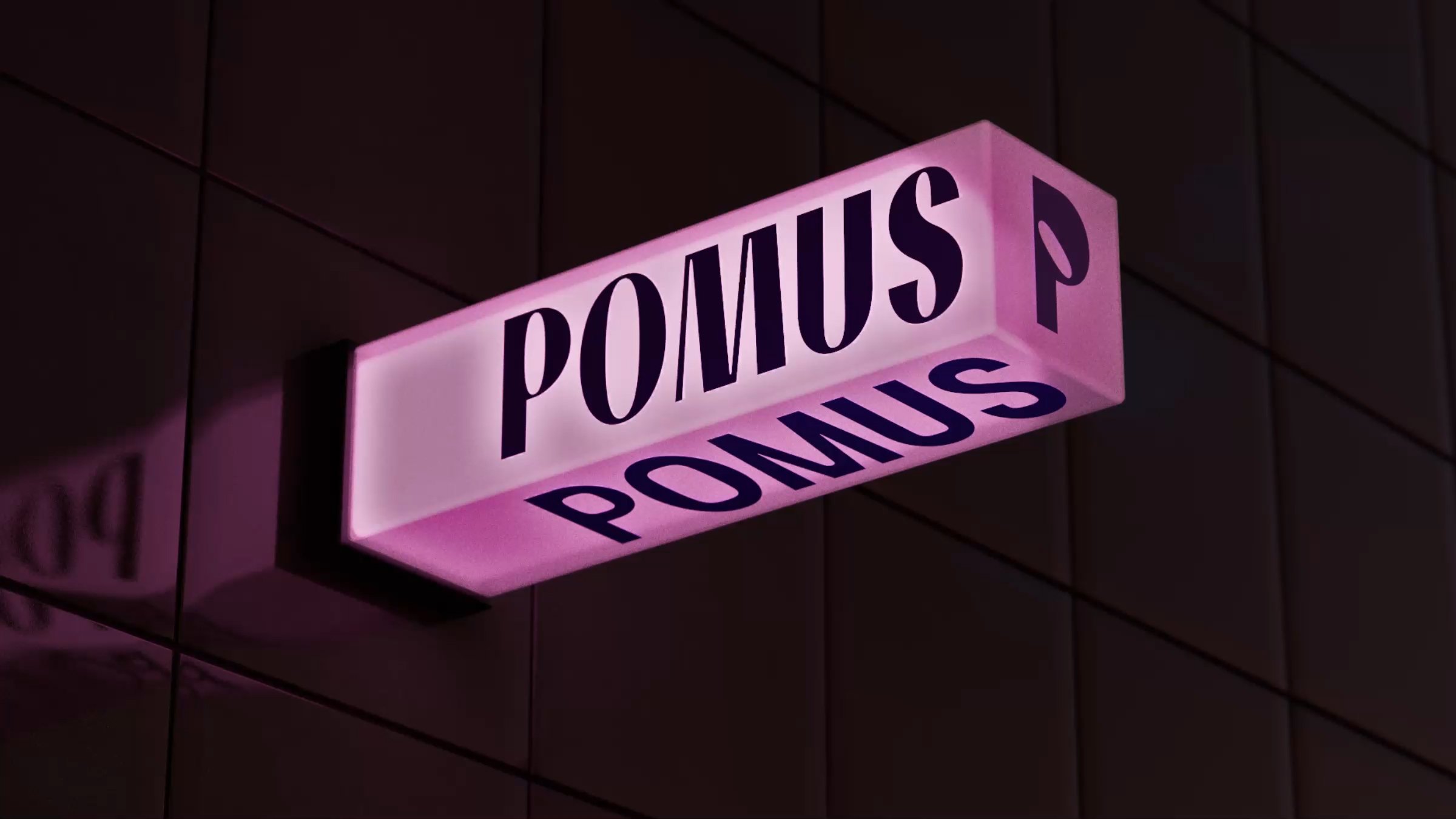
Pomus by Sömestr Studio
Opinion by Daniel Milroy Maher Posted 25 June 2024
Branding a film production company is a delicate business. On the one hand, you need branding that can match and even enhance the quality of the films being produced, but on the other, you need something that doesn’t distract from the work or compete with it. Film is an intrinsically creative visual medium, and building a framework to support it means striking the right balance between respecting the filmmaker and their vision, and elevating their work through subtle yet engaging plays of colour, form and composition.
Sömestr Studio’s identity for creative production company Pomus does just that. Named after the Ancient Greek term for a fruit tree, the Istanbul-based studio specialises in live action and animated film, and prides itself on working with some of the best storytellers around. Founded in 2011, the team at Pomus has over a decade of experience in crafting engaging visual narratives, and even boasts a talented group of in-house animators who are known for their captivating stop-motion and mixed-media work.
With its portfolio going from strength to strength, Pomus decided it was time to signal a new chapter for the studio through a complete rebrand. The brief for Sömestr was to create a fresh identity that could ‘embrace’ the global talent and clientele that Pomus is starting to work with. From Porsche and Peugeot to Vogue and Armani, the studio is turning its hand to a huge array of projects and industries, and this knowledge and expertise needed to be reflected in its own branding.
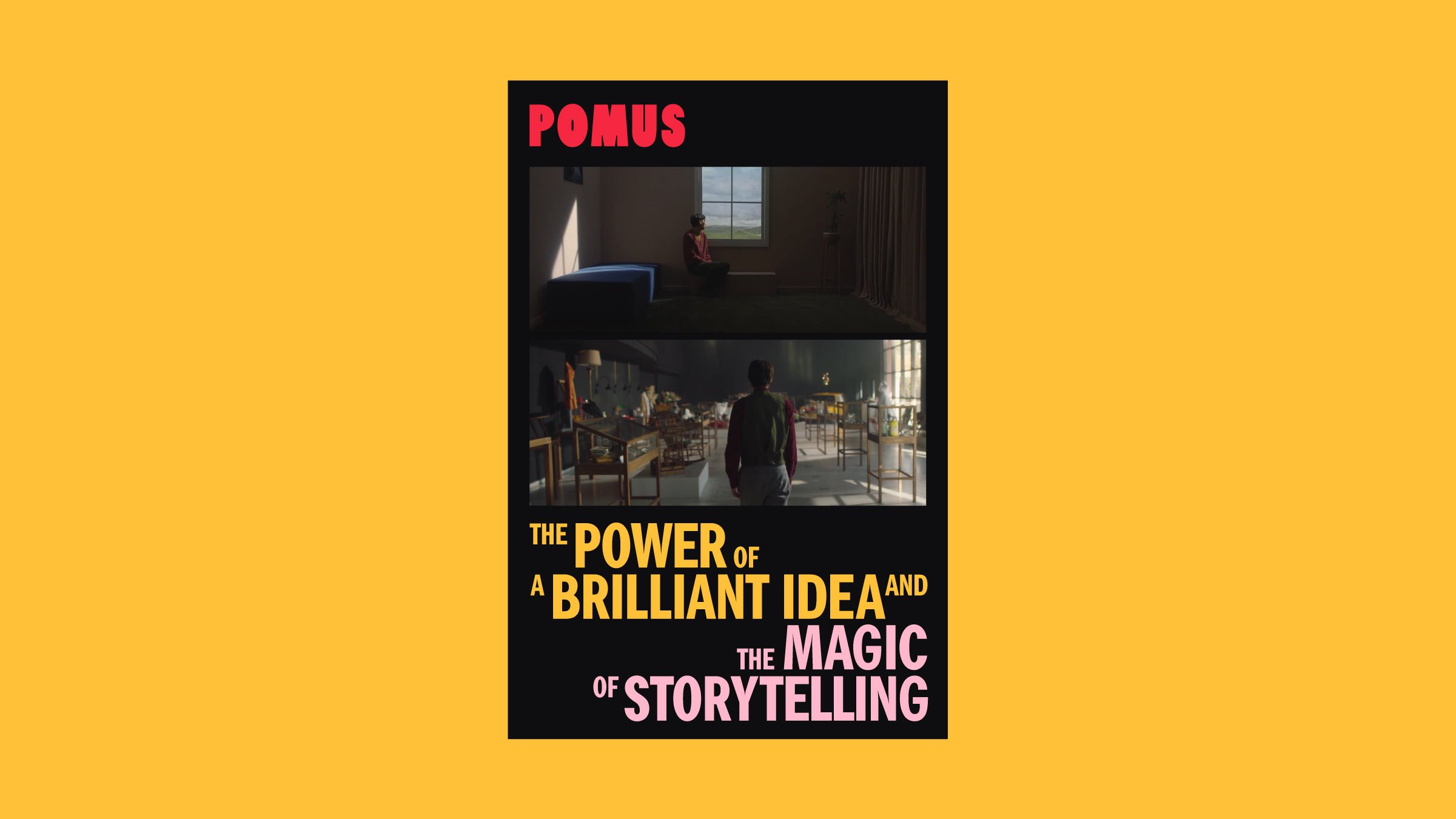
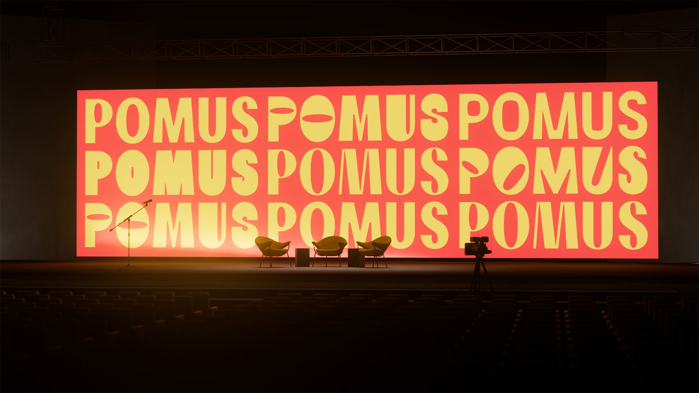
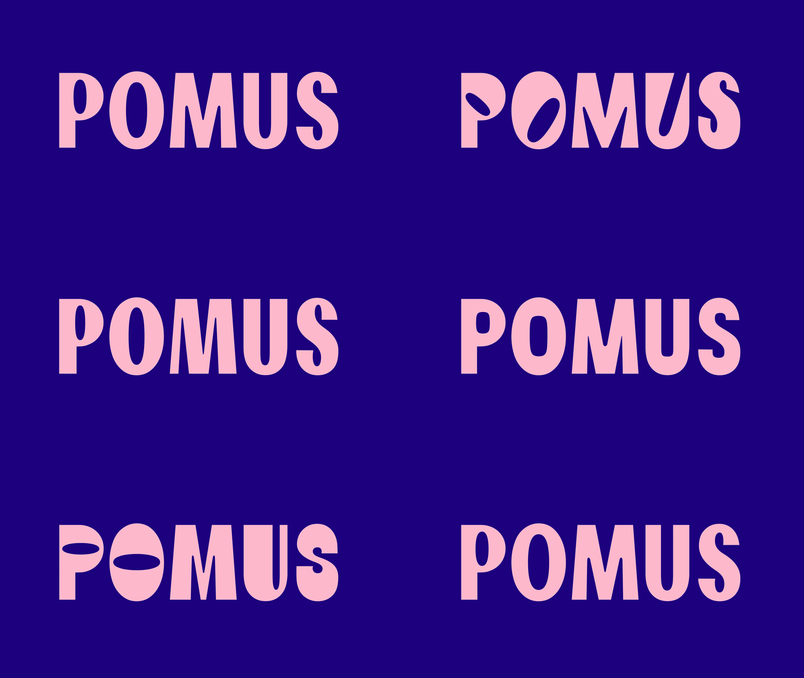
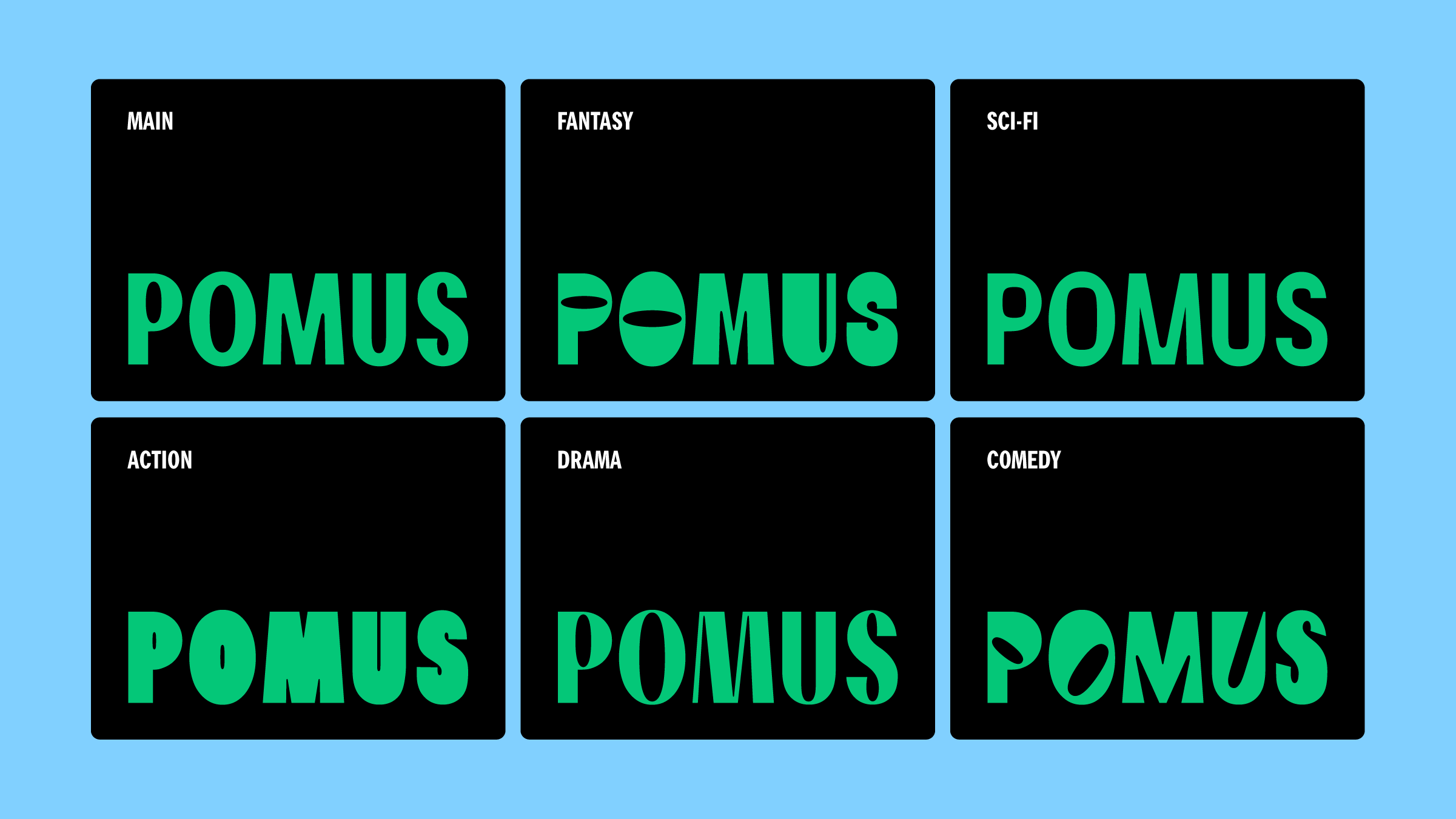
At the heart of Sömestr’s identity for Pomus is beautiful, variable typography that can flex to fit a wide range of use cases, speaking to the many areas within which it operates, and the many different types of films that it produces. Within its portfolio of work are live action and animated videos, music videos, shorts, and lots of experimental pieces, and it was important to highlight and celebrate this diversity. As such, the team at Sömestr developed a fun, adaptable wordmark that can change in form to speak to the most popular genres of film. These include fantasy, sci-fi, action, drama and comedy, and each of these genres have their own corresponding logo.
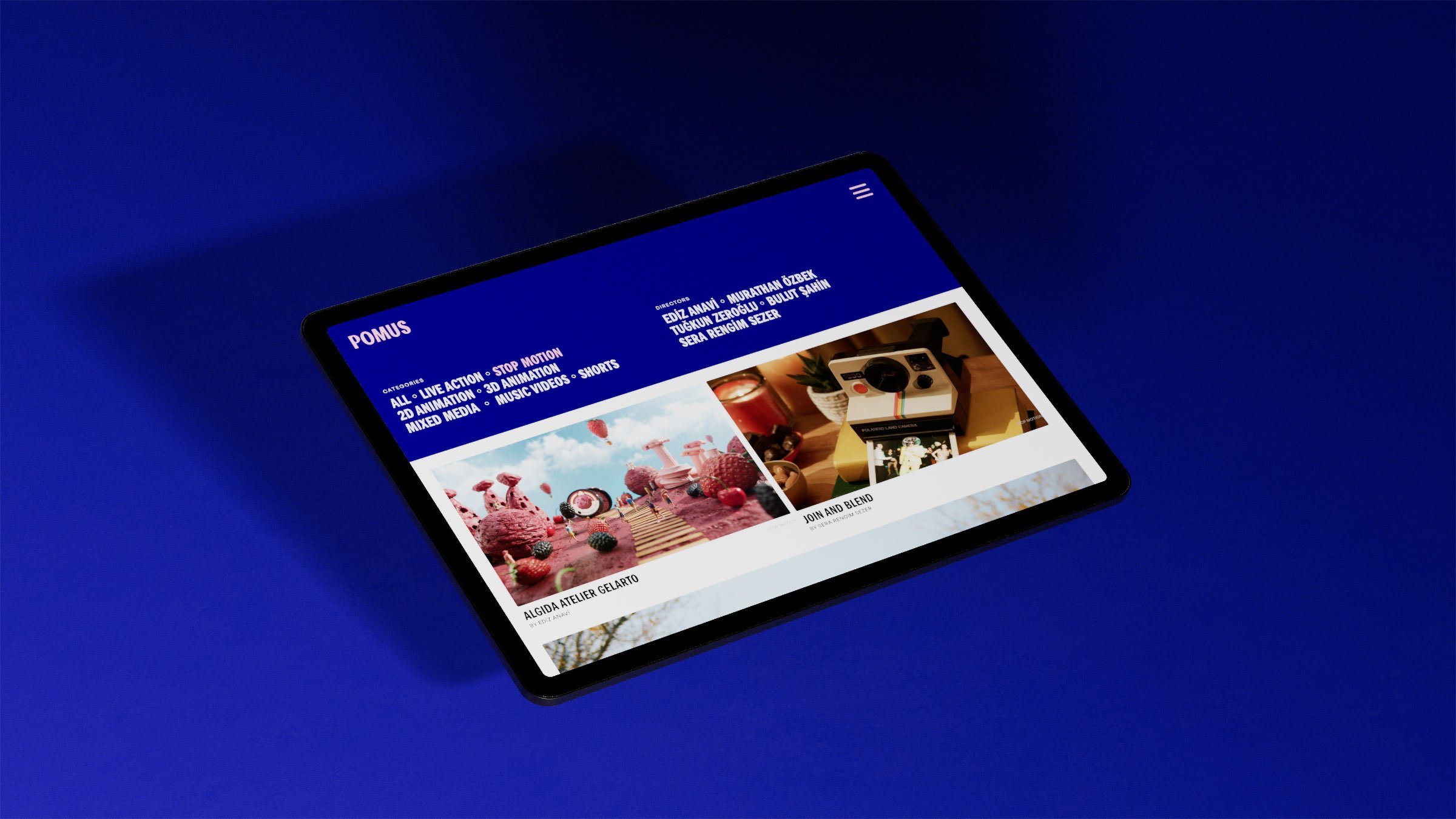
Alongside the wordmark, the main typeface for Pomus is a custom creation by Sömestr called Pranklin Pothic – a play on the iconic sans-serif Franklin Gothic – which serves to ‘transfer the typographic flair into the website and other design materials’. Based on the original typeface, these custom cut letterforms bring personality to all of Pomus’ communications, from film credits to the video archive on its website, and all of the brand’s collateral. Pranklin Pothic does a brilliant job of feeling expressive while letting the work speak for itself.
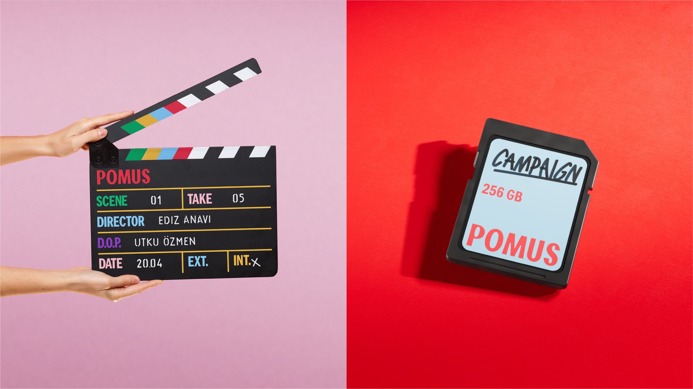
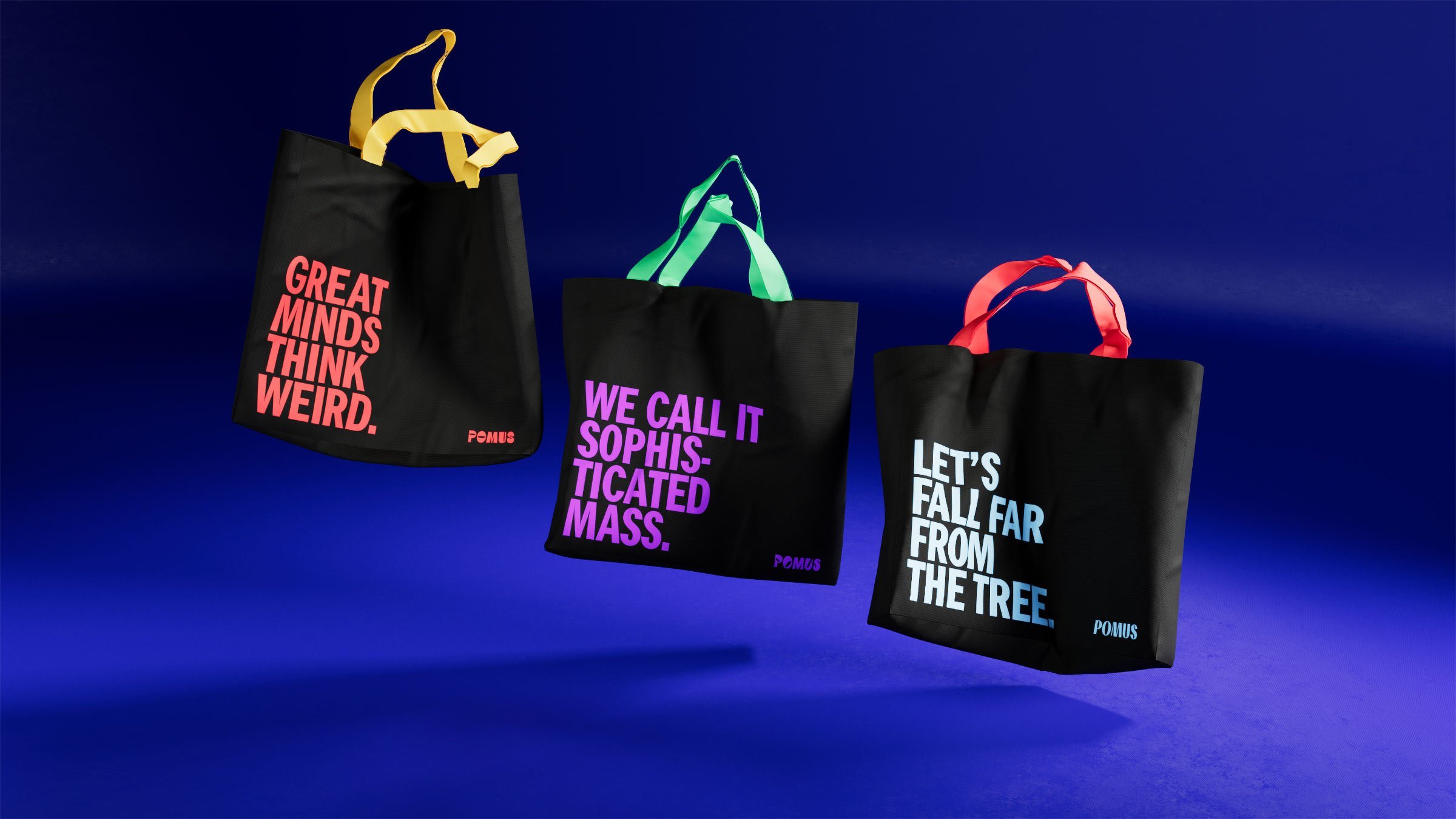
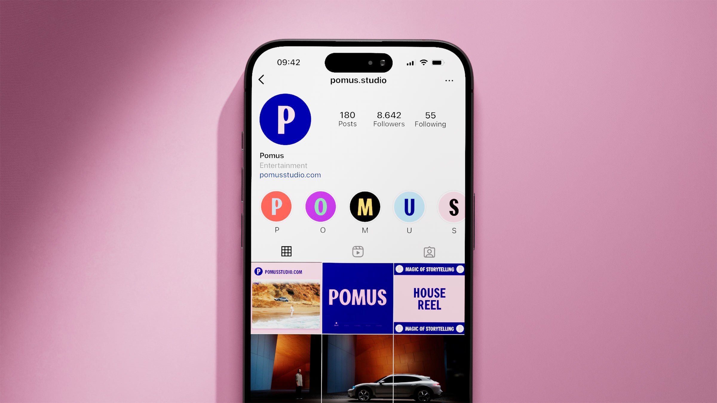
Finally, Sömestr crafted a punchy colour palette for the Pomus brand that once again highlights the variety of films on display, but also nods to the studio’s fruit-inspired name. The primary palette of blue and pink feels at once vibrant and refined, while pops of colour throughout the rest of the identity keep viewers on their toes. Occasionally, where video work – particularly animation – already features bright colours, the brand’s fruity hues can combine for a slightly lurid effect, but, overall, they are successful in establishing Pomus as an upbeat, imaginative studio.
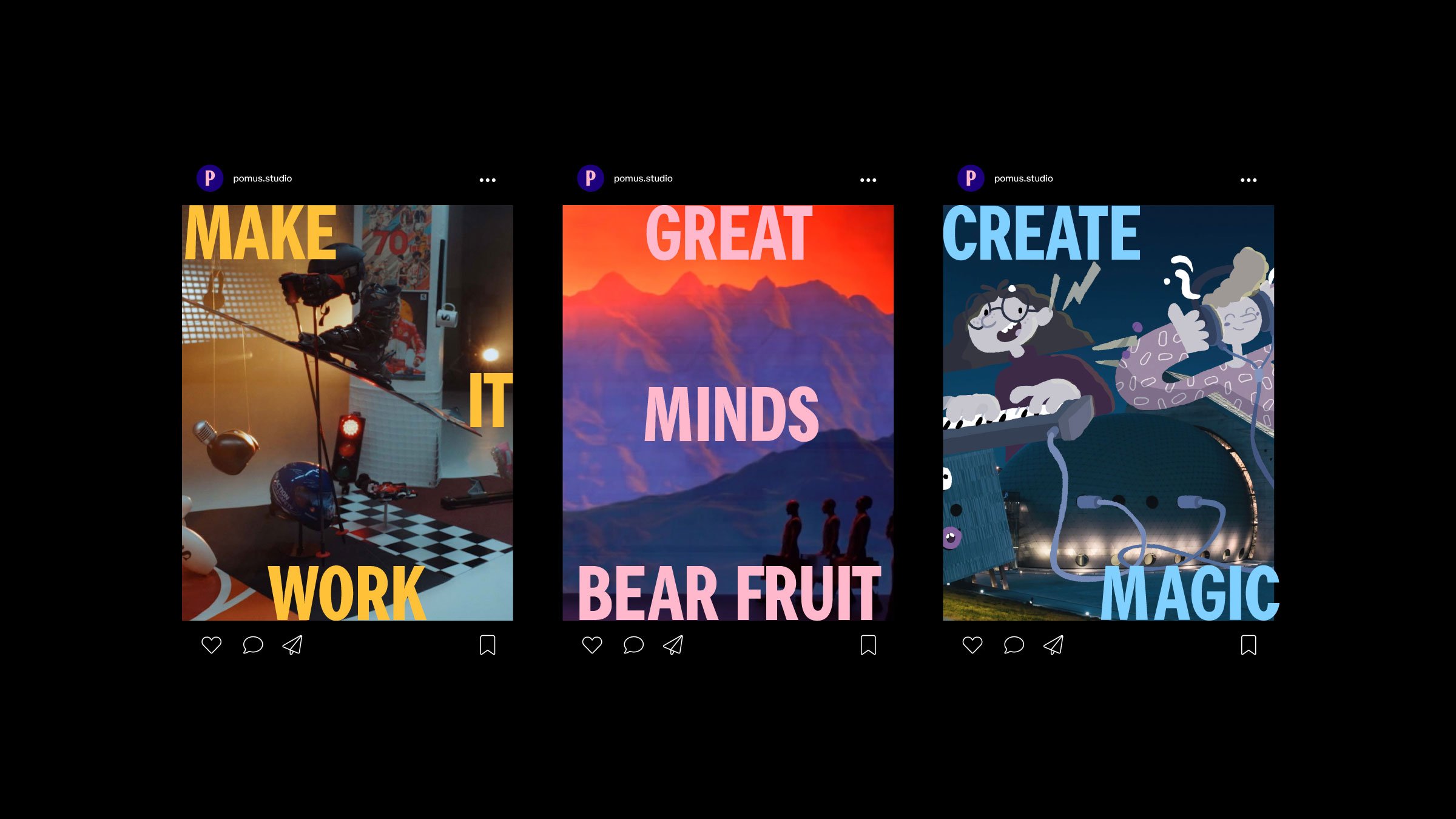

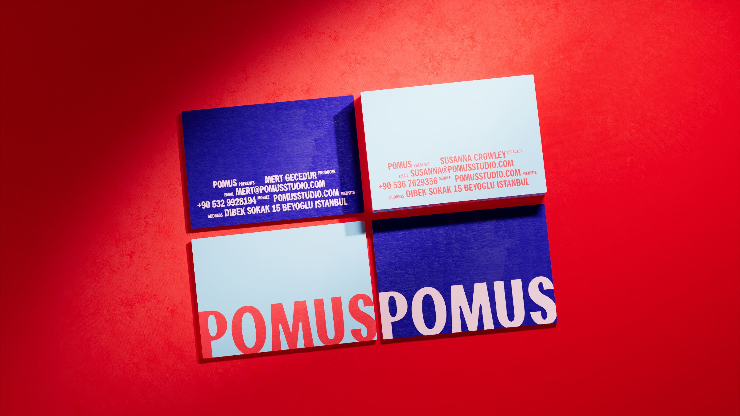
With so many film production companies leaning into more subtle and sombre branding, to show that they are serious about the medium, Sömestr’s identity for Pomus is refreshing in its carefree tone. It manages to introduce playful motion design and fun displays of colour without feeling childlike, and the end result does not detract from the studio’s professionalism. Instead, it invites viewers and creators into a welcoming space, where collaboration is key, and the medium of film can be celebrated in all its technicolour glory.
