WEEKEND by FCKLCK
Opinion by Emily Farbrother Posted 4 July 2024
Who doesn’t love a cheeky cocktail, especially one designed to grab and go? According to WEEKEND drinks, its cocktails are eight times faster to serve than it would take to make the same mix from scratch. With ready-made drinks – that’s ‘RTD’ in marketing slang – becoming increasingly popular, WEEKEND aims to ‘cut through the noise’ with a ‘laid back approach’ to bar-quality beverages.
Founded by two brothers and their cousin, WEEKEND was initially launched in the B2B space as a pre-batched on-tap product. The inspiration came from personal frustration: ‘On a warm summer night at Ghent’s Copacobana festival, [the trio] found themselves craving Mojitos to kickstart the party mood. However, a painfully slow queue at the bar threatened to spoil their night.’ Fast forward a year and the business was born, and originally named ‘Dorst’ (which means ‘thirst’ in Dutch).
Having expanded the range from keg to bottle (in two sizes) as well as cute little cans, in 2023 the team sought to broaden WEEKEND’s direct-to-consumer (D2C) relationship, and to grow internationally. There was also a desire to elevate the business into a more premium positioning. To help achieve these ambitions, WEEKEND approached Amsterdam-headquartered design agency FCKLCK for a complete rebrand.
‘The company was in a growth stage, expanding production, hiring more employees and creating new products that opened up D2C and retail audiences,’ explains FCKLCK co-founder & creative director James Krüger. ‘Dorst [now WEEKEND] had previously focused on convenience and efficiency. We were asked to help build a more culturally relevant and impactful brand.’
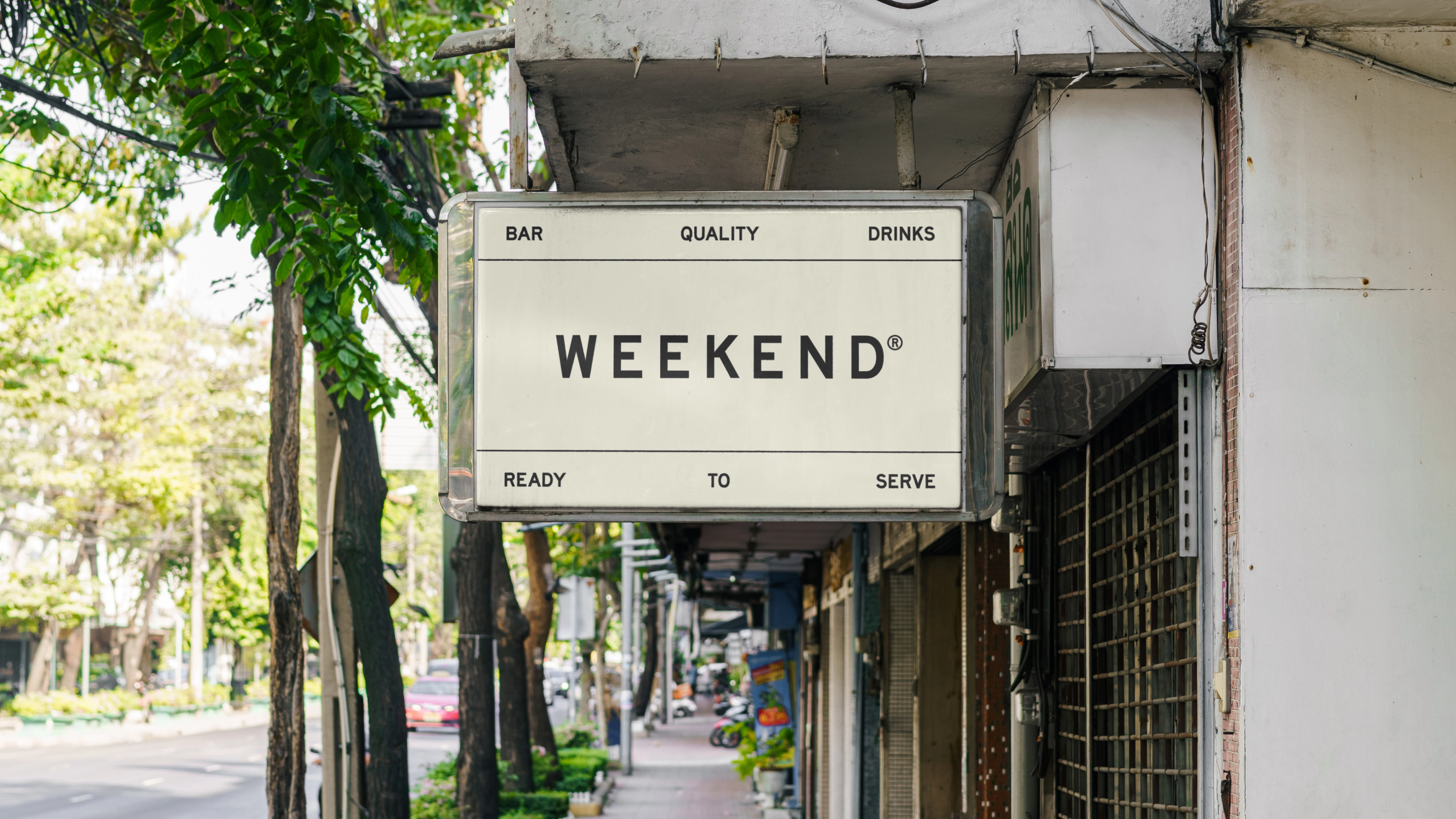
Renaming was first on the agenda. FCKLCK began by exploring names that would invoke an instant feeling of effortlessness and ease. And so ‘WEEKEND’ was chosen, immediately placing the brand in an emotional and conceptual space that highlights brand benefits – namely convenience and ease of use. It helps too, that unlike ‘Dorst’, ‘weekend’ is understood in many languages (Dutch, ‘weekeinde’; German, ‘wochenende’; Croatian and Czech, ‘vikend’).
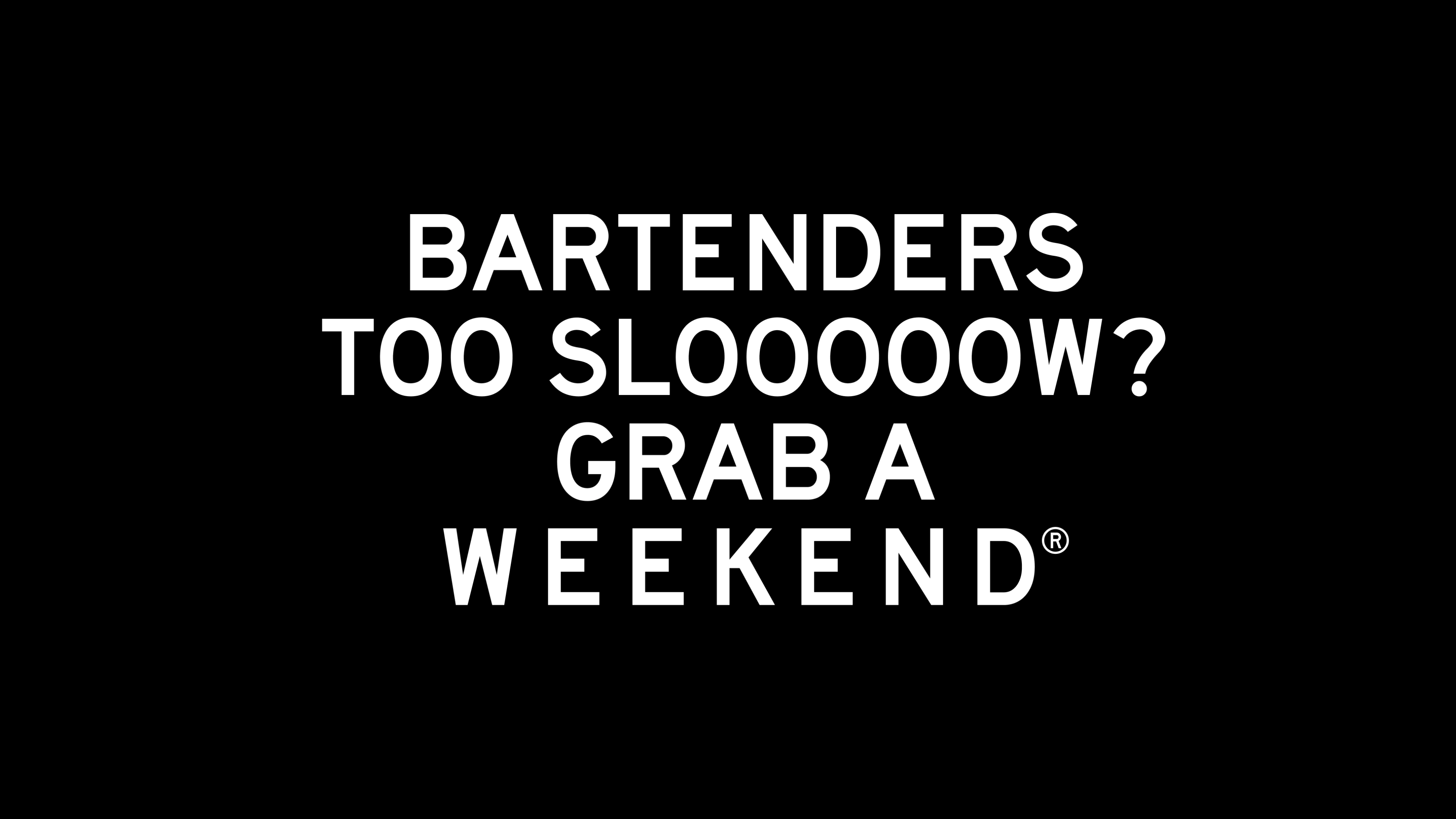
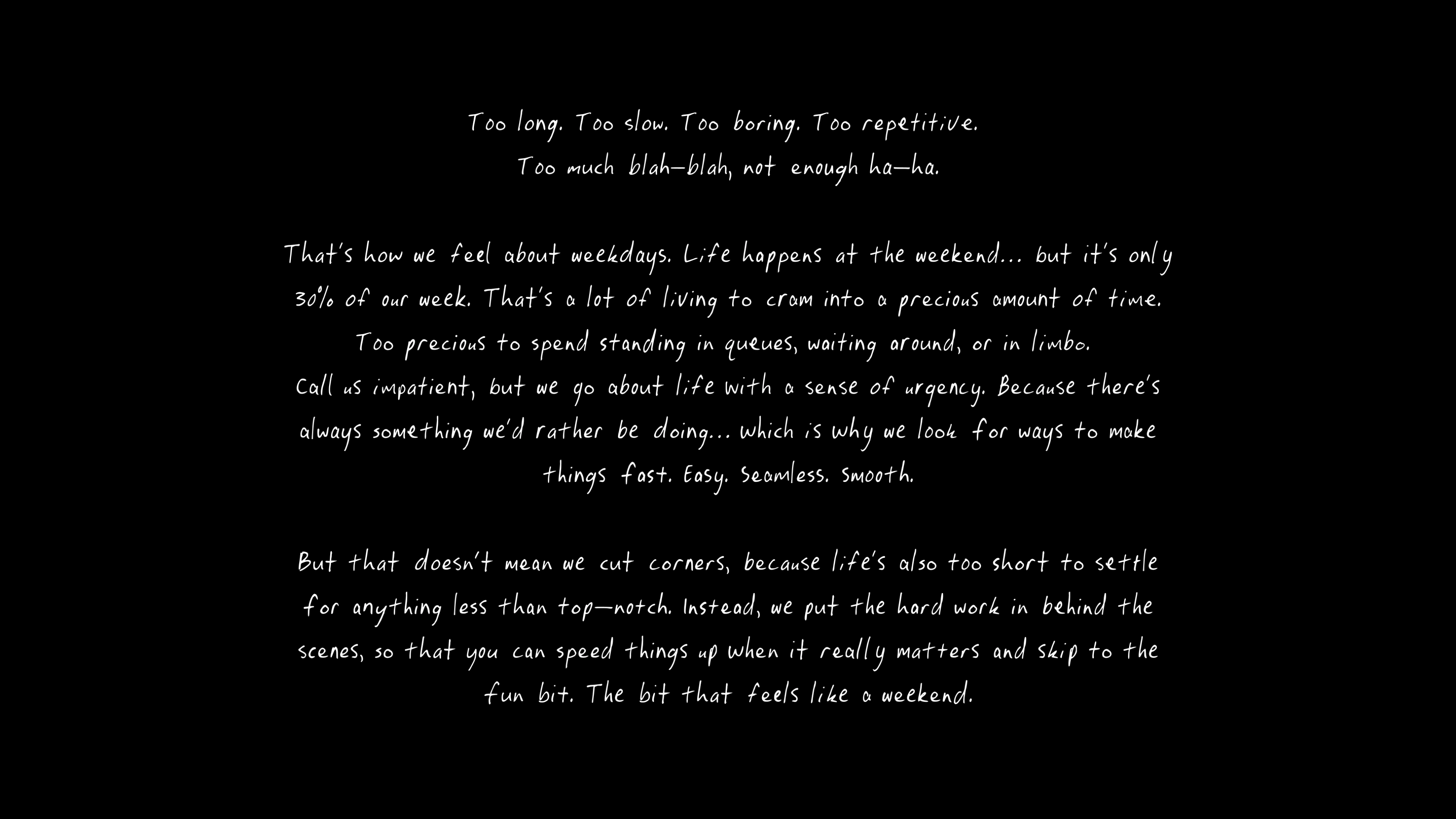
Playful copy accompanies the name highlighting the joy the weekend brings, in contrast to the mundane experience of the working week: ‘Too long. Too slow. Too boring. Too repetitive. Too much blah-blah, not enough ha-ha.’ But fear not! Because ‘there is always time for a WEEKEND’. It certainly chimes; if you ask me, a cocktail can be drunk any day of the week.
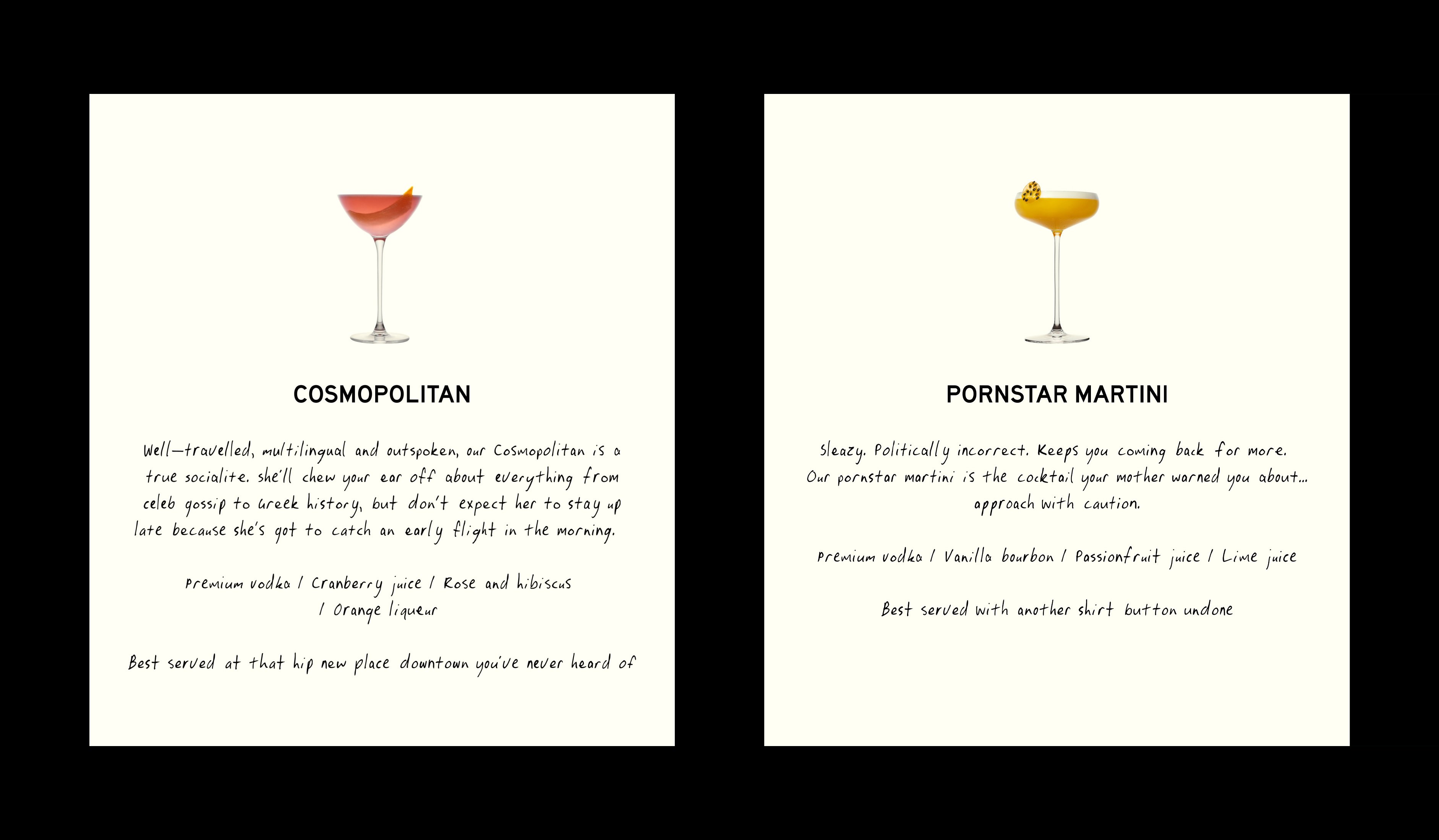
Like the copy approach, the design direction is based on the juxtaposition of weekdays v the weekend – weekdays being rigid and strict, while weekends (or WEEKENDs) represent a mode that’s more easy-going, carefree and effortless. Lines and grids are used across the design system, referencing an efficient approach to planning time using planners, calendars and notebooks. FCKLCK chose the font Highway VAR by Otherwhere for the logo and body copy, continuing the utilitarian aesthetic. This structure is then broken and disrupted by a custom handwritten font called Weekend by Hand. Mimicking scribbles and doodles, this was designed to be more natural and spontaneous, injecting playfulness and allowing for unexpected type placements.
Despite the crafted imperfection (there are seven variables per character), however, the custom script does have an inherent regularity, and perhaps FCKLCK could have been more adventurous with font choices to fully capture a sense of spontaneity and enjoyment. On pack, the font hierarchy could also do with some improvement, with little contrast between the size of the logo and cocktail name. But the overall impression is attractive and on trend, thoughtfully and consistently applied across the product range and the brand’s digital spaces.
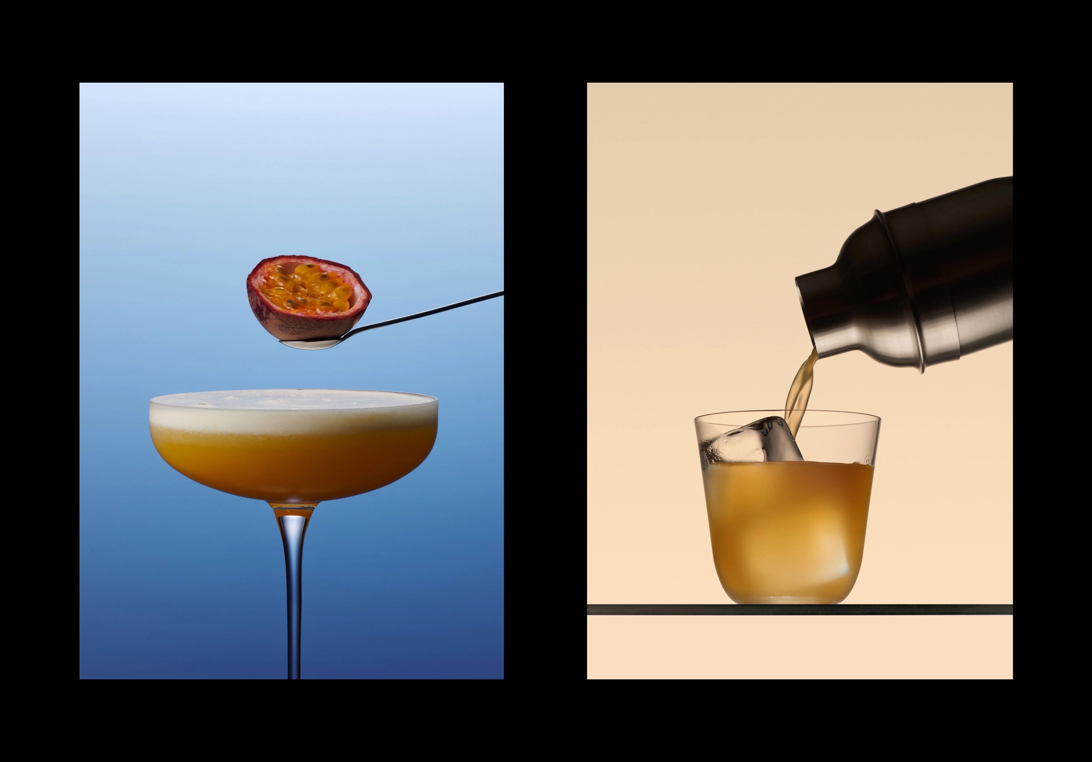
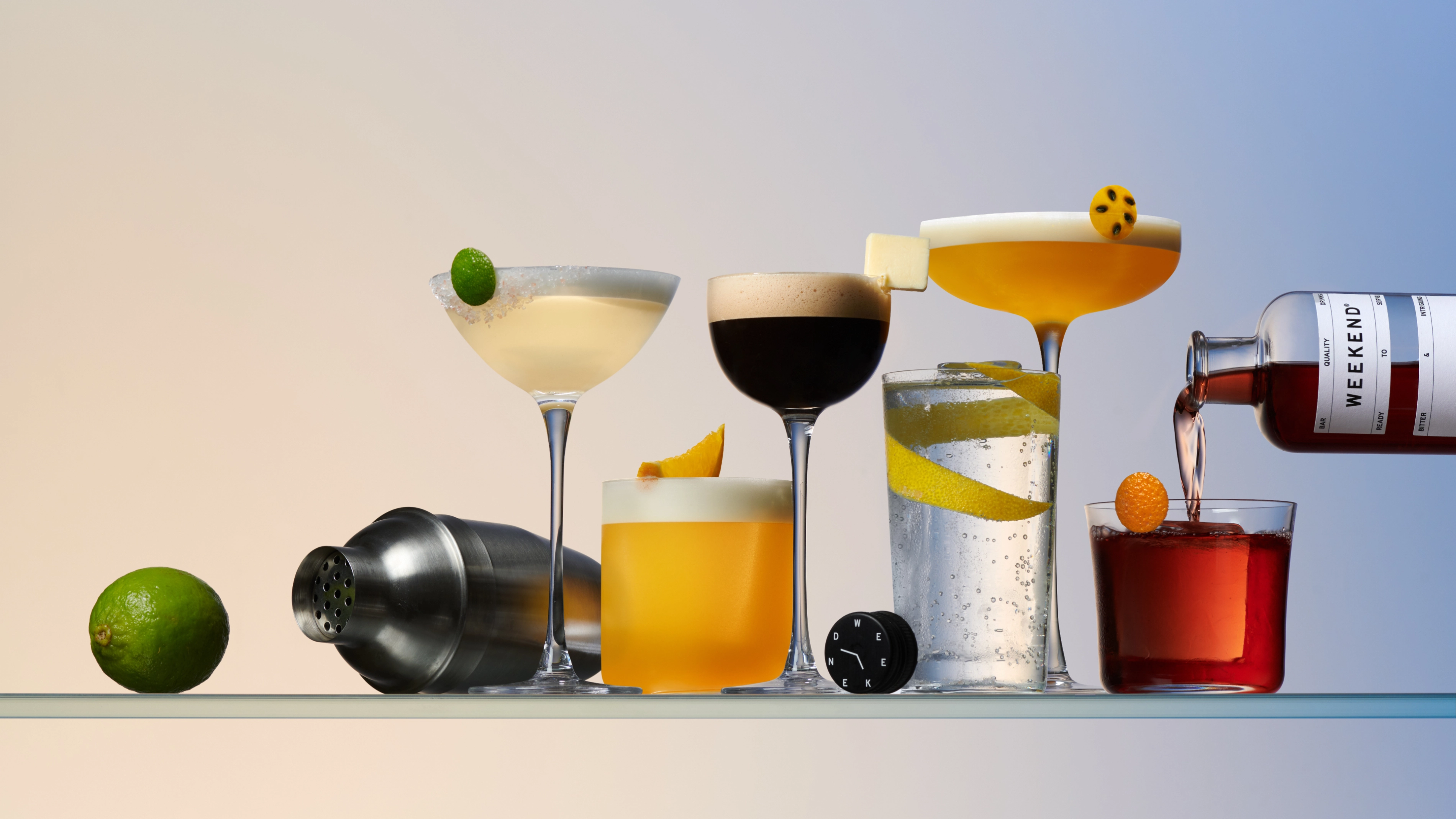
FCKLCK’s colour choices and photography are more exciting and adventurous with pops of colour inspired by the tones of the cocktails used across the brand’s online and physical spaces. Bottle packaging is neutral, allowing the colour of the drinks and image of the cocktail on the label to stand out.
In brand photography, things get even more tasty and premium. FCKLCK partnered with Harel+Ocante – a still life photography duo based in Paris – to create a suite of images which include bottle and serve shots. ‘We needed to overcome the quality perception of pre-batched cocktails and knew photography would play a key role,’ Krüger explains. The resulting imagery really brings the brand to life, conveying the high-quality nature of the product and creating strong visual consistency.
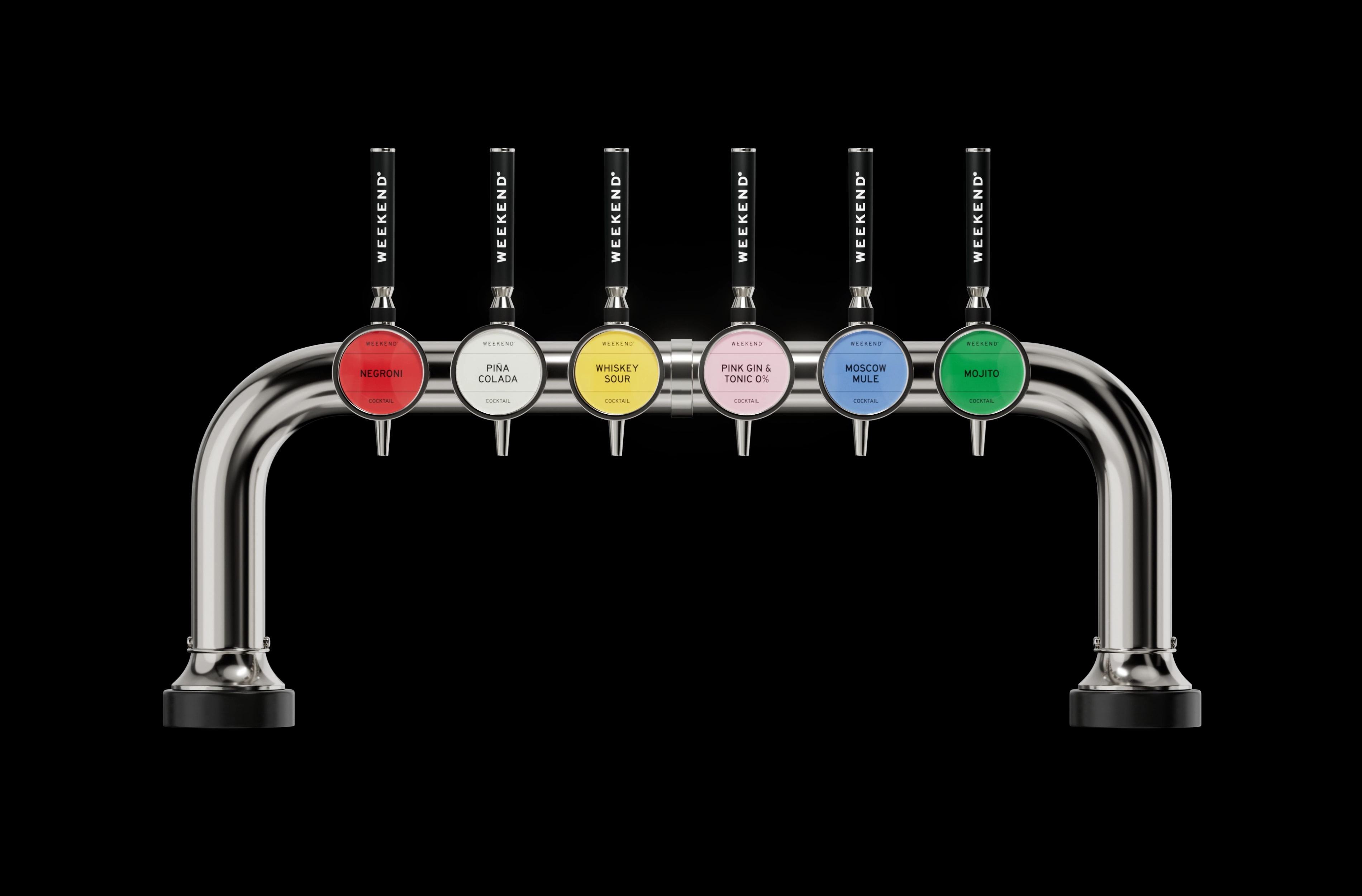
For those looking to engage in a brand’s lifestyle and aesthetic, WEEKEND ticks all the boxes to ensure audience appeal. As a millennial, I am definitely the target audience – willing to pay a bit extra for a nicely branded product. With some pretty average pre-made cocktails on the market the brand stands out to match the drinks’ price point and quality. With only a few other strong competitors, such as MOTH:, there is definite space for WEEKEND drinks to excel thanks to this savvy rebrand.
