La Mia by Papanapa
Opinion by Daniel Milroy Maher Posted 23 July 2024

In recent years, we’ve seen artisanal ice cream brands make an obvious departure from the maximalist, saccharine branding that their mainstream counterparts are so known for. In particular, the typeface-heavy, superimposed ice cream tubs of US-based brands have become a benchmark for exactly the kind of branding that more gourmet confectioners are keen to avoid. While Ben & Jerry’s iconic pastures filled with ingredient collages and boldly outlined text remain paradigmatic in this category, brands with more simplified offerings are looking to just that – their overarching simplicity – to guide their visual identities.
Indeed, most luxury ice cream brands are not interested in offering tubs filled with chunky pieces of cookie dough and brownie, and run through with caramel swirls. Instead, they choose to focus on purity of flavour and texture. Such is the case with La Mia, a São Paulo-based ice cream parlour that specialises in ‘pure gelato’. Offering classic, refined flavours like dulce de leche, macadamia, pistachio and french vanilla, its smooth, simple products are a far cry from the marshmallow-covered madness that made Ben & Jerry’s famous.

As such, the team at La Mia were keen to emphasise this difference, and reached out to local design studio Papanapa to develop a new identity for them. The brief was to position La Mia as a brand defined by its ‘accessibility in price, sophistication in experience’ and the fact that much of its ice cream is made to eat at home. This last point was a crucial part of the project, as La Mia is a self-service store, catering not only to those who want an immediate treat, but also shoppers who are looking for ice cream to enjoy around the dinner table, or on the sofa.
In turn, Papanapa responded by creating a visual system that is clean, clear and colourful. At the heart of the identity is the new La Mia wordmark, which utilises understated sans-serifs (Elephant & Greycliff CF) and lowercase lettering to provide an elegant, yet laid-back feel. As a result, the wordmark does not dominate the branding, but it also means that in certain contexts – on the tubs, for instance – it is difficult to ascertain the brand behind the product. This is also due in part to the small font size used for the packaging, which opts to highlight the flavours instead. The upside of this being that the tantalising ingredients featured in each tub are allowed to stand front and centre, drawing in customers.
![]()


Crucially, whereas many mainstream ice cream brands often like to show the ingredients through imagery, the packaging for La Mia simply spells it out using text, adding to the refined feel of the branding. Thankfully, the typeface used for the flavour names brings far more personality to the equation than the wordmark, contrasting with ‘La Mia’ through the use of all-caps letterforms and varying line weights. Black and bold, this text also stands in stark contrast to the surrounding colours, which are straightforward yet eye-catching.

Arguably, the colour palette chosen by Papanapa is where the identity shines. Composed of bright pastels and rich skin tones, the respectives hues used for each tub serve not only to draw attention, but also to accentuate the already mouth-watering flavours on offer. The satisfying range of colours moves from a clean white for ‘Coco Ranco’ (coconut) to a luxurious orange-brown for Doce de Leite (dulce de leche) and finally to a deep purple for Açai, with an inviting array of shades in between. It’s not unusual for ice cream brands to match their flavours with corresponding colours, but Papanapa has done an exceedingly good job here of allowing each flavour to come through without needing to be explicit with the visuals.
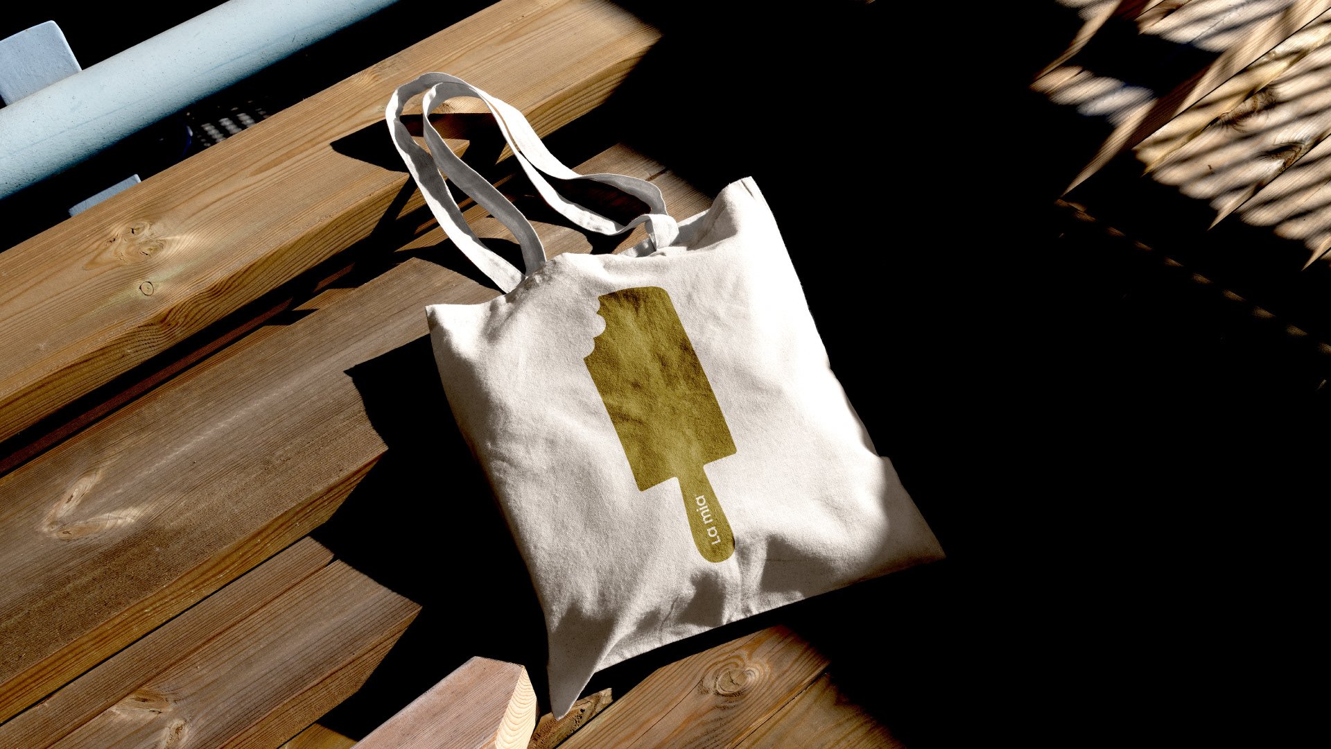
It’s also worth noting the small selection of illustrations that appear across the in-store branding, the online communications and the cardboard boxes used to transport the ice cream tubs. Simple silhouettes of ice creams on sticks and in pots highlight the versatility of La Mia’s offerings, as well as bring an element of whimsy to the identity. These illustrations are brought to life in equally uncomplicated animations, which add movement to an otherwise static brand. Tubs spin, spoons scoop and the different formats of ice cream come together to create fun and friendly displays.


It would be hyperbole to say that Papanapa is breaking new ground here with its work for La Mia. Many luxury ice cream brands (Beau’s being just one of them) have already discovered the sweet success of subtle branding that prioritises type and colour over imagery and illustrations. But it’s true that the design team have at least done it well. The quality and purity of La Mia’s ice cream is obvious in the carefully curated colour palette and the refined typography, and the simplicity of this aesthetic doesn’t mean that the branding is any less inviting. In fact, it does a brilliant job of kick-starting the taste buds, and allowing customers to imagine the delicious flavours that await them inside.