Sense by Buck
Opinion by Angelica Frey Posted 5 September 2024
Since the pandemic, sexual wellness offerings have carved out a space on the shelves of beauty and pharmaceutical retailers, from Sephora to CVS in the US, and even Boots in the UK (founded 1849). According to business insight platform Crunchbase, that’s thanks to ‘an increased cultural shift that embraced sexual pleasure as a crucial component of physical and mental health’. In 2023, the global sexual wellness market was valued at $20.6 billion, and is projected to reach $32.5 billion by 2033.
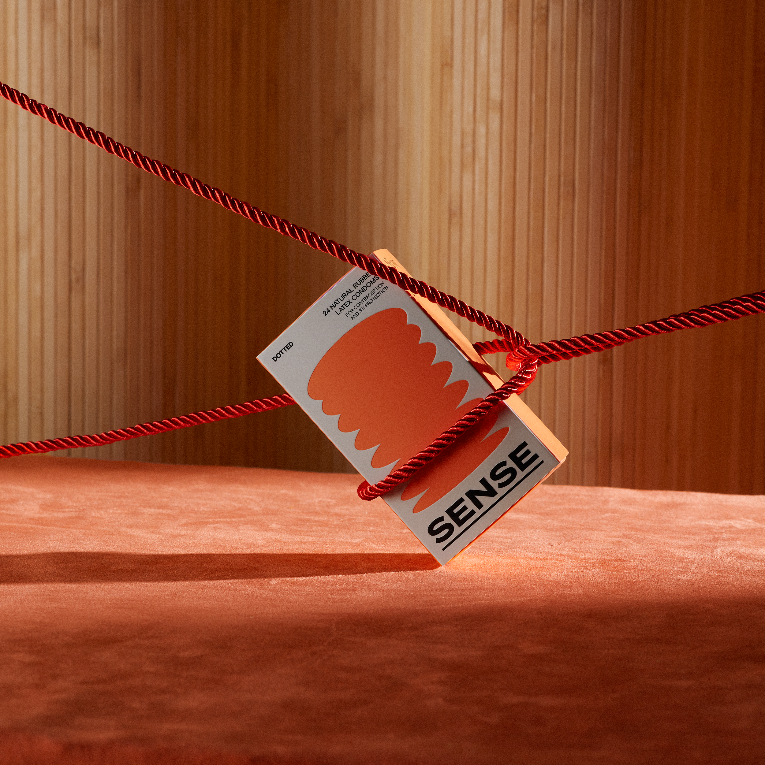
In this thriving industry, SENSE is a sexual wellness startup from Venezuela, founded on the core value of ‘play’. Ahead of its launch in North America, the company enlisted Buck to create a brand identity to help the products stand out in the aisle from competitors, typically packaged in schemes that are ‘dark, highly reflective, and glittering’, according to the agency. Buck wanted to bring SENSE’s packaging design out from the shadows, creating a suite of bottles and boxes that can take their place proudly on the nightstand, in full display.
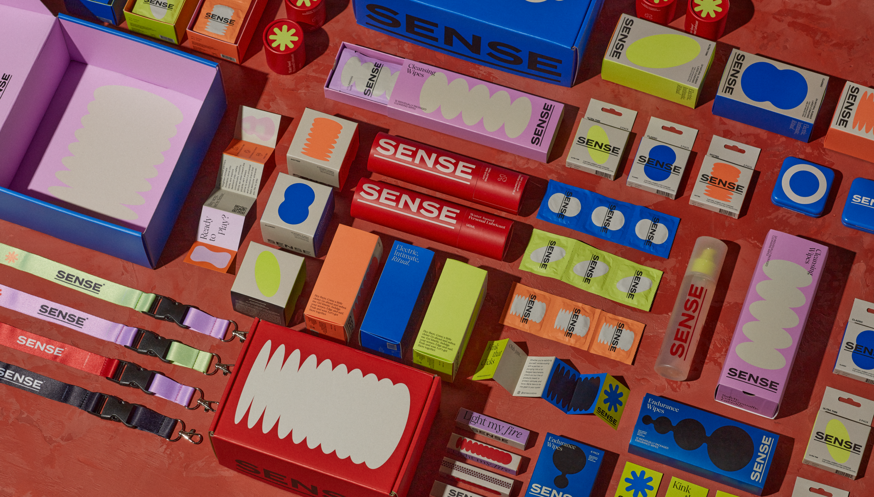
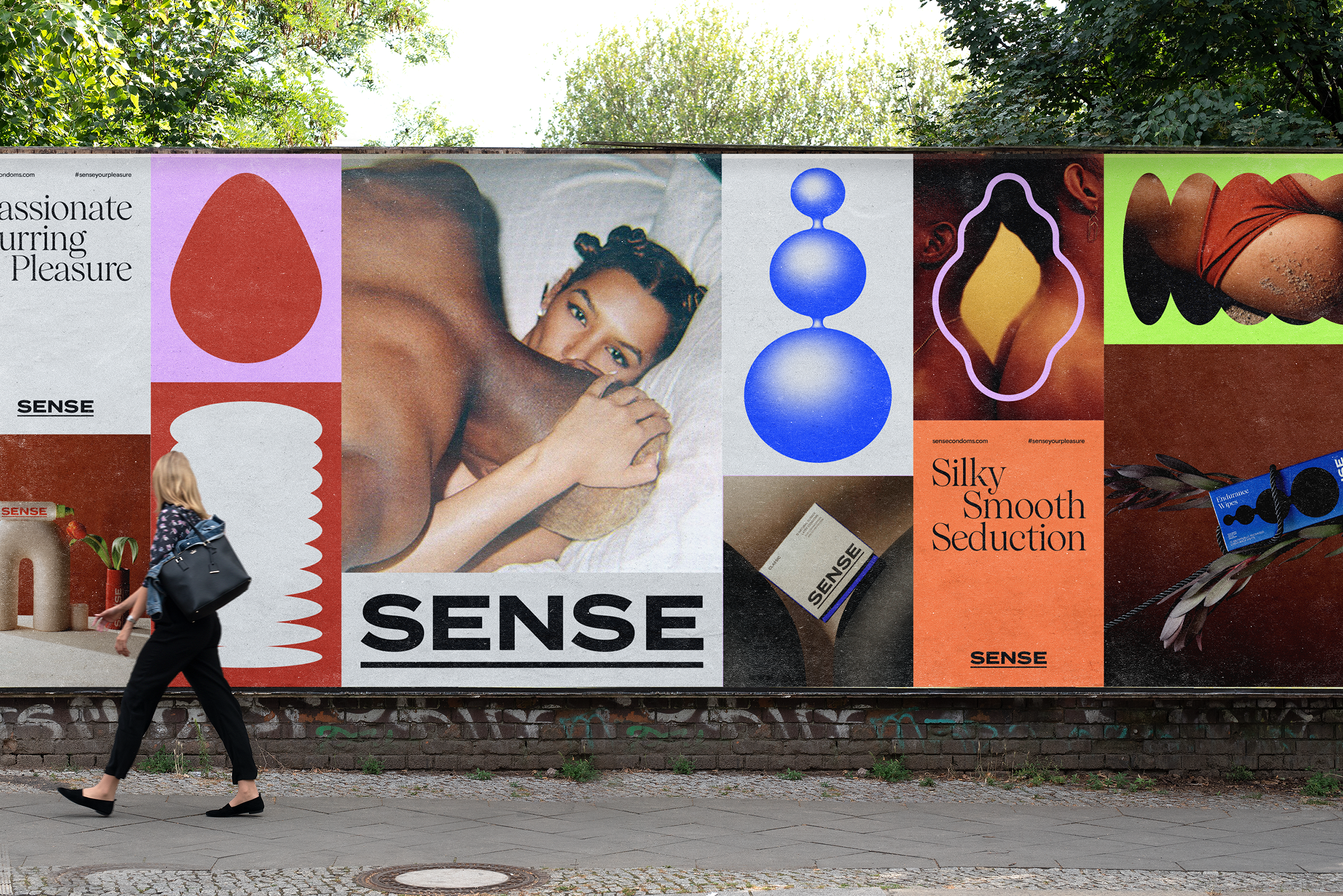
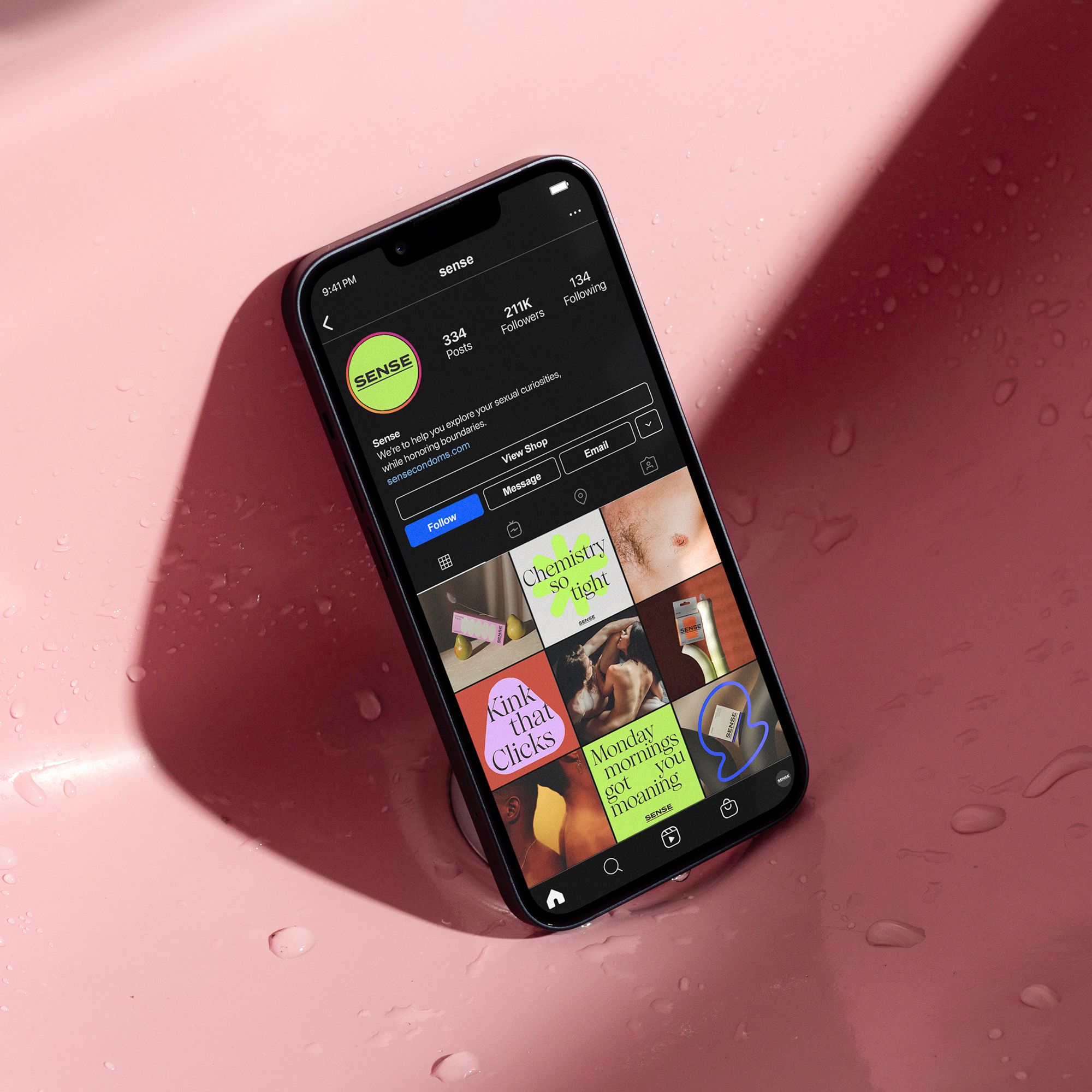
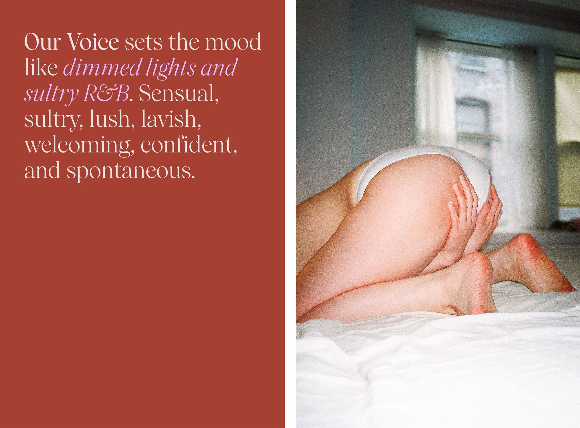
Given the central role of ‘play’ and the brand’s emphasis on confidence, boldness is at the heart of Buck’s visual identity. In terms of copy, the agency landed on turns of phrase that go straight to the point, projecting a ‘clear cut voice of sexual freedom to the world – with no shame, no censorship, and no BS’. SENSE’s Instagram bio, for example, reads simply: ‘We’re here to get you there.’
Abstract, curvilinear shapes create a playful graphic language, inspired perhaps by sex toys or body parts. There’s certainly something sensuous about the motifs, but they also have a sculptural neutrality – the sort of globular, organic aesthetic that’s been a mainstay in home decor for the last decade (consider, for example, the continuing popularity of Matisse prints, the return of the Murano mushroom lamp and the Ultrafragola mirror, and the trendy curved silhouettes of the Goober candles by Talbot and Yoon).
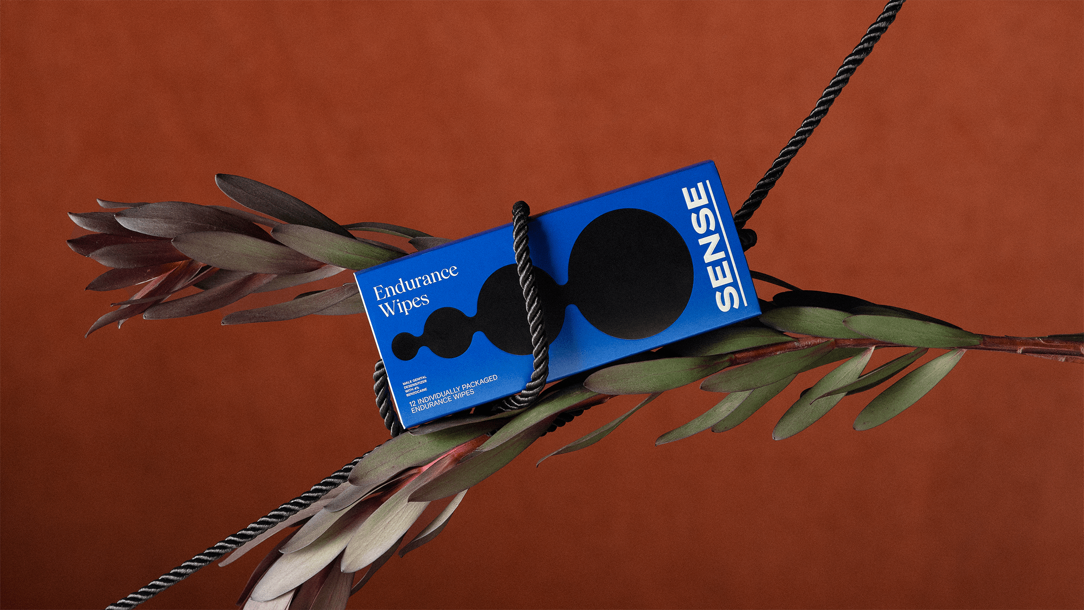
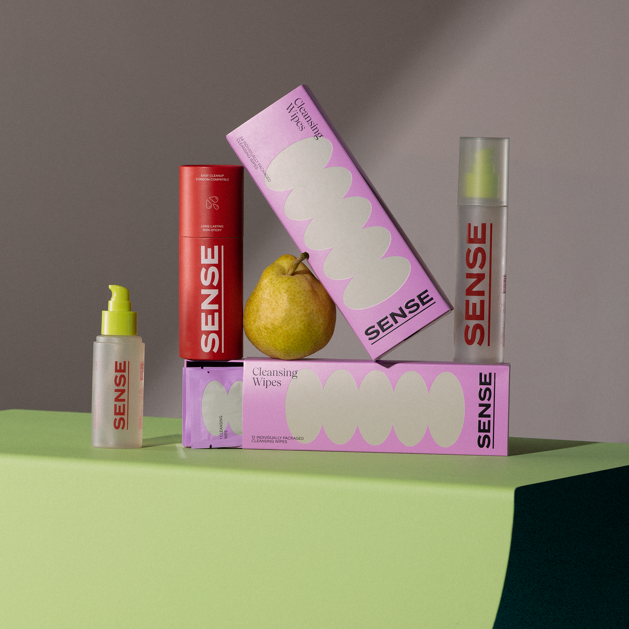
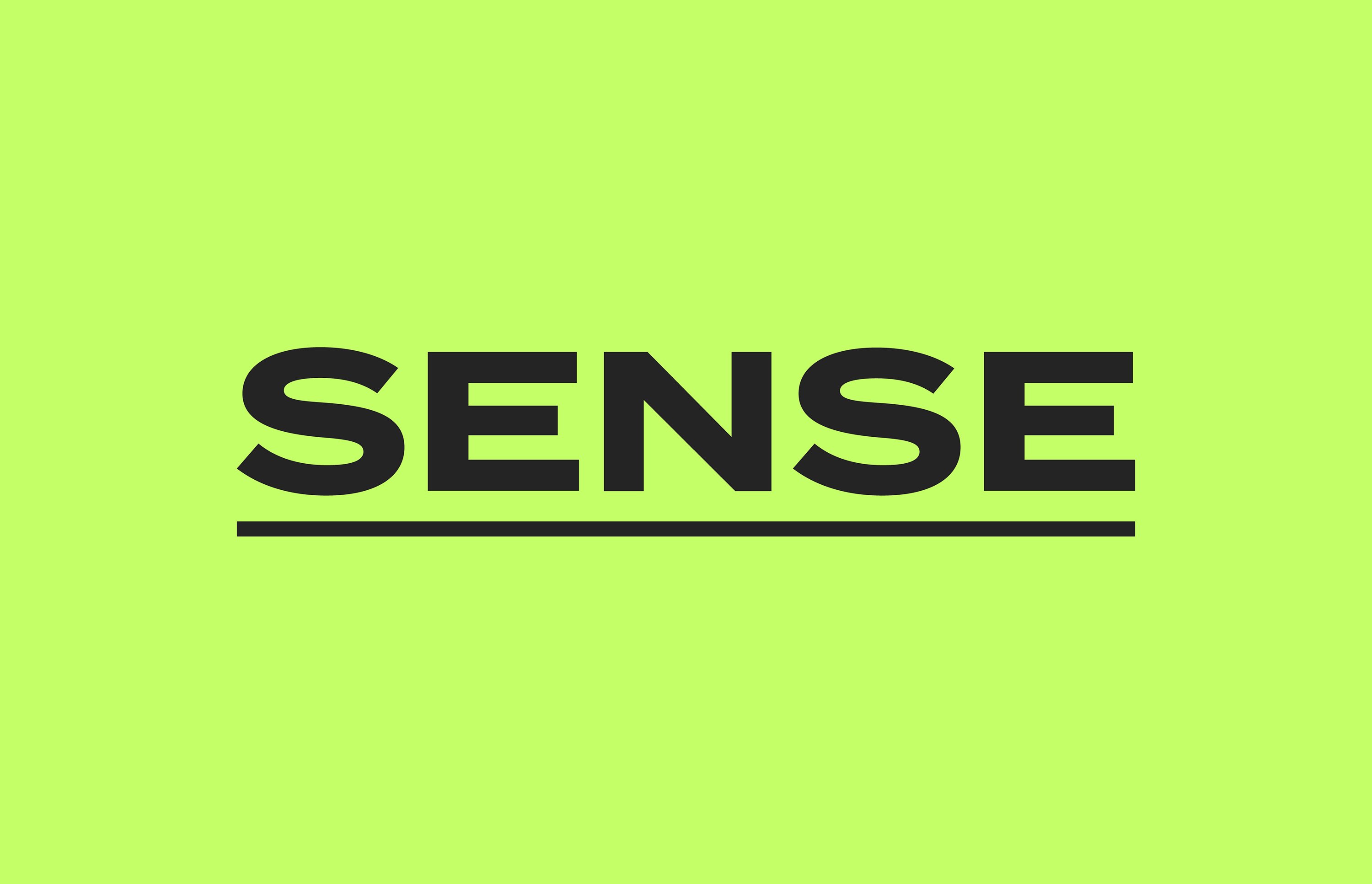
Packaging was developed with user-first principles in mind – the lube bottle is clear, allowing consumers to see how much of the product is left, while the condom wrappers are easy to open. In line with this functional approach, the wordmark comes in a bold, all-caps sans serif font, and is underlined. In contrast, headlines are elongated and sophisticated, set in Wulkan Display, a modern interpretation of old style serifs. There is an emphasis on typographic detail: in the brand guidelines, Buck demands, ‘When building headlines and type treatments, we like to hold our lines nice and snug. Keep the leading around 90–95% of type size, depending on its scale. Shift words a little this way or that to detangle any descenders from ascenders.’
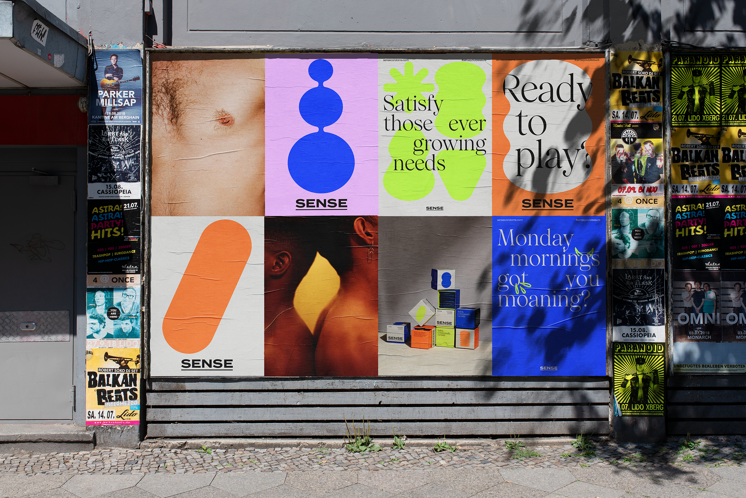
The colour palette is rooted in seven hues, including two neutrals named ‘Bone’ (a cool-toned off-white) and ‘Noir’ (a type of black), alongside neon-adjacent saturated shades, ‘Tangy Orange’, ‘Kinky Lime’, ‘Electric Blue’ and ‘Luscious Lavender’. The final colour, ‘Terracotta’, is a warm red with brown undertones, happily complementing both aforementioned categories.
This stylistic use of colour and shape is not unexplored territory in the personal intimacy space. You can find a similar direction in The Oh Collective, where a play-oriented aesthetic (complete with fauvistic shapes) is rooted in sherbet-coloured hues, such as sky blue and strawberry milkshake, and Tracy’s Dog follows a similar pattern. Head South, which specialises in personal lubricants, serums, and oils, employs a scale of bright pinks, blues, and greens. Dame now has a sunset-coloured palette, with hues ranging from periwinkle to deep, saturated orange; Hello Cake, which also offers sexual-wellness prescription treatments on top of the usual product lineup has a warm and bright colour scheme. Even the Moon Cup now comes in an electric-blue packaging.
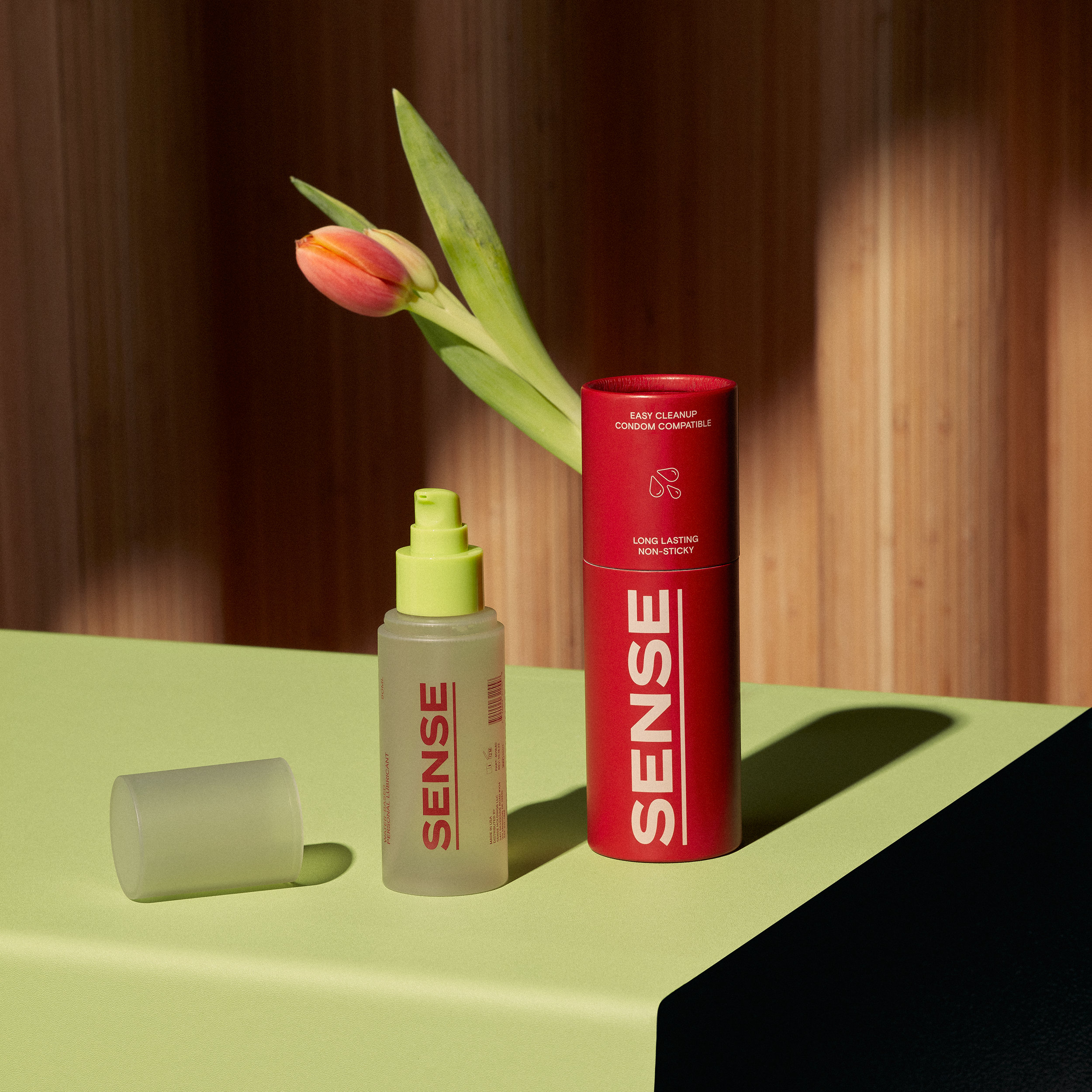
Buck’s work for SENSE does not feel derivative, though: rather, an industry-wide adoption of similar colour palettes and silhouettes celebrates the playful component of sexual wellness, signalling some sorely needed optimism and joy amid the current fraught climate surrounding reproductive rights.
