Wholy Greens by Control Studio
Opinion by Angelica Frey Posted 10 December 2024

Wholy Greens is a B-Corp certified Dutch food brand dedicated to transforming the way people perceive and enjoy vegetables. Its mission is to create a mindset shift from ‘having to eat veggies’ to ‘genuinely loving veggies’ – and it uses pasta as its primary vehicle.
It’s a smart set up, not least because, frankly, what experiences aren’t more enjoyable when you bring pasta into the equation? But also because ‘healthy’ pasta alternatives are having a heyday with dozens of new brands storming social media. Enter the likes of Goodles, a nutrient-packed, high-protein and high-fibre instant mac ‘n’ cheese; Lupii, made from lupini beans; Brami, sold under the mantle of ‘New Era Italian Food’; and of course Banza, the chickpea-based substitute that is now ubiquitous in US supermarkets.

While the company launched in 2018 as ‘VeggiHap’, it subsequently changed its name to Wholy Greens, indicating both ‘whole’ – as in ingredients that are good for you, whole foods – and ‘holy’, implying a moral aspect. This second reading connects not only to the recipes (composed of at least 50% veggies), but the way in which the brand emphasises sustainability, health and community in every aspect of its operations
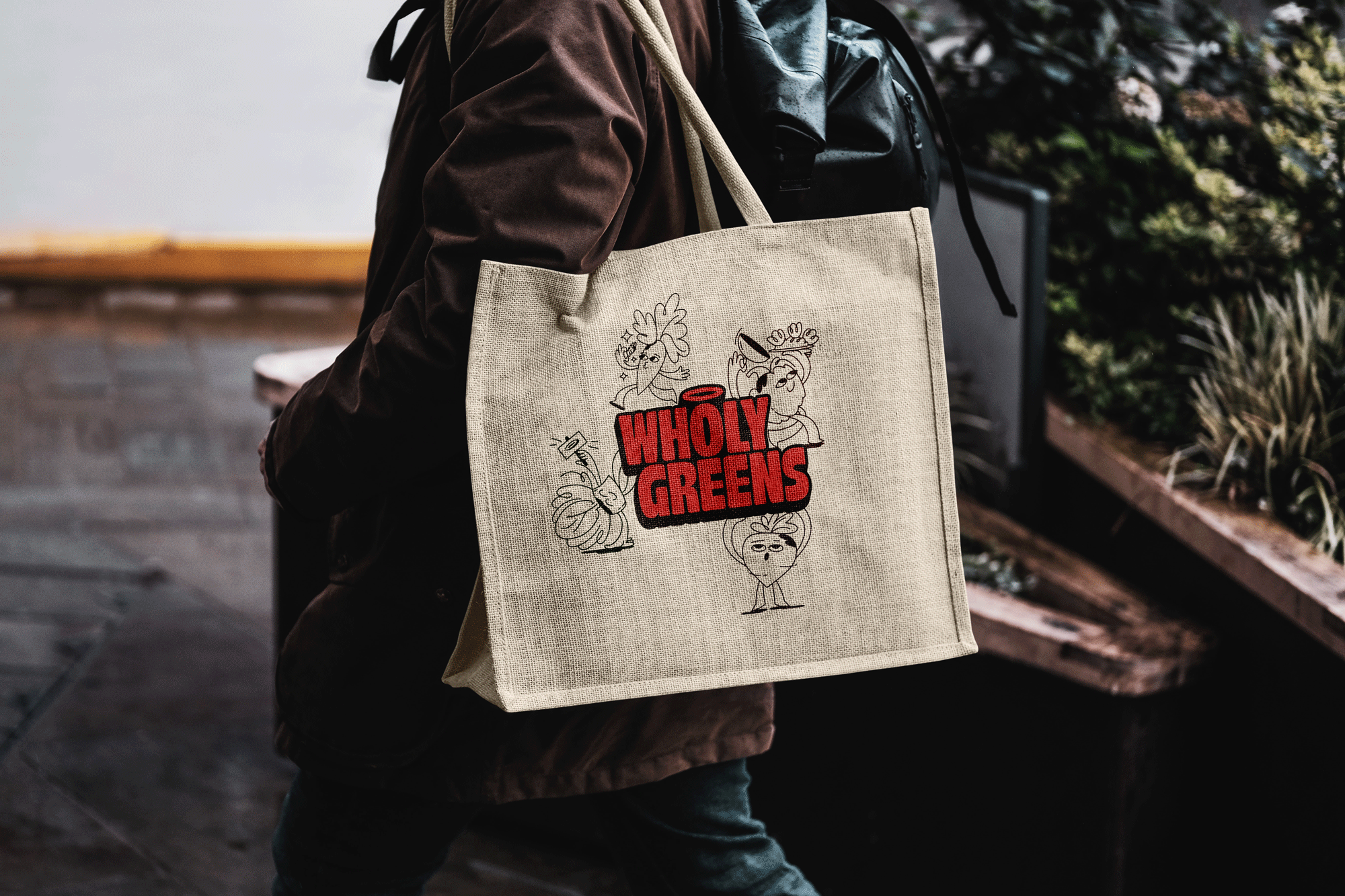
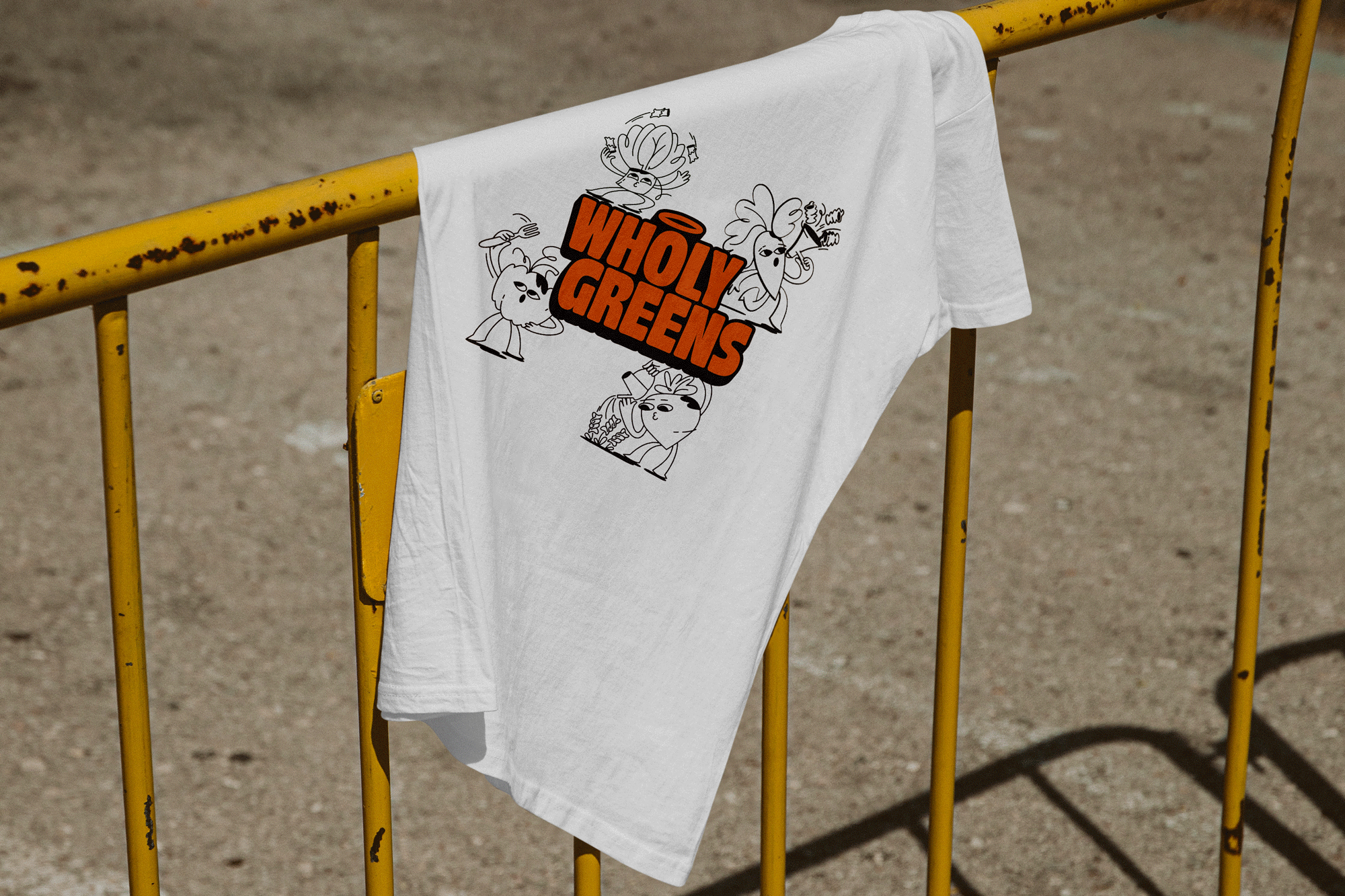
The team enlisted Amsterdam-based digital and design agency Control Studio to develop a brand identity that showcased this ‘holistic’ approach to healthiness (more ‘wholy’ puns to follow…) And at the heart of the identity is the Wholy Ring of Goodness, a symbolic logo ‘representing wholeness, balances and the brand’s commitment to minimising waste through sustainable practice’. Neatly enough, it’s also a halo.
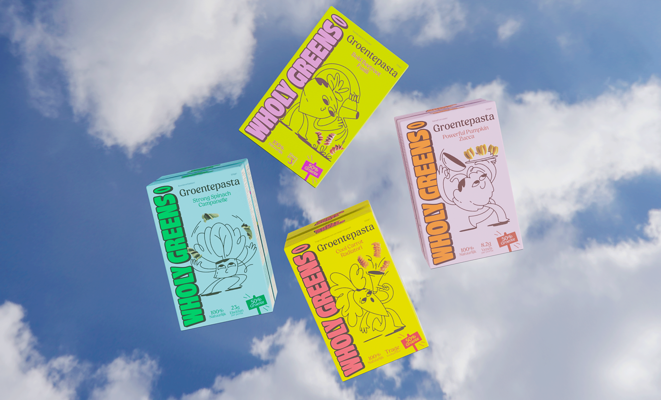
Complementing this is the introduction of the playful Wholy Veggi family – a cast of illustrated anthropomorphic characters designed to educate and inspire. Each is shaped after the key ingredient in each type of pasta and springs into life with its own vibrant colour palette, alternating warm and neon hues, like a capsule collection of patterned jumpers from the 80s.


The variety ‘Bold Beetroot Fusilli’, for example, features a beetroot watering plants on a lime-green background and a candy-pink wordmark; while ‘Strong Spinach Campanelle’ has a leaf-shaped mascot juggling bell-shaped pasta on a baby-blue background and a bright-green wordmark. The package design combines these illustrated elements with magnified photos of pasta (not to scale, I’d assume).
This investment in original art and characters isn’t gratuitous: it speaks to Wholy Greens’ mission to reconnect individuals with nature, through hands-on experiences, which include the very same activities we see the characters being engaged in: harvesting fresh produce, creating meals that are nutrient-rich without sacrificing taste, and being vocal about one’s own values.
It’s a beautiful exercise in world building, using colour and art direction to position the brand as youthful and forward-thinking while layered storytelling encourages sustainable living and healthier habits.


