Compound by DesignStudio
Opinion by Angelica Frey Posted 2 January 2025
What does ‘healthcare’ look like today, especially when we’re increasingly talking about preventative treatment? For Parsley Health and GlycanAge, which promote functional medicine, it’s serene – all blush pink, forest green and rounded corners; for Modern Age, which focuses on longevity, it’s more clinical, with high-resolution botanical imagery and classical icons; Ezra, which offers full-body MRIs as cancer prevention, goes with yellow and white to signal positivity.
Compound – part of digital healthcare company Eucalyptus – is focused on preventative health and performance for men. Its three-pronged programme is articulated in diagnostics (including a ‘DEXA scan’ and ‘VO2 Max test’), protocol and a toolkit providing ‘deep insight, coaching and accountability’ enabling men to ‘optimise their health and achieve longevity’ by working on incremental change. To cut through the marketing talk, Compound combines medicine with a fitness and dietary regime. This is delivered through a combination of telehealth services and in-app support as well as in-person diagnostics and consultations in clinic.
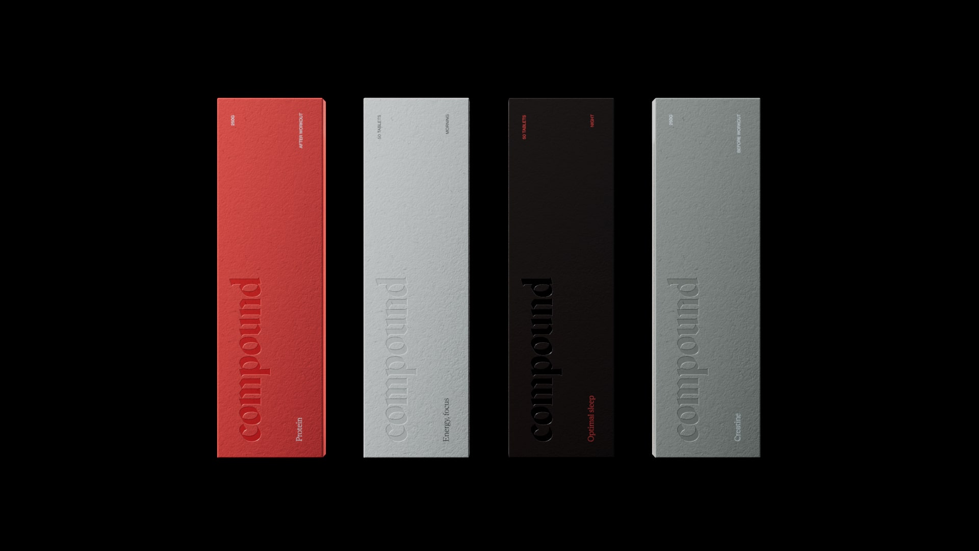
Compound enlisted DesignStudio (Sendwave, Going & Eurostar), the branding agency based in London, New York and Sydney – for brand naming, strategy and experience as it geared up to launch to market. The brief was to differentiate Compound from its competitors by highlighting its offering in terms of analytics, programming and clinical grade diagnostics. That’s those DEXA scans and VO2 tests, along with detailed blood work, which can help to identify potential health issues, as well as set realistic and measurable goals.
Naming was critical. ‘In naming Compound, we wanted to ensure a clear connection to truth and strategy, so brought together the two work streams, building an informed feedback loop’, DesignStudio explains. The name highlights the impact of long-term consistent positive action: ‘It’s not just repetitive efforts which yield results but the small, incremental improvements, when reinvested which create lasting additional positive impact’. This is further amplified by the brand idea, ‘To The Power Of’, which posits that an individual’s health and fitness goals are the byproduct of consistency in compounding actions.
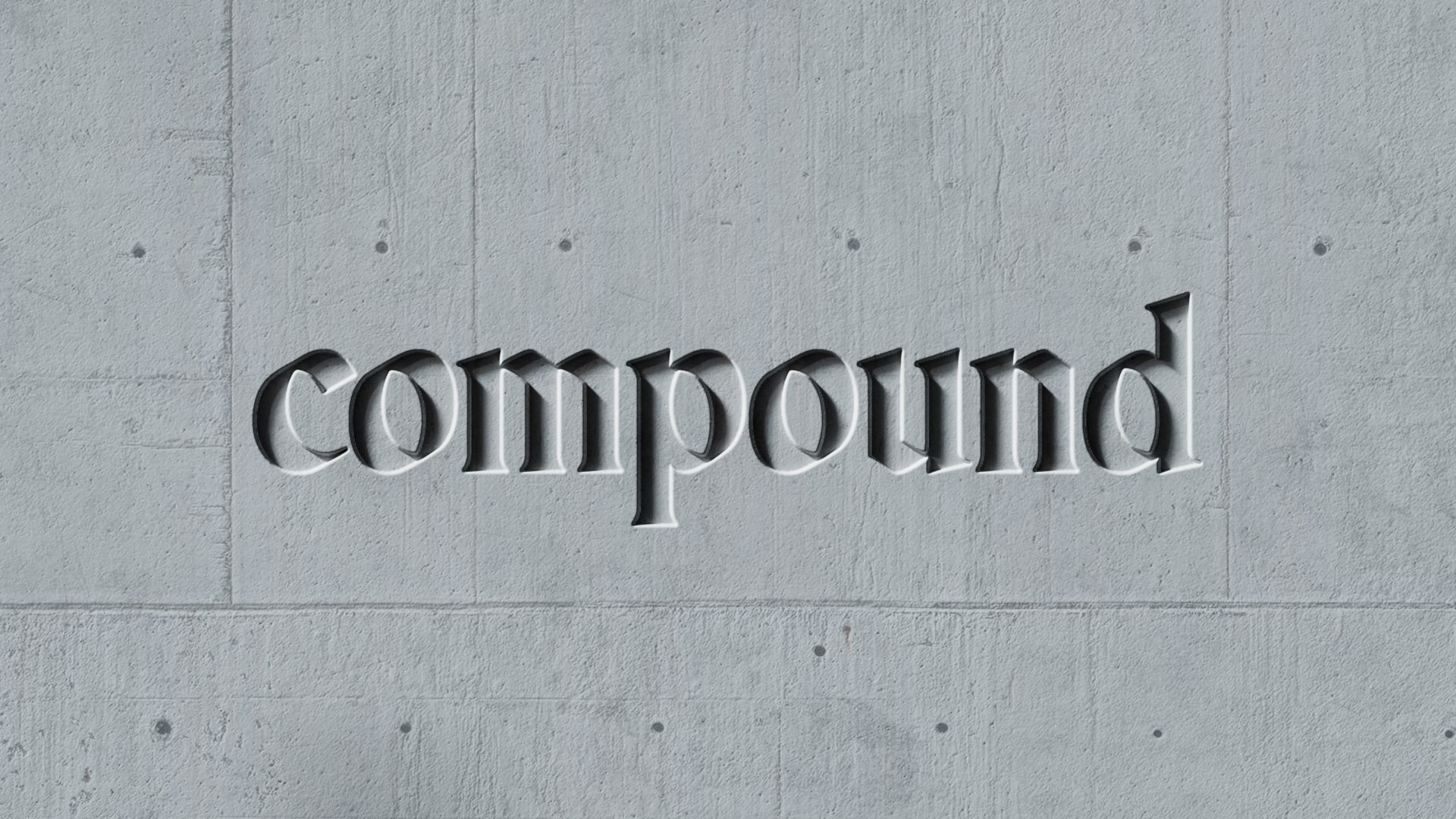
The Compound wordmark, resembling a sleeker version of Fraktur, has elements of both Gothic and early-digital aesthetics which – according to DesignStudio – speak to ‘the deep insight and truth of the analytics and the spirit and ambition’ of self-improvement. Supporting fonts, including Rhetorik and Neue Haas Grotesk, continue the balance of old and new in the brand typography.
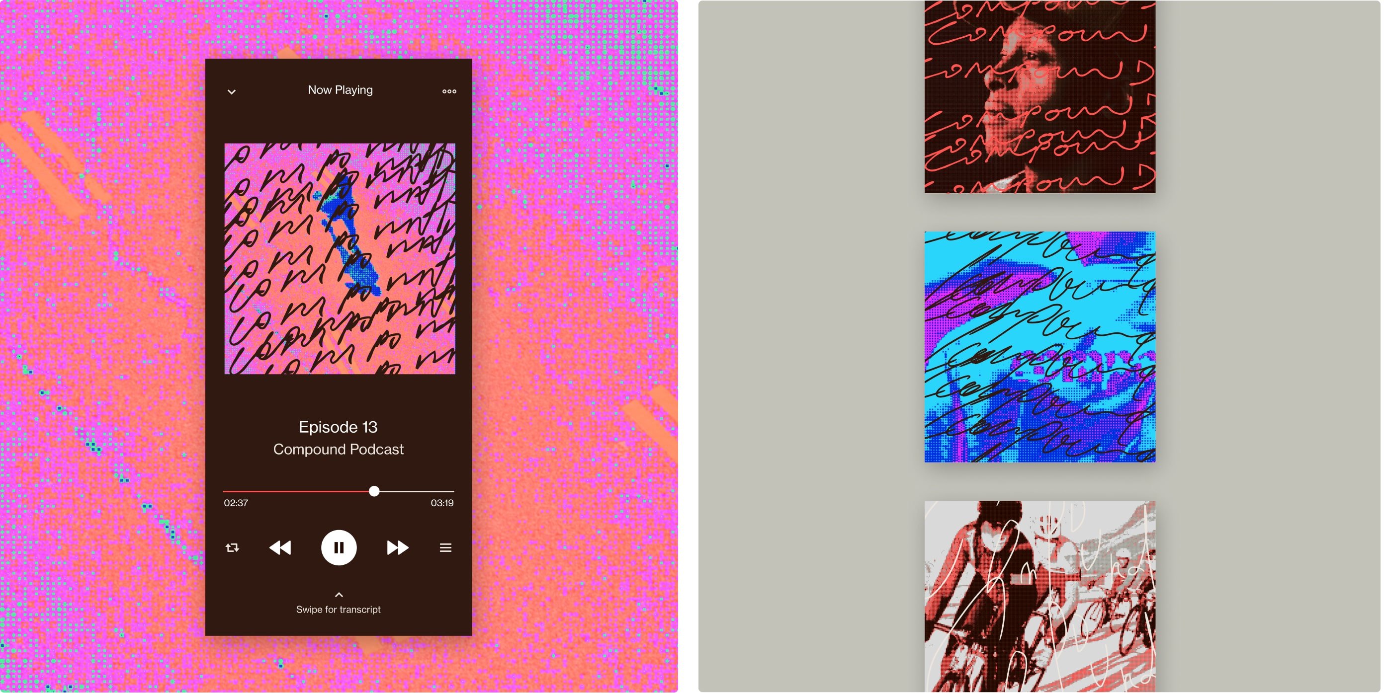
The images featured on Compound’s website and social channels recreate and reference the visual effects of a DEXA scan and a full body x-ray, where different areas present alternating patterns of subtle warm tones and neon-coloured hues. The asset suite also includes a series of icons: one depicts a leaping man performing an aerodynamic ‘Super Mario’ jump while another has three men of different heights standing side by side. These icons have photorealistic proportions but are rendered in monochromatic pixel art, which denser pixels in the darker areas and more sparse ones in the lighter patches. When it comes to illustrating Compound’s methodology, a shuffling deck of cards guides users through the steps – as you scroll the next card comes to the front.
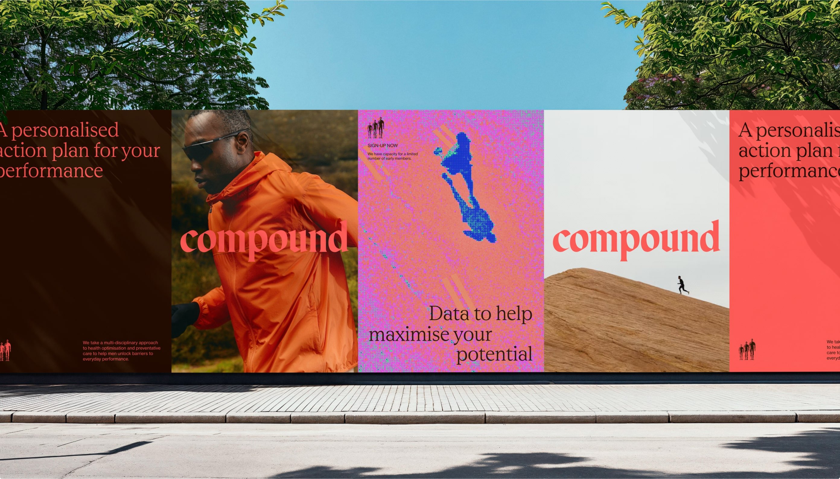
DesignStudio has also made space for clients in the brand. Using technology called PolyCam, Compound takes the traditional before and after images and transforms them into 3D headshots, adding dynamism and customisation. There is also space for client-created versions of the brand name, which take the shape of something signed, scrawled or written. ‘These marks then appear through the client journey to provide personalisation and personality, recognising that each health journey is individual’, DesignStudio explains.
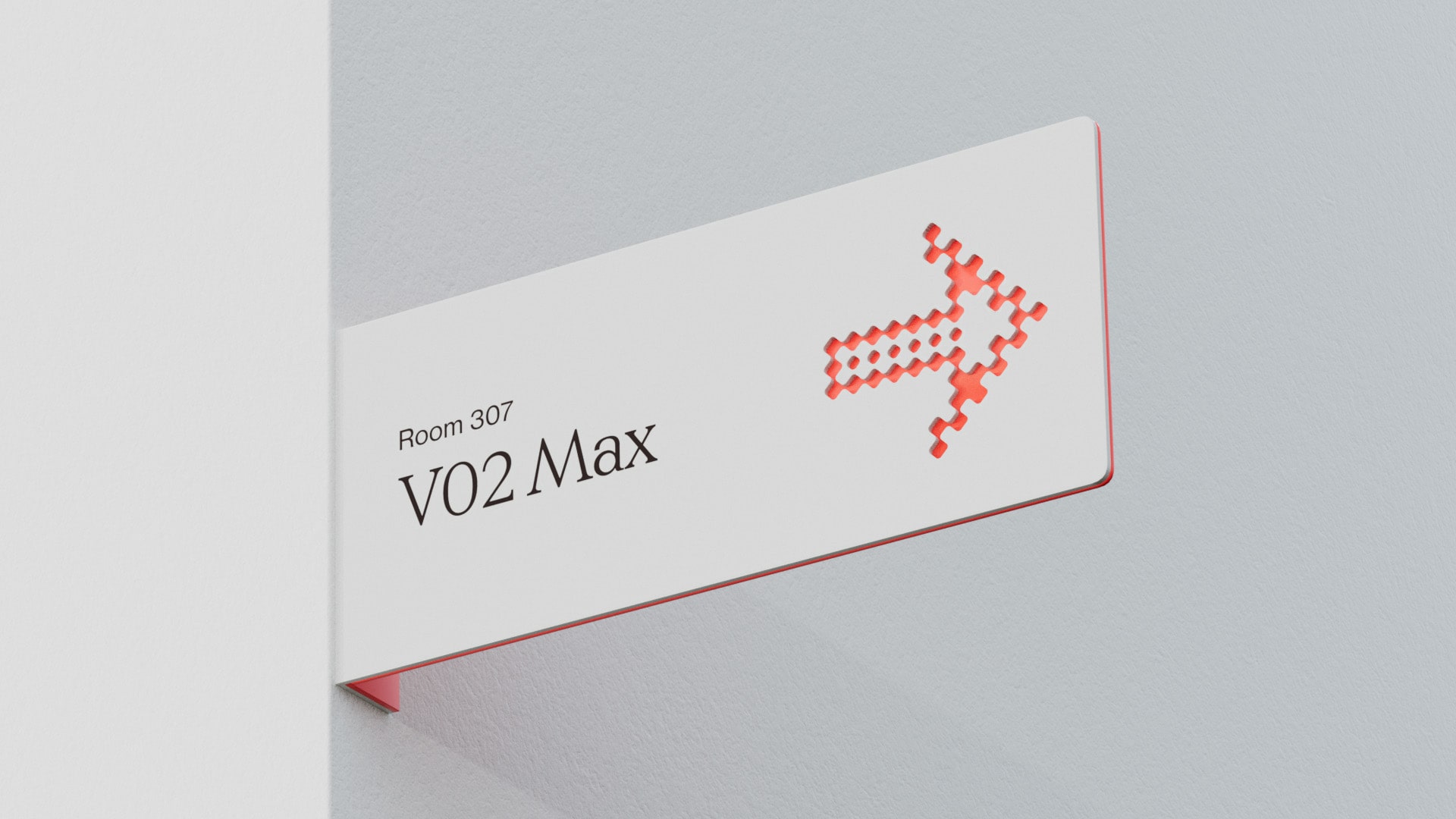
In the crowded marketplace of personalised health, DesignStudio has helped Compound to push the boundaries of what a healthcare brand can look like: the combination of pixel art, gothic scripts, and a lively colour palette offers levity, competence, and a form of calm reassurance when it comes to delivering sensitive health information.
