Helions by Pentagram
Opinion by Eleanor Robertson Posted 1 April 2025
HELIONS… now that sounds impressive. Something to do with helium atoms and stellar fusion, the force that powers stars? Or perhaps it’s invoking Helios, the Greek god of the sun, blazing his chariot across the sky? Nope – it’s actually a tribute to Helions Bumpstead in Essex, a beneficiary of the British gift for naming that also gave us Pratt’s Bottom (Kent), Nether Wallop (Hampshire), and Penistone (South Yorkshire). But it’s apt that ‘Helions’ conjures those associations of light and creation, since the rural village now lends its name to a new photography-focused publishing house, founded by proud native Jack Davison.
On Helions’ homepage, Davison describes himself as ‘a very tired father of two’, but this seriously underplays his credentials. He’s a globally-renowned portrait and documentary photographer with work housed in the permanent collection of London’s National Portrait Gallery, as well as Elton John’s personal archive. In between solo exhibitions, Davison has shot for clients like Hermès and Burberry, and published several books. And he’s a regular contributor to The New York Times Magazine – which is presumably where he met its former art director, now Pentagram partner, Matt Willey.
The two are long-time collaborators, united by a shared creative instinct that blends the imperfections of analogue techniques with an experimental approach to composition. Davison’s photography has graced many of Willey’s most distinctive covers (The New York Times Magazine, Port, Avaunt); in turn Willey’s editorial design provides the framework for Davison’s annual zines (an artistic retrospective of the year). Their relationship is symbiotic as much as it is reciprocal – Willey’s design choices heighten the impact of Davison’s images, while Davison’s photography injects Willey’s graphic layouts with raw emotion and tactile energy. So it’s no surprise that when Davison needed a visual identity for his latest venture, he put his trust in Willey.
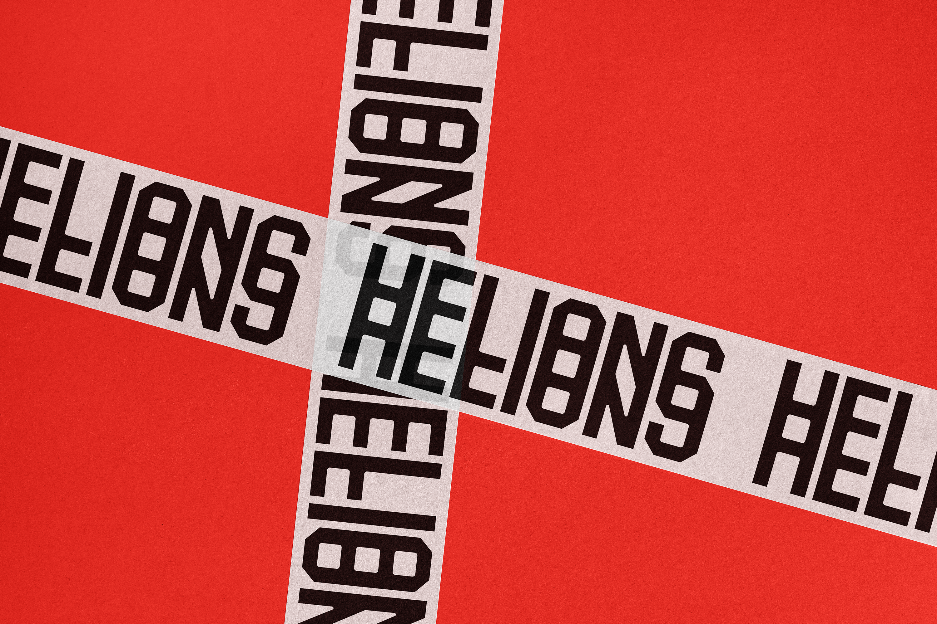
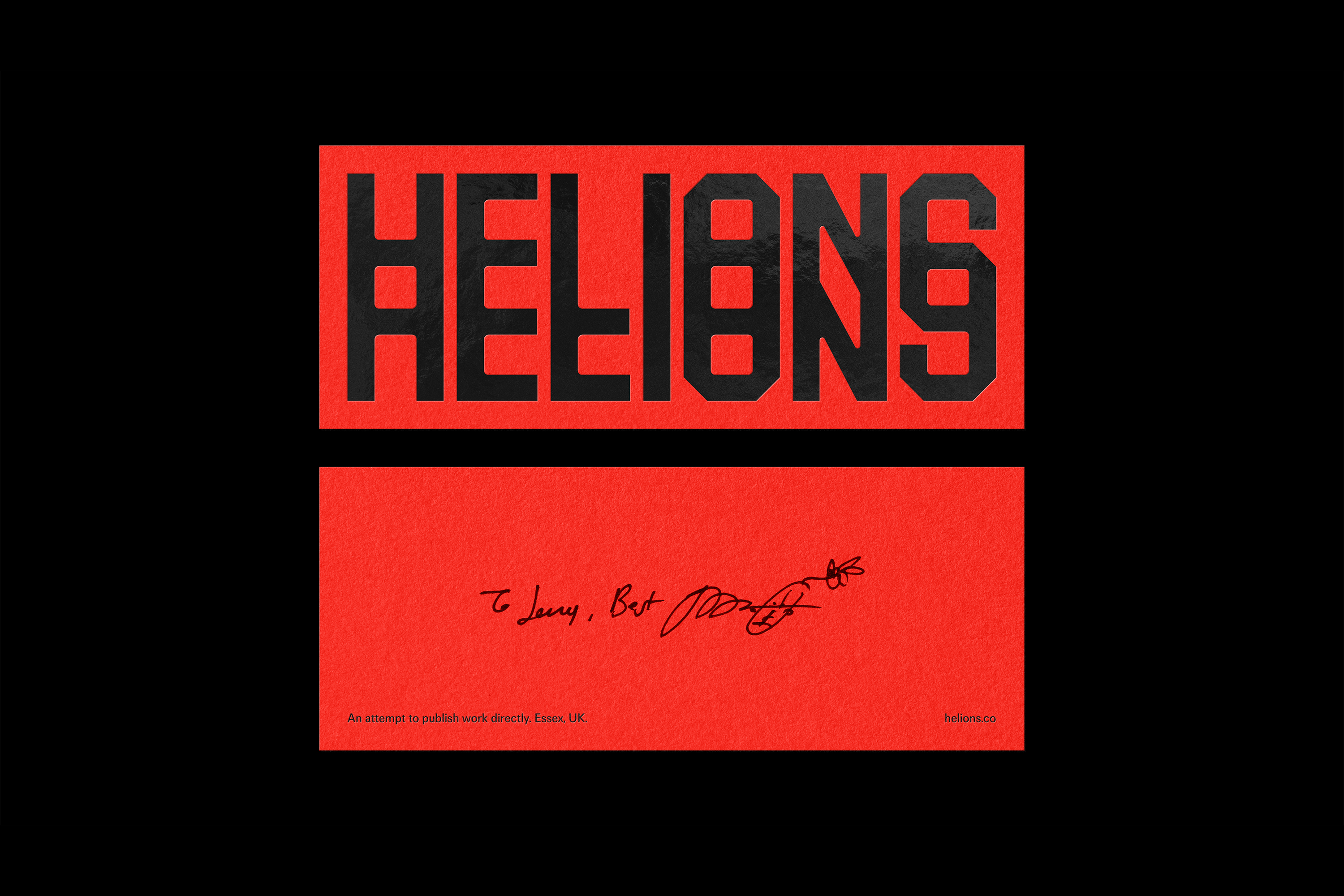
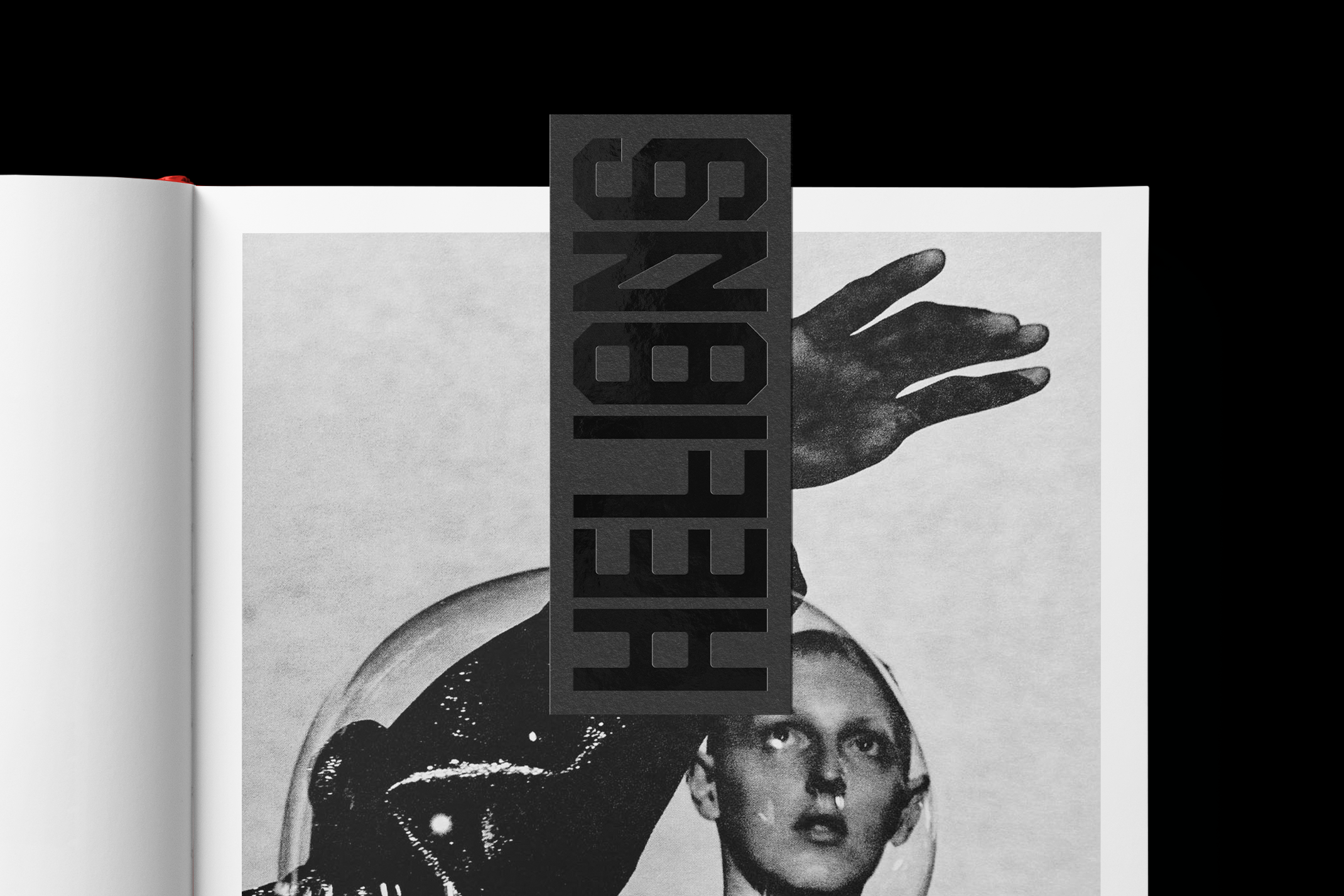
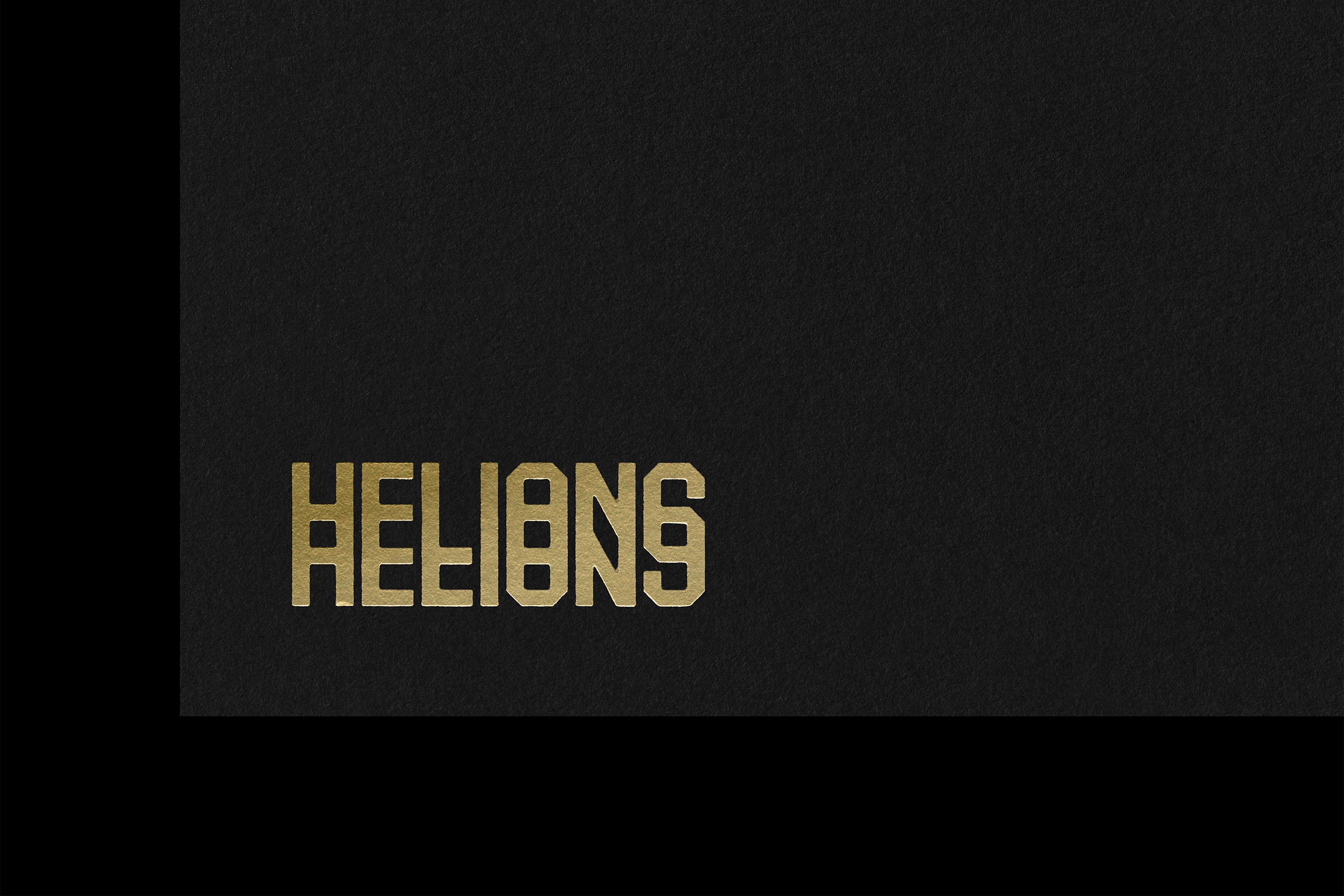
Willey and ‘team’ (which, in this case, specifically means Pentagram associate partner Jonny Sikov) designed the Helions wordmark ‘with an optical effect that mimics light refractions’. This would be an appropriate device for any photography-related brand, but it neatly relates to Davison’s particular style of image making in which there are echoes of the early modernists (May Ray, Walker Evans, Alfred Stieglitz, Lee Miller), as well as Picasso and Francis Bacon. The distorted letterforms tap into this legacy, playing with ideas of reflection and exposure as instruments of abstraction. The result? A logo that feels familiar while forcing a new perspective – much like Davison’s practice.
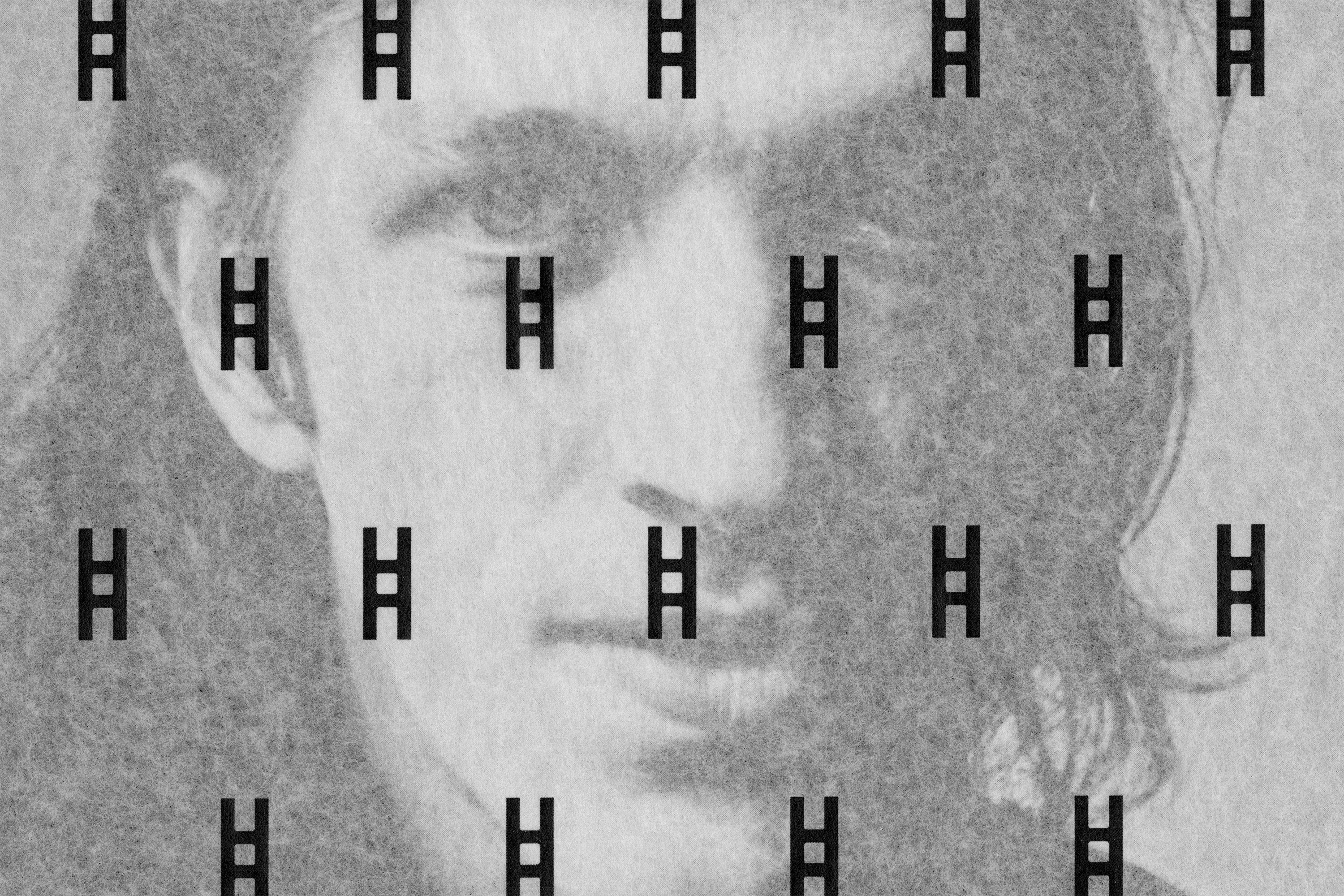
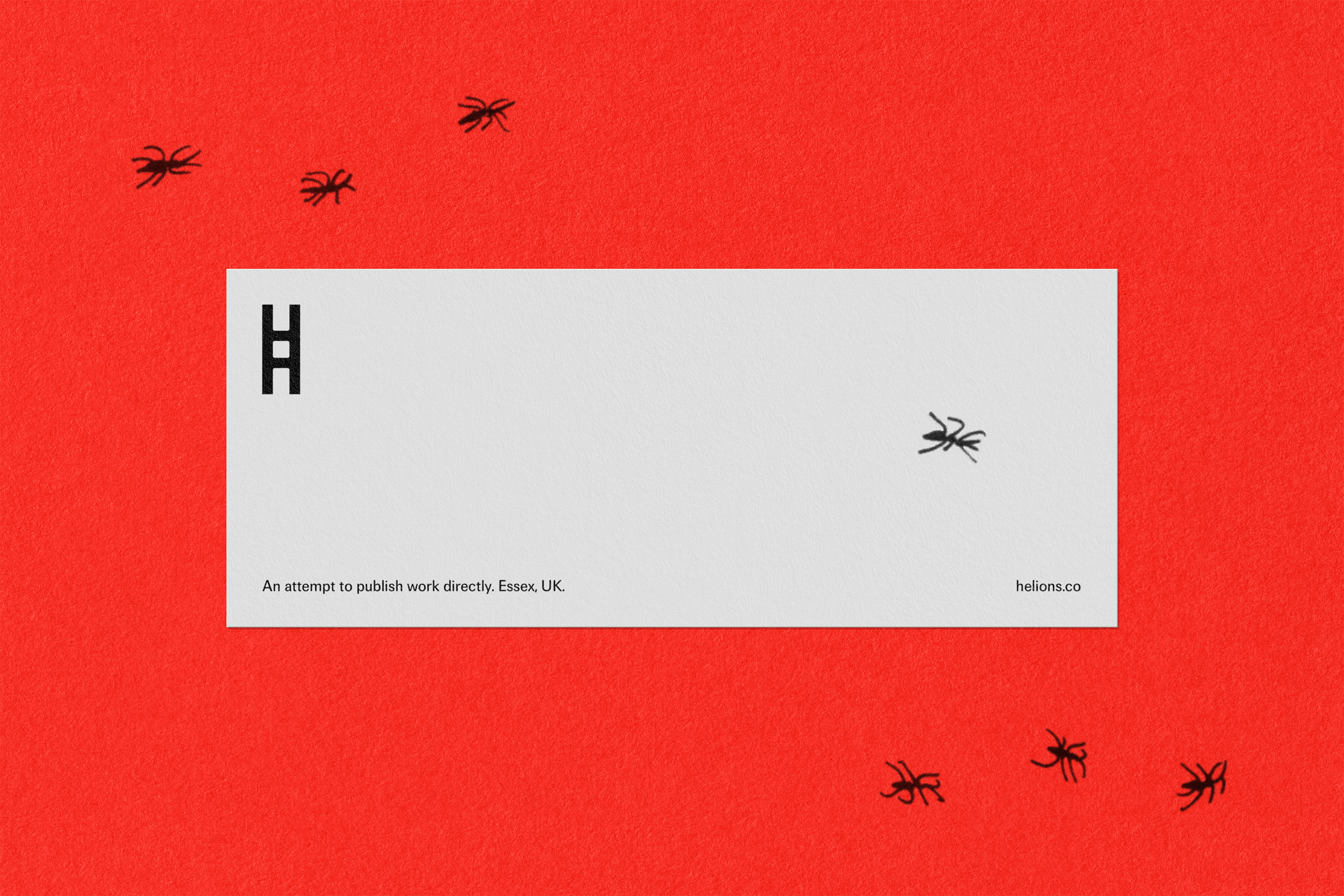
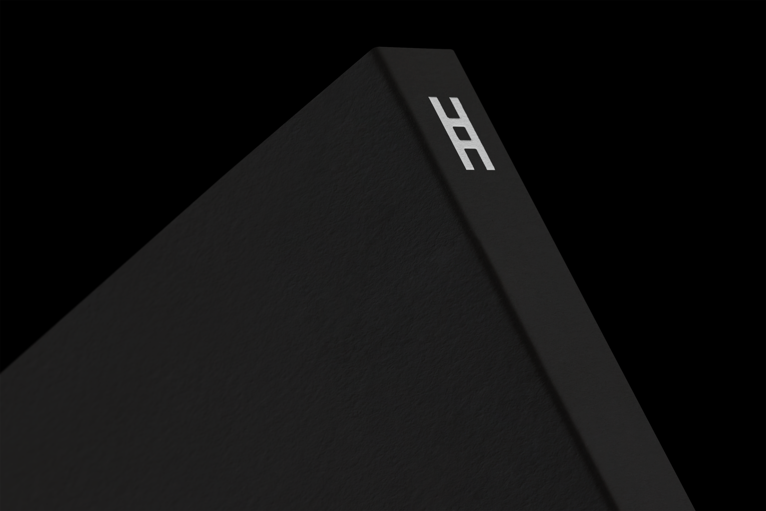
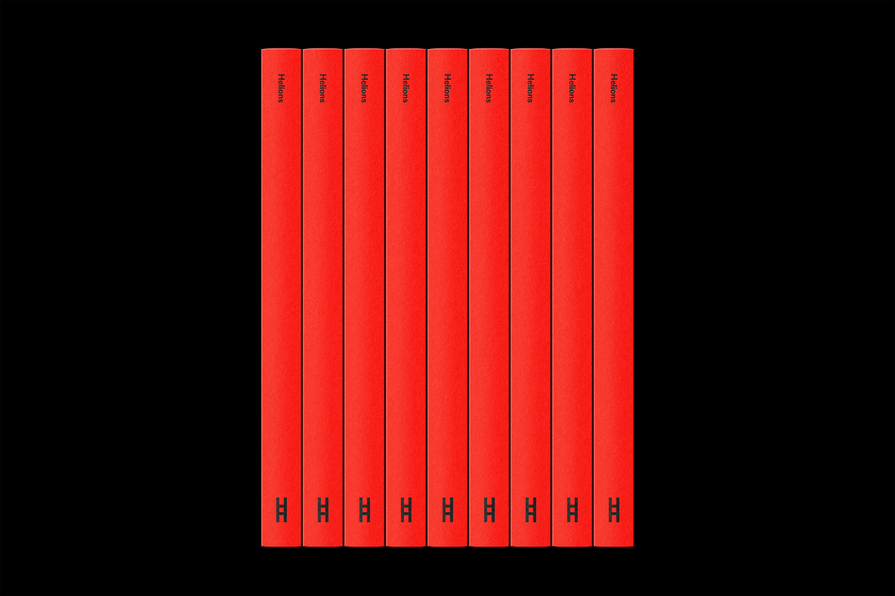
The custom font is unmistakably Willey – bold, industrial, condensed (see MFred, Timmons NY and NSW01). Straight lines, bevelled curves and soft interior corners give the geometric sans serif an engineered elegance: plain yet precise, with just enough uncut charm to keep things interesting. On business cards and bookmarks, the wordmark shimmers in gloss and metallic foils, using print finish to further explore the brand’s relationship with light. The ‘H’ also stands independently as a symbol, resembling a strip of film. This works well as a publisher’s shorthand (or ‘colophon’), on book spines for example. Could the concept have been pushed further – perhaps as a framing device for imagery, or on a roll of packing tape, like a reel of film? Maybe. But there’s something to be said for restraint. Willey and team don’t labour the point, and the work feels all the more assured for that. The colour palette is equally simple and striking, with a high-impact combo of black, white and red.
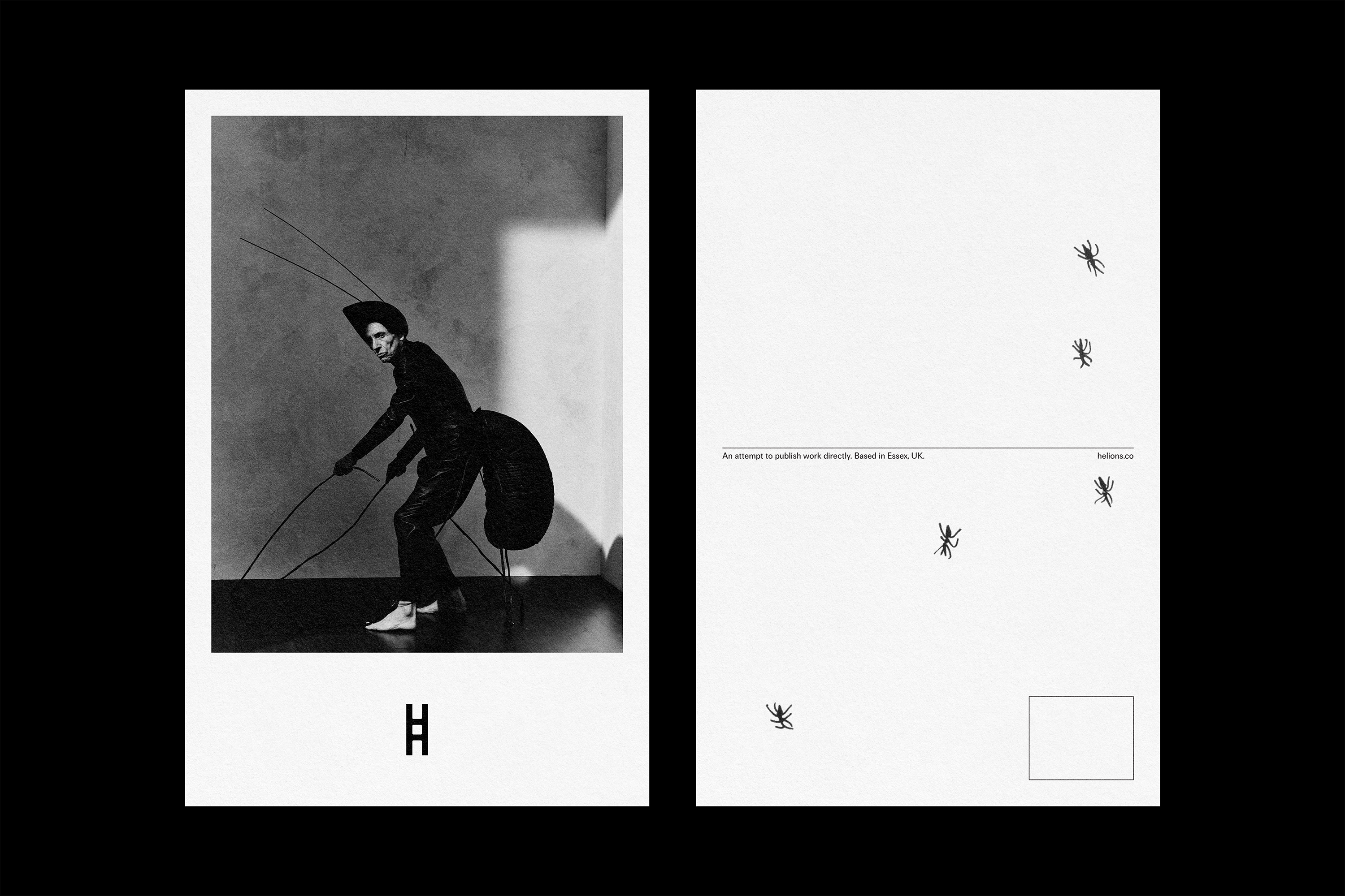
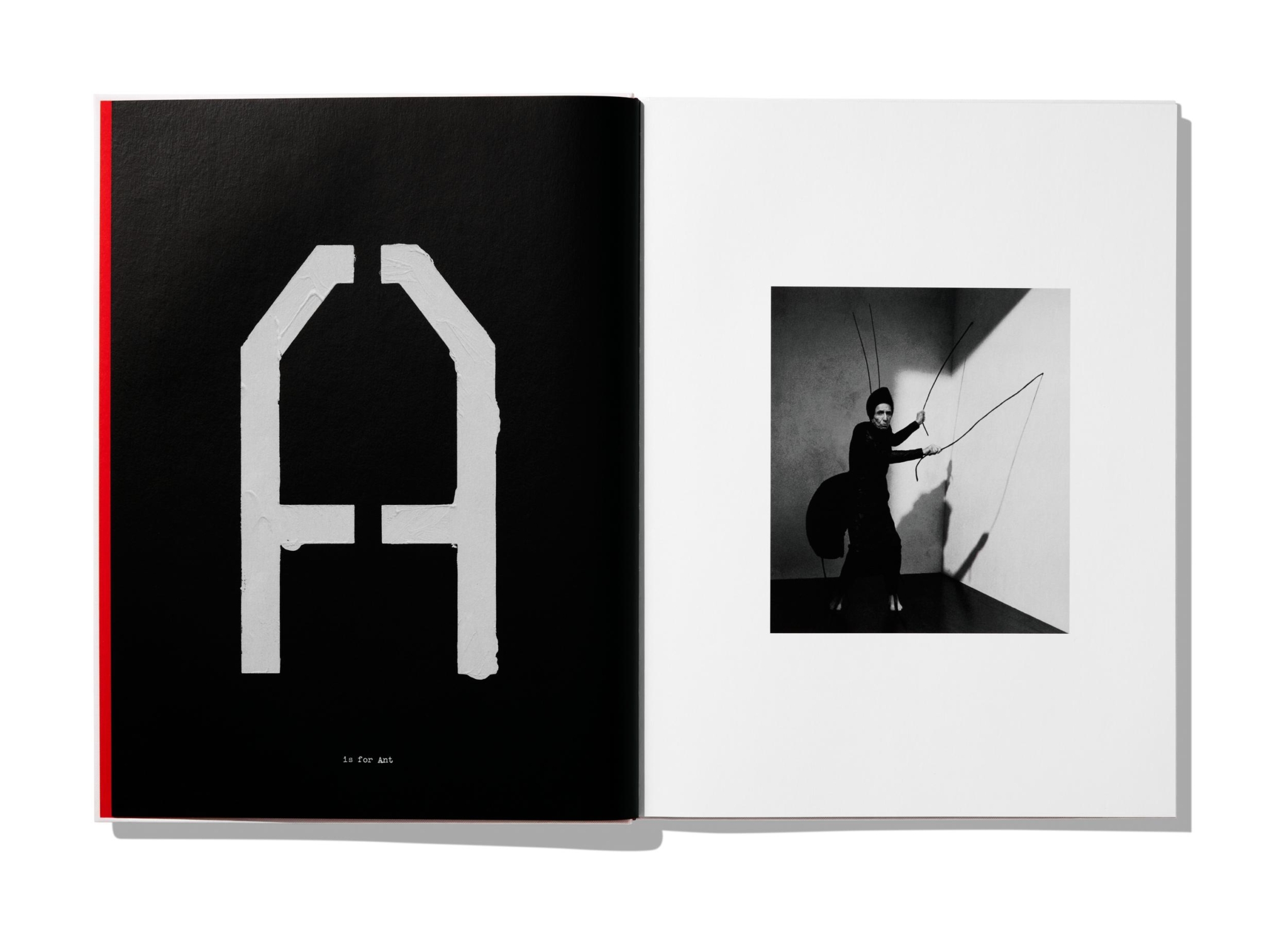
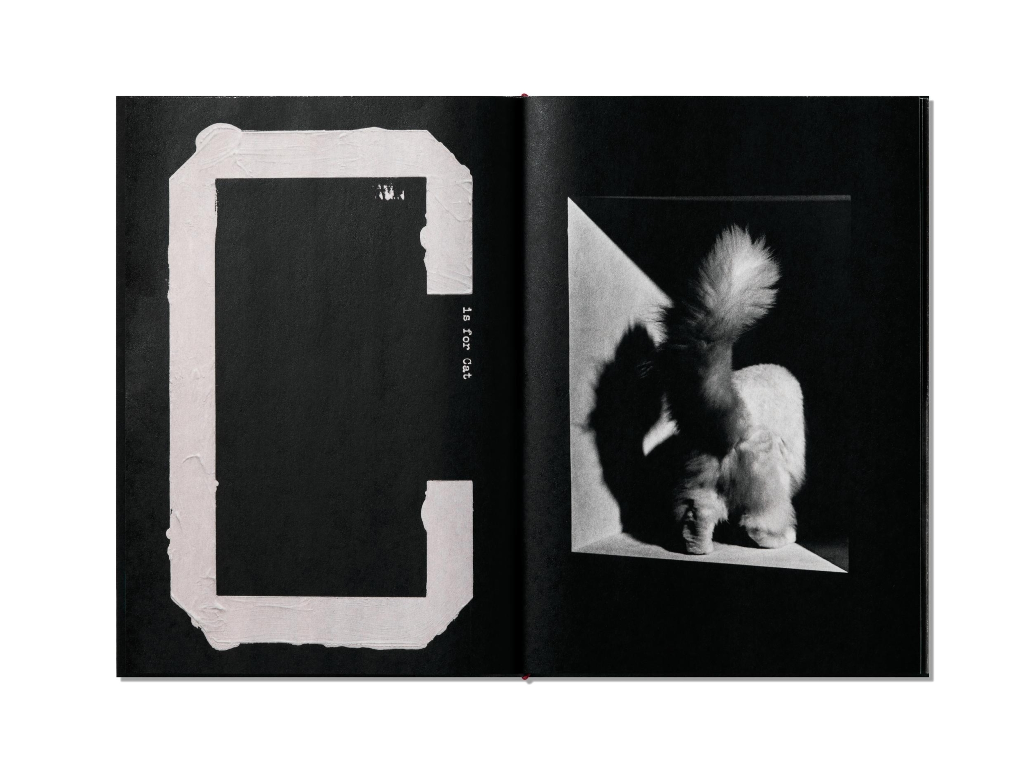
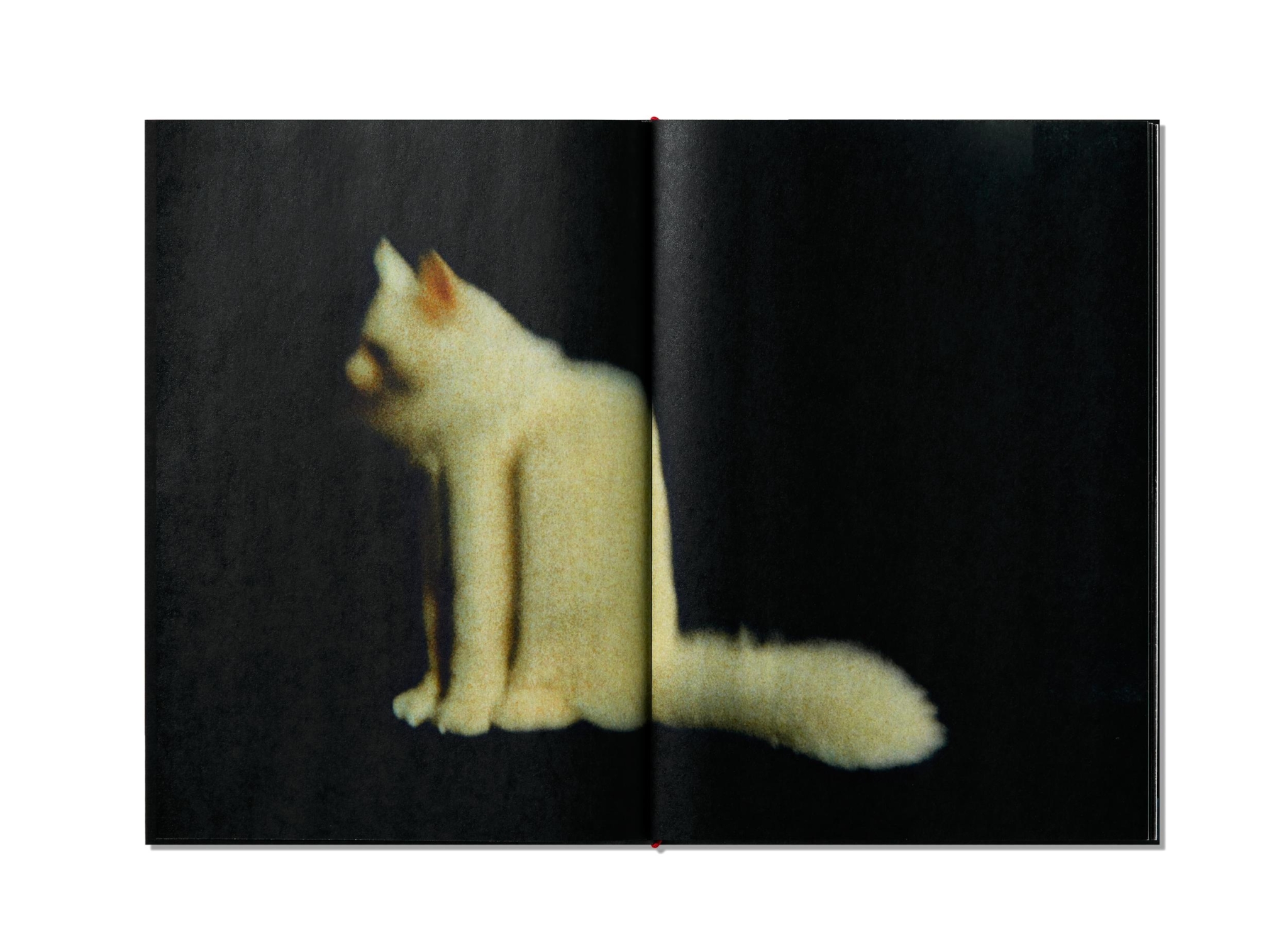
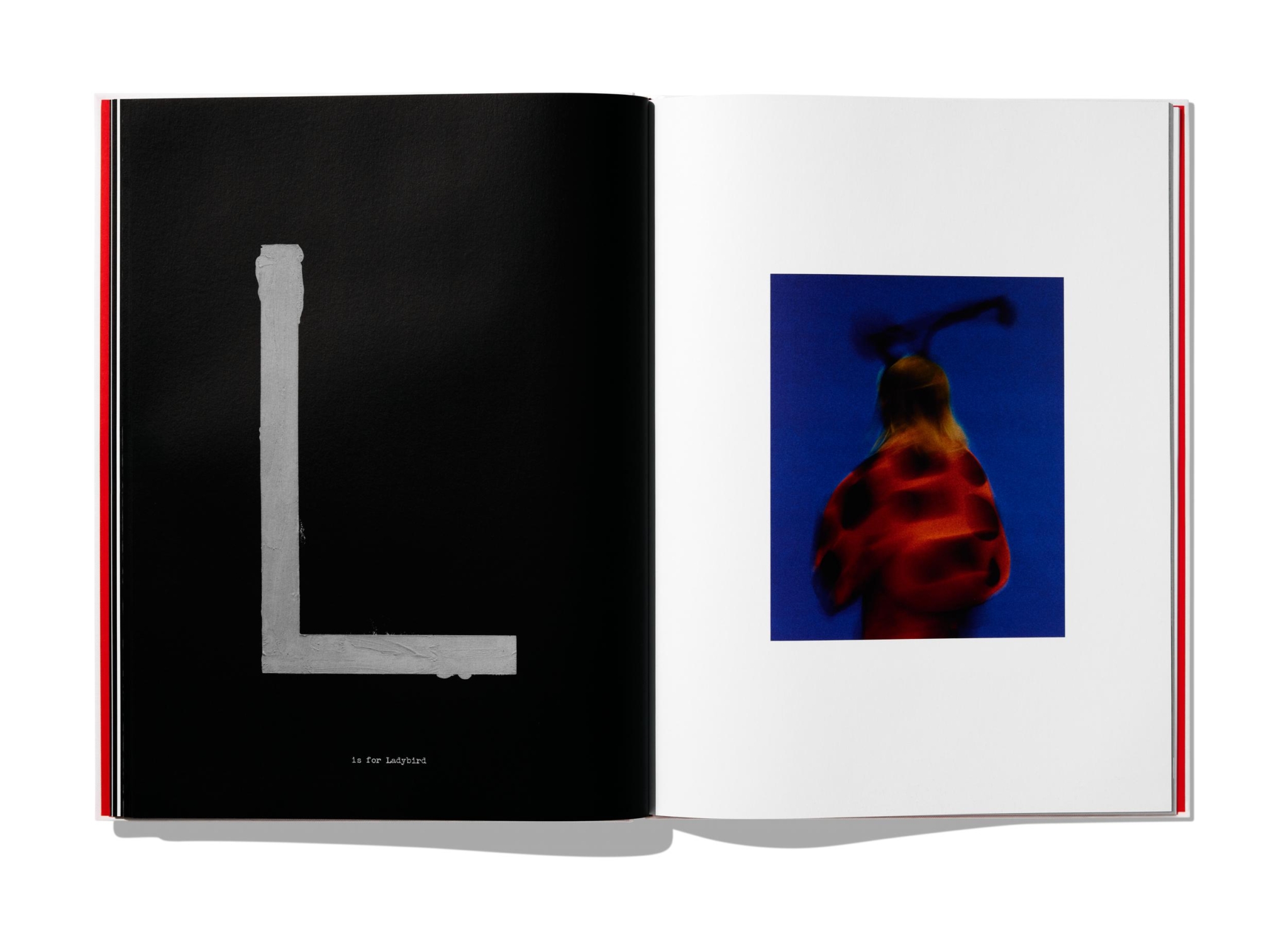
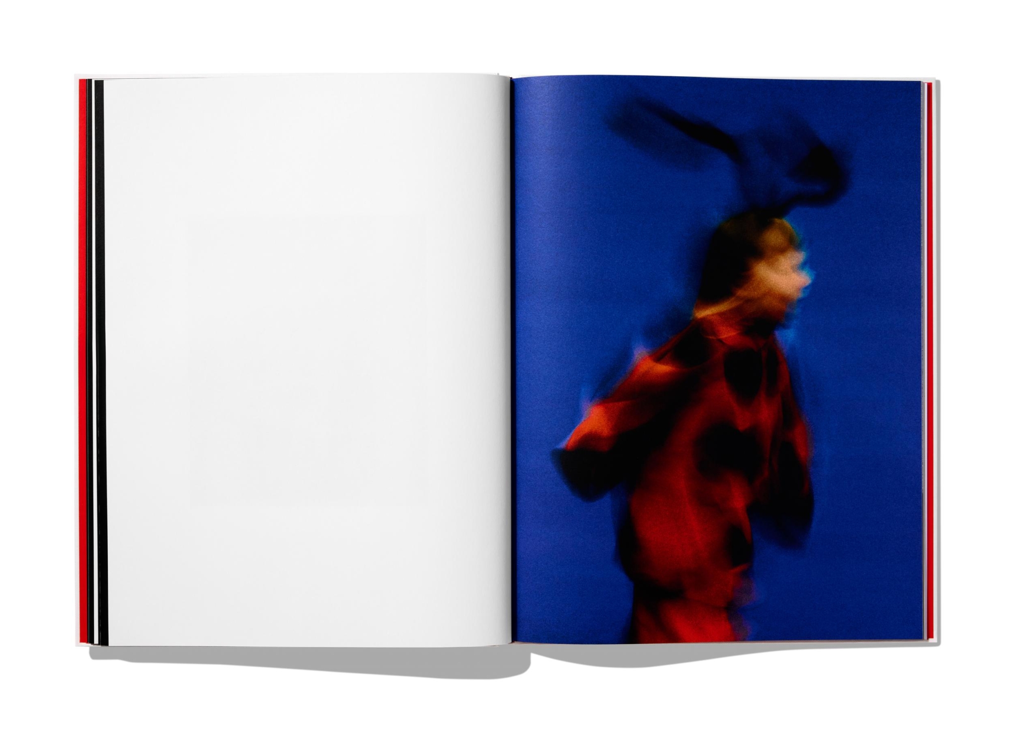
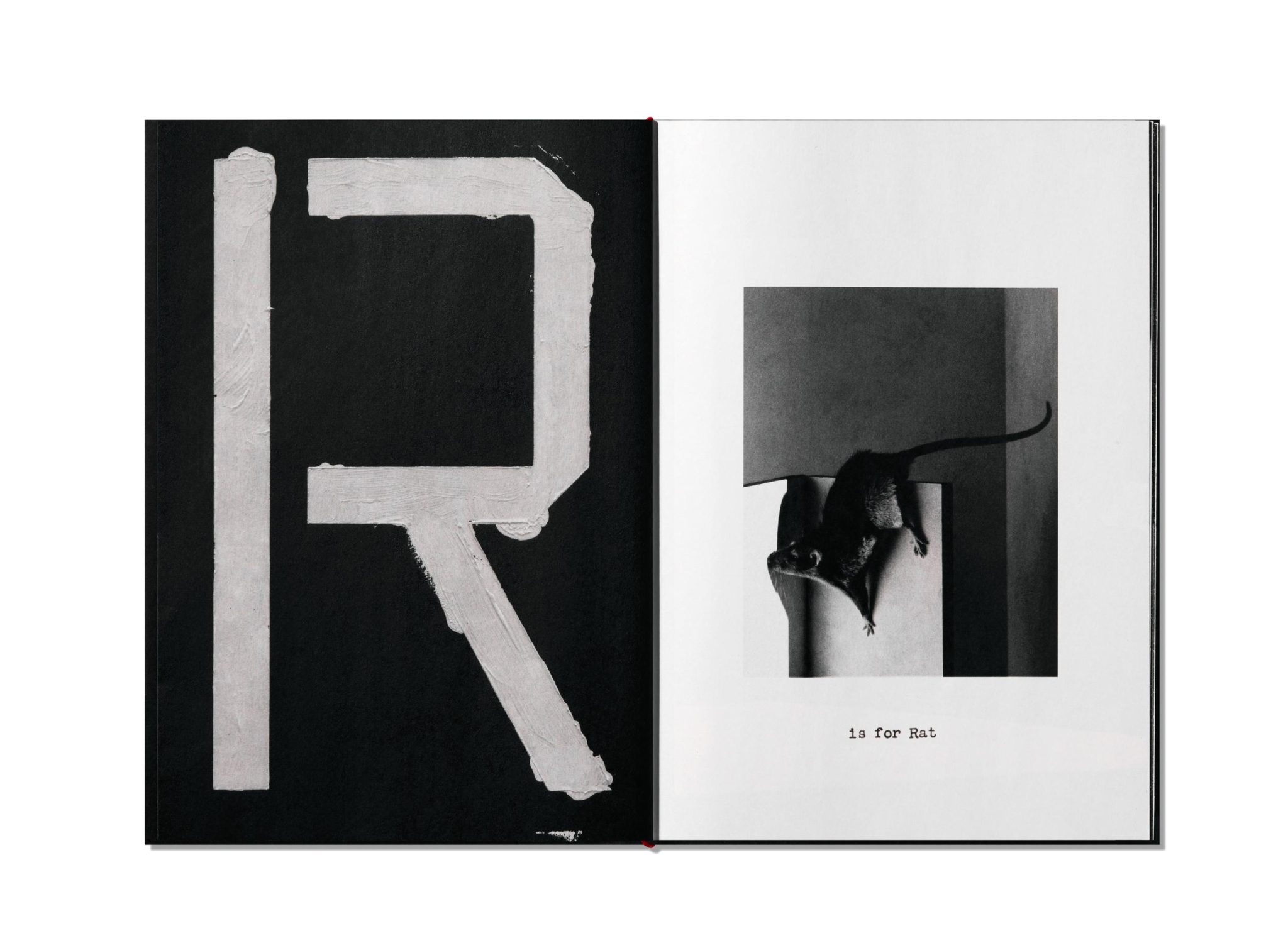
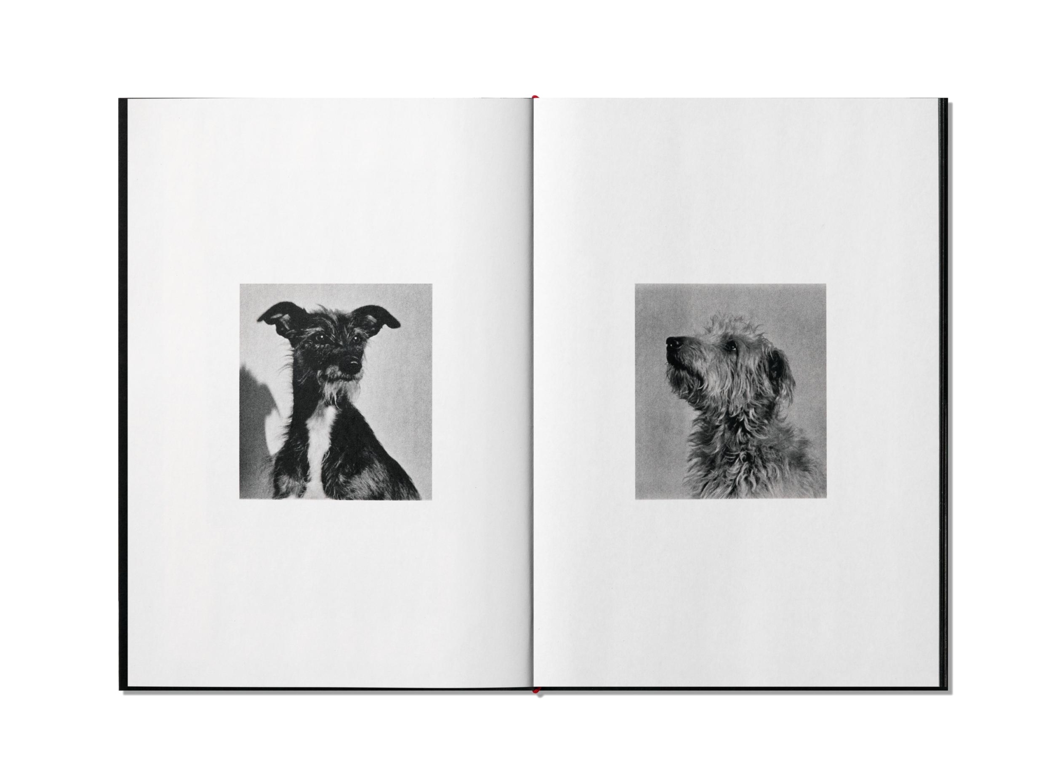
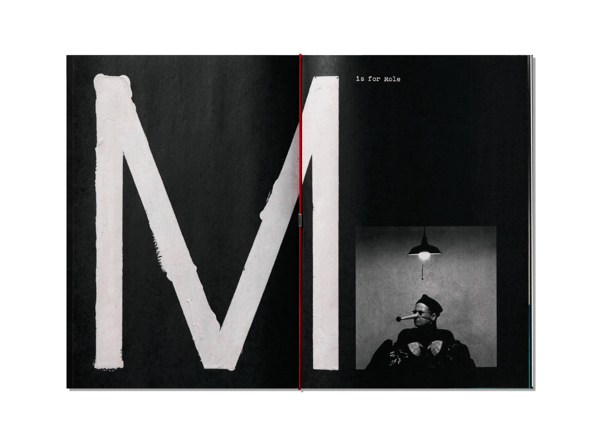
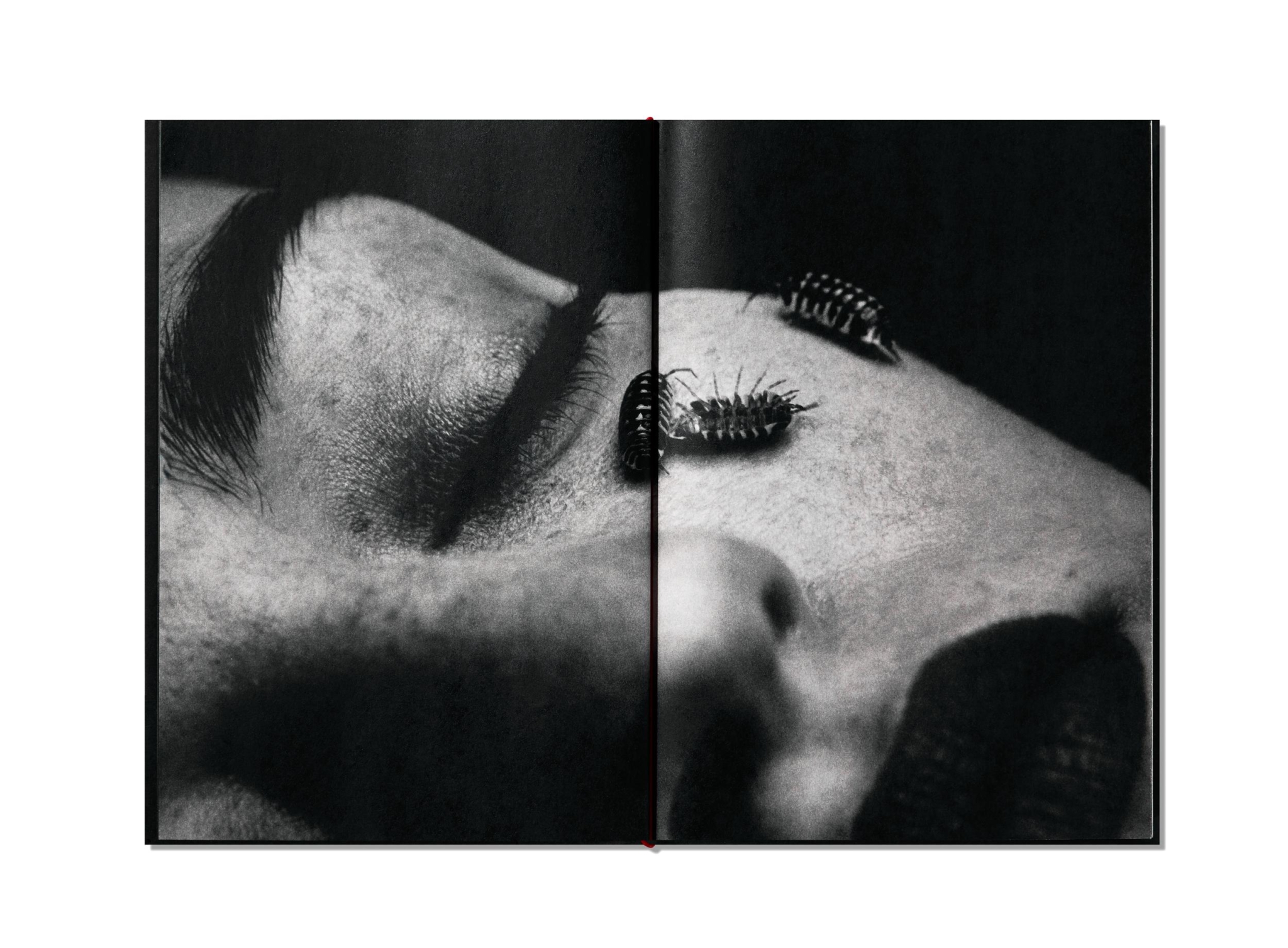
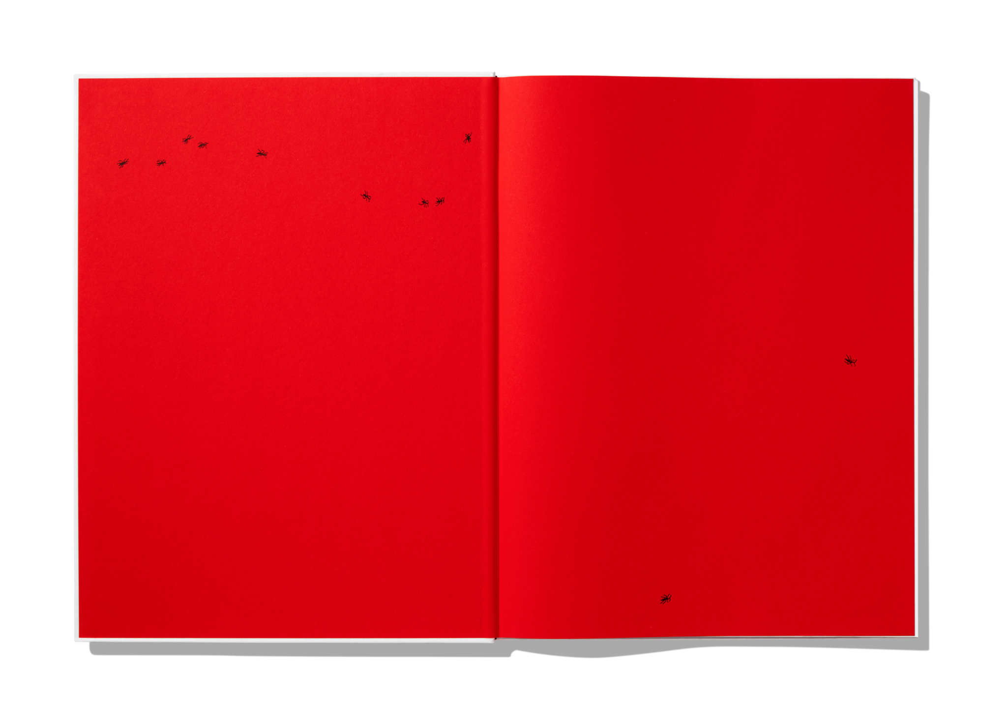
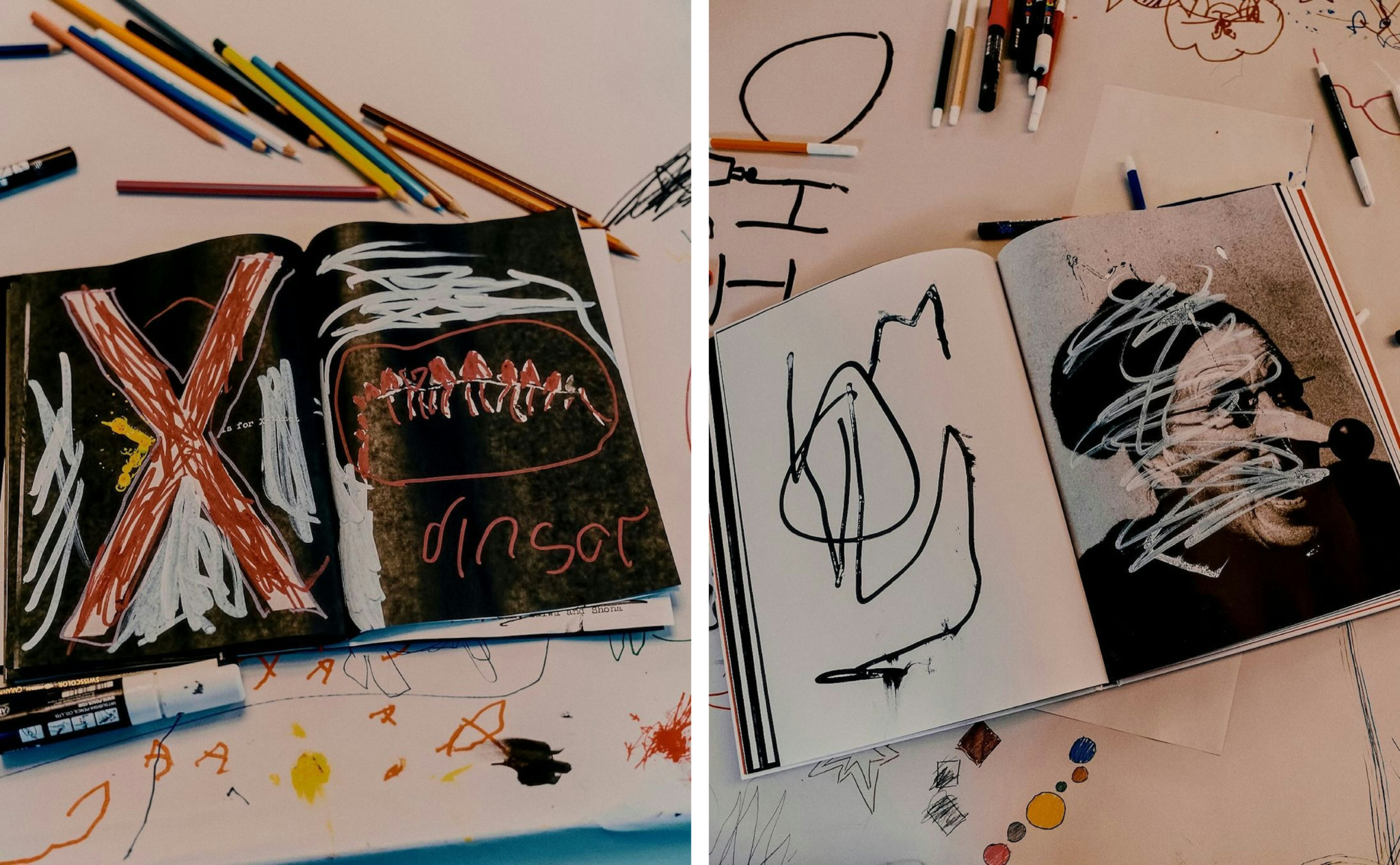
Willey and team also designed the first two Helions releases, A is for Ant and A is for Ant: Children’s Edition, produced as companions to Davison’s recent short film – a collaboration with Oscar-winning production designer Shona Heath (Poor Things). Willey describes the project as ‘a weird and beautiful – and uniquely Jack – take on the traditional alphabet book’. The larger edition leans towards the traditional photobook format, while its smaller sibling is made ‘for children to work into, fold and shape with their own creativity’. Though structurally identical, each follows its own visual sequence, with different paper textures bringing different feeling to the images.
The kids’ version – gold-foiled cover, newsprint text pages – is the more intriguing piece, and the one Davison talks about most animatedly: ‘I wanted to work on a project that spoke to my children’, he writes. ‘A piece of work that they could respond to and have as a window into my world. A celebration of aspects of life that are important to me: creativity, play, the natural world, beauty and silliness.’ Reader, it’s all of the above. As the kind of parent currently introducing my six-month-old to colour through the Farrow & Ball paint chart (‘Now, can we tell the difference between All White and Old White?’), I support an approach to early education that prioritises the esoteric earthworm over the tired old elephant. But I also admire the refusal to dumb things down. Who says pictures (or ideas for that matter) need to be simple to be accessible?
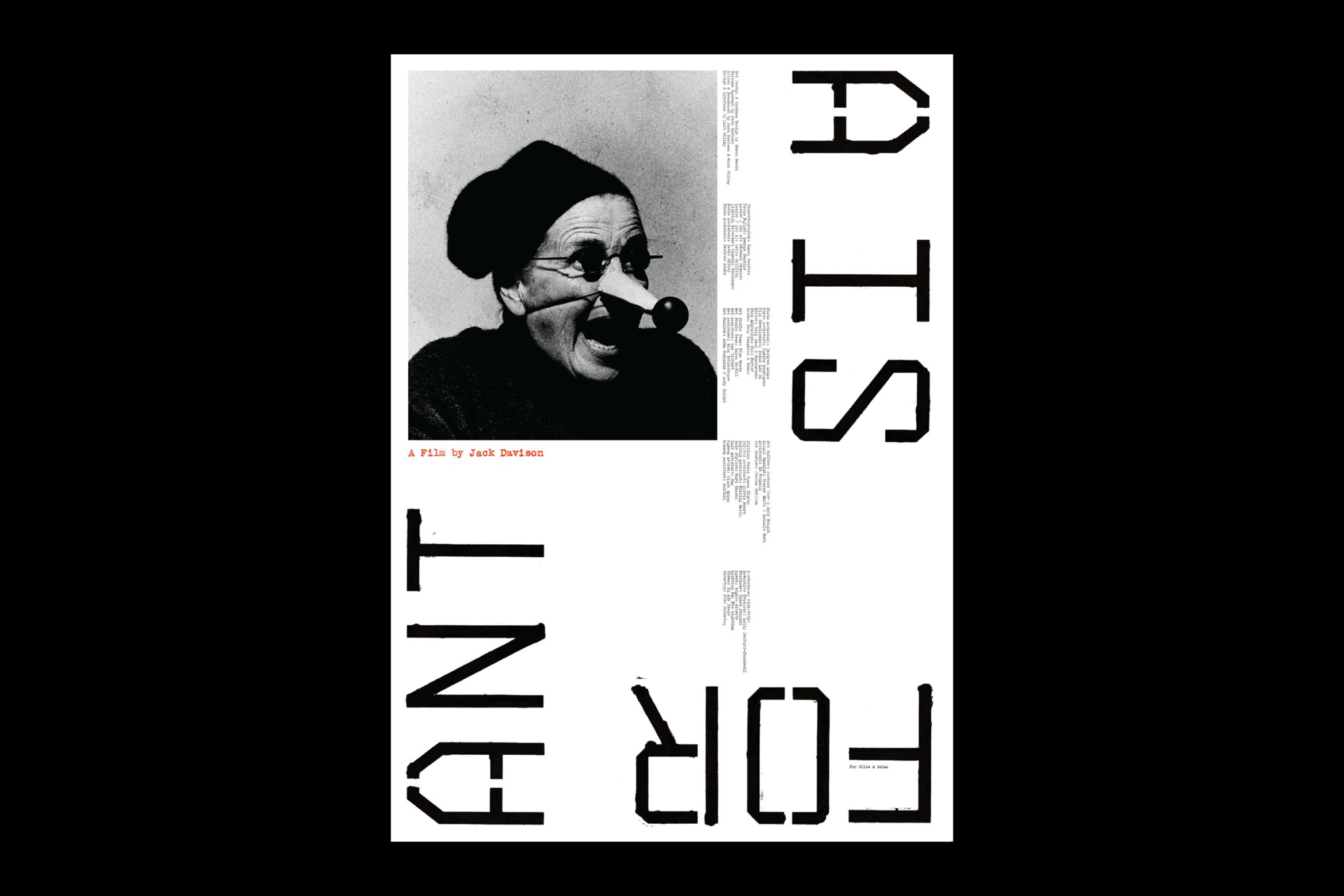
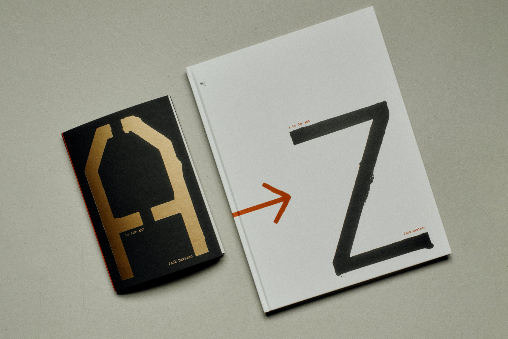
Davison’s images are joyful, poetic and surreal, as silly as they are serious. And Willey’s hand-painted letters serve as more than just captions – they’re characters in their own right, anchoring the book’s visual rhythm. Rendered in another custom typeface (the designer’s showing off now) – stencilled, monospaced, mono-linear and designed in proportion to the page dimensions – Willey’s lettering nods to the handmade inventiveness of Dada, reinforcing A is for Ant’s unconventional take on the alphabet.
With their conversation between disciplines, these books are a fitting debut for Helions. But A is for Ant is just the beginning. Helions is an extension of Davison’s creative approach, a space for experimentation and collaboration. Its bold visual identity – rooted in photography yet open to interpretation – sets the tone for what’s to come: an invitation for others to interact, play and respond in their own way. I can’t wait to see what Willey and Davison’s next collaboration sheds light on.
