Full Pin by Rethink
Opinion by Ruby Lynskey Posted 29 April 2025

Since 2020, engineers-turned-mushroom entrepreneurs Vathana Len and Daniel Vogt have been growing the fanciest mushrooms I’ve ever seen, from their shiny urban greenhouse in Montreal. From Pholiote adipeuse to King eryngii (I don’t know what those are either) and everything in between, Full Pin’s mushrooms are cultivated with meticulous precision and at an impressive rate – over 700 pounds per week.
‘Full Pin’, French Canadian slang meaning ‘to go full speed’, initially focused on providing Montreal’s top chefs with their ‘racing mushrooms’. The duo is now looking to broaden their reach to a wider, yet still discerning, audience. Creative agency Rethink came on board to create a brand that encapsulates Full Pin’s commitment to excellence, executed at lightning speed.

The visual identity has been heavily influenced by automotive racing. But what does that mean for the consumer? Precision and excellence are overlapping themes that make sense to me. However, speed — the most immediately visible theme — is less obviously relevant. Increased availability and culinary variety sounds appealing to chefs managing supply and menu development, but will that same message sell to supermarket shoppers?
![]()

While racing and artisanal produce are worlds apart, given the brand’s approach to horticulture, it’s an aesthetic connection that feels natural. A confident colour palette, logo, and iconography work hard to keep Full Pin in its own lane – miles ahead of the earth-toned world it leaves behind.
An inedible bright blue set against an off-white does the heavy lifting, while mustard and black make tasteful guest appearances across secondary assets, bringing us a little closer to earth. Using an unexpected colour to stand out in this category has become well… expected. But in this instance, the clinical sharpness is refreshing.


The logo has personality and visual immediacy. Set in an italicised, heavy sans serif typeface with softened edges – and an ‘i’ as cute as a button (mushroom) – it seamlessly ties into the racing world. The F and P tessellate like tightly packed fungi to form an F1-esque monogram. If the racing connection wasn’t obvious before, it certainly is now.
A crisper, tightly-kerned sans serif is used throughout the rest of the brand, mirroring the way mushrooms grow and delivering the brand’s clever copywriting. They’ve kept it clean and simple here, making way for photography and icons to feature boldly.
The shroom-like dot of the ‘i’ appears across a charming set of icons, each representing a mushroom variety. Clever repetition of the domed tittle mimics a checkered flag, reinforcing the racing narrative. Laying it on even thicker, a set of racing badge-inspired stickers unique to each variety are featured in the brand kit – although exactly where they’re applied isn’t clear. The retro aesthetic looks cool and adds personality, but leans close to pastiche at times.


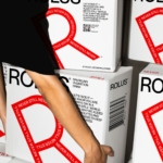
Shoot Studio’s photography elevates the brand further, offering a premium feel. Slightly trendy but thoughtfully executed, the imagery – featuring the founders clad in pit-crew overalls inspecting mushrooms and pushing mysterious buttons – brings the racing metaphor to life. In particular, the products resting in gloved hands stand out – nothing like a glove to scream laboratory!
It would be remiss of me not to mention the (assumed) direct reference to the classic Nike Cortez advert we all love. Where the iconic sneaker has been swapped out for a bunch of enoki, and the copy playfully reads ‘competitive spores’. As a designer who spends a significant amount of my life trawling are.na boards, it was instantly recognisable. Honestly, I think it’s kind of genius riffing (or ripping) off a brand that has such an established message of being category winners. And if it goes over your head? It’s still an attractive piece of design. Forget what I said about pastiche, bringing these themes into the gourmet food world is fun.
And speaking of fun, the brand is having the last word on that with their merch. It’s clever and genuinely cool. ‘Champis de course’ on the tote bag is copywriting gold, and so beautifully ties the visual language to the product.

From start to finish, it’s an identity that boldly lands somewhere between pastiche and premium. Exuding confidence in its product, colours, logo and photography provide a push and pull across the identity. Throughout the messaging, one thing is clear: these mushrooms are fast. But after a fair amount of analysis – and a few Google searches like ‘benefits of fast mushrooms?’ — I find myself wondering: is there truly a need for speed, or did the designers simply get carried away with a visually irresistible idea, leaving strategic positioning in their dust?