Hank’s Bagelry by Studio Ongarato
Opinion by Richard Baird Posted 18 September 2025

Sometimes, a brand identity can be deeply strategic, have a rich heritage or an involving narrative. Other times, it can be simply eye catching and cool. Suites of custom designed icons, art directed photography, tone of voice, motion behaviours, programmatic graphic elements and bespoke in-house content generating tools…. not every brand needs these. They’re colours to paint with. I call this ‘scope’, and it’s why I love brands and brand building.
Knowing ‘what to use’, ‘how to use it’, ‘why it’s being used’ and ‘when’ is critical, and this instinct often defines and divides designers. While budget plays part of the equation, there are studios that fly because they know when to dial it all back and deliver only what is necessary.
When it comes to bagels, or any other high street commodity for that matter, increased competition (along with the rising costs of physical locations, supplies and utilities) sees new entrants demand consideration. We’re past kindly asking – get them through the door, get them tasting your goods, and let them decide if they want to return. As you expand to new locations, identity conjures past experience quickly, provoking positive memories at the moment you are ready to buy.

I see a lot of work. Sometimes all it takes is a tiny little thing that tells me to dig a bit deeper, get a sense of the strategy, see how it all plays out across digital, or in store. For me this is a must, although (dig incoming) I increasingly get the sense that blogs (and awards) don’t really care beyond the case study.
Being distinctive and brave in the imagery chosen is essential. Category and industry codes are thought to be shortcuts to relevance and communicative clarity, but largely they blend in, and are forgettable. These motifs are often things that stick for the sake of safety, not screwing up at the first hurdle. I’ve been here with bakeries, and I regret the results. The wheatsheafs and corn bushels… *facepalm*. That bakery lasted six months.
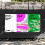
Hank’s Bagelry – I didn’t realise bagelry was a word, autocorrect really wants to have it’s own way here – has locations in Armadale, a suburb of Perth, and Chadstone, a suburb of Melbourne. With increased competition and plans for expansion, rebranding for this next stage was undertaken by Studio Ongarato (One Wellington, Kisume & 85 Spring Street). Working with illustrator Shoba Tsuchiya, the team have brought not only a charm and personable quality to the brand, but a playful narrative element that plays out across web and print. When it comes to ‘scope’, we’re talking fundamentals – a type, colour and mascot play. Narrow but wonderfully done.
![]()


Why does it work? The quality of the character design, the range of its behaviours, its scale across packaging, the colour, and finally, typeface (ITC Cheltenham) which anchors everything, bringing the mind back to quality and craft. I don’t think I’ve ever written ‘vibe’ in a BP&O review. This feels like vibe branding. It’s a vibe – and it doesn’t need to be anything more.
The character – let’s assume this is Hank – owes a lot to the work of British cartoonist, illustrator and writer of children’s books Roger Hargreaves (9 May 1935 – 11 September 1988). He was best known for creating the Mr. Men, a series I grew up with in the UK in the 1980s. In 2021, Hargreaves wrote a special book and YouTube series Mr. Men and Little Miss in Australia.


Child-like curiosity, play and innocence are embedded in the style and storytelling. The bagel hole as child-like secondary character is cute. And at a time where it’s incredibly difficult to hold on to conviviality, it’s no wonder we’re seeing a rise in mascots. In the past I have called this mascotification infantalising (I did so in this article on Ding) but, quite frankly, I need to find tiny little joys right now, in anything.
This approach is not unique, but it shines because it’s just enough, and exceptionally well-executed in print and online. There’s clearly a great sense of the space of the page, or box or bag throughout. Thoroughly eye-catching.