Walk down any supermarket aisle and pattern fatigue hits quickly. Smooth, shiny, hyper-finished products all trying to out-gloss each other. Every one buffed within an inch of its life.
Then a raw, hand drawn illustration appears and the aisle shifts. The human touch cuts through immediately. You sense the hand behind them, the small imperfections, the tension that comes from something actually being made. Illustration that has not been flattened by process reads as pen on paper, not software smoothing the edges.

And shoppers respond to that instinctively. Research into attention and perception of credibility keeps circling the same point. Packaging that looks crafted tends to draw the eye and is often read as more trustworthy. In food and drink especially, where decisions are fast and trust is key, anything that feels less corporate and more human is decoded long before anyone reads the ingredients list.
Brands understand this too. Innocent leans into the wobble. Oatly built an entire communication system around doodles and side of pack conversation. That visual looseness opens the door for a more personal tone because the pack has already lowered the defences.
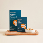
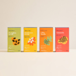
Jo Cutri Studio’s work for Faithful To Nature shows how to harness that energy with control. Bold colour palettes and organic, abstract shapes hint at ingredients without spelling everything out. Seeds, nuts and powders that often look awkward on pack become confident, contemporary forms. The brand shifts away from health-store earnestness into modern lifestyle territory and carries itself more lightly as a result.
Underneath the illustration, the system stays disciplined. Logo placement, typography and hierarchy remain consistent across ranges. Information is easy to navigate and the shelf still reads as a family. The looseness sits on top of structure, which is why it comes across as deliberate rather than careless. Relaxed, not unfinished.

Done well, raw illustration gives products an authentic energy, a visual language that communicates “this is the real deal.” Done badly, it looks lazy and drops straight into “my kid could draw this” territory. That judgement line matters. The difference rarely sits in the tool but behind the intent behind every mark. If the drawing adds to the story, it earns its stripes. If it doesn’t, consider it visual clutter.
![]()