Experimental typography is where letters break free from convention and take on a life of their own. It’s design without a safety net, where creativity is only limited by the designer. The results can be unpredictable, uncomfortable, and often brilliant.
Traditionalists might clutch their pearls, but this is where things get interesting.
Experimental type plays with readability on purpose, turning letters into material rather than something to skim past. Designers treat type like clay, stretching, warping, and reshaping it into forms that demand attention. From subtle distortions to full abstraction, clarity stops being the point. You notice it first, then work it out.
The term might ruffle feathers, but at its core this is about creative tension. Familiar forms pushed just far enough to make you stop, hesitate, and look again. When it works, it lands harder than any neatly set headline.
Good experimental type puts a speed bump in front of your eye. It makes you work a fraction harder. You clock shape, rhythm and attitude before you get to the word. That effort is the test. Has the brand earned the right to slow you down here, or not?
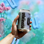
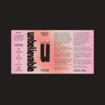
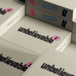
The packaging for non‑alcoholic drink brand Unbelievable, by Marta Veludo Studio, shows how much impact experimental type can carry. Playful, distinctive, impossible to miss in a crowded fixture.
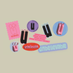
The identity builds around the letter “u,” complete with sleepy eyes floating over a soft, airbrushed backdrop. From there, the typography loosens its tie. Bubbly 3D forms, warped letter shapes, and rich textures give each can its own mood. Negroni leans warm and dusk‑coloured. Gin Tonic sharpens with pine and citrus. You read the flavour before you read the words.
For brands like Unbelievable, experimental type isn’t risk but a weapon. Every letter is a chance to surprise, connect, and stick.
Elsewhere, this is where things can slip. Rocket fuel and risk in the same breath. A stretched word here, a stacked logo there, fractured headlines everywhere, and the system starts competing with itself. Packs, posters, socials all pulling in different directions.
The control sits in knowing when to bend the rules and when to leave them alone. One moment of disruption set against everything else toeing the line.
A single bend is enough to change the entire read.
![]()