Most packaging looks like someone tried to squeeze a TED Talk onto a postage stamp. Every “key message” gets a logo, a burst, a badge, a seal, a story, then marketing wonders why nothing sticks.
Space is how you pick winners in that chaos. Give something room and it reads as important. Squeeze it and it dissolves into background noise. What gets noticed, and in what order, is decided long before anyone hits print.
See space as allocation and the whole surface changes. You choose what gets air and what gets crowded. A logo with breathing room becomes an anchor. A product name with clear margins reads as a headline. Claims pushed to the edges turn into decoration, no matter how central they were in the brief.
Balance keeps the structure upright. Type, imagery, colour and empty board have to share the surface properly. Too much weight at the top makes a pack feel shelf-heavy. Dense clusters drag the eye into one corner and leave the rest idle.
Materials push the point further. On uncoated board, “blank” areas aren’t blank. Texture, fibre variation and soft shade shifts show through, signalling tactility and substance. Leave them visible and the substrate works for you. Flood them with ink and you’ve paid for premium stock to masquerade as a flyer.
Once a brand commits to one idea, space stops being decoration and starts acting as strategy. Hierarchy moves out of theory and into shelf reality.
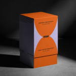
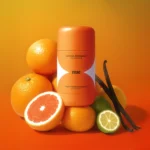
Refillable natural deodorant NUE, a concept by Ezgi Sarıcam, shows that discipline in action. The pack is built around a single golden-hour hourglass that wraps the surface. The orange form takes control while a white channel through the centre holds calm vertical space for the brand name to sit clearly.
Colour and space move together. Orange carries energy because it’s contained in bold uninterrupted blocks. Copy is edited hard and type stays modest. The layout resists the urge to fill every available inch, which is exactly why the brand reads so cleanly.
The restraint is most obvious in what the pack chooses not to include, with no benefit clouds, no QR codes and no last-minute claims squeezed into whatever space survived artwork round six. Everything on the surface has a reason to exist and nothing looks like it’s fighting for oxygen.
It comes back to deciding what deserves room. Treat space and balance as strategy and the pack starts directing instead of drifting, telling the eye where to land, what to trust and what to remember.
NUE trusts one idea and gives it the surface to carry weight.
![]()