Bulk flour sacks usually get treated like back‑of‑shop clutter. Necessary, heavy, instantly forgettable. Which is strange, considering a 25kg bag spends its entire life in full view, in bakeries, on pallets and in the background of every proud “today’s bake” photo.
Make that sack look intentional rather than something to step around, and the brand immediately levels up.
Start with the basics. The bag needs to survive forklifts, stacking and flour‑covered hands, so structure, seam strength and clear information are essential. Once that is in place, think like a poster designer instead of a commodity supplier.
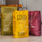
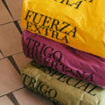
Give each SKU one dominant colour, and set the product name in type so large you can read it from across the bakery.
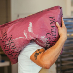
Wayfinding becomes an advantage. These bags are seen from the side, folded over trolleys, dusted in flour and stacked wherever they fit. Use vertical type, wraparound layouts and typography that can take a beating. The bag should still communicate clearly even when life gets messy.
Then layer in story where it matters. Use the surface to highlight what makes the flour special. Grain variety, origin, milling method and ideal use. Not a wall of text. A short line, a small emblem, or a simple icon system that says “bread”, “pastry” or “pizza”.
If sustainability is part of the offer, bring it onto the sack itself. Recyclability, reduced plastic and reuse ideas for bakeries. A large surface with small but precise information.
Harinas La Encarnación now uses giant bags that look more like art‑school posters than bulk ingredients. Large serif type, saturated blocks of colour and that dotted bird sweeping across the surface turn the product into part of the brand’s visual language.
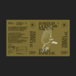
The dotted bird is especially clever. Formed from flour‑like particles, it turns the product itself into illustration. Heavy typography paired with delicate pointillism at big scale. A tough but graceful energy that fits something destined to become bread at 250 degrees.
And beneath all of that, the system works. Each flour variety owns a colour so staff can pick the right sack instantly. Some SKUs introduce local storytelling without overdoing it. Form and function sit in the right proportions.
That’s the opportunity in big‑format packaging. Keep it simple, bold and brutally functional, with just enough poetry that a pallet of flour suddenly feels like a brand moment. Not backstage clutter, but front‑row billing.
Many categories are hiding their best branding in plain sight.
Designed by Rubio & del Amo