The corner shop near my school used to have a fridge that sounded like it was fighting for its life. Inside sat a chaotic wall of colour. Coke, Tango, Lilt, Irn-Bru, Dr Pepper and the odd mysterious import with radioactive colouring and absolutely no concern for dental enamel.
I used to buy Mirinda for one reason.
It looked dangerous.
Not actually dangerous obviously, although I’m fairly certain it could remove varnish if left long enough.
That’s probably why this new rebrand works.

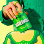
Mirinda always looked excessive. The orange too bright, fruit graphics huge. The whole thing had the visual subtlety of somebody hitting every button at once. Which made perfect sense when you were twelve years old choosing drinks almost entirely on visual impact.
PepsiCo hasn’t tried to dull it down.
The new identity pushes harder into the sensory overload people already associated with the brand, but now there’s more structure behind it. Organised chaos.
The packs push flavour harder than before. Bigger fruit graphics, heavier colour blocking and typography with enough movement to feel animated. Your eye lands on orange, mango or lime before it lands on Mirinda itself, exactly where PepsiCo sought the attention.
Mirinda doesn’t have the luxury of being Coca-Cola and can’t survive on fragments and memory alone. In crowded fridges and crowded phone screens, it needs to look like the drink with the biggest flavour hit before anything else.
That pressure’s shaping beverage branding everywhere now.
Soft drinks spend half their lives appearing through delivery apps, social clips and mobile thumbnails. A lot of brands have responded by flattening themselves into cleaner, safer design systems that hold together neatly at postage-stamp size.
Mirinda’s gone the other way and that’s why people are reacting.
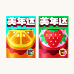
The older identity often felt disconnected depending on the market. Some packs looked playful, some tired and some barely connected. This redesign finally gives the brand a recognisable global structure without draining the personality out of it.
Semi-circular fruit graphics sit are still central to the system. The same curve runs through the logo, the “Smile Please” platform and the motion system, creating recognisable shapes that survive even when the logo shrinks or disappears.
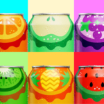
That matters for a brand sold across India, the Middle East, Asia and Eastern Europe, all with different retail environments and flavour ranges. The whole thing still reads as Mirinda even when regional teams start to pull it in different directions.
There are still trade-offs. Some versions push flavour so aggressively the logo becomes secondary, and “Smile Please” sits in crowded emotional territory. Half the drinks industry is trying to sell tiny moments of happiness to exhausted people scrolling on their phones.
Still, I think the redesign succeeds because it remembers something a lot of beverage brands have forgotten.
Fizzy pop is supposed to be fun.