Designing For Things You Can’t See
Written by Lisa Cain Posted 4 February 2026
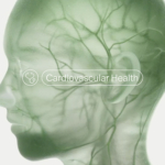
Microbes aren’t easy brand assets to work with.
You can’t photograph them and you can’t point at them. One bad headline has taught most people to associate them with illness, contamination, or something they should scrub harder. Not ideal when the job is building trust around something meant to support human and planetary health.
Most people can’t picture their microbiome, but they can decide in three seconds whether a pack looks credible. That gap shapes how they read the science and the brand behind it.
That’s the starting point for anyone designing in this space.
Push too far into clinical cues and everything turns cold. Drift too far into lifestyle and the credibility drops out. Neither survives in a category built on evidence, consistency, and long‑term use.
The language doesn’t help. Strains, metabolites, pathways, gut–brain axis. All accurate, none inviting. The challenge isn’t simplifying the science, but organising it so people can grasp what matters without wading through terminology. Packaging has to make sense of an ecosystem no one can see.
And because the science is still unfamiliar to most people, the visual defaults carry even more weight.
The work converges visually, even as the propositions diverge.
Different strains, claims, and applications sit behind packs that resolve in almost the same way. You register the category before the brand.
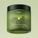
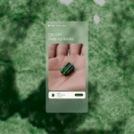
That’s the space Seed has worked in for years, and it shaped the brief. As the range grew, they partnered with MOUTHWASH Studio to evolve the identity without losing clarity.
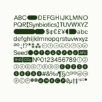
The focus stayed on structure rather than surface. With Dinamo, the studio developed Seed Sans, a variable typeface that shifts between precision and expression without tipping into either. The form of Seed’s DS‑01 product fed into the type design. Capsules, dots, and symbols sit inside the character set, letting scientific ideas appear within the text instead of around it.
The colour system expanded in the same way. Seed’s green remained the anchor, joined by tones drawn from Darwin’s Nomenclature of Colour, giving the system range without losing its centre.
Growth curves under a microscope informed how the system moves, echoing the cycles Seed works with. But movement only matters if the system holds its shape everywhere it shows up.
All of this sits inside a framework built to adapt. The brand speaks differently to customers, clinicians, and retail buyers while still holding together across platforms and markets.
Taken together, the work points to a broader shift.
Seed’s evolution shows where this category is settling. Systems that can carry complexity without defaulting to the same visual shortcuts. Work that stays legible as the science expands instead of smoothing into tone.
Designing for microbes is less about showing the unseen and more about deciding what earns trust, holds together, and survives first contact with a shelf.