Botanical branding has put down roots. The problem is, too many of them are the same plant.
Somewhere between “natural” and “premium”, half the market settled on the same starter kit. Fine‑line foliage, desaturated greens, serif type and lots of white space. It signals “natural” and “sustainable” quickly, but repeated often enough it turns shelves into a single visual tone. You register the category, not the brand.
That sameness is starting to show, and the split’s becoming clear. Some brands treat botanical language as something to build with, developing illustration systems, colour worlds and structures that are specific to them. Others reuse the same sage labels and interchangeable sprigs and disappear into shelves already full of close matches.
The result is a category where “botanical skincare” could just as easily be “botanical gin”. One promises to tone your pores, the other promises to erase a working week, and the only real clue which is which is whether it lives in the bathroom or the freezer.
With sustainability now expected, nature on packaging shows up everywhere, arranged in similar ways and delivering similar cues. That ubiquity is exactly why the few brands that rethink the language stand out immediately.
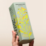
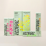
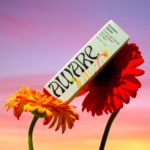
Fibra’s work for Aware is one of them. The vines aren’t decorative accents but part of the structure, wrapping the pack and defining its surface. Saturated colour carries across the layout, while a botanical figure drawn for this system rather than lifted from reference books runs through the composition. Contemporary typography cuts across the illustration instead of retreating into the margins.
Across the range, the system holds. Layouts repeat cleanly, information stays readable, and white space appears where it supports the composition rather than signalling restraint by default. Considered, not cautious.
This is where botanical packaging works. It looks like the brand actually met a plant in real life and understood what it was trying to represent instead of reaching for the nearest visual shorthand.
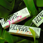
The plant on this pack doesn’t actually exist but has been drawn for the brand, not lifted from familiar leaves or sprigs. Origin, care and craft still read clearly, and the same illustration system carries across formats and markets without thinning out.
And that clarity is the point. Once botanical becomes the default setting, memorability comes from defining your own version of nature, even if that means growing something that only exists on your pack.
Why blend in when you can bloom.