Good packaging has a lot in common with good architecture. Different scales, same principles.
Both start with structure. Skyscrapers stay upright because every beam, joint and load path has been thought through. Packaging faces its own pressures. Protect the product, survive transport, stack efficiently and compete in a crowded retail environment.
Cartons, trays and closures follow the same logic. Corrugated fluting absorbs impact. Structural folds spread pressure across the pack. Every crease, rib and corner exists for a reason.
Buildings also have to work for the people moving through them. Doors sit where you expect them. Corridors lead somewhere useful. Packaging should work with the same clarity when it lands in your hands.
Pull tabs, snap closures and resealable lids shape that experience. When a pack opens cleanly, pours properly and closes again without a struggle, the design is doing its job.
Architecture is rarely judged on structure alone. Proportion, material and light shape how a space is experienced. Packaging works with the same ingredients. Curves, balance, texture and surface finish turn a container into something worth noticing.
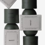
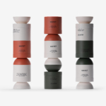
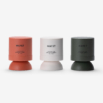
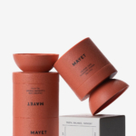
Studio Hou’s work for Mayet brings those ideas together. The skincare range uses cylindrical and semi-spherical forms that echo the symmetry of architectural columns. Shapes that look balanced and deliberate while also stacking neatly and sitting comfortably in the hand.
The graphics stay restrained. Soft tones and minimal typography leave the form of the containers to carry the design.
That restraint fits Mayet’s philosophy. Cleansing sits at the foundation of the routine, so the packaging follows the same thinking. Reduce everything to what matters and build from there.
Architecture shapes the spaces we move through. Packaging shapes the objects we handle every day. When structure, function and form align, design stops being decoration and becomes something you experience.
