Porridge used to live at the sensible end of the breakfast aisle. A bowl of oats, a splash of milk, maybe a spoon of brown sugar if someone felt unusually indulgent.
That era has passed.
The modern bowl has become a custom build rather than a fixed recipe. Base grains have expanded beyond rolled oats to include steel‑cut, rye flakes, quinoa blends, amaranth and barley. Each brings a different texture, fibre profile and nutritional slant. Even the liquid becomes a choice. Water keeps things clean, milk adds creaminess and plant‑based options like oat or soy bring their own weight and flavour.

Toppings now act as a form of self‑expression. You can read a person’s priorities in the bowl they assemble. The gut‑health crowd layer kefir, stewed fruit and seeds. Gym regulars fold in protein, nut butters and cacao nibs. Others drift towards the dessert end of the spectrum, building banana, caramel or chocolate combinations that would not look out of place on a dessert menu, only anchored by grains.
It’s all porridge, technically. It’s also personal brand. And from a product and packaging point of view, that shift opens up the entire category.
Brands now have permission to move porridge out of the old health‑food corner and into the worlds of indulgence, performance and ritual. Design can lean into bold flavour narratives, functional cues around energy, digestion or slow release, and formats that reflect how people actually eat. That might mean portionable oat blocks, savoury breakfast cups, overnight kits destined for the office fridge or topping assortments that encourage people to build their own bowl.
If your porridge still looks like a compromise next to a pastry, the brief has been missed.
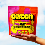
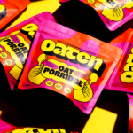
That thinking sits at the heart of OATEN, a concept by Julisera Studio. The pack opens with “not your grandma’s porridge,” and the design follows through. Instead of the usual oatmeal neutrals, the range arrives in orange, hot pink and punchy yellow, anchored by thick black typography that reads clearly from several feet away. Big lettering, graphic illustration and high‑contrast colour give the pack real presence.
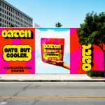
In a category where many packs still rely on soft palettes and gentle health cues, OATEN heads in the opposite direction and injects some long‑overdue attitude into the breakfast aisle.
Which is exactly where porridge now appears to be going.
Grandma was right about the oats. She just never had toasted coconut, black tahini and a blowtorch.
