Pet food packaging has become a multi‑billion‑dollar category, growing fast as pet ownership rises and brands move further into premium territory.
That growth is changing how the aisle looks. With more brands competing for attention, packaging has to work harder. Stylised illustration has become one of the most distinctive tools in the category.
Illustration has a power photos rarely match. It doesn’t just show a pet, it reinterprets it. A few confident lines can turn a dog, cat or paw print into a character with personality.
The magic lies in the way illustration invites the viewer in. Without a photograph spelling out every detail, the brain fills the gaps and the pack begins to feel more personal. Illustration here is not decoration. It connects, entertains and stays in the memory long after the product is gone.
Concerns about trust often lead brands to photography. People tend to believe what a camera captures, especially in categories where freshness or authenticity comes under scrutiny. In those cases, realistic images can reassure the shopper.
Pet care plays by different rules. The category is built on emotion, character and the bond between owner and animal. Illustrated packs tap directly into that instinctive behaviour. A stylised dog or cat can express warmth, humour or attitude in ways a glossy photograph often struggles to achieve.
There’s also a psychological effect at work. Humans enjoy completing visual information. A simplified drawing invites us to fill in the missing details, which encourages a small moment of participation and increases our sense of connection. Graphic reduction can also signal confidence, which explains why bold shapes and line art are so common among contemporary premium brands.
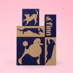
Placed on shelf, this approach can be surprisingly powerful. A flat two‑colour cat on a tin often feels more distinctive than a polished photo of a real animal sitting beside it.
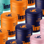
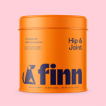
Finn, the pet wellness brand, shows how successful this style can be. Their supplement tins, created with Gander and Daniel Brokstad, trade glossy dog portraits for bold geometric sketches. Bright colours clearly separate the variants, the typography keeps everything clean and readable, and the reusable tins add a sense of permanence. The result is science‑led products with a personality that feels both modern and warm.
Stylised illustration brings energy, wit and individuality at moments where photography can feel overly literal. It hints rather than instructs, and that subtlety can be remarkably persuasive.
Shoppers are unlikely to describe any of this in design terms. They will simply say “the one with the funny dog” or “the tin with that face on it”. And that’s exactly the point.
