Organic Fertilizer of Awaji Island by UMA, Japan
Posted: Filed under: Packaging Reviews | Tags: Agriculture Logos and Packaging, Best Packaging Designs, Branding, Branding News, Creative Packaging, Design Opinion, Design Reviews, Designed by UMA, From Asia, Graphic Design, Graphic Design Blog, Japanese Design, Minimal Design, Packaging Company, Packaging Design, Packaging Design Blog, Packaging Design Resource, Packaging News, Paper and Card Packaging, Pastel Colours, The Best Packaging of 2015, Typography, Uncoated Papers & Cards Comments Off on Organic Fertilizer of Awaji Island by UMA, JapanOpinion by Richard Baird.
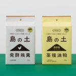
島の土 / Island of Soil is an organic fertiliser created to help develop good quality soil and draw out and compliment the natural power of the land. The range is made using livestock feces and processed vegetable scraps from animals raised and produce grown on the Japanese island of Awaji. It comes in two varieties, a poultry manure and sawdust mix, and a rapeseed oil cake and powder mix, both packed in two sizes, a large 15kg bag and smaller 500g bag. These will be sold through large agricultural retailers as well as small gardening shops.
Island of Soil’s packaging was created by Osaka based studio UMA. It features an unbleached card interior and a bleached and printed paper exterior, closed with a copper split pin and has a bold typographic and iconographic approach to its graphic design.
F. Ménard designed by Lg2boutique
Posted: Filed under: Logo Reviews | Tags: Agriculture Logos and Packaging, Bag Design, Brand Identity Reviews, Branding, Brochure Design, Business Card Design, Design For Print, Design News, Design Opinion, Design Reviews, Designed by lg2boutique, Designed in Montreal, Designed in Québec, Fonts in Use: Brothers, Fonts in Use: FF Kievit, Fonts in Use: Vitesse, Graphic Design, Heritage, Logo Design & Branding Blog, Logo Designs, Packaging Design, Serif Logotypes, The Best Brand Identities of 2013, The Best Logo Designs of 2013, Tinted Photography, Typography Comments Off on F. Ménard designed by Lg2boutiqueF. Ménard is a Canadian pork producer and butcher with a family heritage that dates back fifty years. Their visual identity, developed by brand and packaging design specialist lg2boutique, creates a seamless fusion of a past and present – traditional service values alongside contemporary high standards – through the union of vintage and contemporary photography, the utilisation of digitised, early 20th century typeface and a flat, economical colour palette cohesively executed across a variety of collaterals.
Blanca designed by Lo Siento
Posted: Filed under: Logo Reviews | Tags: Agriculture Logos and Packaging, Bottle Packaging, Brand Identity Reviews, Branding, Brochure Design, Business Card Design, Design News, Design Opinion, Die Cut Design Detail, Embossed Business Cards, Graphic Design, Logo Design & Branding Blog, Logo Designs, Logos, Logotypes, Milk Packaging, Monochromatic Brand Identities, Packaging Design, Sans-serif Logotypes, Stencil, Stencil Cut Logotypes, The Best Logo Designs of 2012, Typography, Visual Identity Design Blog Comments Off on Blanca designed by Lo SientoBlanca is a ‘dairy hub’ created to ‘mediate between two extreme poles of the industry; [milk] production and [consumer] knowledge’ and to ‘produce honestly, think critically and consume responsibly.’ Based around a simple stencil cut logo-type solution executed with a monochromatic simplicity and subtle craft cues, Blanca’s visual identity, developed by Barcelona-based brand and graphic design agency Lo Siento, manages to infuse and visually convey the disparate perceptions of commodity and care.