Vi Novell 2016 by Atipus, Spain
Posted: | Author: Richard Baird | Filed under: Fonts in Use, Food and Drink, Graphic Design Reviews, Packaging Reviews | Tags: Branding & Packaging of 2017, Creative Packaging, Design For Print, Design Opinion, Design Reviews, Designed by Atipus, Designed in Barcelona, Drinks Packaging, Geometric Pattern, Graphic Design, Graphic Design Blog, Minimal Design, Minimal Package Design, Packaging Company, Packaging Design, Packaging Design Blog, Packaging Design Resource, Packaging News, Patterns, Spanish Design, The Very Best Packaging of 2017, Typography, Wine Design, Wine Label Design, Wine Packaging | Comments Off on Vi Novell 2016 by Atipus, SpainOpinion by Richard Baird.
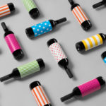
Vi Novell 2016 is a young wine from Catalonia with an intense ruby colour and a fresh and fruity flavour profile. It is the seventh in an ongoing series, and is dedicated to the party; the open-air dance, the joy and celebration of the beginning of the season, the first sip of wine, shared with friends, and the continued enjoyment of a long tradition yet in tune with modern times. Wine producer Celler Masroig worked with Barcelona-based graphic design studio Atipus to capture this moment and spirit with a striking label design of simple form and multi-colour, followed up online with a site that blends dynamic pattern and story.