
Emily Gosling

4P’s by Base Saigon
What with it being the season to be jolly and all that, it feels almost contrarian to not be as positive as I usually am in covering projects for BP&O – after all, it’s about showcasing the very best in brand design and packaging. But in the spirit of the ‘O’ for ‘Opinion’, it’s tricky to be as nigh-on-unanimously gushing...
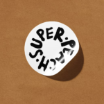
Super Peach by Pentagram
Restaurant brand Momofuku began life with its New York Noodle Bar in 2004 and in the two decades since, has opened more than 15 restaurants across North America, each building on founder chef David Chang’s vision of boundary-pushing cuisine. Since its naissance Momofuku “became known for reshaping Asian-American cuisine and challenging dining conventions with a bold and innovative approach,” according...
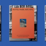
Hotel Park Ave NYC by Colt
Located on the corner of Park Avenue South and East 30th Street in Manhattan’s Midtown, Hotel Park Ave is the artist formerly known as the Mondrian Park Avenue. Its change in name is thanks to its change in owner: international hospitality company Lore Group announced its acquisition of the site and mooted its subsequent rebrand late last year, and to...
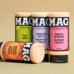
MAG by LG2
Based in Quebec, MAG is a family-run, family-recipe-based range of condiments anchored by its signature mayonnaise but also comprising dressings and Asian-inspired sauces. The brand made something of a splash earlier this year with its innovative solution to keeping mayo cold in situations like summer barbecues: creating labels using an ultra-thin layer of silica aerogel – an insulator developed by...
Blueberry by Studio NARI
“Mind. Blown”, as someone in Gen Alpha might have said a long time ago, maybe while performing some flossing at a velocity so rapid as to be barely perceptible to the naked Millennial eye. But they probably wouldn’t say that any more, such is the rapacious speed at which all things ‘young person’ change. Gen Alpha inhabits a world so...

Eternal Research by Cotton
Niche/difficult electronic music types and brand design nerds are rarely found too far from one another; often, indeed, they’re one in the same. It’s little surprise really when you look at the typographic wonders to be found across the spectrum of things like vintage synthesisers – the sublime curves of ‘Omnichord’ or the strangely pagan-ish letterforms on a Prophet-5, to...
INTL 2025 by Warriors Studio and NAM
International Assembly began life as Graphic Design Festival Scotland back in 2014, founded by then-recent-ish grads Beth Wilson, James Gilchrist. The pair also helm Warriors Studio, which has been taking care of the festival’s creative direction, branding and design since its inaugural edition, too. GDFS became International Assembly, or INTL, in 2020; and when the new name and identity, also...
Bugg by Seachange
Bugg is a New Zealand-based gardening brand founded earlier this year as the sibling of garden tools and accessories retailer Gubba. It bills itself as “premium products for people who live in the garden,” but its charming brand design definitely goes harder on the latter half of that clause than the former. Not that it looks cheap by any means...
Butter Baby by Universal Favourite
It takes a skilled pair of hands/creative agency to make you fall in love with a fictional character (lore-laden backstory and all) who is literally a big blob of fat. But as has become increasingly apparent over the years, Universal Favourite (The Dinner Ladies, Monkey Baa Theatre Co., LBDO) is more than a skilled pair of hands – I honestly...
Mutt by Brands & People
We’re at an interesting juncture when it comes to the petcare category – especially when it comes to dogs. Long gone are the days of barbour jackets and wellies, whistles, and gargantuan cans of Winalot; but we’ve also (thankfully) started to leave behind the whole ‘fur baby’ thing – the nauseating ‘cockapoo mommy’ era that ushered in things like nail...
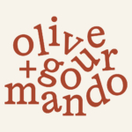
Olive + Gourmando by Caserne
Olive + Gourmando is a Montréal bakery, café, and restaurant that opened its doors in 1998 and has since become something of a culinary institution. With its expansion to a second location, Caserne – a design studio also based in Montréal – was brought in to refresh its identity. The aim of the project, according to Caserne, was to “support...
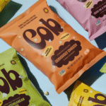
Cob by Saint Urbain
If there’s something we’ve come to rely on Saint Urbain totally nailing, it’s a wordmark. Even the most cursory glance across their recent projects affirms the agency’s knack for a grabby, smart, playful yet sublimely appropriate approach to brand type, and this new project is no exception. The work in question is for Cob Foods, for which Saint Urbain (Buena...