Brewdog

Brewdog’s Lone Wolf by B&B Studio
Lone Wolf—a whisky, gin and vodka range—marks Brewdog’s entry into the craft spirits market. These are produced by Brewdog’s distillery in Scotland, the only one to make base spirit from grain under one roof, a roof specially modified to accommodate a 19m high 60-plate rectification column to get the purest results possible. The range features a brand identity and packaging design created...
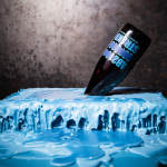
Brewdog Abstrakt by O Street
Brewdog’s Abstrakt is a limited edition craft beer concept that has released 20 different varieties since it began in 2010. Each beer is bottle-conditioned (bottled with a small amount of yeast, providing further fermentation and maturation), brewed and released just once, individually numbered and known only by their release code. It is a concept described as more art than beer, as boundary pushing and blurring...

Brewdog Menus by O Street
O Street worked with craft brewery Brewdog; best known for their beers and big attitude but also a growing hospitality presence throughout the United Kingdom, to create a distinctive menu design and system for over fifty of their bars. This included both a full menu which features a handmade backboard, and a Daily Drafts menu, individually finished at each location....