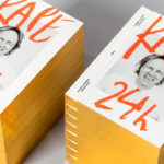
Kape 24h by Bond, Finland
Posted: Filed under: Fonts in Use, Graphic Design Reviews, Material & Print Specs | Tags: Art Direction, Book & Magazine Cover Design, Book & Magazine Design, Colour in Use: Gold, Cooking Logos and Packaging, Designed by Bond, Edge Gilding, Finnish Design, From Scandinavia, Gold Foil, Print Finishing, The Best Graphic Design Work of 2018 Comments Off on Kape 24h by Bond, FinlandOpinion by Richard Baird.
Kari Aihinen is a Finnish chef with a growing international reputation. Aside from creating exclusive pop-up Finnish dinning experiences for New Yorkers, working for Ravintola Savoy and developing one-off Nordic-Asian menus with chef Eric Neo in Singapore, he is also the co-founder and headchef of Helsinki restaurant Roster.
Roster is a distinct experience. It features an interior design of custom furniture with a vintage twist, raw and refined materials and hand-picked design objects. Although sophisticated, Roster is a casual rather than formal dinning experience. The restaurant’s graphic identity, designed by Scandinavian studio Bond, is an articulation of this, and the brisk, humorous and warm personality of Kari Aihinen. This is furthered explored in the design of Kari Aihinen’s new cookbook Kape 24h, also designed by Bond.
Lulu Cake Boutique designed by Peck and Co.
Posted: Filed under: Food and Drink, Logo Reviews | Tags: Baking Logos and Packaging, Brand Identity Reviews, Branding, Cooking Logos and Packaging, Design For Print, Design News, Design Opinion, Design Reviews, Designed by Peck & Co., Logo Design & Branding Blog, Logo Designs, Logo Opinion, Logos, Script Logotypes, Stationery Design, The Best Brand Identities of 2013, The Best Logo Designs of 2013 Comments Off on Lulu Cake Boutique designed by Peck and Co.Lulu is a New York-based cake boutique who, in the words of Peck and Co., the design agency behind the boutique’s new visual identity, craft ‘masterpieces unmatched in flavor’ and are obsessed with detail, artistry and flavour.
Based around a fine line script with large enthusiastic loops and a polished fluidity that neatly walks the line between personal signature and piped icing, contrasting uppercase sans-serif characters and a monochromatic colour palette, Lulu’s identity is a sharp juxtaposition of individuality and creative flourish alongside professional efficiency. While the illustrations and tone of voice (see ‘In Cake We Trust’, ‘Get Your Sugar On’ and ‘Life Is Better With A Cake’) feel a little generic and clunky next to the clear communicative duality and finish of the logotype the the use of unbleached, string-tied boxes, paper, stickers, tape and what looks like a letter-press finish work well to add a small-scale, traditional and custom sensibility to the project that really builds on the craft values of the brand.
La Catería designed by Firmalt
Posted: Filed under: Food and Drink, Logo Reviews | Tags: Baking Logos and Packaging, Brand Identity, Brand Identity Reviews, Branding, Business Card Design, Catering Logos, Cooking Logos and Packaging, Design For Print, Design Opinion, Design Reviews, Designed by Firmalt, Foil Blocking, From Latin America, Gold Foil, Graphic Design, Logo Design & Branding Blog, Logo Opinion, Logos, Logotypes, Monogram Design, Serif Logotypes, Stationery Design, The Best Brand Identities of 2013, The Best Logo Designs of 2013 Comments Off on La Catería designed by FirmaltLa Catería is a San Pedro-based catering company that produces salads, snacks, deserts and pastries for events with a focus on both presentation and quality of ingredients.
Inspired by small European street markets, “where a variety of textures, styles, forms and colors blend together to create a unique experience that feels warm and inviting”, multidisciplinary design agency Firmalt developed a visual identity solution that includes a logo-type, monogram, tinted photography, a cream textured substrate and block foil print finish to give the brand “classical roots but with a modern execution”.