Creasing in Print
LogoArchive Ukraine
In 2020 LogoArchive started to roll out a research programme, inviting international designers to use the platform to share the works of their countries, with a special interest in those who have been previously under-represented. This included nations in the Middle East, East Asia and Eastern Europe. Since then, the LogoArchive Instagram accounts have continually surprised and delighted. One of...
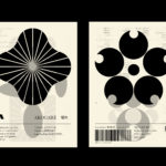
LogoArchive – Akogare 憧れ by Hugh Miller
LogoArchive returns with its fourth collaborative Extra Issue and first bi-lingual release, documenting the forms of Japanese logo design. Through the distinctive smaller format of the bound booklet LogoArchive seeks to surprise and delight with each new issue, introducing new collaborators to offer unexpected interpretations of the ubiquitous logo book. For this Extra Issue, Hugh Miller orchestrates graphic impact and...

Real Review by OK-RM
Real Review is an award-winning quarterly magazine that pursues what it means to live today through analysis, evaluation and enquiry. It is a collaboration between London-based design studio OK-RM and editor Jack Self, the founder of architectural practice and cultural institute Real. Real Review offers wide ranging comment on a variety of topics, is presented in a compact format and mixes dense...
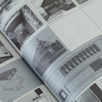
Superkül: Rain, Gravity, Heat, Cold by Blok
Superkül is an Canadian architectural studio with a portfolio described as having an understated boldness, subtlety and spacial richness, and a process that intends to find the essence of each project and remain true to this throughout design and development. Superkül has won many awards and is considered one of Canada’s most progressive architecture firms. To celebrate the studio’s first ten years...
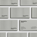
Ascui & Co. Architects by Grosz Co. Lab
Ascui & Co. Architects is an Melbourne-based studio with a rich history, depth of experience and a vision they describe as being a true perspective rather than one founded on intuition. Their projects are considered smart and environmentally sustainable, unexpected yet grounded by purpose, and range from residential additions to multimillion-dollar commercial developments. Anchored in the concept of Process & Possibility — a maxim that refers...
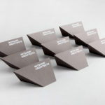
Mitsuori Architects by Hunt &Co.
Mitsuori Architects is an architectural design studio that creates high quality structures and spaces that merge aesthetic beauty with careful planning and thoughtful detailing. Their large scale project experience is combined with the flexibility of a smaller practice allowing them to provide big clients with a personalised service. Mitsuori’s visual identity, designed by Melbourne based Hunt & Co. and informed by a name that translates from Japanese as...