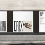
Custom Typefaces & Logotypes
INTL 2025 by Warriors Studio and NAM
International Assembly began life as Graphic Design Festival Scotland back in 2014, founded by then-recent-ish grads Beth Wilson, James Gilchrist. The pair also helm Warriors Studio, which has been taking care of the festival’s creative direction, branding and design since its inaugural edition, too. GDFS became International Assembly, or INTL, in 2020; and when the new name and identity, also...
Muse Group by Collins
Muse Group exists as a collection of digital products covering all aspects of the creative process in music. This reviewer is familiar with Audacity and has used it in the past, but other platforms include Ultimate Guitar, MuseClass, MuseScore, and MuseHub. These tools are used by a range of professional musicians, budding amateurs, and everyone in between, working across all...
Sigma by Stockholm Design Lab
You could argue that there’s a fair few similarities in terms of Japan and Sweden’s approach to design, and the aesthetics of life more generally. Both are known often for a specific kind of minimalism – a tastefulness that eschews fluff, luxuriates in crisp whites and keeps its edges, everything in its right place, rules and order and form following...
Klangwelt Toggenburg by Studio Marcus Kraft
Klangwelt Toggenburg (which translates as ‘sound world Toggenburg’) is a cultural organisation that manages to marry a devotion to the experience and exploration of (you guessed it) sound, with breathtakingly gorgeous (as far as I can tell from Google Images, anyway) mountainous natural landscapes of the Swiss Alps, and some serious architectural chops to boot. Klangwelt Toggenburg began life more...
Siuru by Bond
Estonia’s Siuru plays with important questions, subverting and, at the same time, fulfilling expectations. Is it an art museum? A library? A cinema? Or a cultural institution? For a Bond (Veikkausliiga, Saaristo, Cable Factory) the design studio in charge of developing a brand identity for Siuru, this raised the concern, how do you brand something that seeks not to be characterised...
Uniqode by Koto
If we wanted to be poetic about it, we could describe QR codes as the inhabitants of the pixel-thin gap between our physical and digital realities; the conduit between IRL and URL. Once a novelty, perennially often a bit of a pain in the arse, they really came into their own during the pandemic when suddenly things like handling paper...

ROM by Leo Burnett
Okay, let’s get it out of the way… yes, there are elements of Pentagram’s 2018 Library of Congress in Leo Burnett’s work for the Royal Ontario Museum (ROM). In both projects, type is a frame for images of archive material. Is it BP&O’s responsibility to acknowledge similarities in all the work we publish, tracking a typology back to the start...
Saaristo by Bond
‘Saaristo’ is the generic term for ‘archipelago’ in Finnish, but – to the outside world – it’s sufficiently distinctive to refer to the entire region in Western Finland, which now makes up a new tourism brand. This brand intends to generate more interest in (and visitors to) the world’s largest archipelago: a collection of 40,000 islands. This scale makes it...
North Road by Manual
Independent content studio North Road was founded in 2022 to unite a portfolio of companies covering everything from scripted entertainment (‘Chernin Entertainment’) and non-scripted content (‘Kinetic Content’) to non-fiction productions (under ‘Words + Pictures’). Across these entities, North Road is one of the largest global suppliers of TV and film content, and is able to work on over 70 active...

Williams Cocktails by Offff
In the last five years, canned cocktails have become ubiquitous, with offerings from MOTH: (packaging by Pentagram) and Whitebox (cans created in-house) among the strongest designs competing on the shelves of off-licenses, delis and bottle shops. Convenience and a post-pandemic demand for ‘on-the-go’ experiences have helped drive this trend, with Mintel data demonstrating that sales of spirit-based ready-to-drink beverages increased...

Hello Klean by Two Times Elliott
Beauty is, of course, in the eye of the beholder, but there’s no denying that objectively, its branding and identity design has undergone some huge changes over the past decade or so. Gone are the days of faux-luxurious designs that were all about swathes of abstract silk; women coiffured to within an inch of their life; a microscopic lens on...
Compound by DesignStudio
What does ‘healthcare’ look like today, especially when we’re increasingly talking about preventative treatment? For Parsley Health and GlycanAge, which promote functional medicine, it’s serene – all blush pink, forest green and rounded corners; for Modern Age, which focuses on longevity, it’s more clinical, with high-resolution botanical imagery and classical icons; Ezra, which offers full-body MRIs as cancer prevention, goes...